

Cards
Usage
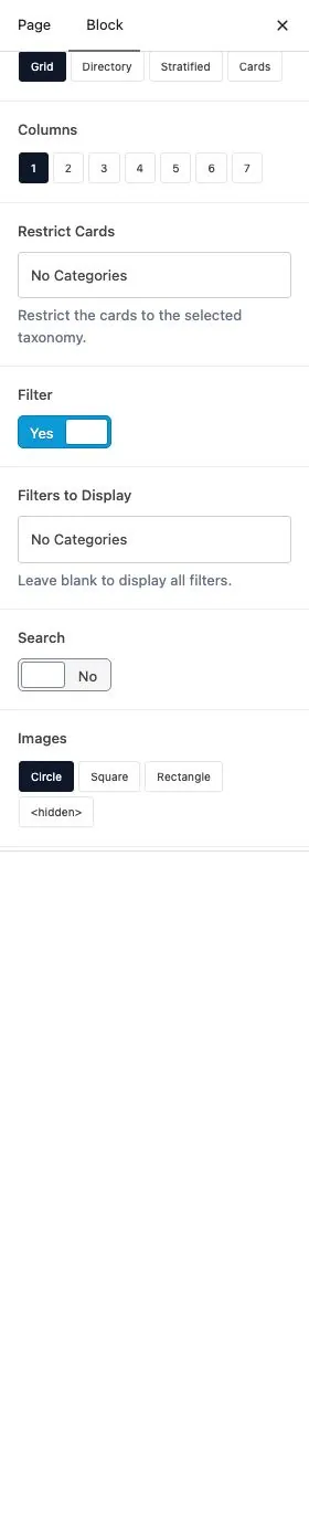
The Cards block shows every published card, or just the categories you pick, as a Grid, Directory, Stratified list, or Cards tiles. Search for Cards in the block inserter.
Cards are sorted A–Z by title. Turn on Filter for category buttons or Search for a live search box.
When to use it
Use it to list programs, services, or resources. Stratified suits scanning by category. Cards suits tiles with a wide image.
Tips
- Set Layout first. Images hides when Layout is Cards.
- Filters to Display appears after you turn on Filter.
- Search matches the title and the description (or content) as they appear on the card.
- Uncategorized cards never appear in Stratified.
Settings
Cards
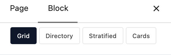
How the cards are arranged on the page.
- GridImage, title, description, and optional button in columns.
- DirectoryThe same pieces, centered.
- StratifiedOne heading per category, then that category’s cards. Uncategorized cards are skipped.
- CardsA framed tile with a wide image. Images is hidden; the image stays a golden rectangle.
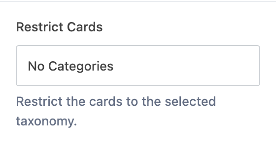
Only list cards in the categories you check. Leave blank to include every published card.

Adds Show All plus a button for each category above the listing. The buttons show and hide the cards already on the page.
Which category buttons appear. Appears when Filter is on. Leave blank to show every category that has cards. To change which cards are listed, use Restrict Cards.
Adds a live search that matches the title and the description (or content) as they appear on each card.
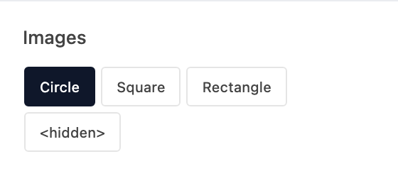
Crop shape for each featured image. Hidden when Layout is Cards — that layout always uses a wide rectangle.
- Circle defaultA round crop.
- SquareA 1:1 crop.
- RectangleA wide golden rectangle.
- <hidden>Hide the image.
Makes the image open the card's Link. The editor preview doesn't show this.
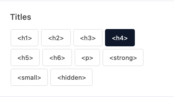
Visual style for the card name. The name stays an H3.
- <h1>Looks like your site's H1 style.
- <h2>Looks like your site's H2 style.
- <h3>Looks like your site's H3 style.
- <h4> defaultLooks like your site's H4 style.
- <h5>Looks like your site's H5 style.
- <h6>Looks like your site's H6 style.
- <p>Looks like your site's paragraph style.
- <strong>Looks like bold paragraph text.
- <small>Looks like small paragraph text.
- <hidden>
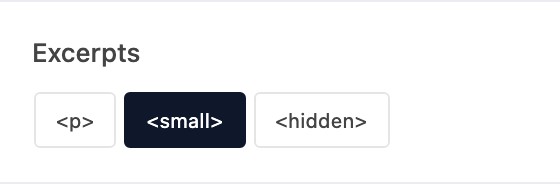
Visual style for the description (or content). Hidden removes that copy.
- <p>Looks like your site's paragraph style.
- <small> defaultLooks like small paragraph text.
- <hidden>Hide the description.
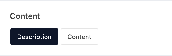
Which card field fills the description area.
- DescriptionThe Description (excerpt).
- ContentThe editor content.
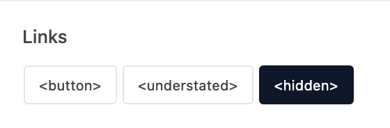
How the card Link looks. Hidden (the default) shows no button.
- <button>A solid button.
- <understated>A text link.
- <hidden>No button.
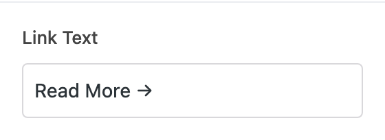
Fallback button label (default Read More →). If the card Link has its own title, that title wins.