

Search documentation
No results found. Try a block name or setting label.
Blocks
Dirigible Blocks
-
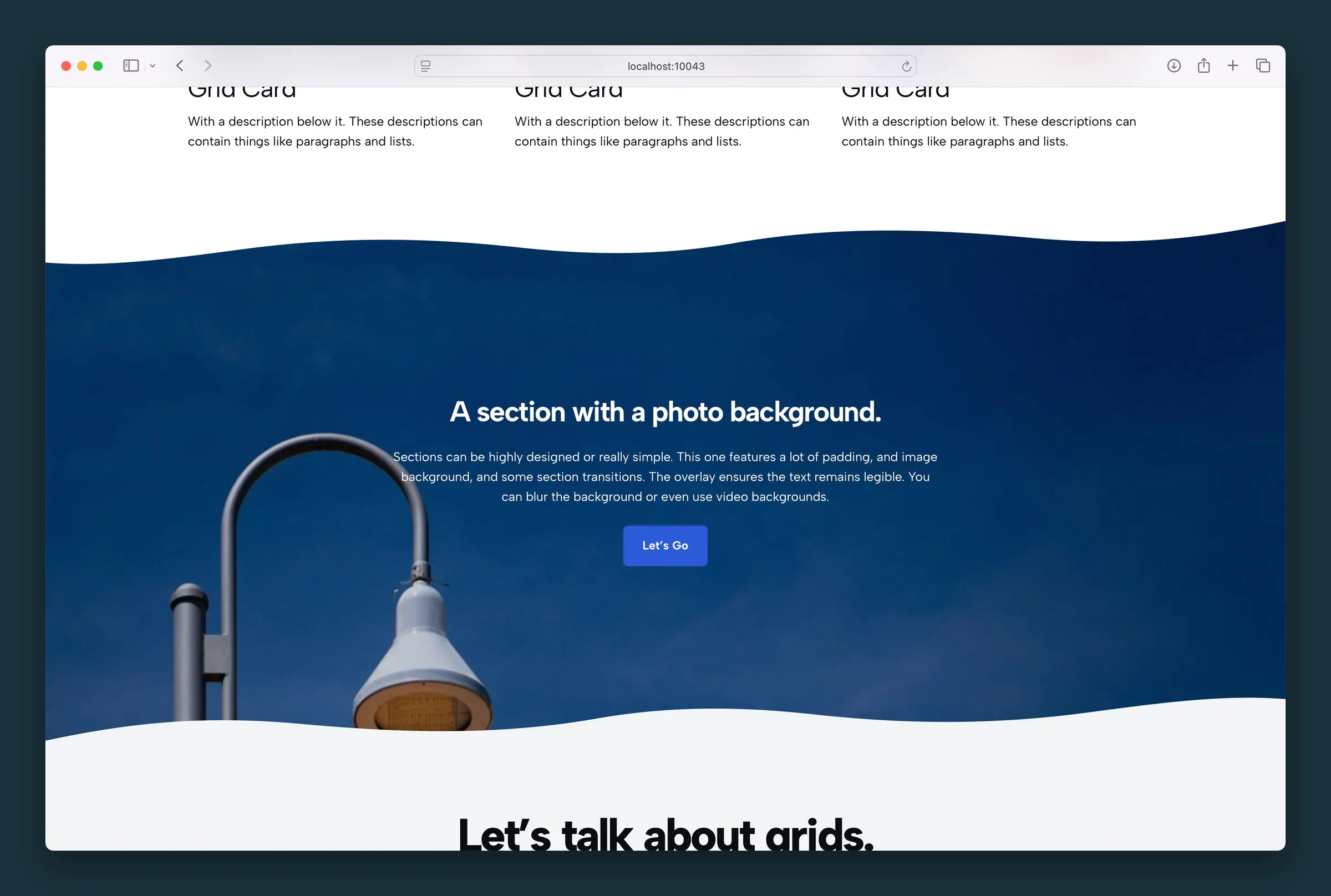 Section
A section container that groups blocks over a color, image, video, pattern, or gradient background.
Section
A section container that groups blocks over a color, image, video, pattern, or gradient background.
-
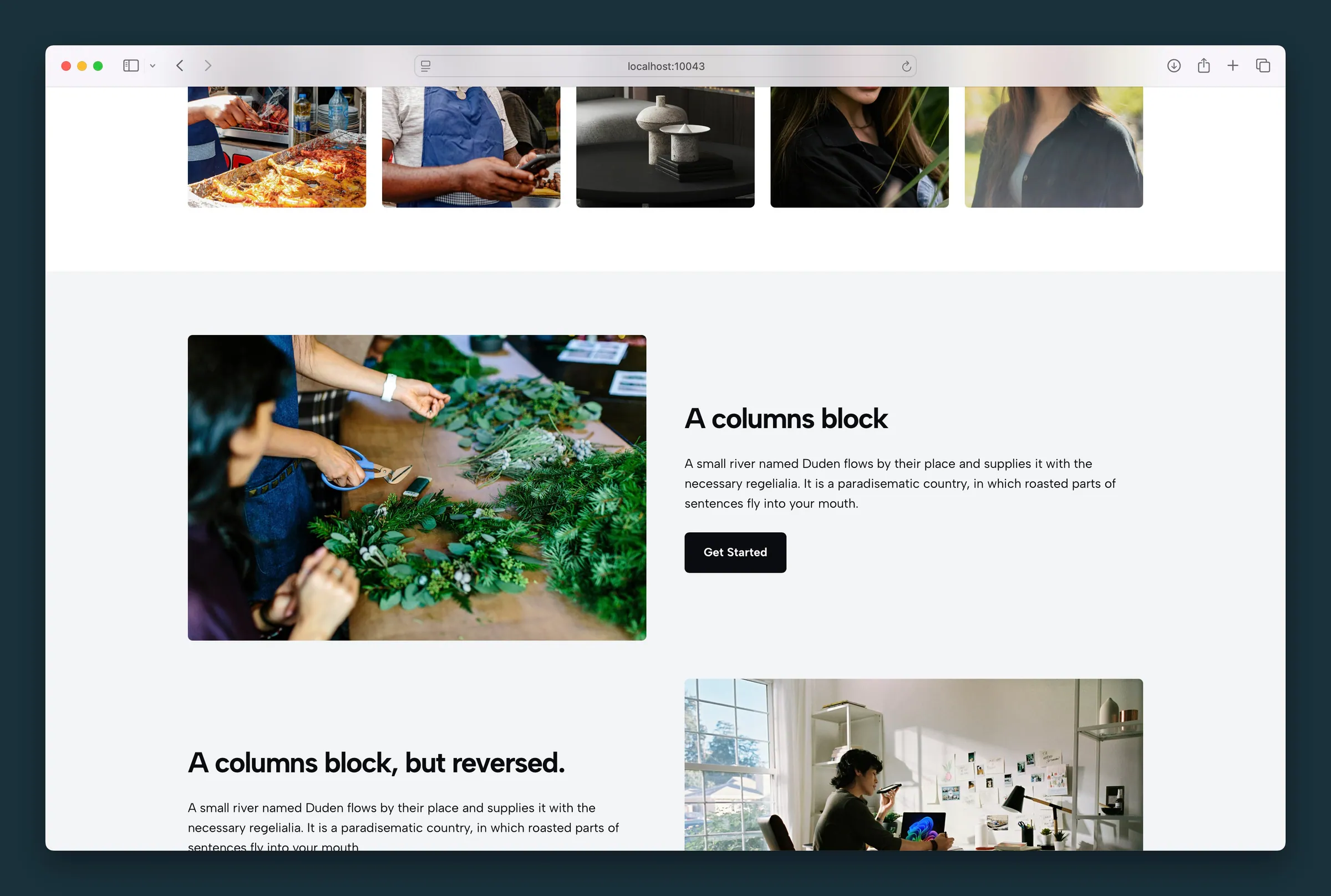 Columns
A two-column layout for image and text, video and text, or any side-by-side content, with sizing and mobile stacking controls.
Columns
A two-column layout for image and text, video and text, or any side-by-side content, with sizing and mobile stacking controls.
-
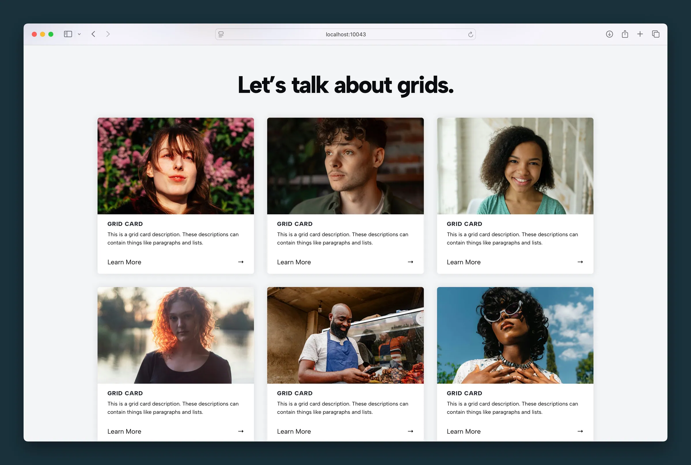 Grid
A card grid for services, features, team members, or image galleries, with image, icon, text, and video cards.
Grid
A card grid for services, features, team members, or image galleries, with image, icon, text, and video cards.
-
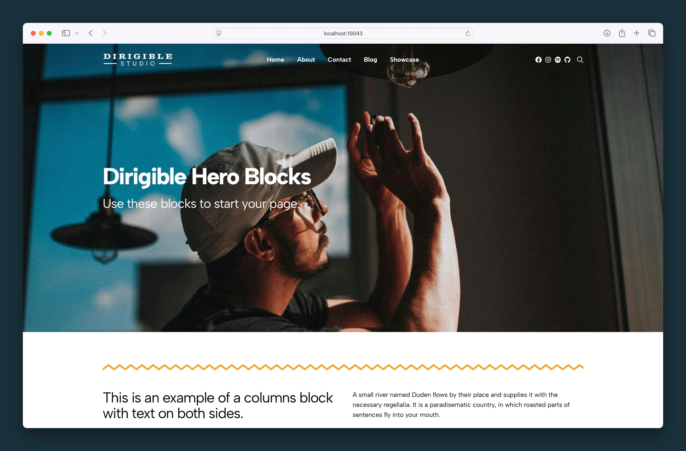 Hero
A hero banner that opens a page with a headline, subheadline, optional logo, and call to action over a color, image, pattern, or video background.
Hero
A hero banner that opens a page with a headline, subheadline, optional logo, and call to action over a color, image, pattern, or video background.
-
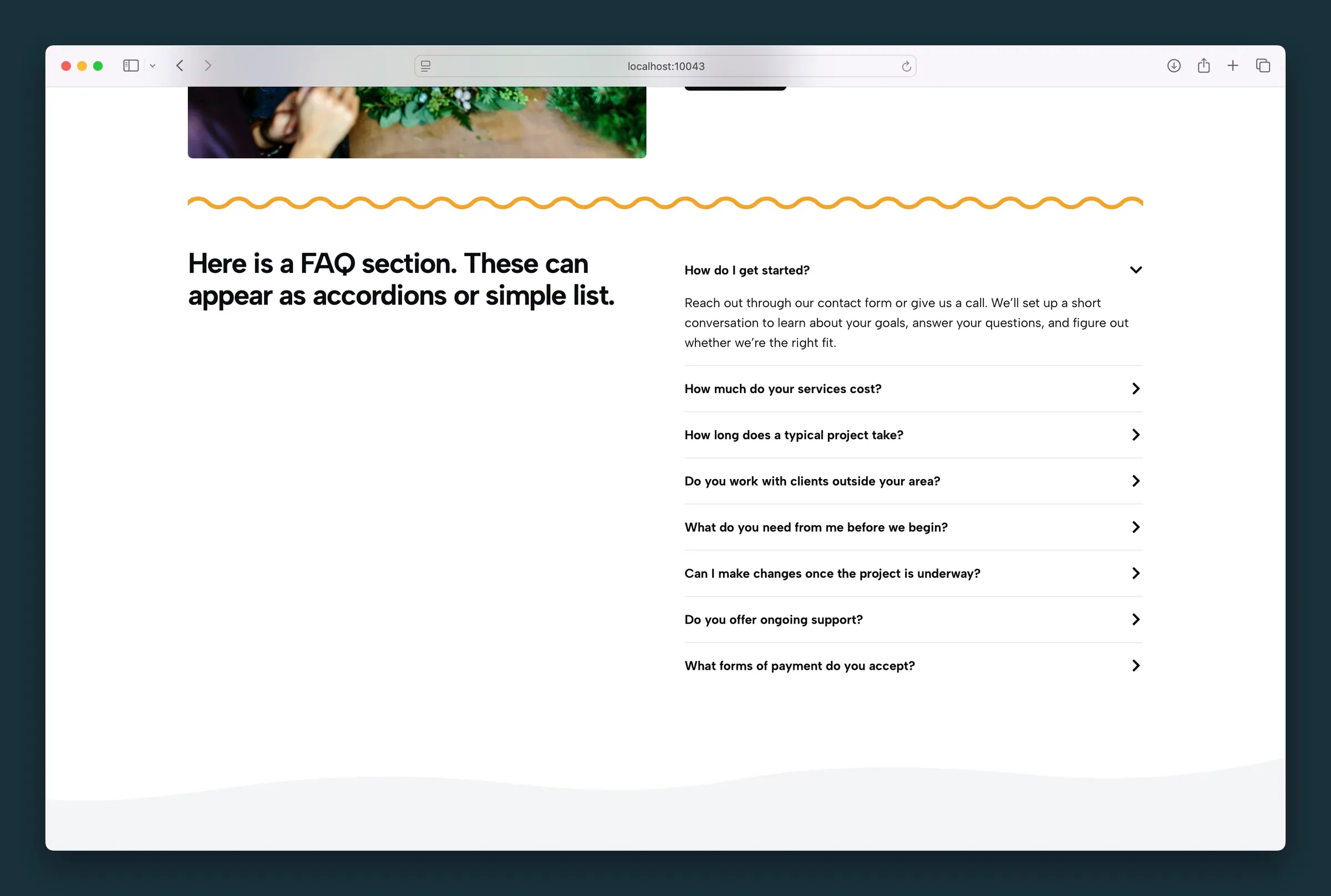 FAQ
An FAQ accordion or static list of questions and answers, set up so search engines can read it.
FAQ
An FAQ accordion or static list of questions and answers, set up so search engines can read it.
-
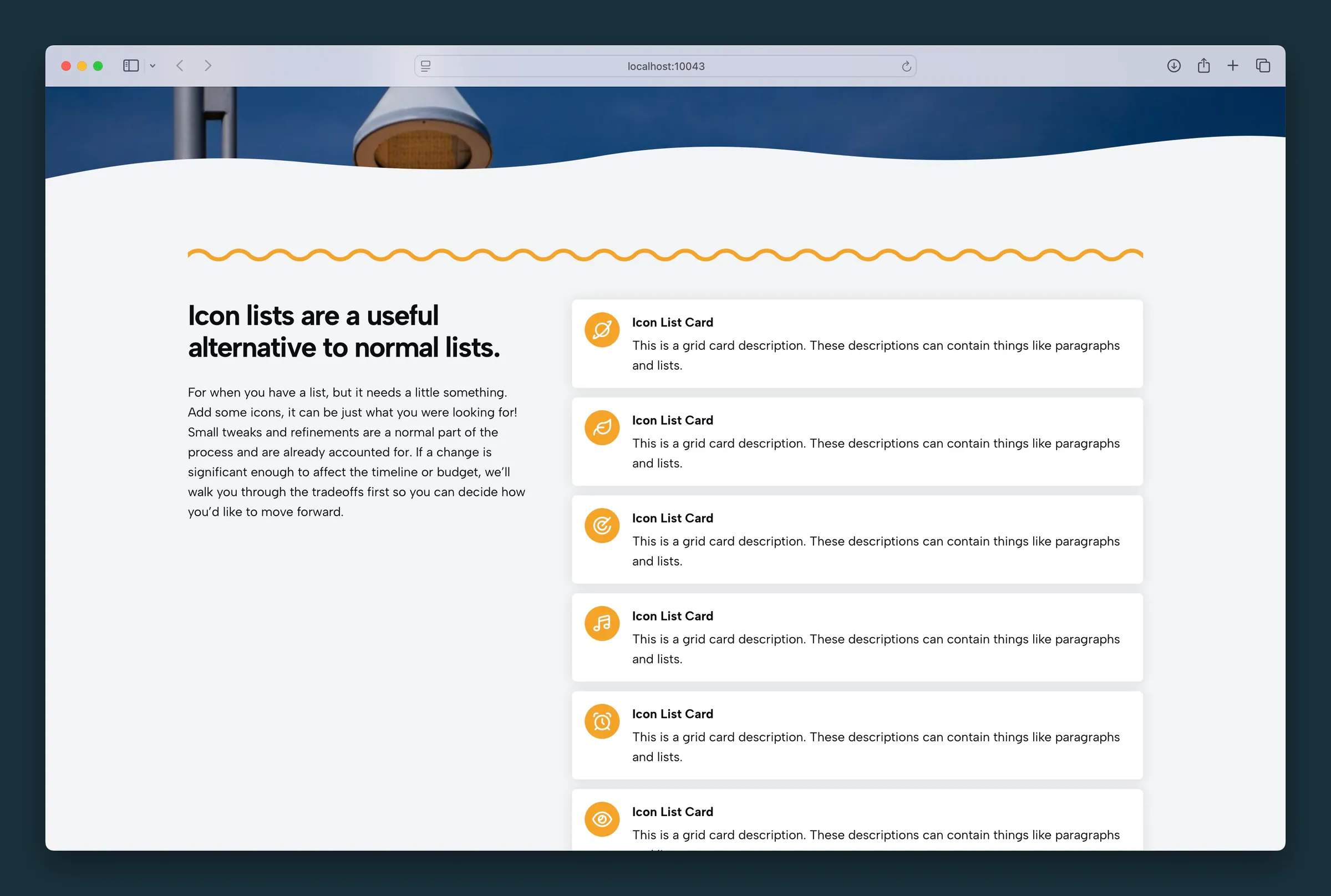 Icon List
A grid of icon cards, each with a headline and short text beside the icon. Use it for features, services, benefits, or process steps.
Icon List
A grid of icon cards, each with a headline and short text beside the icon. Use it for features, services, benefits, or process steps.
-
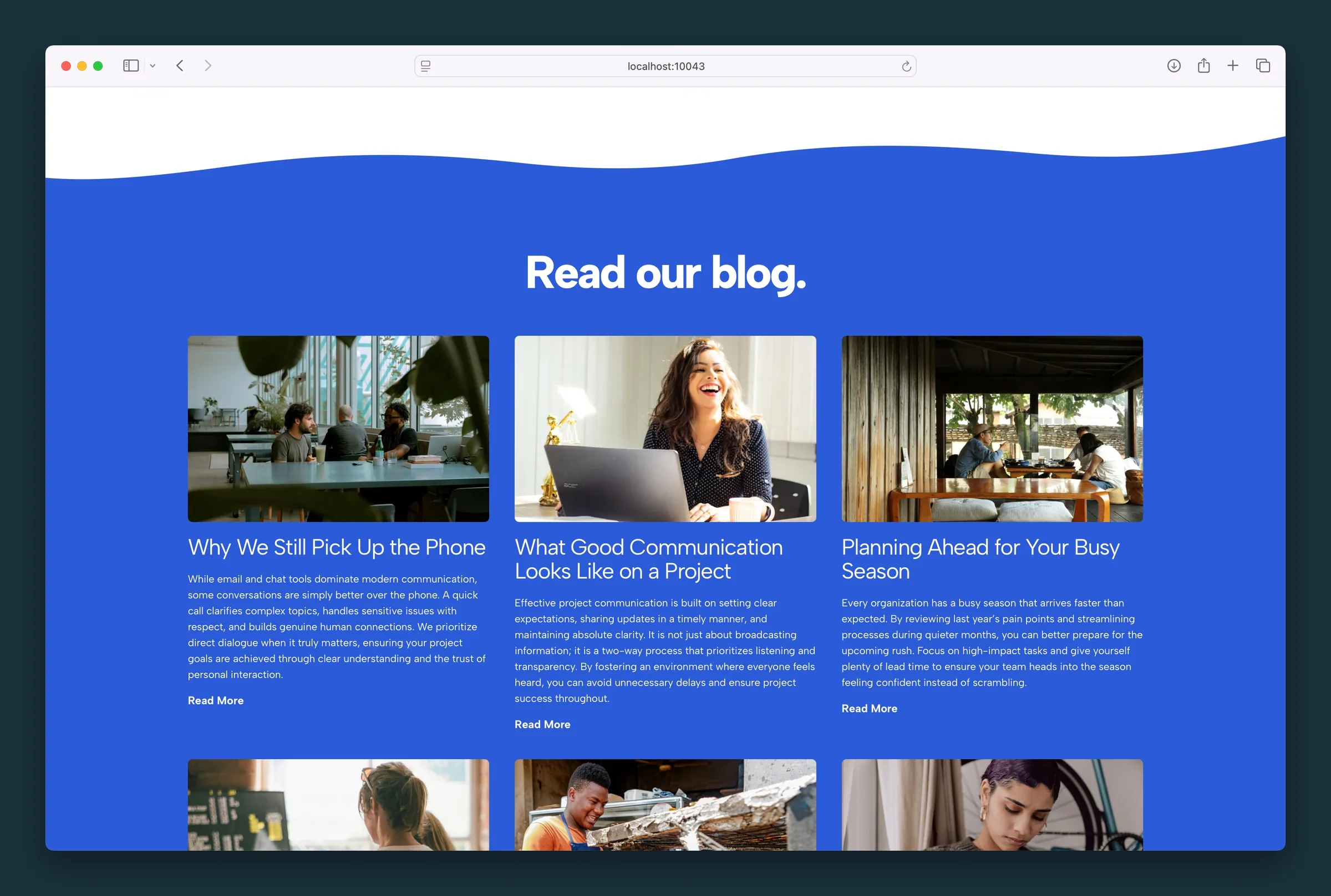 Blog Posts
Show your latest blog posts or news on any page as a grid, list, cards, or magazine layout, filtered by category or tag, or hand-picked.
Blog Posts
Show your latest blog posts or news on any page as a grid, list, cards, or magazine layout, filtered by category or tag, or hand-picked.
-
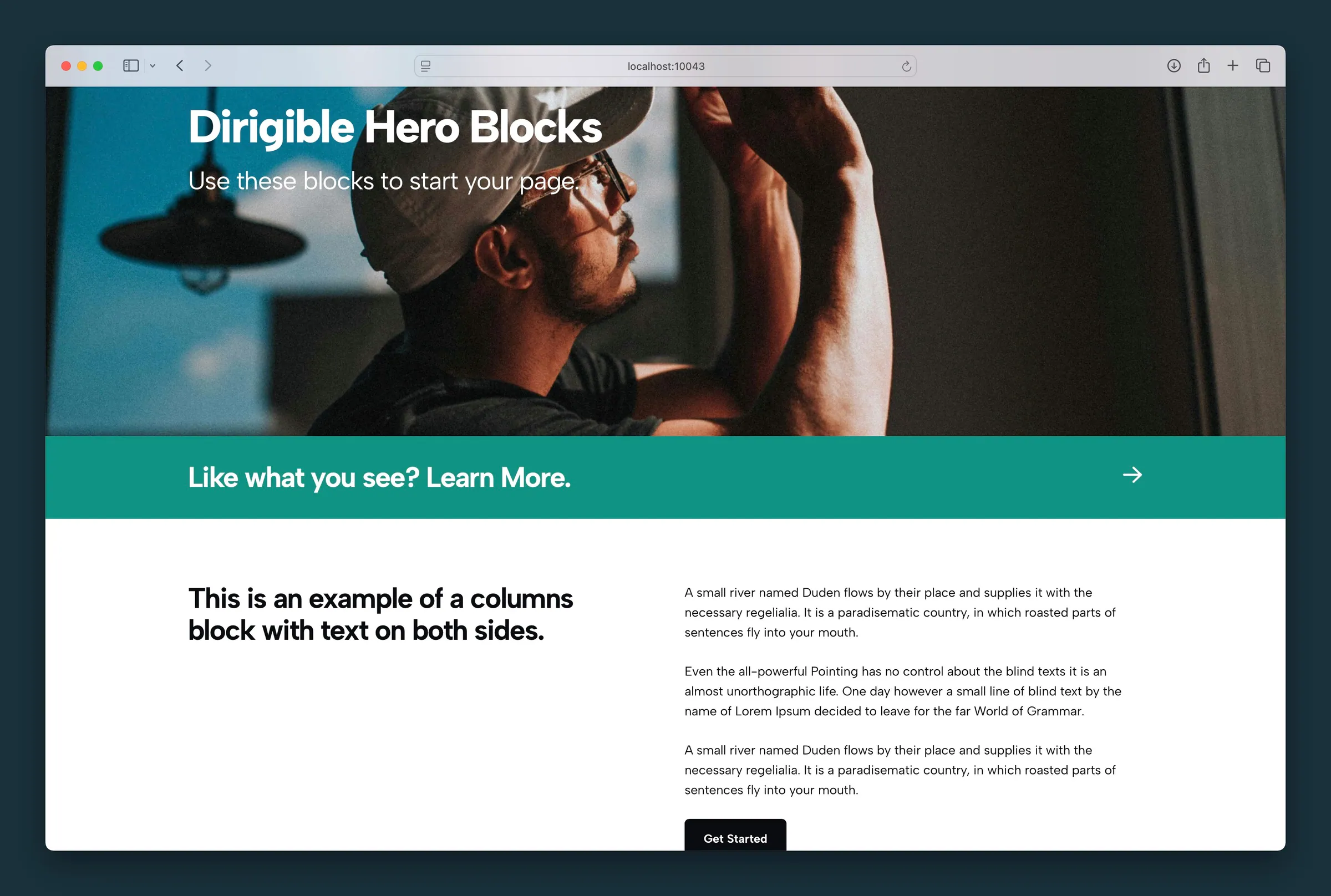 Action Strip
A full-width call to action banner that links the whole strip, with a short headline and optional icon.
Action Strip
A full-width call to action banner that links the whole strip, with a short headline and optional icon.
- Animated Slider An auto-advancing slider with a looping background video, a headline and a button on each slide.
- Before and After A before and after image slider. Choose two photos and visitors drag a divider to compare them.
-
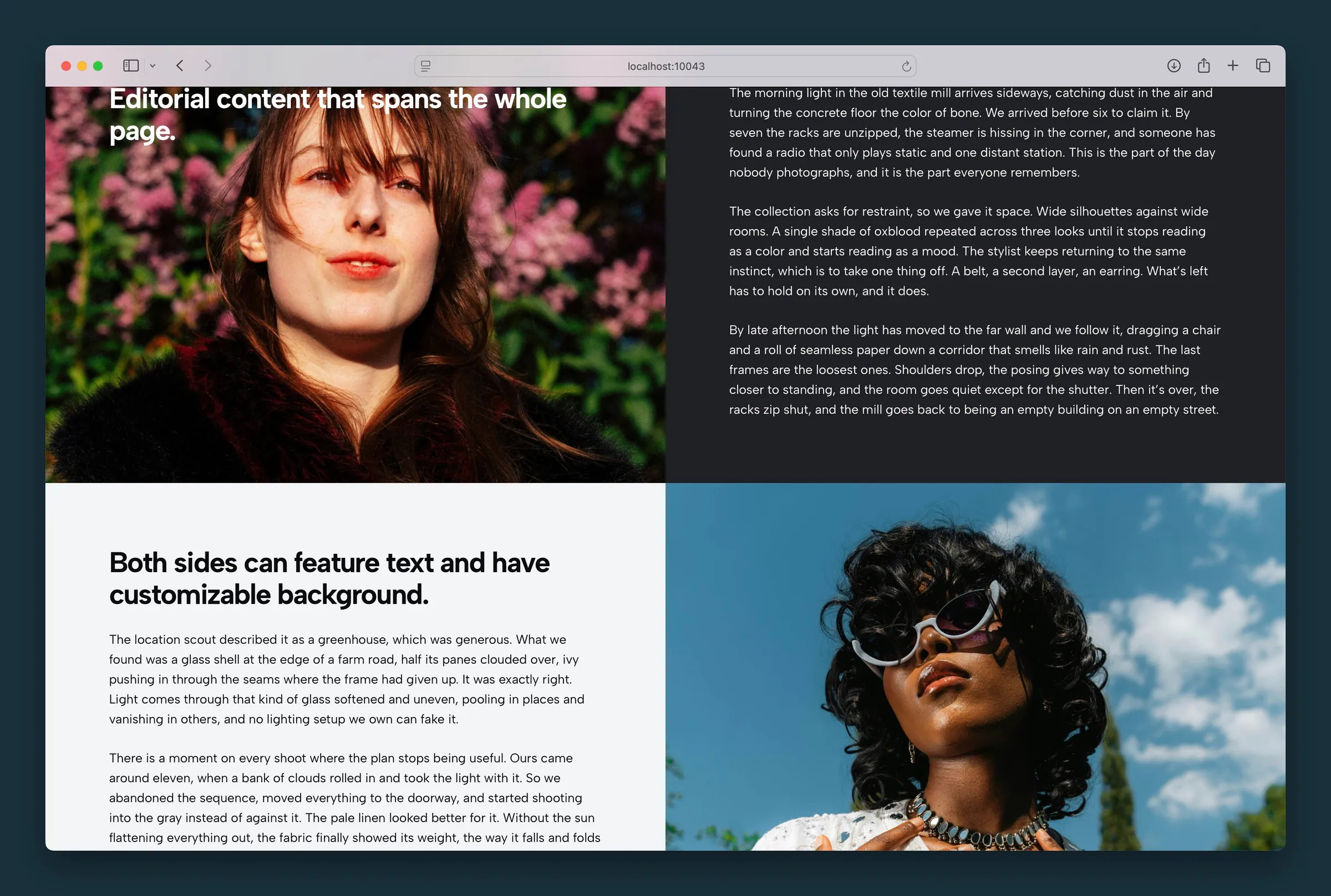 Blocks
A two-column layout where each side has its own background, text position, and nested content.
Blocks
A two-column layout where each side has its own background, text position, and nested content.
-
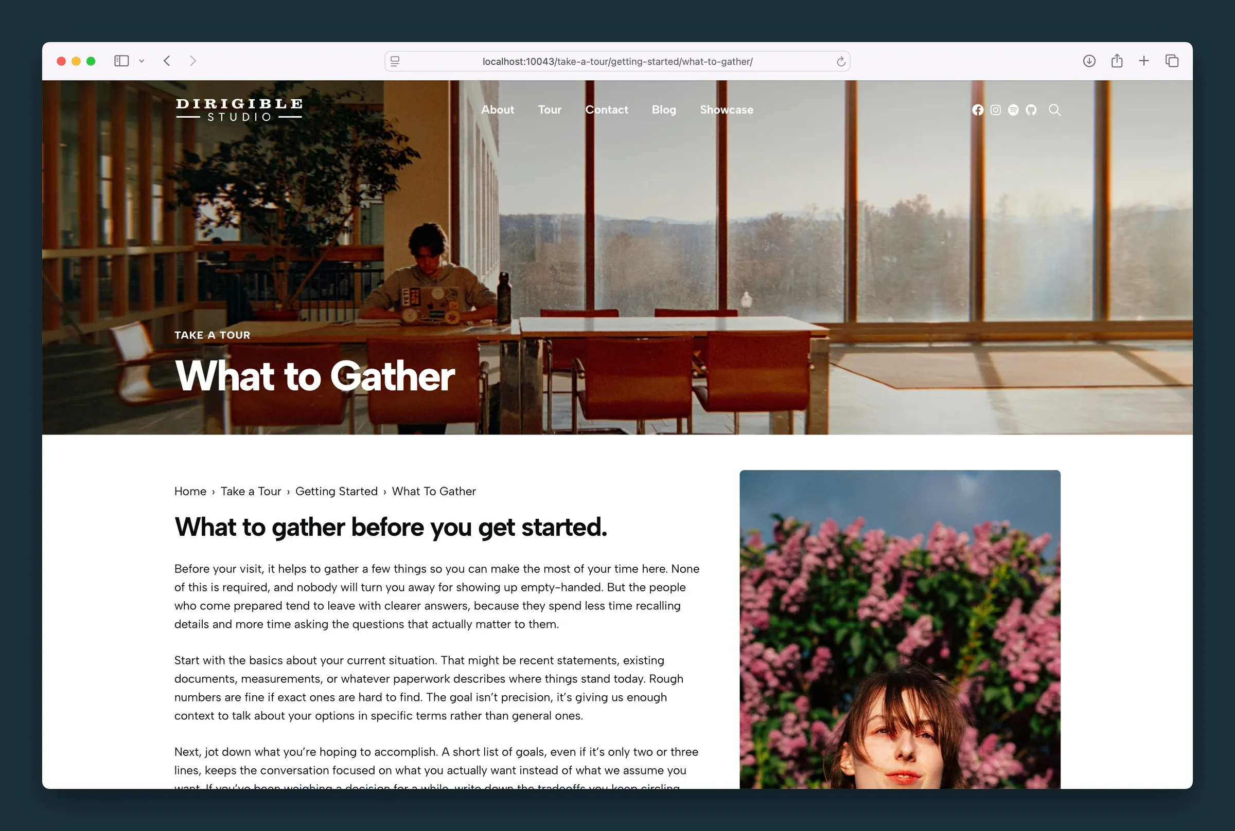 Breadcrumbs
A linked breadcrumb trail showing the pages that lead to the current page, usually placed at the top of the page.
Breadcrumbs
A linked breadcrumb trail showing the pages that lead to the current page, usually placed at the top of the page.
-
 Breakout Grid
A layout that puts one big idea in a circle at the top, then breaks it out into a row of numbered cards for steps, key points, or services.
Breakout Grid
A layout that puts one big idea in a circle at the top, then breaks it out into a row of numbered cards for steps, key points, or services.
-
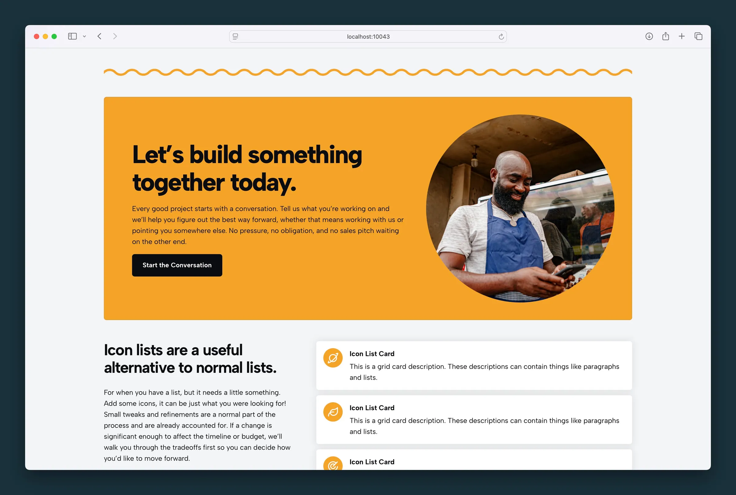 Call To Action
A call to action banner that pairs an image with a headline, short copy, and a button, for sign-ups, purchases, contact prompts, or offers.
Call To Action
A call to action banner that pairs an image with a headline, short copy, and a button, for sign-ups, purchases, contact prompts, or offers.
- Chart Bar, line, area, pie and donut charts, or one big number, drawn from a small table you type or paste from a spreadsheet.
-
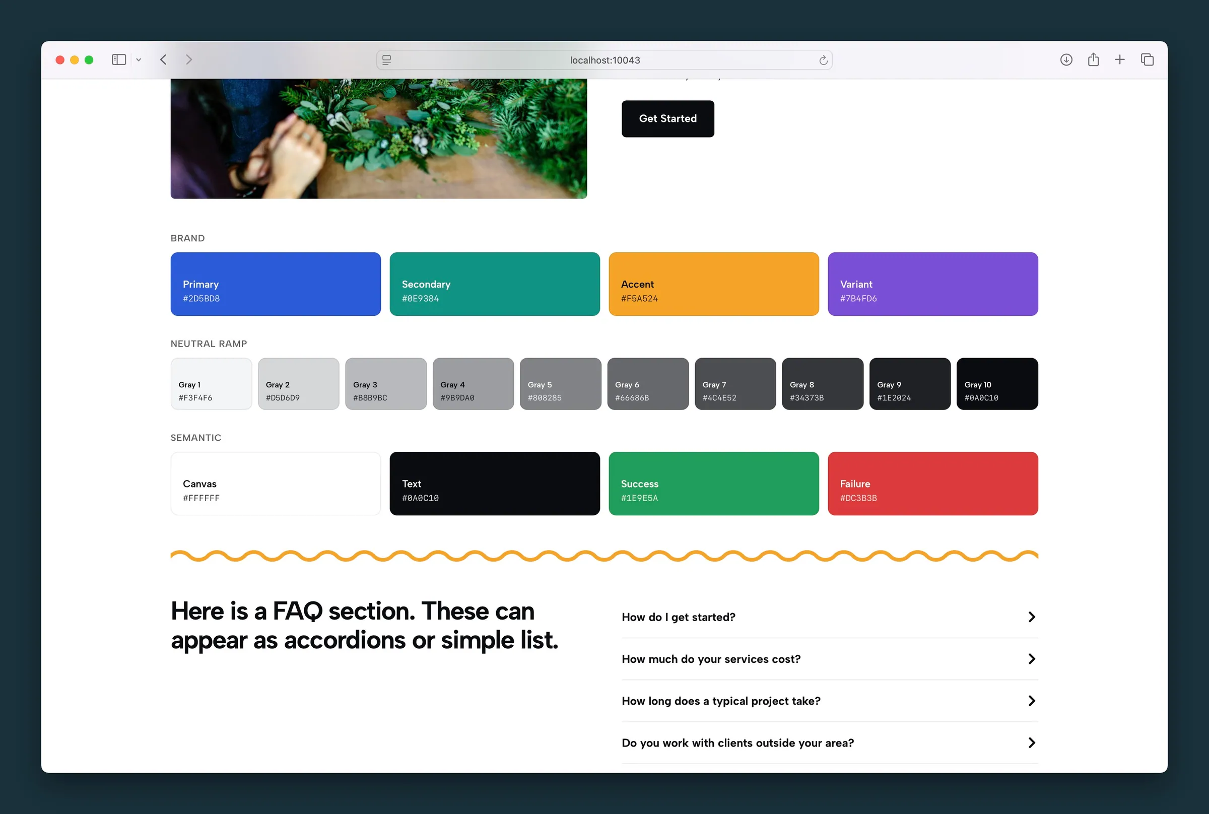 Color Palette
Show your site's brand color swatches on a style guide or onboarding page. The swatches come from the theme palette and update when it changes.
Color Palette
Show your site's brand color swatches on a style guide or onboarding page. The swatches come from the theme palette and update when it changes.
-
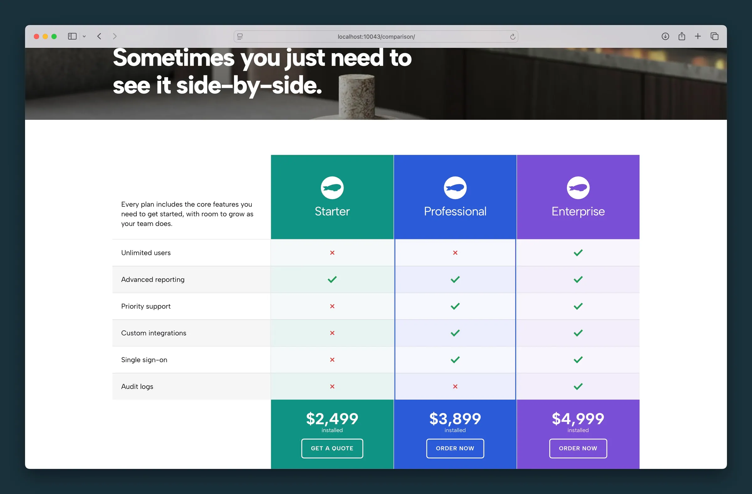 Comparison Matrix
A feature comparison chart for products or pricing plans, with check and X icons. Table on desktop, cards on mobile.
Comparison Matrix
A feature comparison chart for products or pricing plans, with check and X icons. Table on desktop, cards on mobile.
-
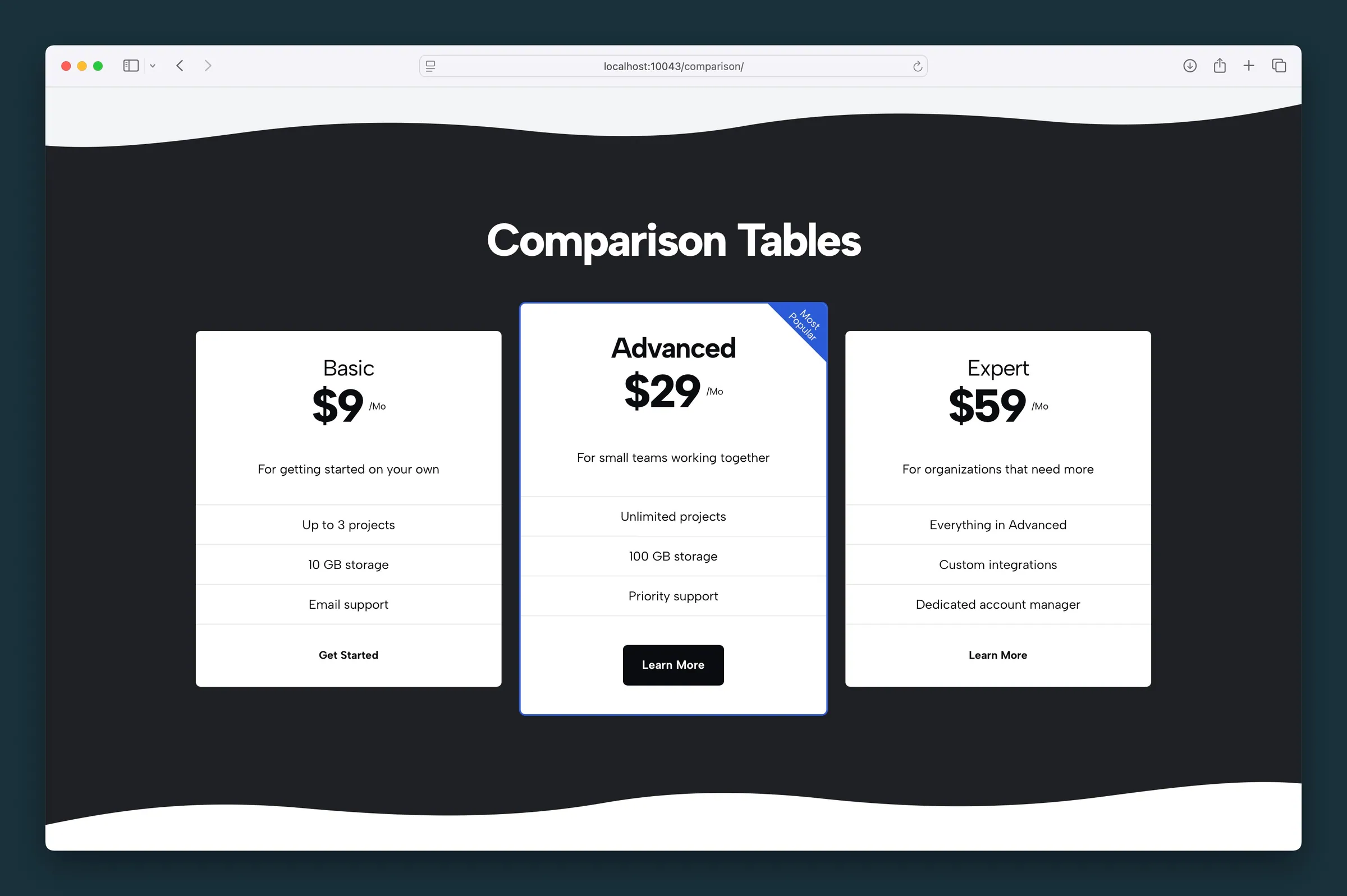 Comparison Table
A pricing table of side-by-side plan cards that stack on mobile, with an optional highlighted or flagged tier to steer visitors to your best plan.
Comparison Table
A pricing table of side-by-side plan cards that stack on mobile, with an optional highlighted or flagged tier to steer visitors to your best plan.
- Counters Animated number counters that count up to your stats when visitors scroll to them. Use them for milestones, metrics, or years in business.
- Diagram An interactive image with clickable points. Visitors pick a marker to read about that spot.
-
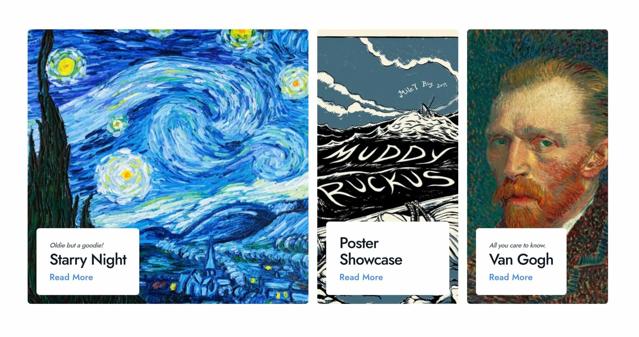 Featured Content Hero
A page-top hero that features three posts or pages as large linked photo tiles, one big and two smaller, to send visitors to your best content.
Featured Content Hero
A page-top hero that features three posts or pages as large linked photo tiles, one big and two smaller, to send visitors to your best content.
- Header Banner A banner for the top of a post or page that shows its featured image, title, and tags automatically, so it updates when the page does.
- Hero Slider A hero banner that keeps one headline and button in place while background photos slide or fade behind it, with overlay and timing controls.
-
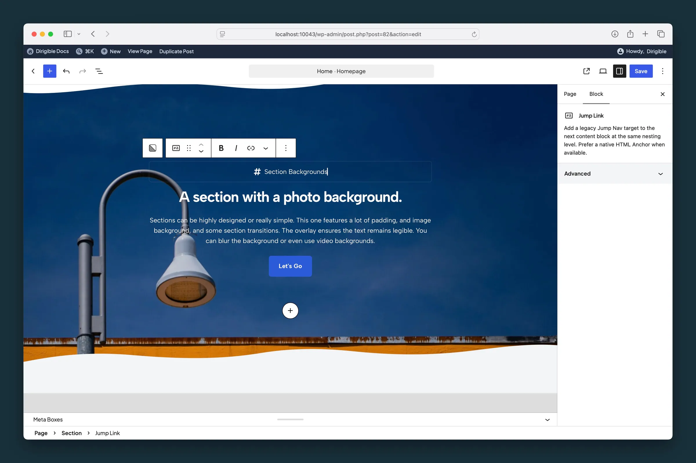 Jump Link
An older way to mark an anchor link target for Jump Nav. Use a block's HTML anchor field when it has one.
Jump Link
An older way to mark an anchor link target for Jump Nav. Use a block's HTML anchor field when it has one.
- Jump Navigation In-page navigation, like a table of contents, built automatically from the anchored sections on your page. Visitors click to jump to each section.
-
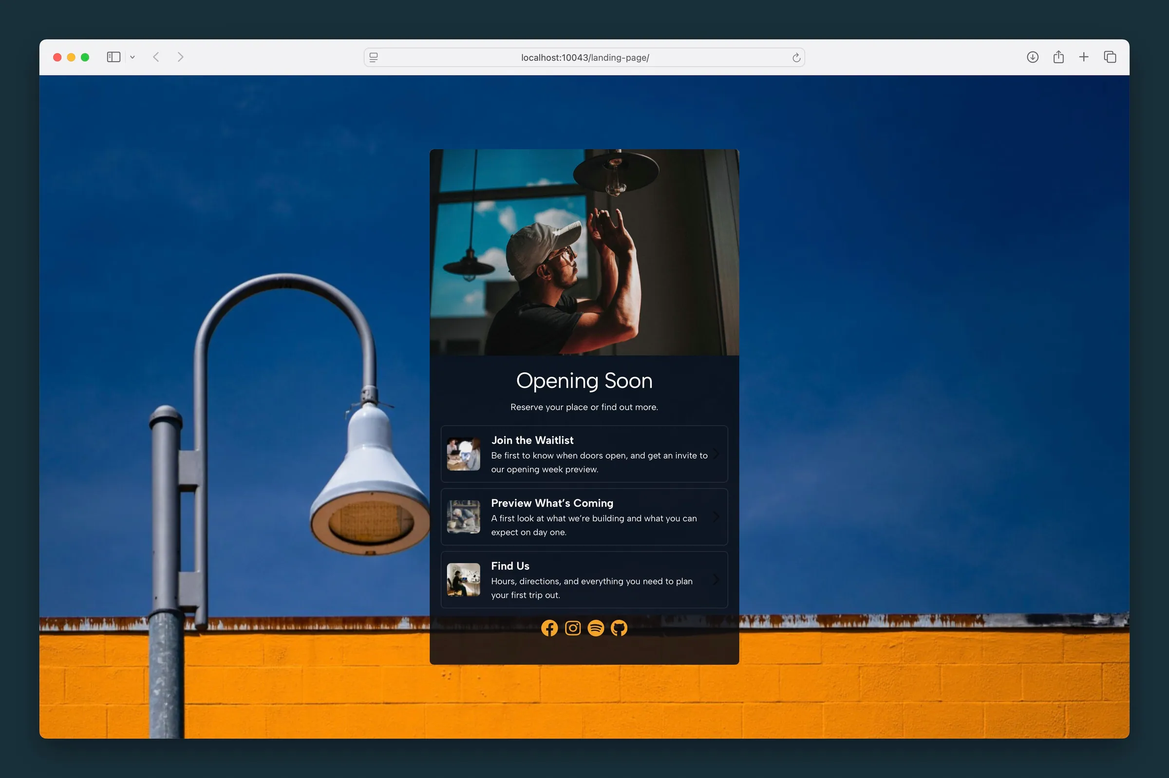 Landing Page
A link-in-bio style landing page with avatar, headline, link list, and optional social icons.
Landing Page
A link-in-bio style landing page with avatar, headline, link list, and optional social icons.
-
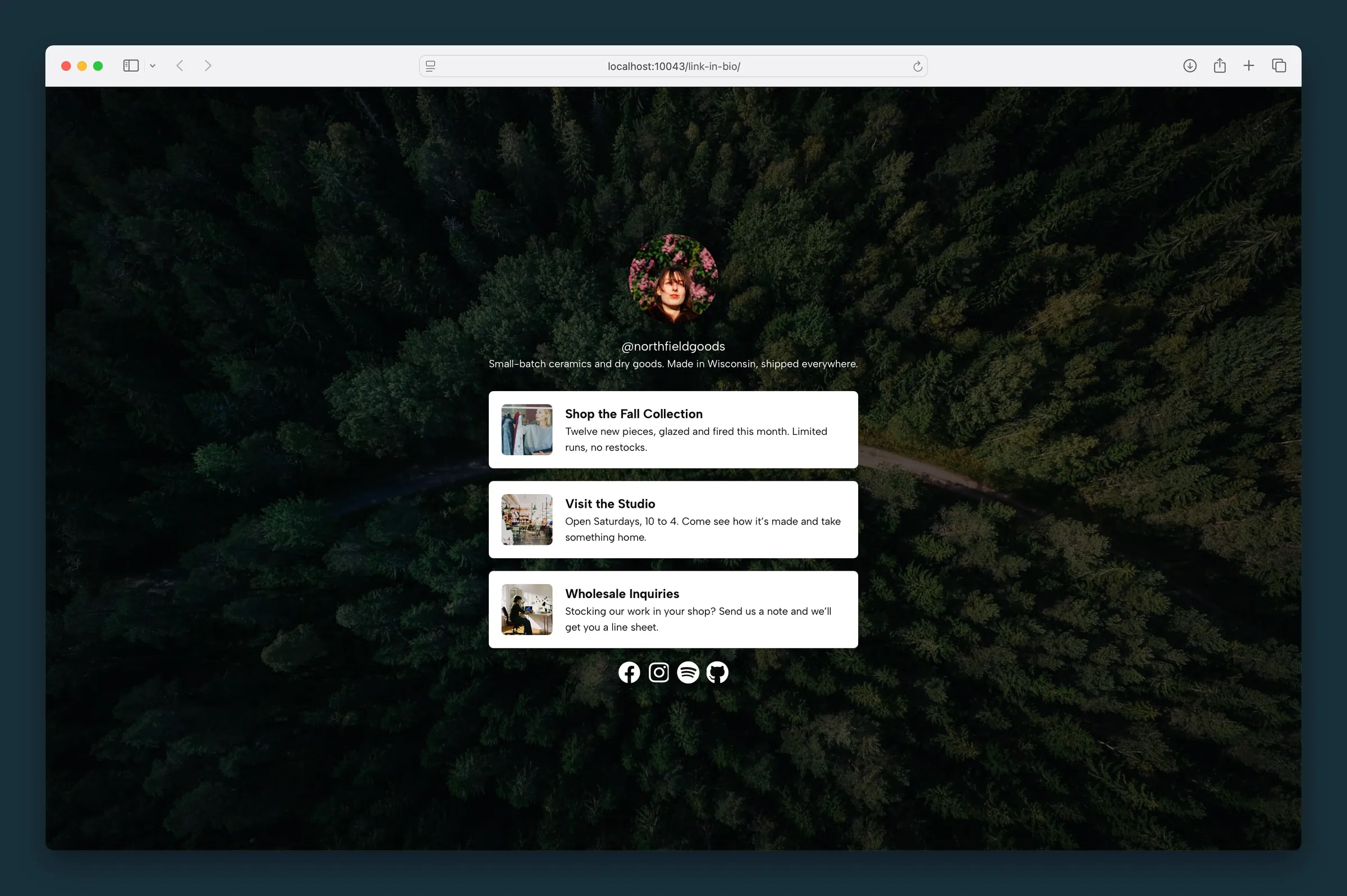 Link in Bio
A standalone link-in-bio page with avatar, handle, bio, and styled link cards — no third-party service required.
Link in Bio
A standalone link-in-bio page with avatar, handle, bio, and styled link cards — no third-party service required.
- Logo Carousel A scrolling logo carousel for partners, sponsors, or clients. Logos glide past continuously or step one at a time, with sizing and recolor options.
-
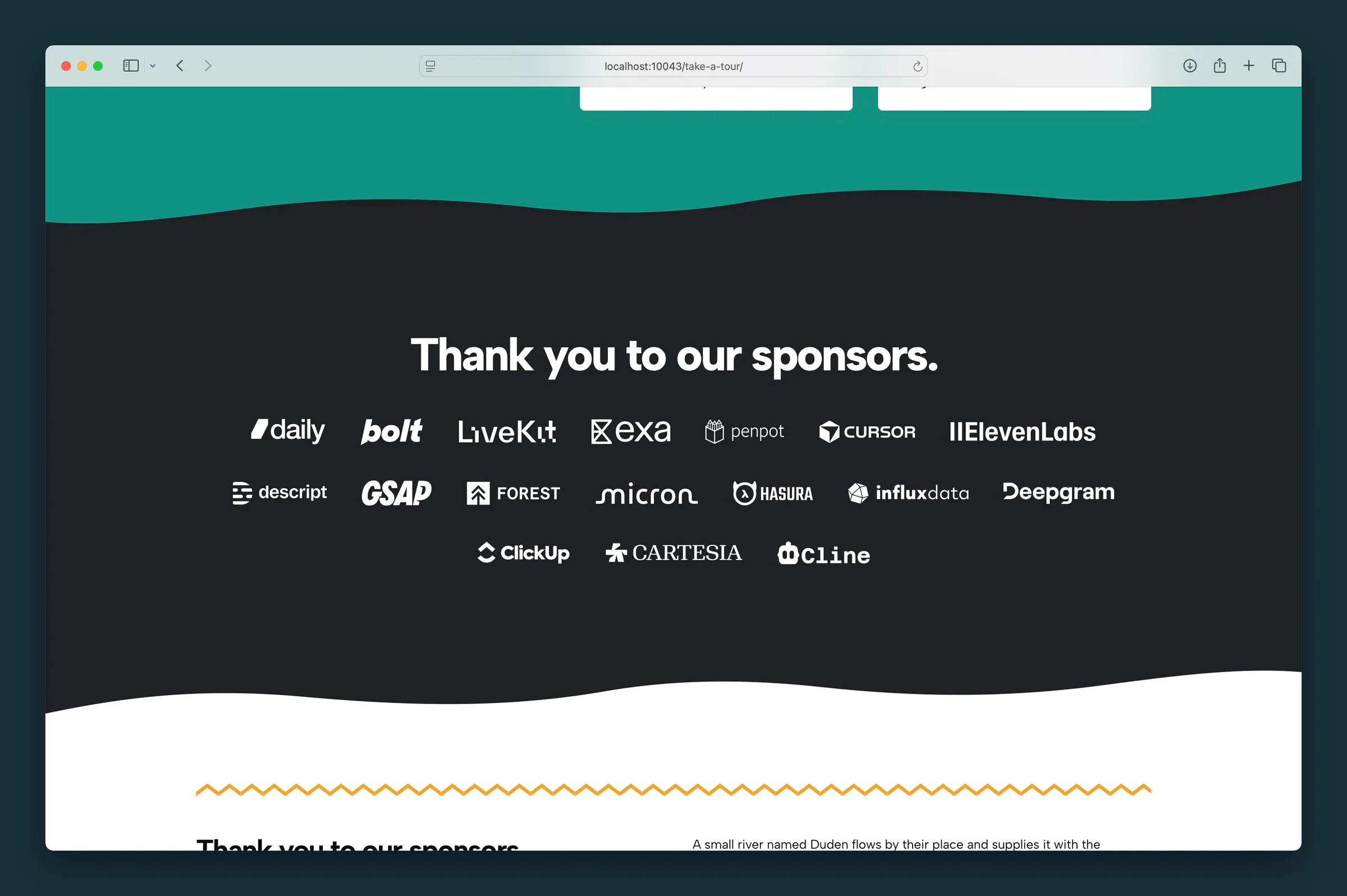 Logos
Display sponsor or partner logos in a uniform, responsive row with optional links and recoloring.
Logos
Display sponsor or partner logos in a uniform, responsive row with optional links and recoloring.
-
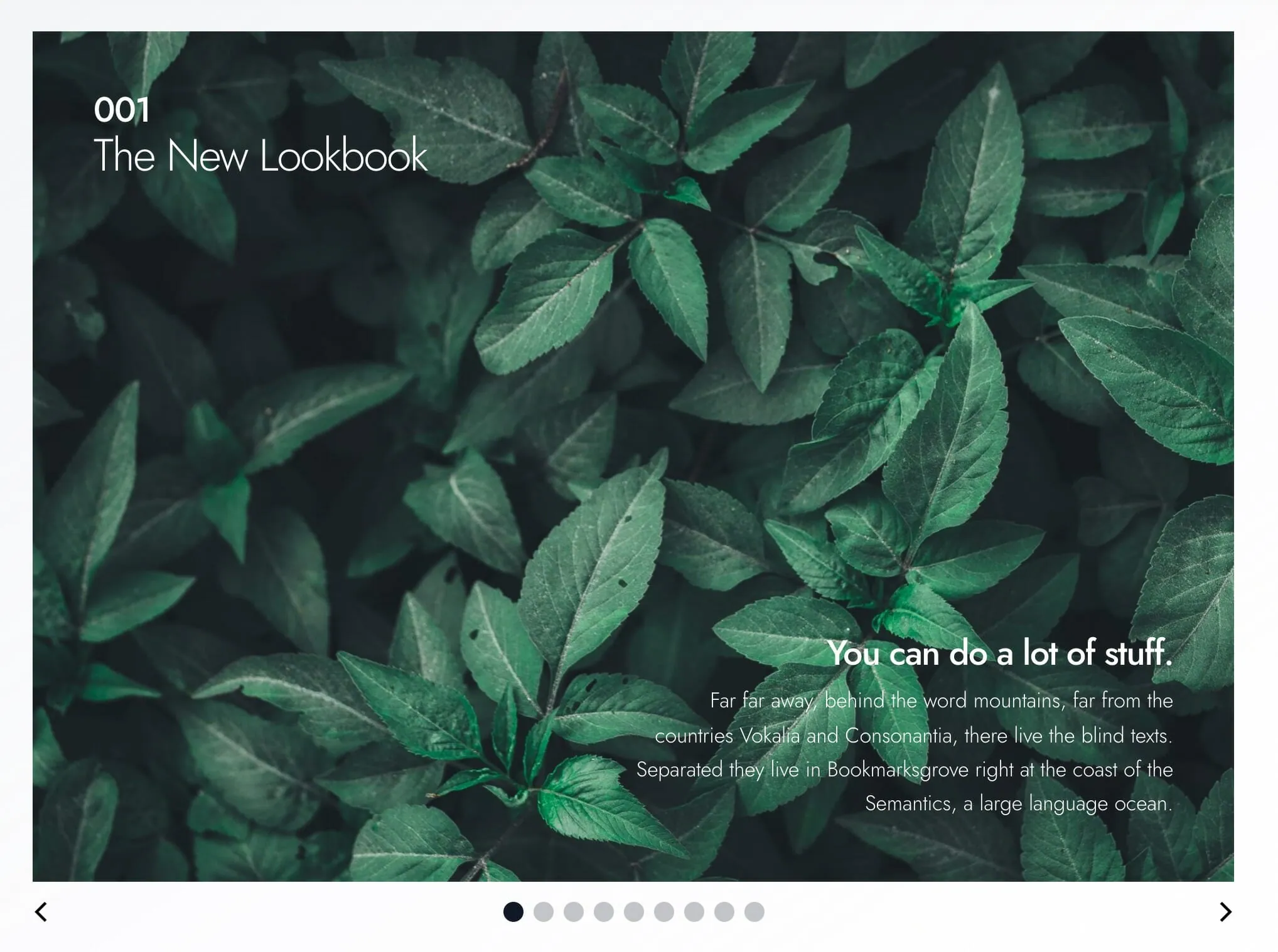 Lookbook
A magazine-style slider of cover, copy, and photo spreads for lookbooks, brand stories, and editorial collages. Slides stack on phones.
Lookbook
A magazine-style slider of cover, copy, and photo spreads for lookbooks, brand stories, and editorial collages. Slides stack on phones.
-
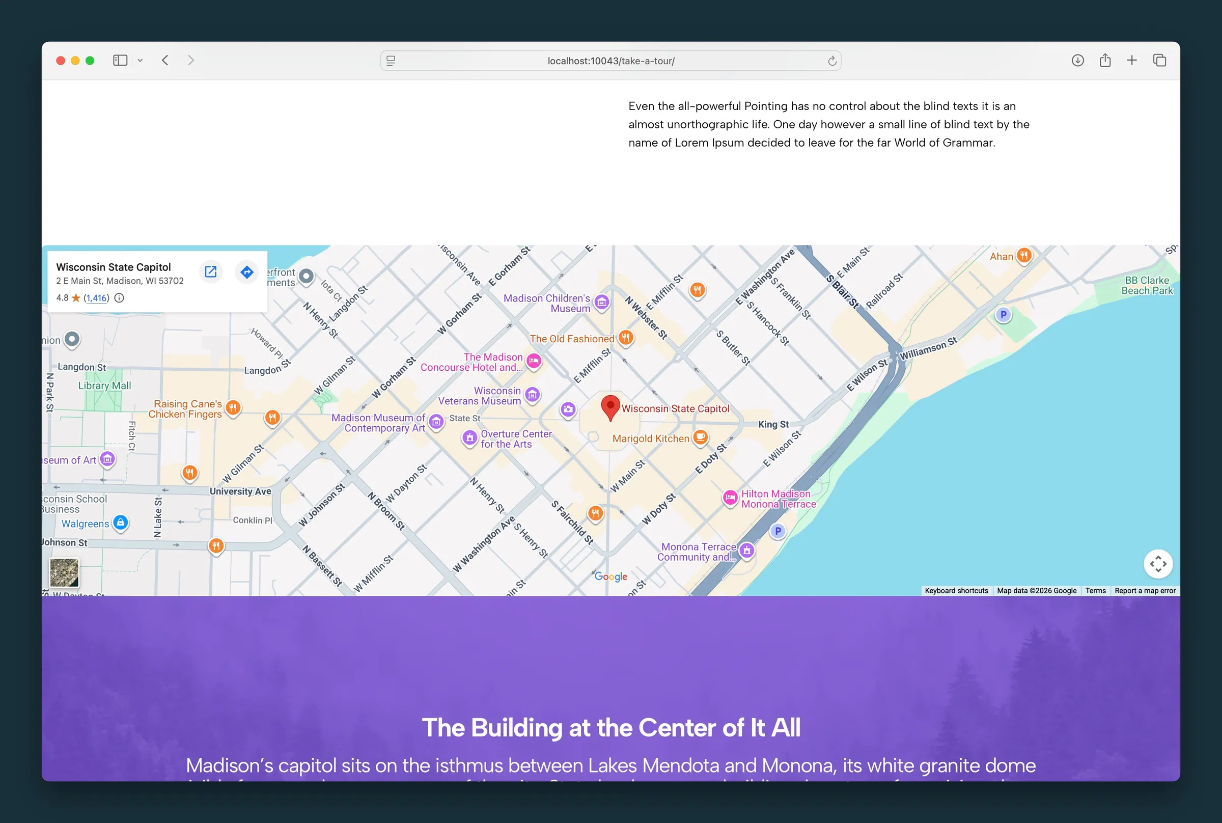 Map
Add a Google Map to any page by pasting the embed code from Google Maps. Use it on contact pages, event venues, or a single location.
Map
Add a Google Map to any page by pasting the embed code from Google Maps. Use it on contact pages, event venues, or a single location.
-
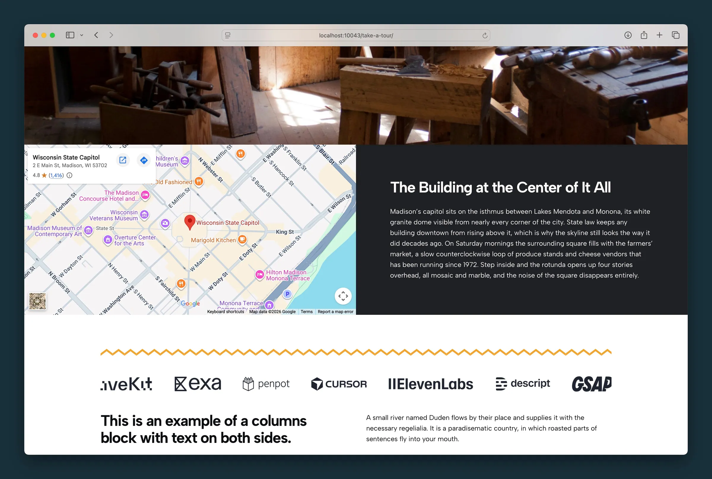 Map & Text
An embedded Google Map beside a content column for your address, hours, directions, and buttons, in one two-column band for contact pages.
Map & Text
An embedded Google Map beside a content column for your address, hours, directions, and buttons, in one two-column band for contact pages.
- Marquee A scrolling text banner, like a news ticker, for announcements, sales, event dates, or key messages. Set the speed, look, and heading level.
- Masked Image Crop a photo into a shape: an organic blob, a preset like a heart or star, or your own SVG. Good for hero accents, team photos, and product shots.
-
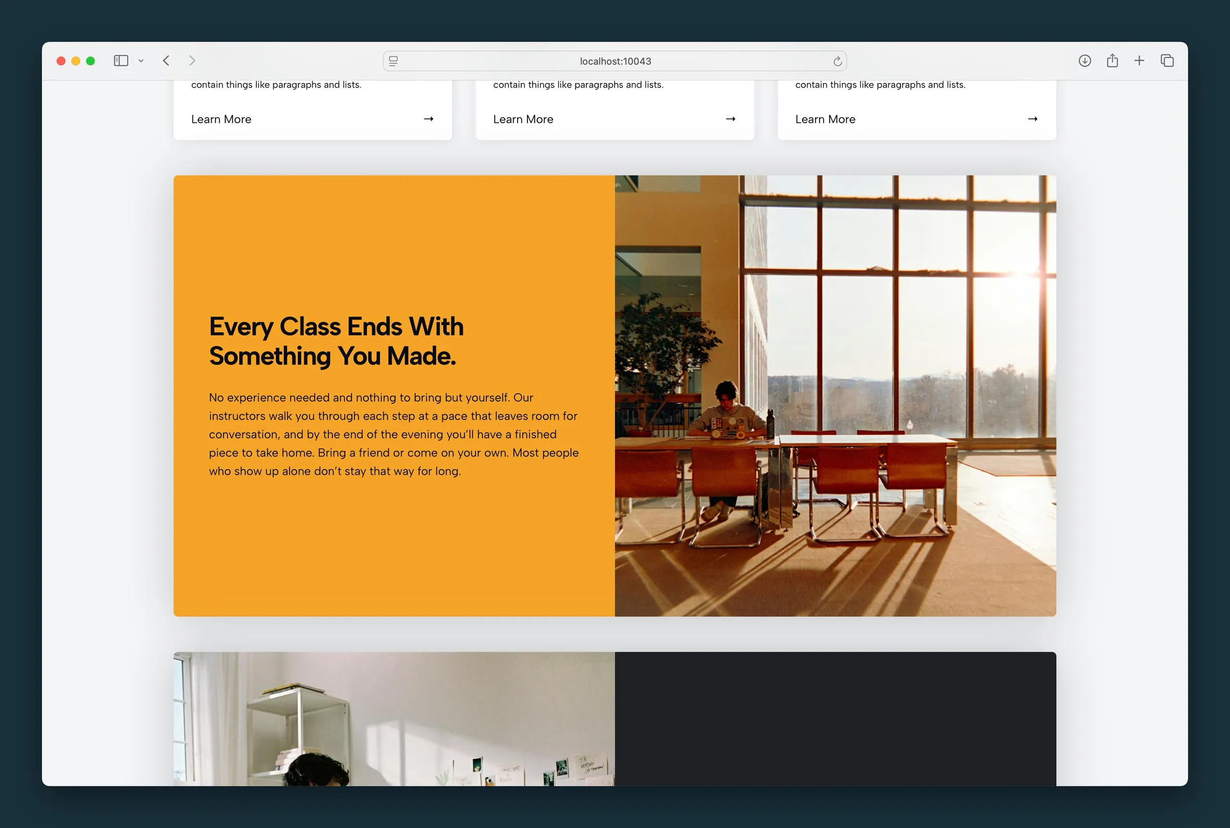 Media Callout
An image or video beside a column of text, for feature highlights and spotlights, with column sizing, rounded corners, and a drop shadow.
Media Callout
An image or video beside a column of text, for feature highlights and spotlights, with column sizing, rounded corners, and a drop shadow.
-
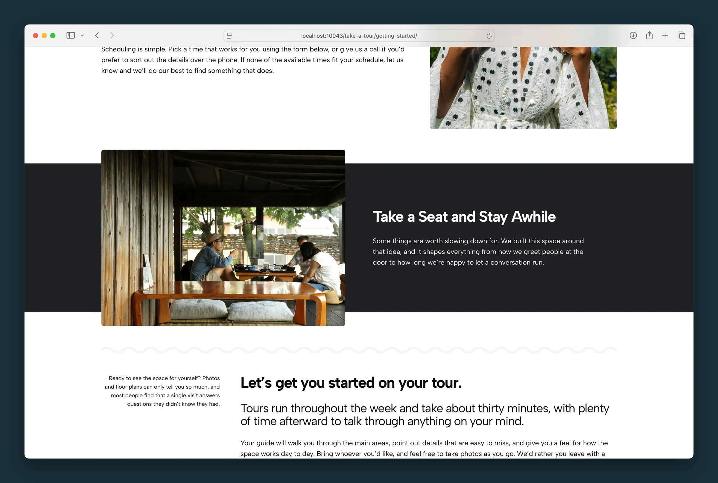 Media Strip
A full-width color band with a photo that breaks out above and below it, beside a content column.
Media Strip
A full-width color band with a photo that breaks out above and below it, beside a content column.
- Overlay Grid An image grid where each card reveals text, a color overlay, or a second photo on hover. Existing grids keep working; use Rollover Cards for new ones.
- Photo Block Slider A rotating photo gallery beside one fixed panel of text, for telling a story across several images.
-
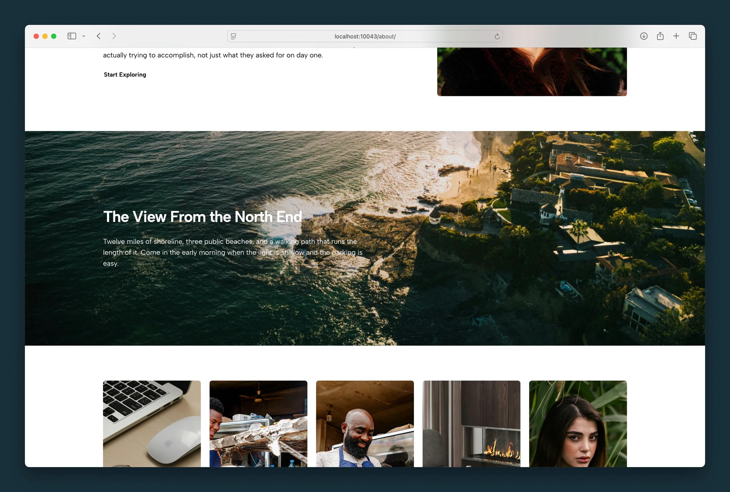 Photo Feature
Full-bleed photo background with headline, body copy, and optional button overlaid on the image.
Photo Feature
Full-bleed photo background with headline, body copy, and optional button overlaid on the image.
-
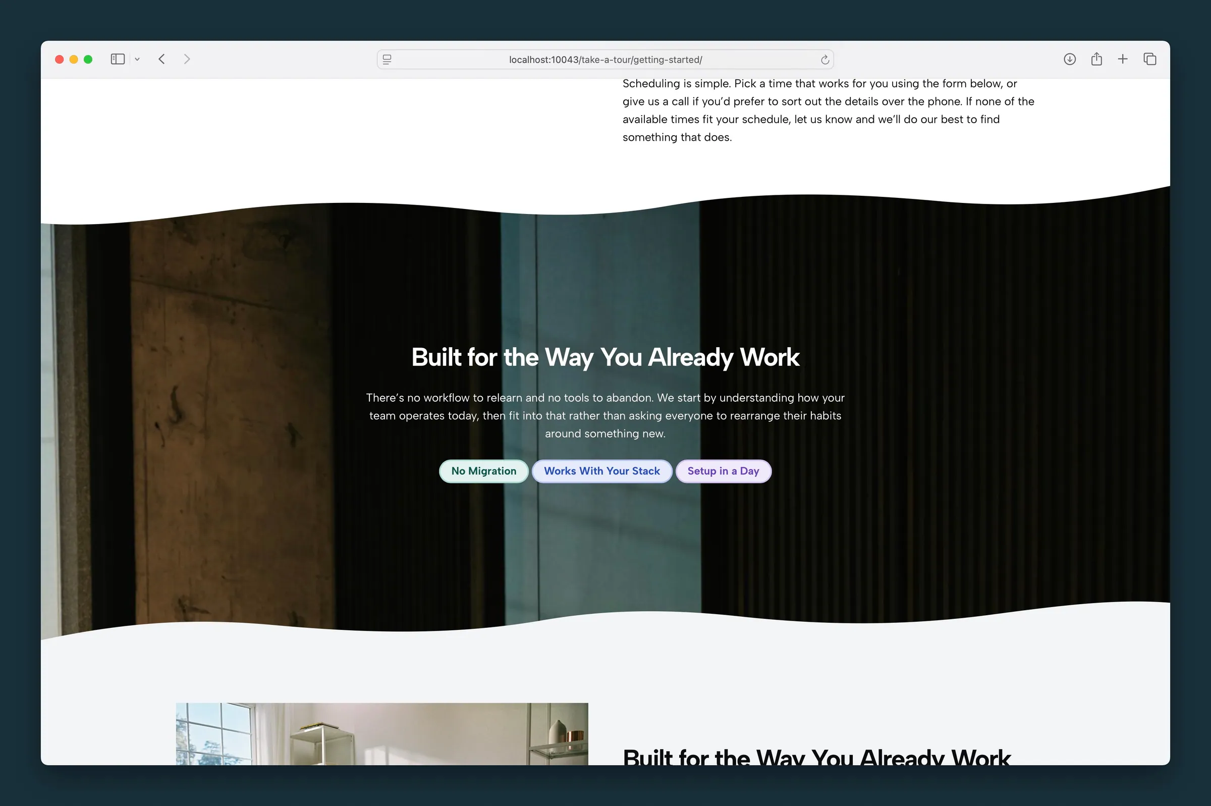 Pills
Show short labels as styled pills: categories, features, skills, or status tags like Live or New, with optional links, colors, and a status dot.
Pills
Show short labels as styled pills: categories, features, skills, or status tags like Live or New, with optional links, colors, and a status dot.
-
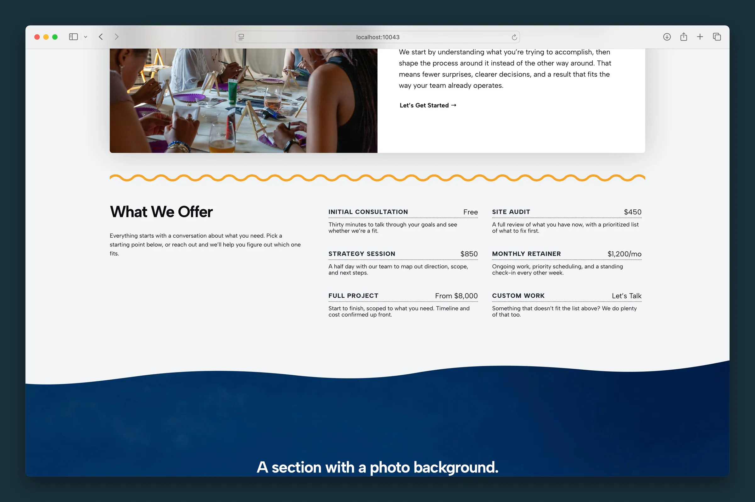 Price List
Build a menu or price list with item names, prices, and short descriptions, as a list or cards.
Price List
Build a menu or price list with item names, prices, and short descriptions, as a list or cards.
-
 Quote
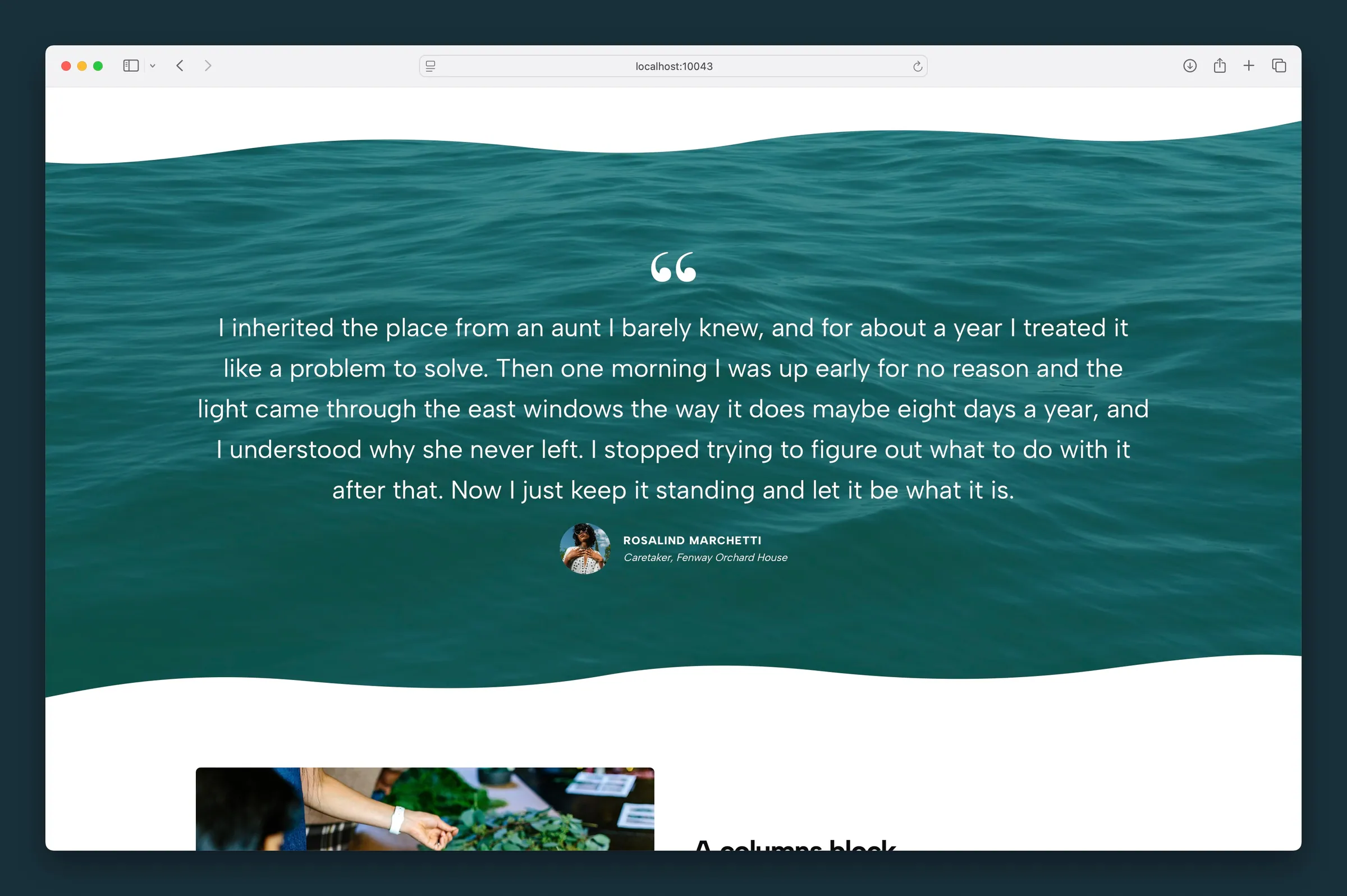
A featured testimonial or pull quote with an optional quote mark, headshot, name, and job title. Add a colored accent bar with the Border style.
Quote
A featured testimonial or pull quote with an optional quote mark, headshot, name, and job title. Add a colored accent bar with the Border style.
-
 Quote Blocks
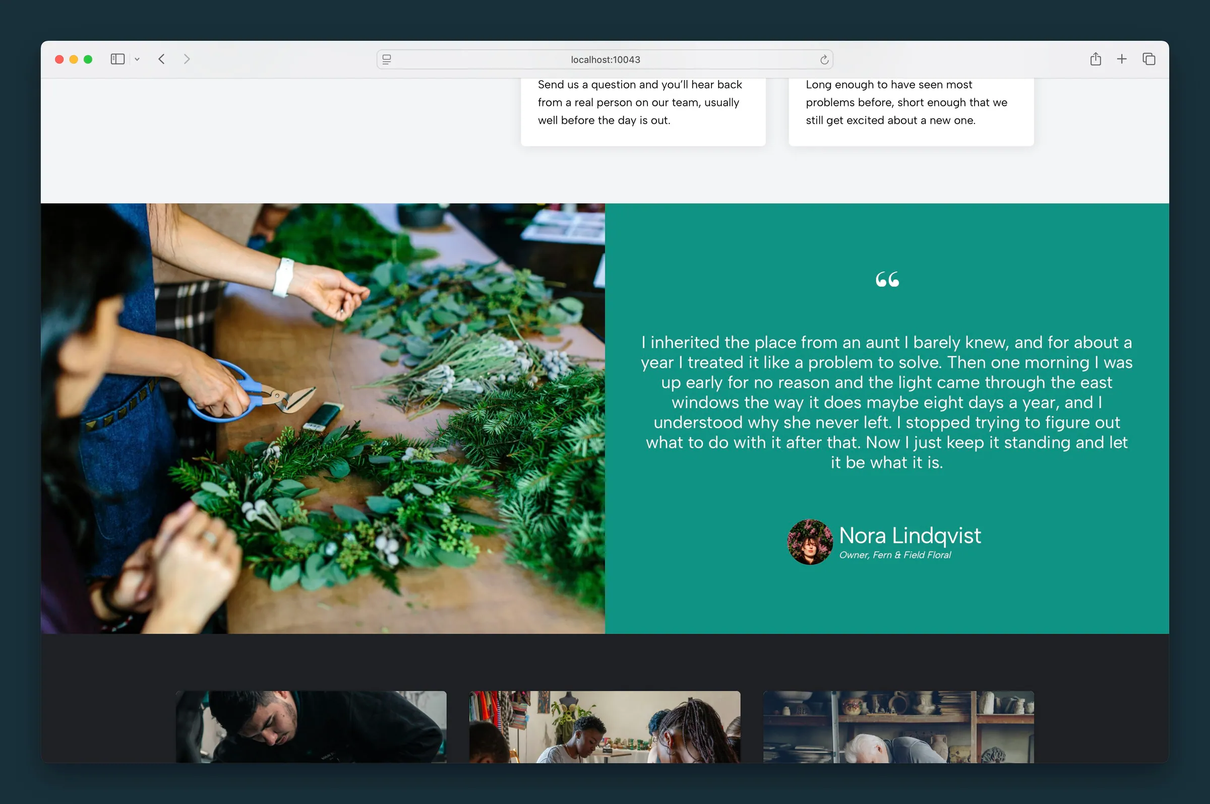
A customer testimonial beside a large featured photo, half and half, with quote marks, headshot, name, and job title. Good for case studies.
Quote Blocks
A customer testimonial beside a large featured photo, half and half, with quote marks, headshot, name, and job title. Good for case studies.
- Quote Group Stack several testimonials or client reviews in one block and style them once, so every quote on a testimonials page matches.
-
 Quote Slider
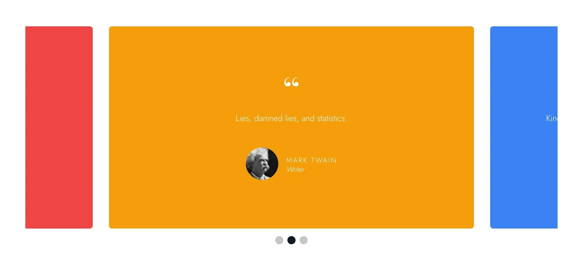
A testimonial slider that rotates through quote cards with names, titles, and headshots. Visitors swipe, click the dots, or use arrow keys.
Quote Slider
A testimonial slider that rotates through quote cards with names, titles, and headshots. Visitors swipe, click the dots, or use arrow keys.
- Rollover Cards A grid of image cards whose headline, text, and button appear on hover. Use it for services, team members, portfolio tiles, or promo links.
- Site Preview Embed a live website preview with desktop, tablet, and mobile views and an optional Visit link.
- Slider Image slider and carousel for hero banners or any content, with optional autoplay and swipe navigation.
-
 Slideshow
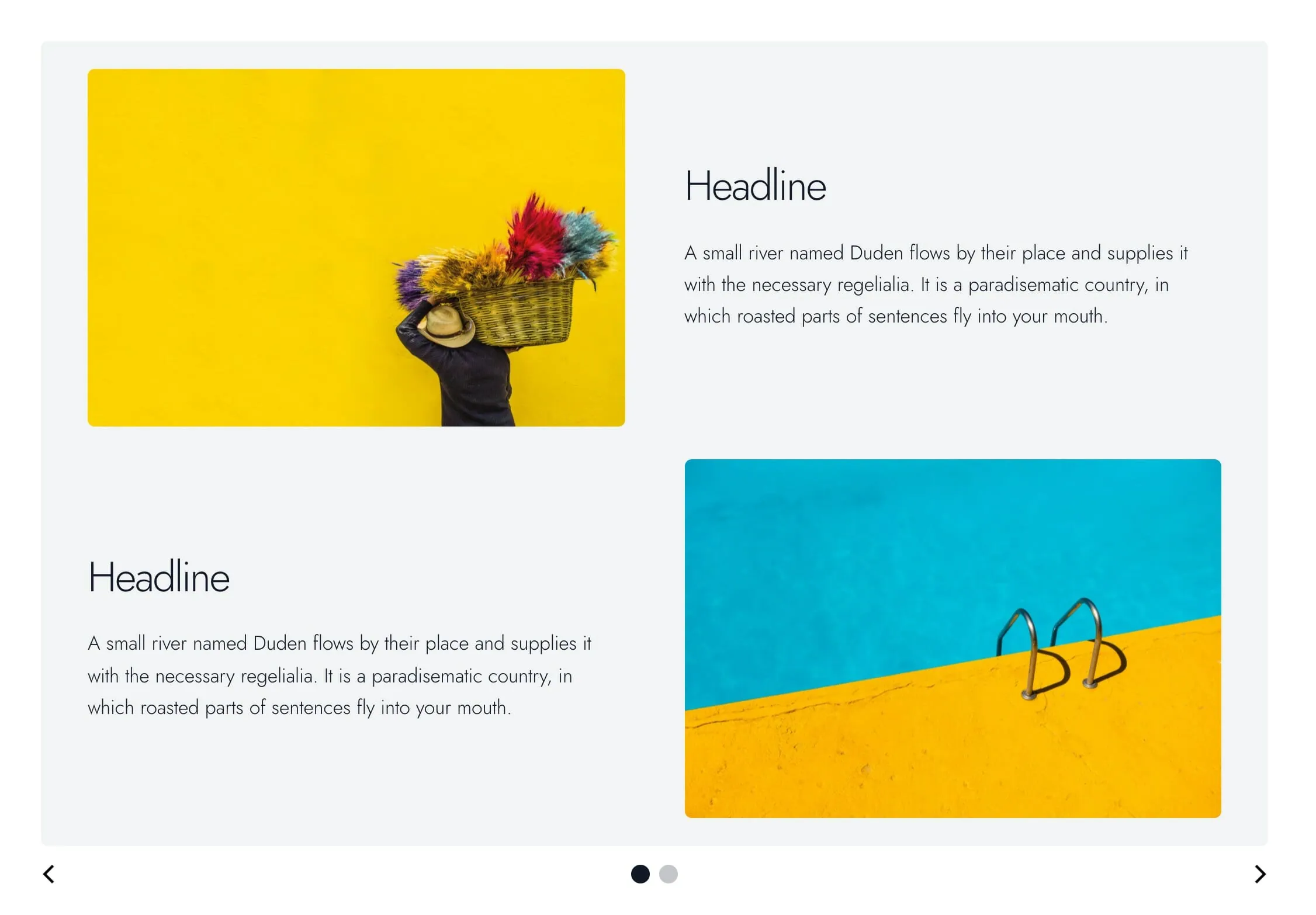
A content slider where each slide holds any blocks you like: headings, images, columns, or lists. Visitors use arrows, dots, swipes, or keys.
Slideshow
A content slider where each slide holds any blocks you like: headings, images, columns, or lists. Visitors use arrows, dots, swipes, or keys.
-
 Socials
A row of linked social media icons pulled from your site settings. Update your accounts once and every row updates.
Socials
A row of linked social media icons pulled from your site settings. Update your accounts once and every row updates.
-
 Spacer
An invisible vertical gap between blocks, with separate mobile and desktop height presets so spacing tightens on phones and opens up on desktop.
Spacer
An invisible vertical gap between blocks, with separate mobile and desktop height presets so spacing tightens on phones and opens up on desktop.
- Stacked Cards A deck of cards visitors tap or click to advance, each holding its own text, images, and buttons. Good for step-by-step reveals and short stories.
-
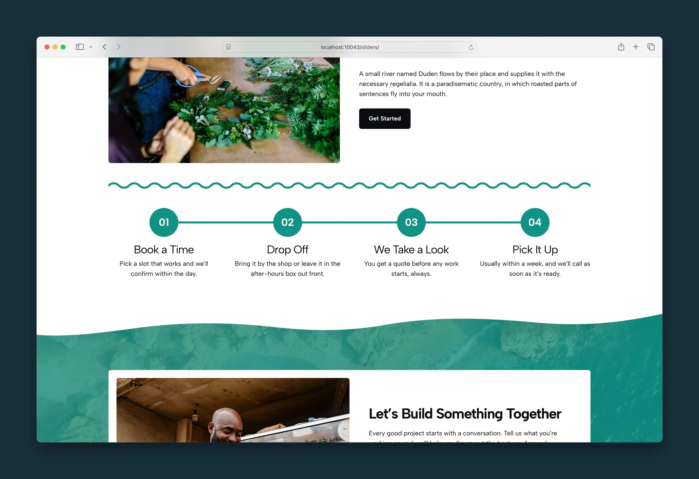 Step by Step
A how-it-works grid of numbered steps, each with a counter circle, title, and short description.
Step by Step
A how-it-works grid of numbered steps, each with a counter circle, title, and short description.
-
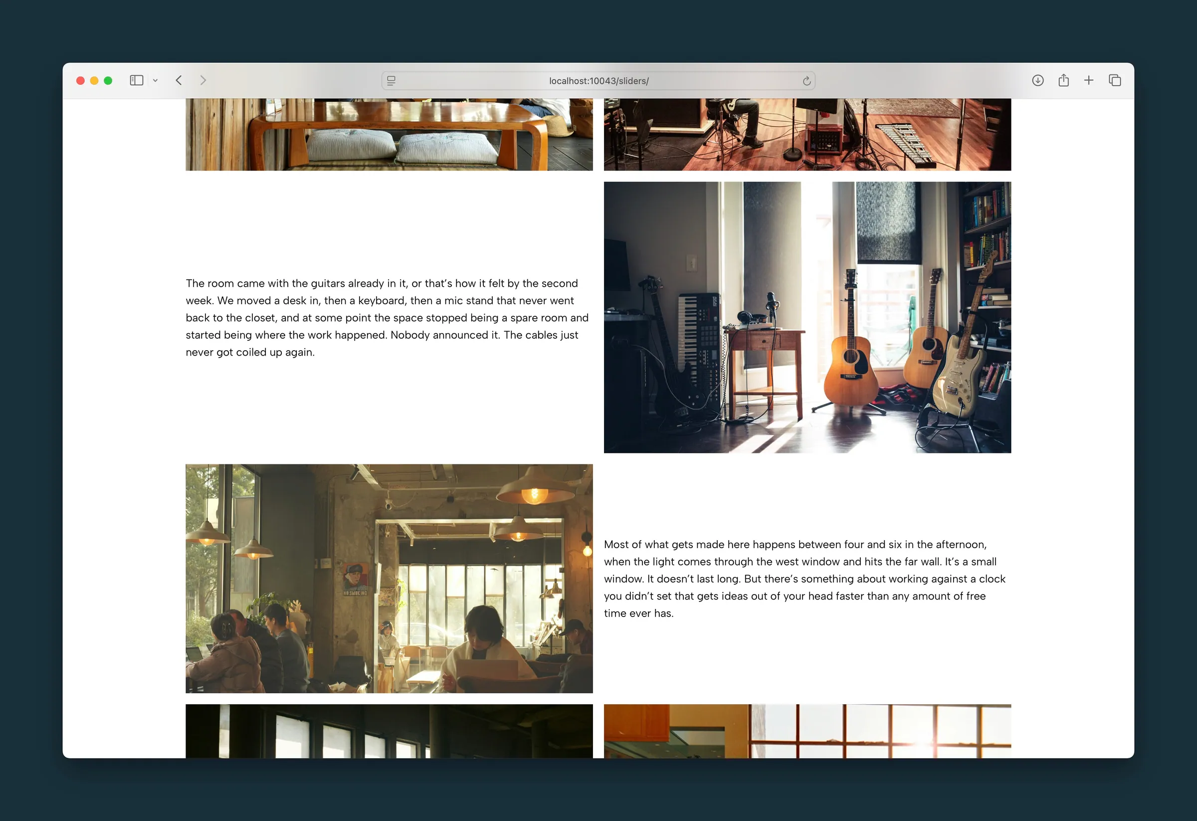 Storyboard
Drop images and text passages into one grid and arrange them to tell a project story with a magazine-style rhythm.
Storyboard
Drop images and text passages into one grid and arrange them to tell a project story with a magazine-style rhythm.
- Storyboard Slider A slider of large photo slides, each with its own headline, text, and link over the image, to walk visitors through a story or case study.
-
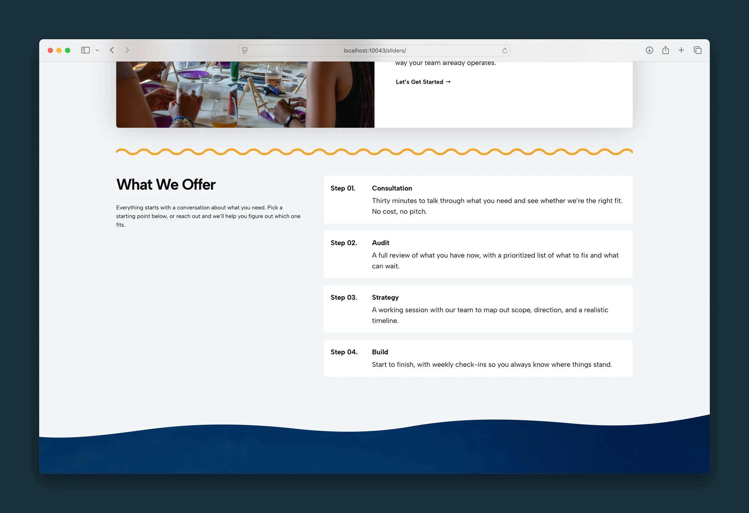 Structured List
A feature list or grid where each item can be plain text, numbered, led by an icon, or led by a short label.
Structured List
A feature list or grid where each item can be plain text, numbered, led by an icon, or led by a short label.
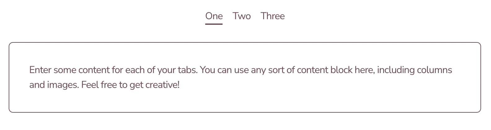
- Tabs Tabbed content panels with Tags, Inset, Pill, Underline, or classic tab styles. Each tab holds any blocks you like.
-
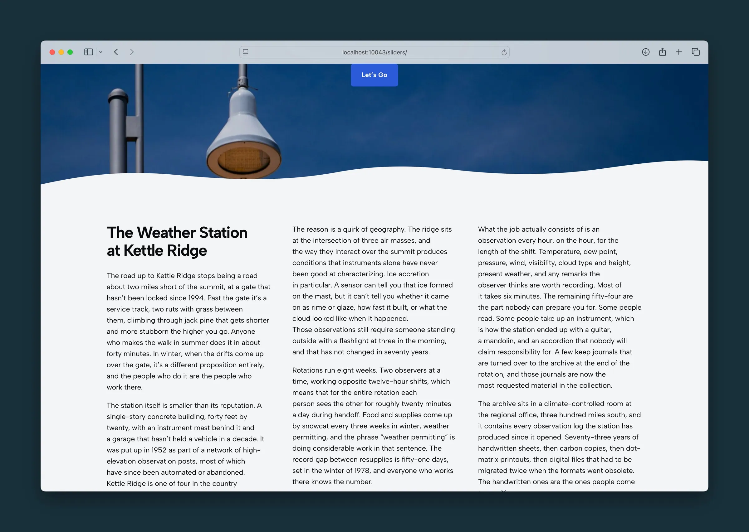 Text Columns
A magazine-style multi-column text layout for headings, paragraphs, lists, and images that stacks to one column on phones.
Text Columns
A magazine-style multi-column text layout for headings, paragraphs, lists, and images that stacks to one column on phones.
-
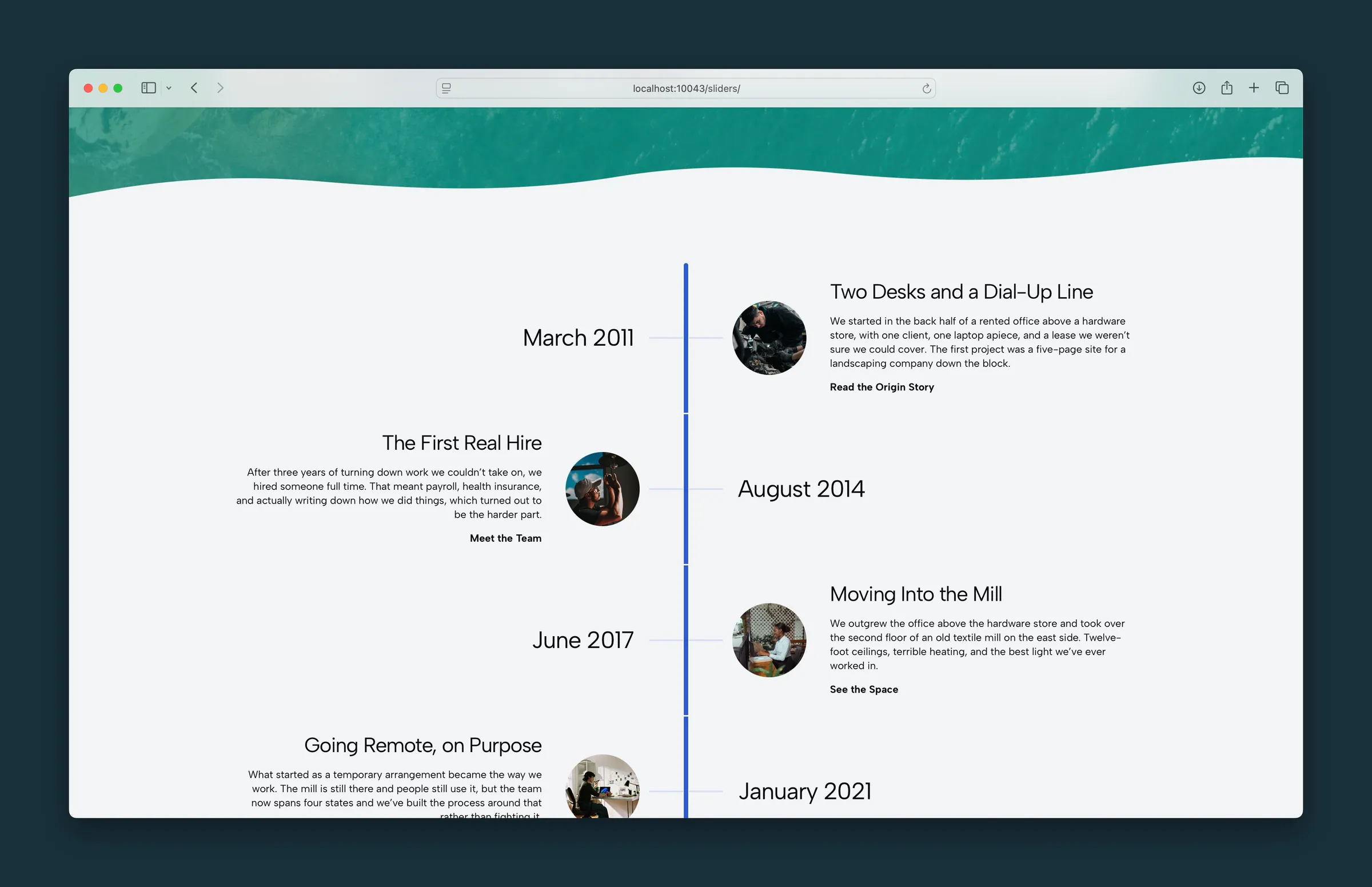 Timeline
A vertical timeline of dated entries, each with a label, title, text, optional photo, and link. Zigzag or one-sided layout.
Timeline
A vertical timeline of dated entries, each with a label, title, text, optional photo, and link. Zigzag or one-sided layout.
-
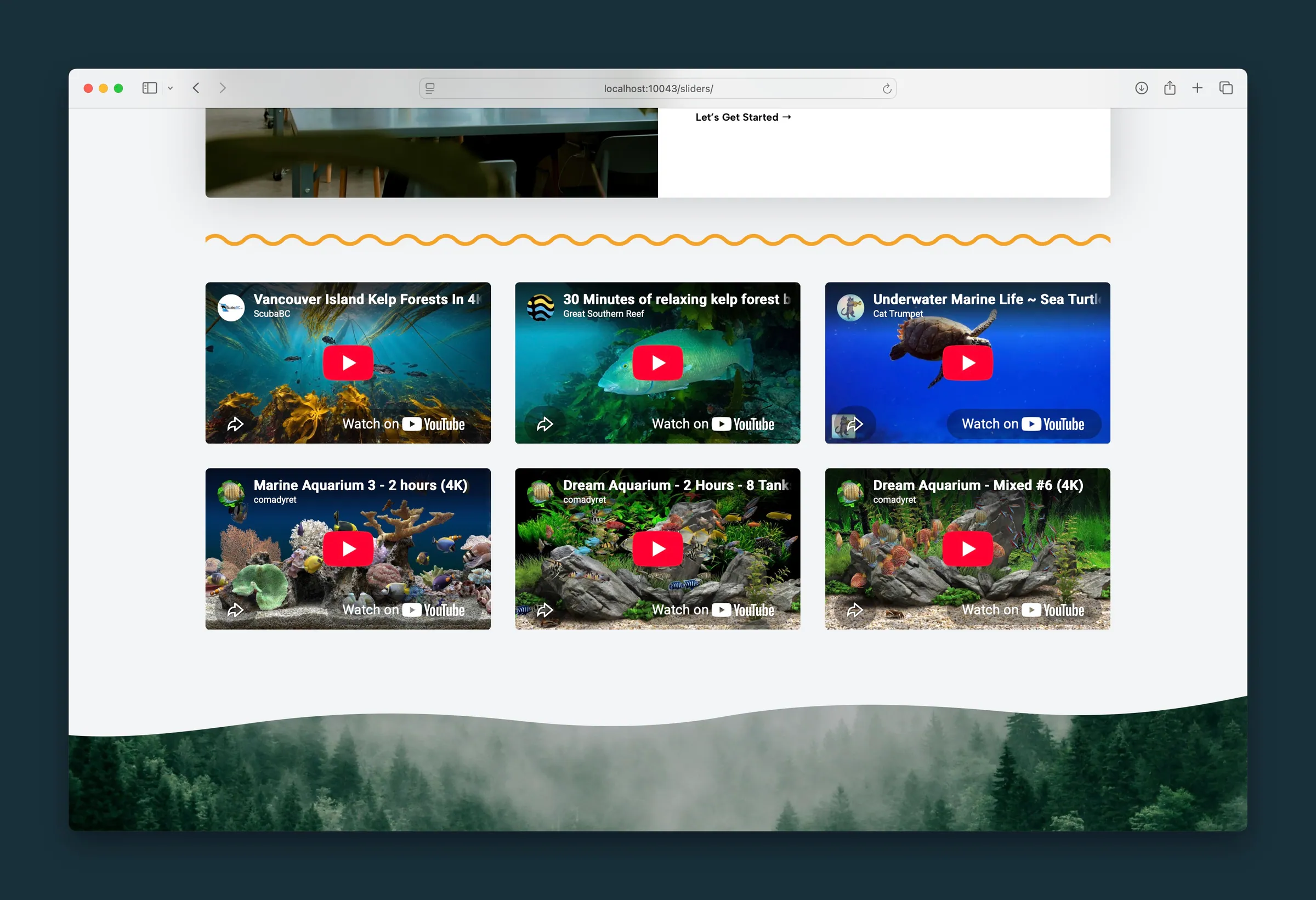 Video Gallery
A video gallery grid of 2, 3, or 4 columns for YouTube, Vimeo, uploaded videos, or anything else WordPress can embed.
Video Gallery
A video gallery grid of 2, 3, or 4 columns for YouTube, Vimeo, uploaded videos, or anything else WordPress can embed.
-
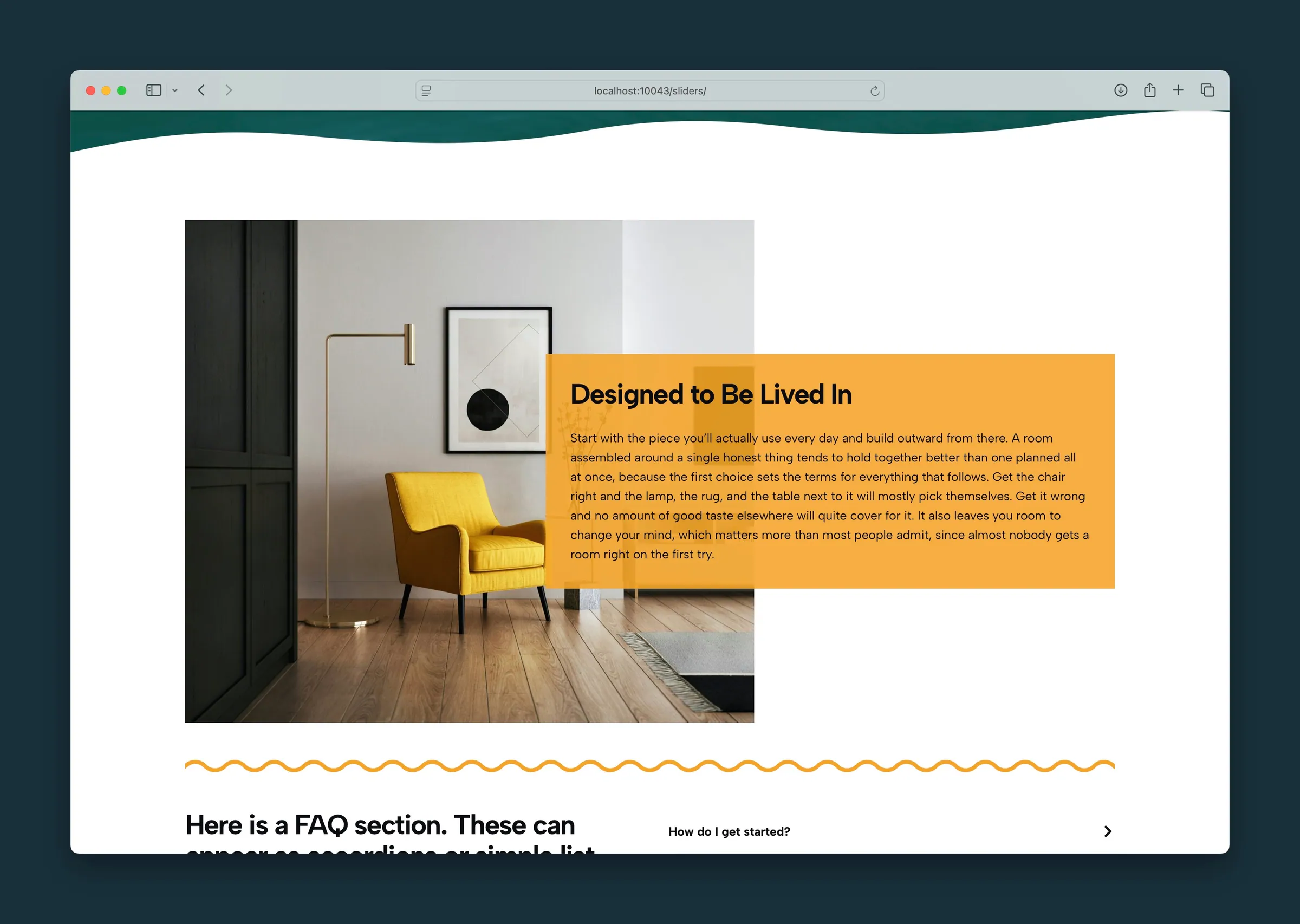 Vignette
An editorial image-and-text block with five layout styles, accent color backgrounds, and a Magnitude slider to tune the effect.
Vignette
An editorial image-and-text block with five layout styles, accent color backgrounds, and a Magnitude slider to tune the effect.
-
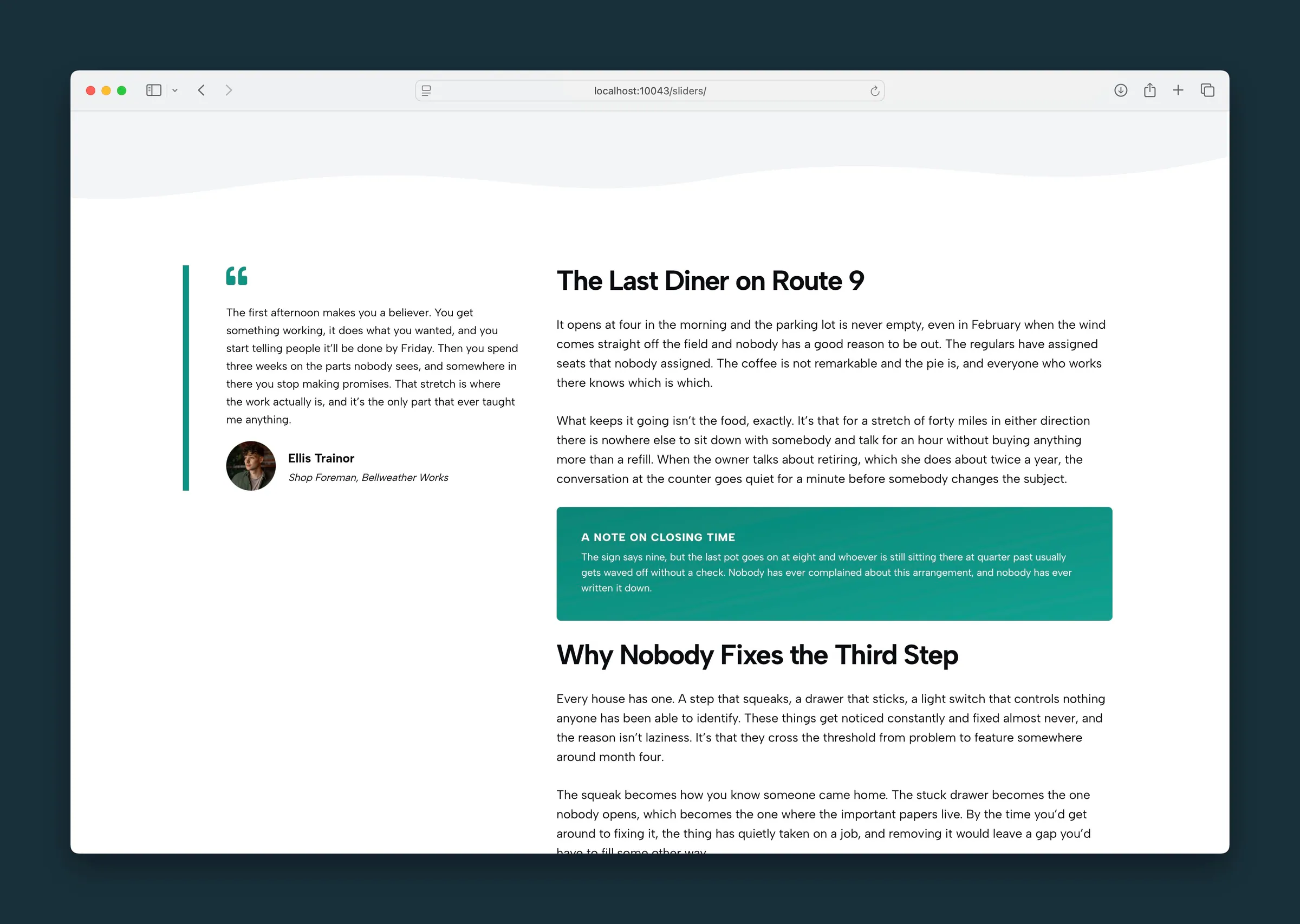 Well
A rounded, padded panel with a background color and optional gradient. A lighter-weight container than a full Section.
Well
A rounded, padded panel with a background color and optional gradient. A lighter-weight container than a full Section.
-
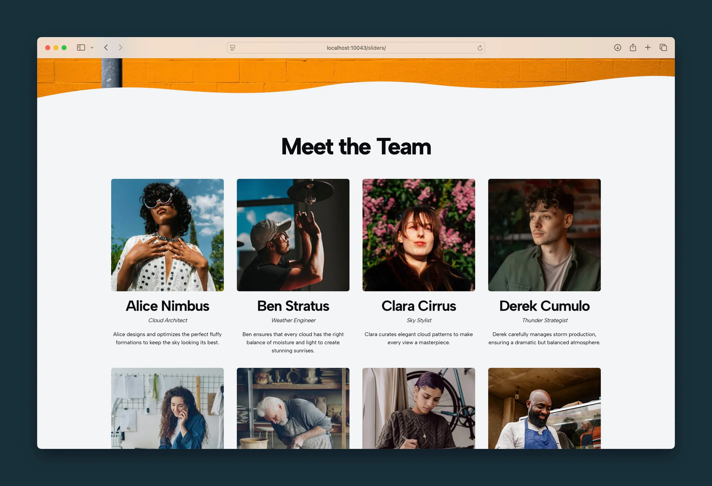 Yearbook
A meet-the-team grid where you enter each person by hand, with photo, name, job title, bio, and link. Simpler than the People plugin.
Yearbook
A meet-the-team grid where you enter each person by hand, with photo, name, job title, bio, and link. Simpler than the People plugin.
No items match your filter. Try another keyword.