

Logo Carousel
Showcase logos in an auto-scrolling carousel band.
Usage
Logo Carousel loops your client, partner, or sponsor logos through a horizontal strip. Click Add logos in the sidebar to pick images, then adjust size, gap, and opacity. Turn on Re-Color Logos to tint them all one color.
Under Carousel Settings, Motion sets how the row moves: Continuous glides the logos past at the Scroll speed you choose, and Step jumps one logo at a time on a timer. New carousels start on Continuous. In Step, visitors can also swipe or scroll the row sideways; dragging with a mouse doesn't move it.
In the editor, Step shows the row as it moves on the site (centred, looping, at your Autoplay interval), so you can tune the timing while you watch; swipe sideways on a trackpad to move it yourself. To add, remove, or reorder logos, click Edit gallery in the toolbar.
When to use it
Place it below a hero or testimonial section for client, partner, or sponsor logos. Works well on homepages and landing pages where social proof should stay compact.
Tips
- Upload all logos at a similar aspect ratio for the cleanest row.
- Lower Opacity for a subtle “as seen in” strip; raise it when logos should feel primary.
- Logo size and Gap control density without editing each image.
- For a slow, ambient strip, use Continuous with a Scroll speed around 20–40. With only a few logos, Continuous repeats them to fill the row.
- A Logo Carousel made with Dirigible Blocks Extended becomes this block when you open its page in the editor, or run Update blocks under Tools & Maintenance (Dirigible theme 5.31.70 or later). Logos keep their height, spacing and timing. Save the page to keep the change; until then the site shows the old carousel.
Screenshots
Editor
-
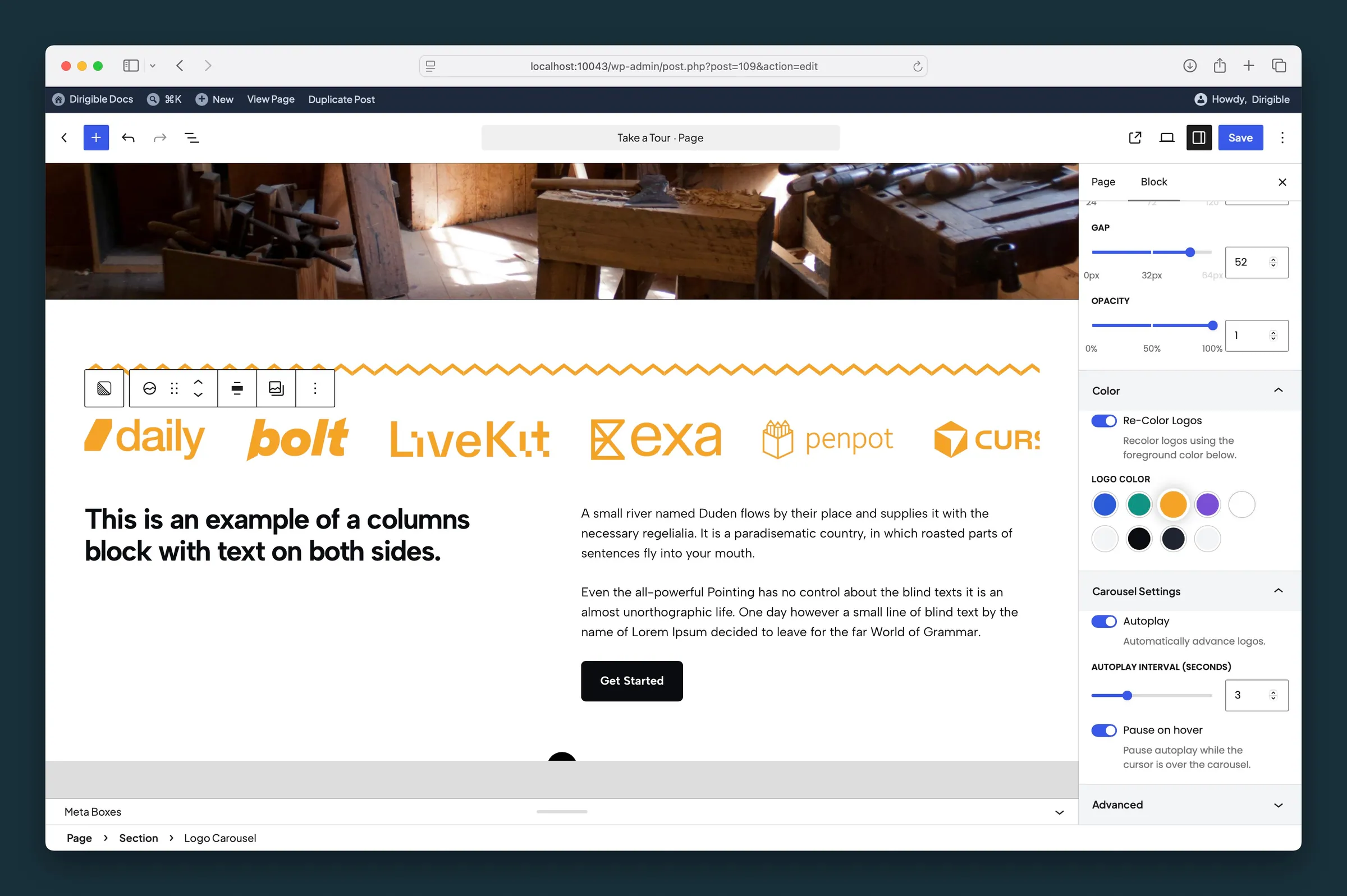
Re-Color Logos and Carousel Settings — golden accent tint, autoplay interval, and pause on hover. -
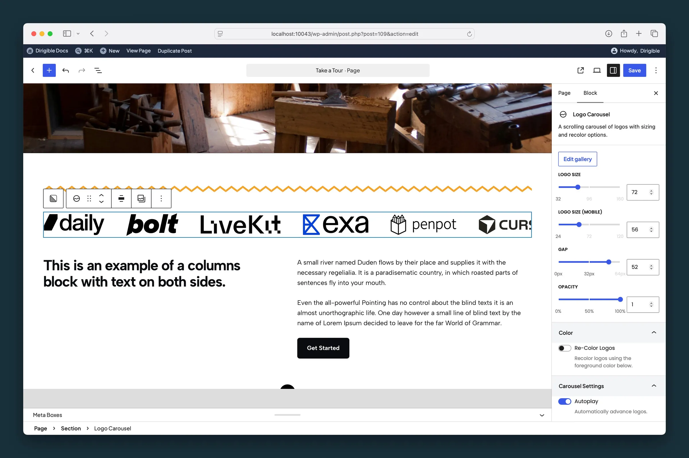
Logo size, mobile size, gap, and opacity — default black logos with autoplay enabled.
Settings
Settings
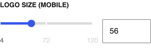
Logo height on screens 781px wide and narrower. Dragging the slider previews the mobile size in the editor.
Horizontal space between logos in pixels.
Transparency applied to every logo in the row.
Trims transparent or white padding around each logo in the carousel so marks with extra space around them don't look smaller than the rest. Does not change the uploaded file. Applies to every logo in the carousel.
Color

Tints every logo one color from your palette. Works best with SVG logos.

The color used when Re-Color Logos is on.
Carousel Settings

Moves the logos automatically on the live site. Motion picks a continuous glide or one-at-a-time steps.
Continuous glides the logos past in a steady, endless row; they repeat as needed to fill the width. Step jumps forward one logo at a time, and visitors can swipe or scroll the row. New carousels start on Continuous. Visitors who've turned on reduced motion in their device settings see a still row instead.
How fast the row glides in Continuous mode, in pixels per second (5–200). Lower is slower; the default of 30 is a gentle drift. The row plays in the editor too, so you can adjust the speed while you watch.
Seconds between logo transitions (0.1–10). Shown when Motion is Step.
Pause autoplay while the visitor's cursor is over the carousel.