

Landing Page
Create a standalone web page to direct your visitors.
Usage
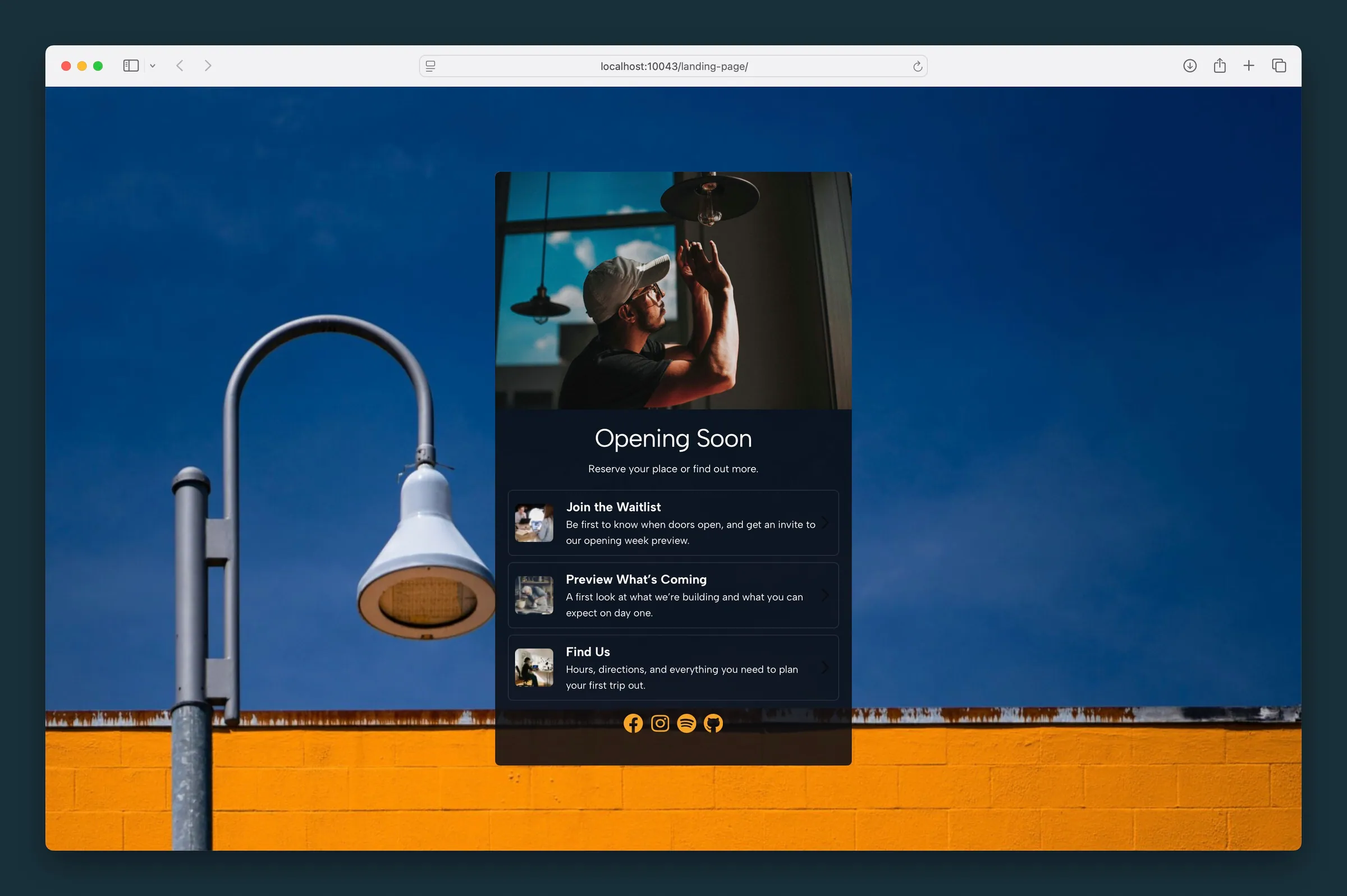
Use the Landing Page block for a single-purpose page you link to from an email, ad, QR code, or social post — somewhere to send visitors for one campaign or call to action. It works much like a link in bio page.
The block fills the screen with a centered card: optional image, headline, description, a stack of links, and optional social icons.
Parent and child blocks
The Landing Page parent holds two inner block areas:
- Links — container for Link children; use Add Link to grow the list
- Socials — optional icon row (included in the default template)
Select Landing Page for page-wide styling (background, avatar, headline, card width). Select Links for settings that apply to every link. Select an individual Link to edit its URL, headline, body copy, and thumbnail.
Use the parent button in the toolbar, breadcrumb path, or List View to jump between parent and child blocks.
Content (parent)
- Image — photo at the top of the card, with Image Focal Point
- Headline and Description — edit inline or in the Content sidebar panel
- Headline Style — changes how the headline looks (it's styled text, not a heading in the page outline)
- Corners — Sharp or Rounded on the card
- Link BG and Link BG Opacity — colored wash behind the link list; opacity moves in 1% steps
- Text Color (reverse print) — light text on dark backgrounds, including the links
- Max Width — caps how wide the card gets (default 24)
Links container (child)
Select the Links block to style all link rows at once:
- Headline Style — typography preset for each link title
- Image Corners — Sharp, Rounded, or Circle on link thumbnails
- Padding — internal spacing on each link row
- Image Size — thumbnail size
- Action Color — accent for the chevron and hover border
Individual links (child)
Each Link child supports:
- Link URL — destination (toolbar or sidebar)
- Headline and Body — primary and supporting text
- Image — optional thumbnail with focal point
Background (parent)
Background Type options:
- Color — solid palette fill
- Image — photo with focal point, overlay color, and overlay opacity
- Gradient — start color, end color, and direction (including radial center)
- Pattern — repeating texture with overlay and Background Size scale
Enable reverse print when using a dark background so headline, description, and links stay legible.
Block width
Landing Page defaults to Full width and fills the height of the screen. It's meant to be the whole page, not a section dropped between other content.
Screenshots
Front-end
-
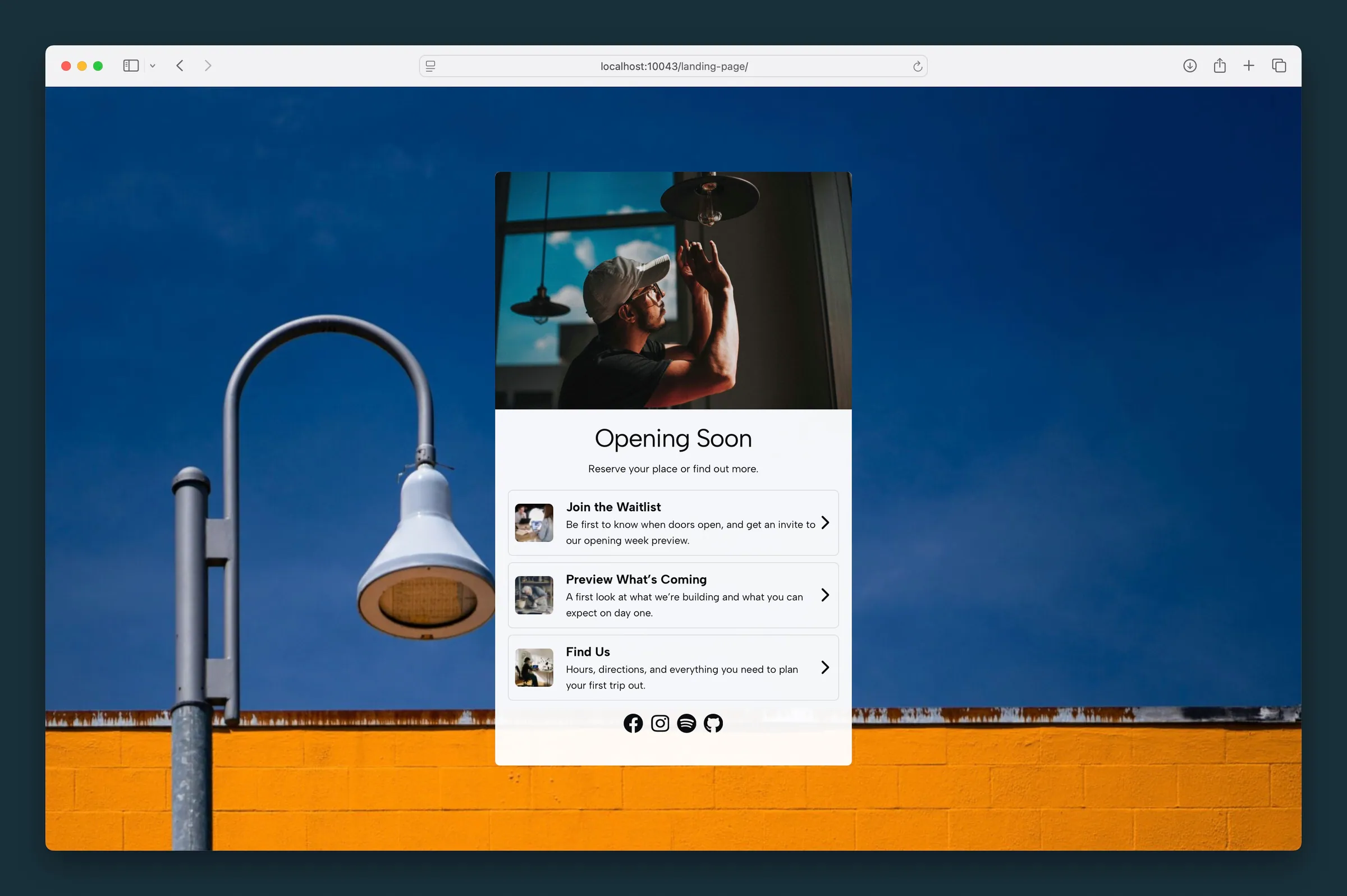
Light card on a brick-and-sky photo — three link rows with headlines, body copy, and chevrons. -
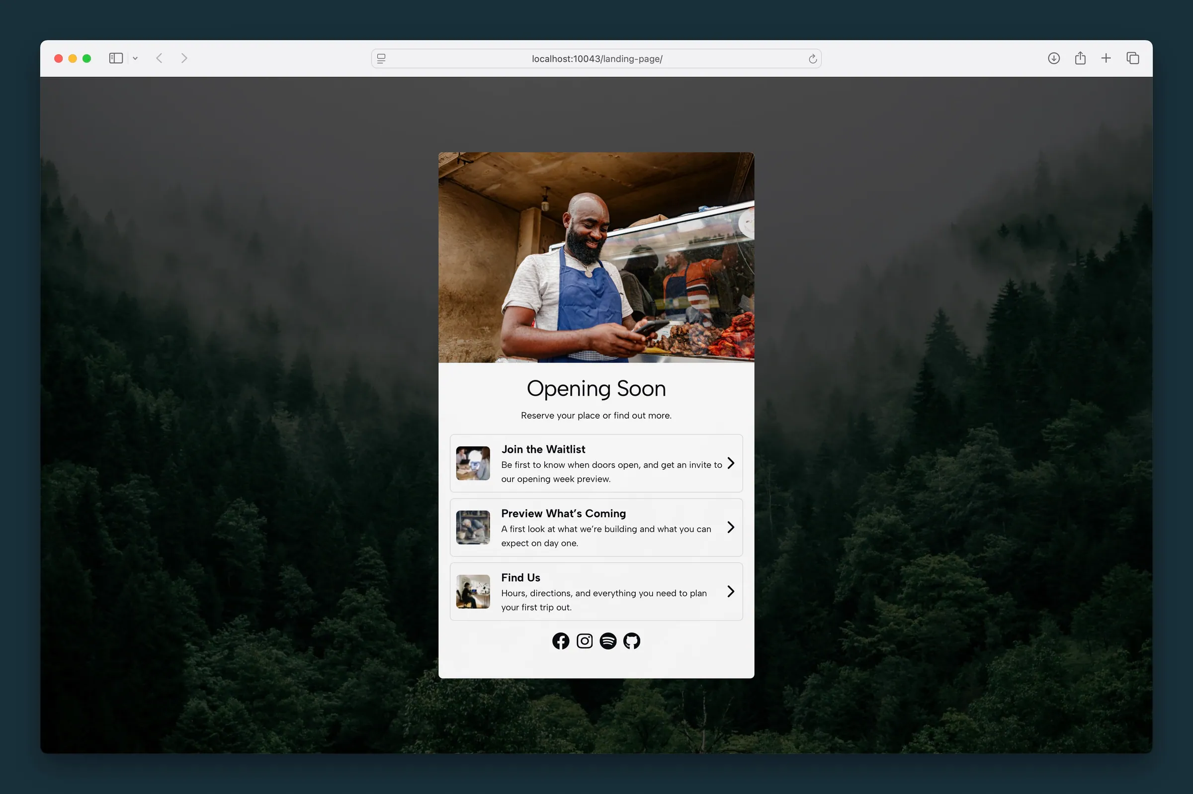
Same link stack on a dark forest background — full-height band for campaign or coming-soon pages.
Editor
-
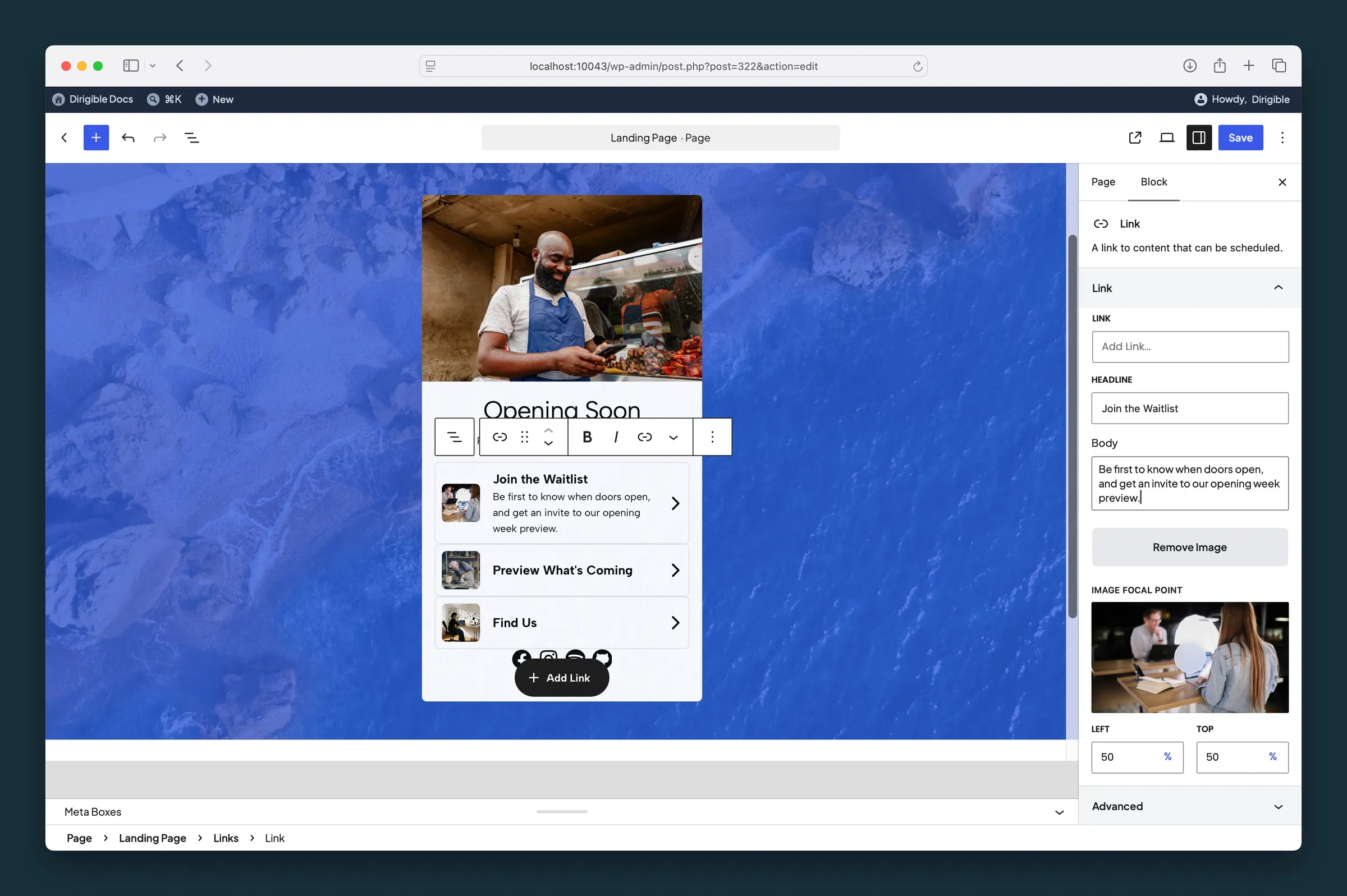
Individual Link block — URL, headline, body, and thumbnail focal point in the sidebar. -
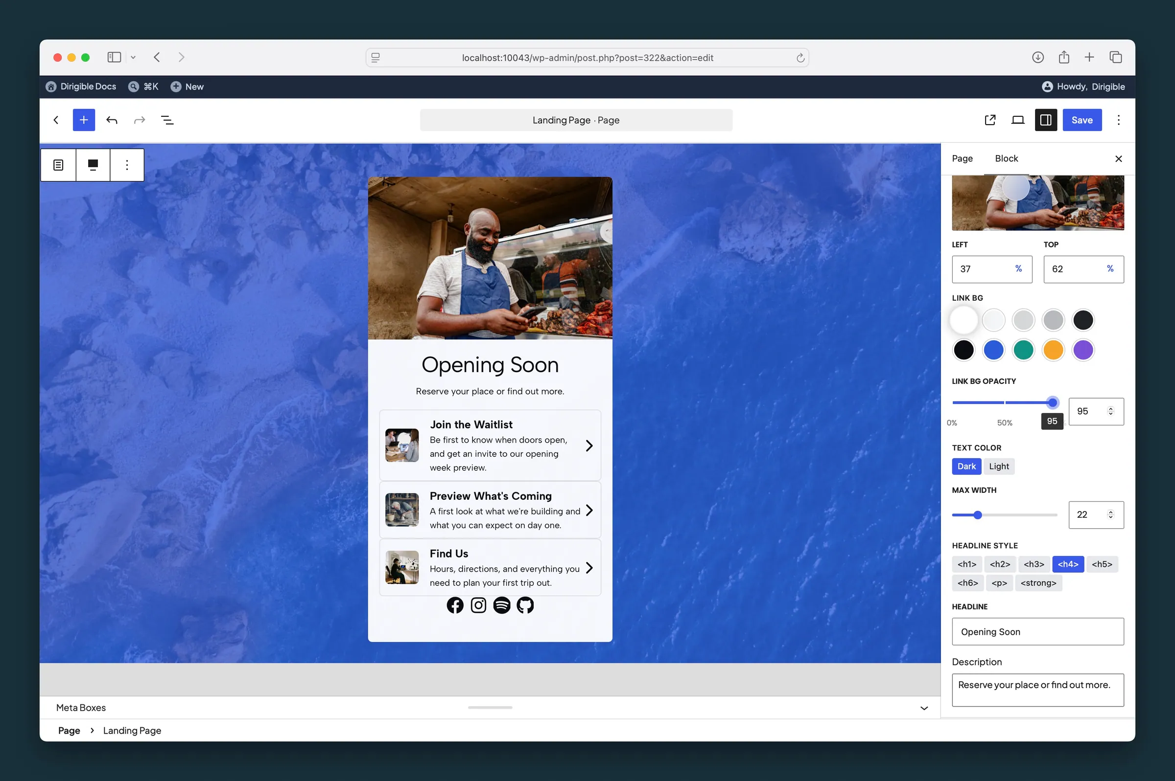
Landing Page parent Content settings — Link BG, opacity, reverse print, max width, and headline style.
Settings
Content

Sets Sharp or Rounded corners on the landing page card container.

Keeps the important part of the top image in frame when it's cropped. It follows the image's focal point from the Media Library until you move it here; after that it's this block's own.
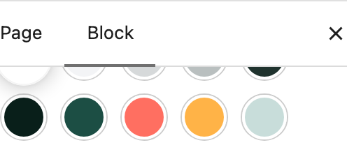
Background color wash behind the link list area inside the card.
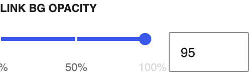
Opacity of the link list background overlay, from transparent to solid, in steps of 1%.

Switches to light text for dark backgrounds, including the links. Choosing a background color picks Dark or Light for you, whichever reads better on that color; change it any time.
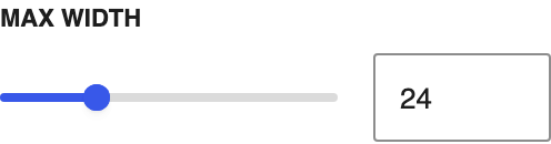
Caps how wide the centered card can get.
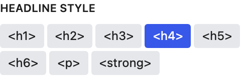
Changes how the headline looks. It's styled text rather than a true heading, so it doesn't appear in the page outline.

The main title under the avatar image. Each link has its own Headline too, shown as that link's title.
Background Settings

Sets the focal point for the background image so the important area stays visible across screen sizes. It follows the image's focal point from the Media Library until you move it here; after that it's this block's own.


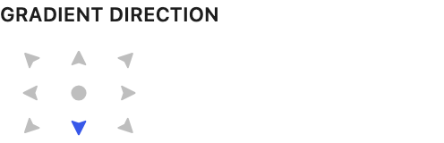
Controls gradient flow direction, including radial center. Only applies when Background Type is Gradient.
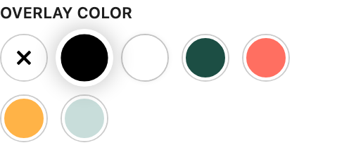
Tints an image or pattern background so text stays readable. Changing it also sets Text Color when the overlay is strong enough to set the tone: a dark overlay from the default opacity up, a light one from 70% up. Change Text Color any time.
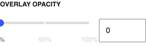
Overlay strength from transparent to solid, in steps of 1%. Set to 0% to disable. Dragging it also updates Text Color as the overlay starts or stops dominating the image; a dark overlay counts from the default opacity, a light one from 70%. Change Text Color any time.
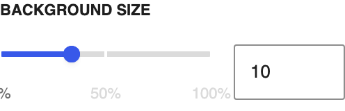
Scales the repeating background pattern.
Settings
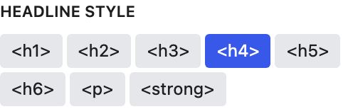
How every link's headline looks, from heading sizes down to bold body text. Set it on the Links block and it applies to all links.

Corner shape for each link's thumbnail: Sharp, Rounded, or Circle.
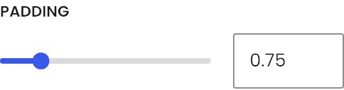
Space inside each link card.
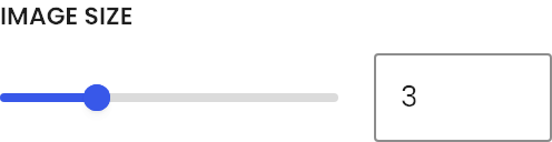
Width and height of each link's thumbnail.
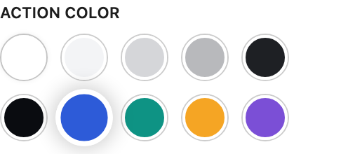
Color of each link's arrow and of its border on hover, from your site palette.
Link
Where the link goes. Search your site's pages or paste any web address.
The main title under the avatar image. Each link has its own Headline too, shown as that link's title.
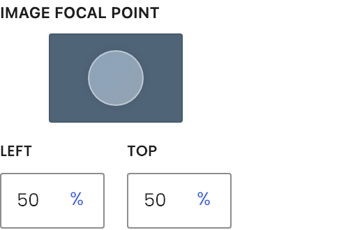
Keeps the important part of the link's thumbnail in frame when it's cropped. It follows the image's focal point from the Media Library until you move it here; after that it's this block's own.