

Vignette
A photo and text block with magazine-style layouts, offset color panels, and overlapping text.
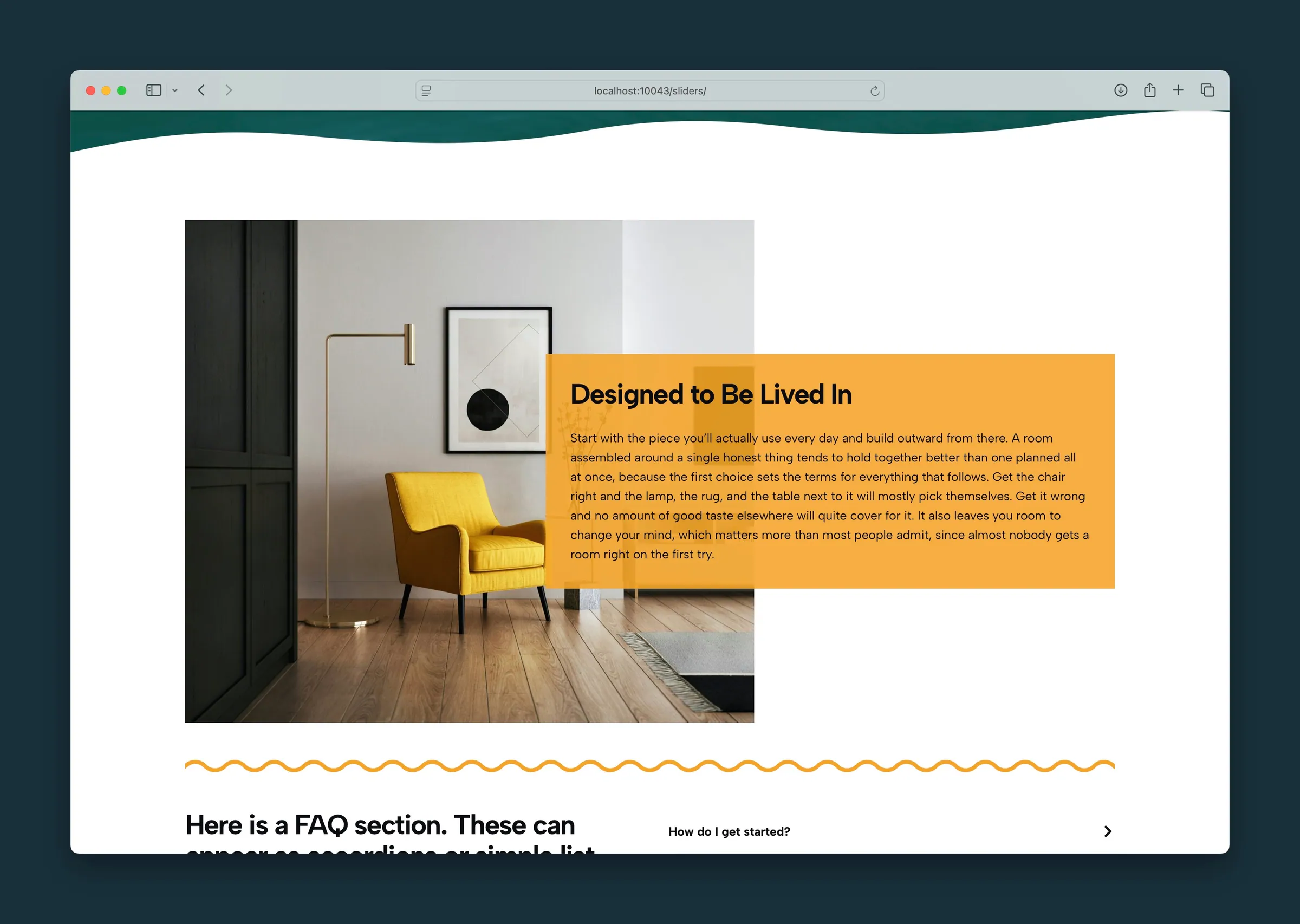
Usage
Vignette pairs a photo with a headline, subheadline, body text, and an optional link, like Photo Feature, but adds layout styles that change how the photo and text relate. Switch Style without losing any content. Try Offset Background, Magazine, or Flexible Magazine to find the look that fits your page.
Use Vignette for editorial bands, magazine-style features, or any section where the photo and text should overlap, offset, or share a colored background. For a plain photo beside text, use the Photo & Text layout under Columns instead.
Content
Each Vignette has:
- Photo: click the placeholder in the editor or Choose Photo in the sidebar.
- Headline: the main title, edited on the canvas or in the sidebar.
- Subheadline: a supporting line, edited on the canvas or in the sidebar. If you clear it completely, it disappears from the canvas until you type it back in the sidebar.
- Body: paragraphs and lists in the text area.
- Link URL: an optional call to action below the body. Once a URL is set:
- Button Text: defaults to Learn More. Edit it on the canvas or in the sidebar.
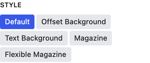
- Style: Button (default) or an Understated text link.
Layout
- Swap Blocks: puts the photo on the other side on screens 800px and wider. It's in both the block toolbar and the sidebar. On phones, the photo always comes first.
Style
Sidebar Style options:
- Default: photo and text side by side, half and half, similar to Photo & Text.
- Offset Background: an accent-colored block offset behind the photo. Magnitude sets how far it shifts; negative values shift it the other way.
- Text Background: a solid accent panel behind the text. Magnitude sets how far the text overlaps the photo.
- Magazine: accent highlights behind each line of text. Magnitude sets how much the text overlaps the photo.
- Flexible Magazine: like Magazine, but the photo and text shift together as Magnitude increases, and line spacing adjusts with it.
Color and effects
- Text Color: Dark (default) or Light, for text on a dark background or accent color.
- Accent Color: the color of the offset, text panel, or magazine highlights (default Primary).
- Opacity: how see-through the accent color is (0–100% in 1% steps; default 100).
- Magnitude: how strong the current style's effect is (-10 to 10; default 5).
Accent Color and Opacity only show on the page with the Offset Background, Text Background, Magazine, and Flexible Magazine styles.
Block width
Vignette supports Wide and Full alignment from the block toolbar and starts at Wide.
Tips
- Pick a Style first, then adjust Accent Color, Opacity, and Magnitude. They behave differently in each style.
- Offset Background is a good fit for a bold brand-color block behind the photo.
Screenshots
Front-end
-
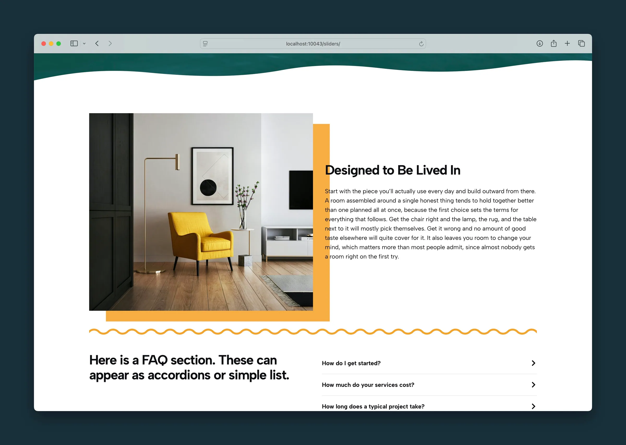
Offset Background — the photo sits on an accent bar, with the copy beside it. -
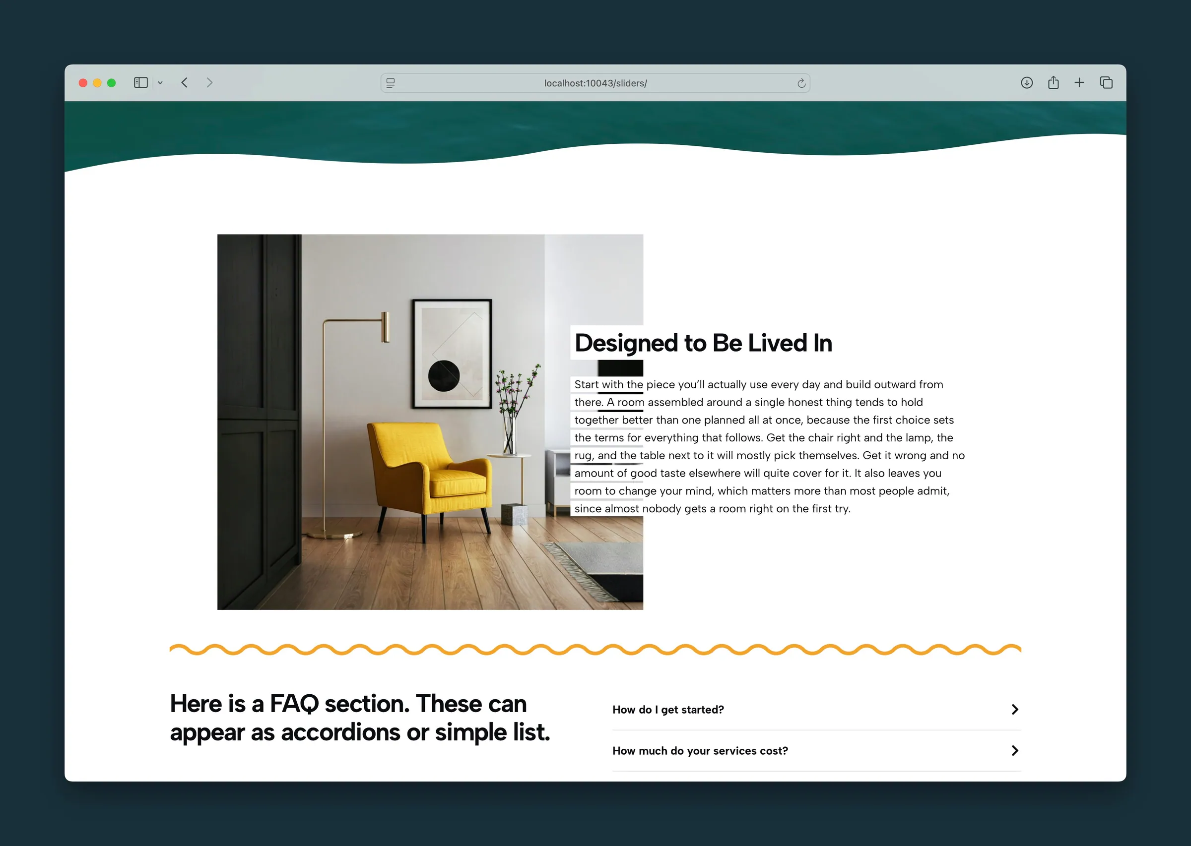
Magazine — the headline overlaps the edge of the photo.
Editor
-
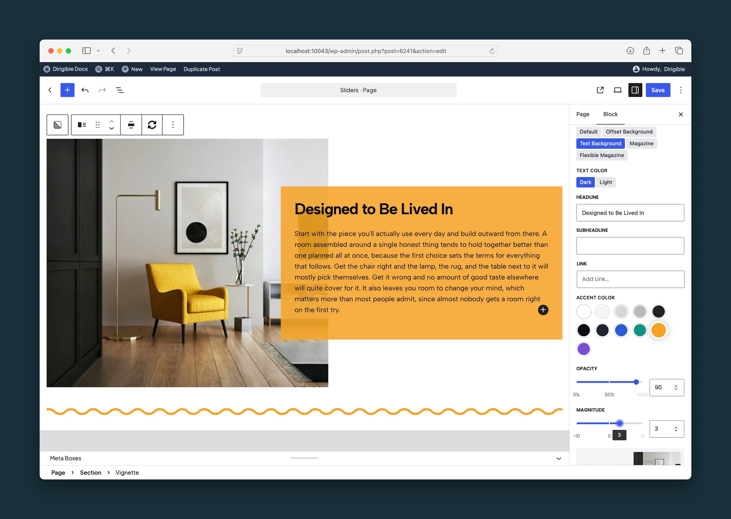
Text Background selected, with Opacity at 90 and Magnitude at 3. -
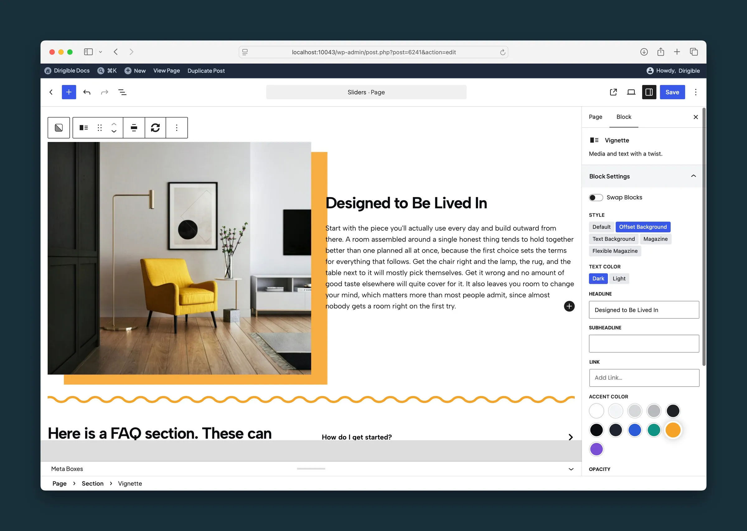
The same block set to Offset Background.
Settings
Block Settings

Puts the photo on the other side on wider screens. On phones the photo always comes first.
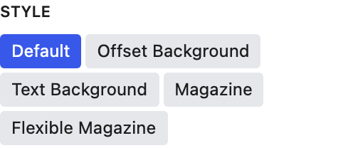
Changes how the photo and text relate: side by side, an offset color block behind the photo, a color panel behind the text, or magazine-style line highlights. Your content stays the same when you switch.

Use Light when the text sits on a dark background or accent color.
A supporting line under the headline. If you clear it, type it back here to bring it back.

Button or a plain Understated text link.

Color of the offset, text panel, or magazine highlights. It doesn't show with the Default style.
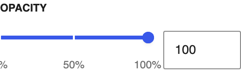
How see-through the accent color is, in steps of 1%. Only affects the styles that use an accent color.
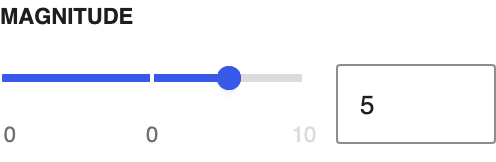
How strong the current style's effect is: overlap, offset distance, or shift, depending on the style. Negative values flip the direction of Offset Background.