

Media Strip
A full-width strip with an overhanging image and editable content.
Usage
Media Strip is a full-width color band that pairs a photo with a content column — heading, paragraph, list, buttons, or Pills. On desktop the photo can overhang the band, sticking out above and below it for a layered, magazine-style look. Unlike Media Callout, you pick the photo from the sidebar instead of placing an Image block.
Use it for a bold break between sections: team spotlights, product features, testimonials with portraits, or anywhere the photo should feel bigger than its background.
Layout
The block has two side-by-side areas inside the colored band:
- Photo — chosen from the sidebar Image panel or by clicking the placeholder in the editor
- Content — regular blocks, starting with a headline, paragraph, and button
On desktop, the photo and content sit side by side with adjustable proportions. On mobile, they stack with the photo first and no overhang.
Block settings
- Padding — space above and below the content (None through XXL; each step is a little smaller on mobile)
- Background Color — palette fill for the band
- Block Sizes — five column width presets from larger-left through larger-right (toolbar icons or sidebar)
- Max Content Width — caps how wide the text column gets (10–70, default 50) so lines stay easy to read
- Swap Blocks — swaps photo and content on desktop (toolbar or sidebar)
- Text Color (reverse print) — light text on dark backgrounds, applied to everything in the content column
- Image Overhang — how far the photo sticks out above and below the band on desktop (0–30, default 4)
- Offset Overhang — adds matching space above and below the band so the photo doesn't run into neighboring blocks
Image
Open the Image sidebar panel to manage the photo:
- Photo — choose, change, or remove the image
- Rounded Corners — softens the photo edges
- Image Focal Point — keeps the important part of the photo in view when it's cropped
The photo is cropped to fill the full height of the row on desktop.
Content
Allowed blocks: Heading, Paragraph, List, Buttons, and Pills. Edit inline or add blocks in the content column. It starts with a headline, body copy, and a button — replace or add to them as needed.
Block width
Media Strip supports Wide and Full alignment from the block toolbar and defaults to Full width. The color band spans the chosen width; the photo and content stay within your site's wide content width.
Tips
- Increase Image Overhang for a more dramatic photo; turn on Offset Overhang when the photo runs into the section above or below.
- Turn on Text Color (reverse print) whenever you pick a dark Background Color.
- Overhang only applies on desktop (640px and wider). On mobile the layout stacks normally.
Screenshots
Front-end
-
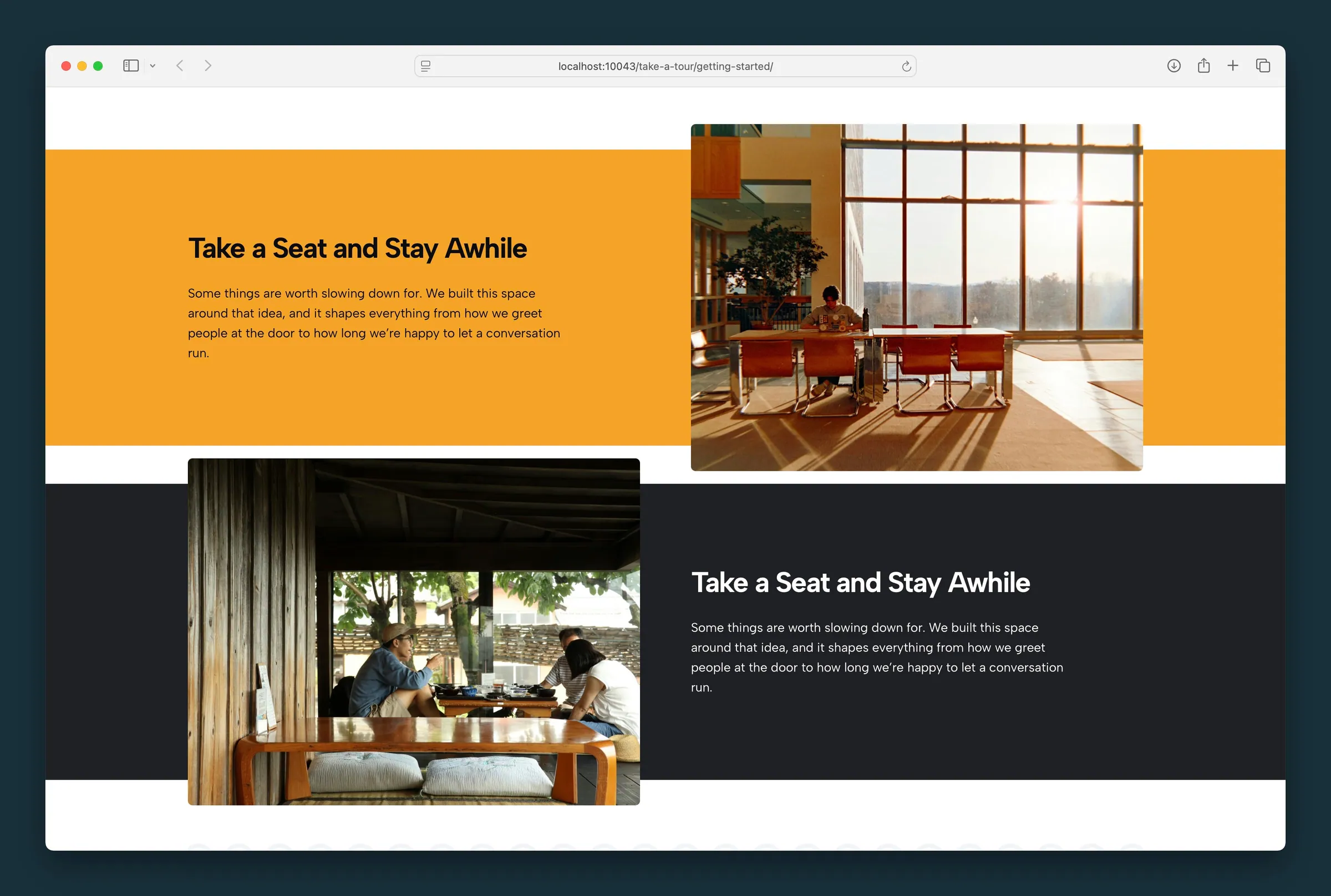
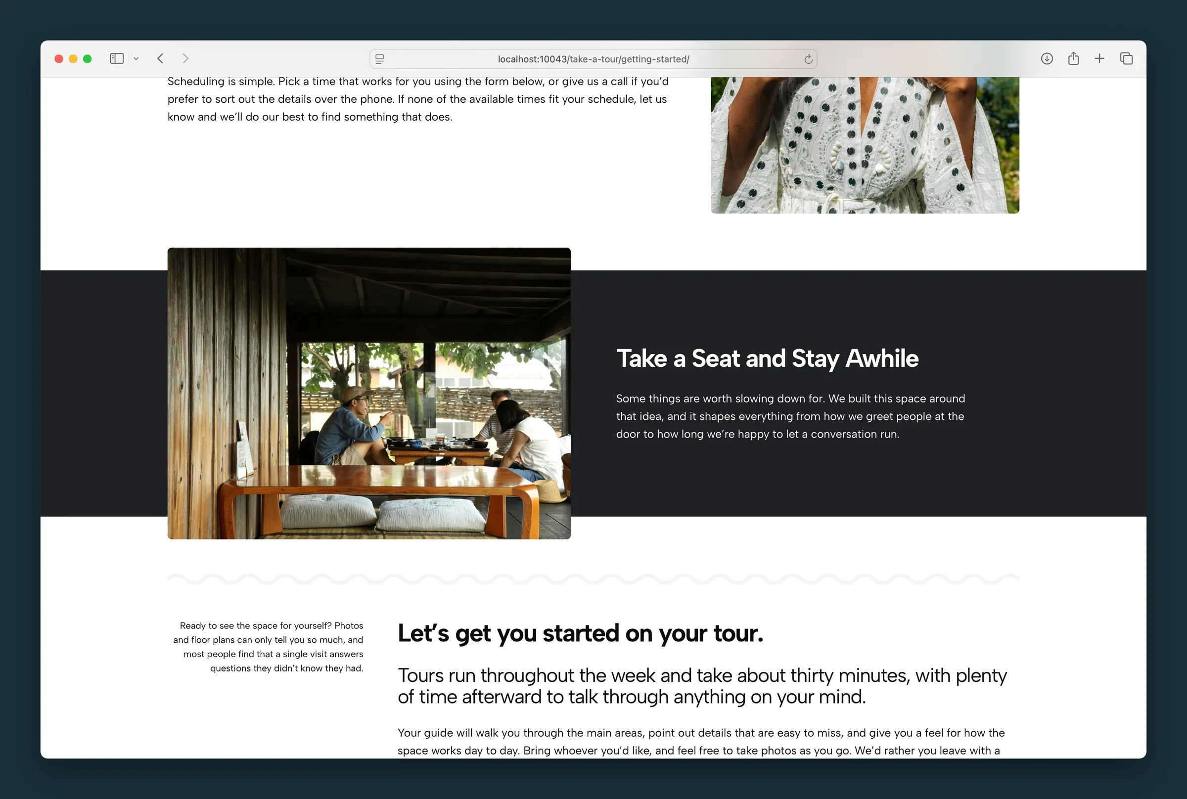
Two strips on one page — amber and dark backgrounds with overhanging photos on opposite sides. -
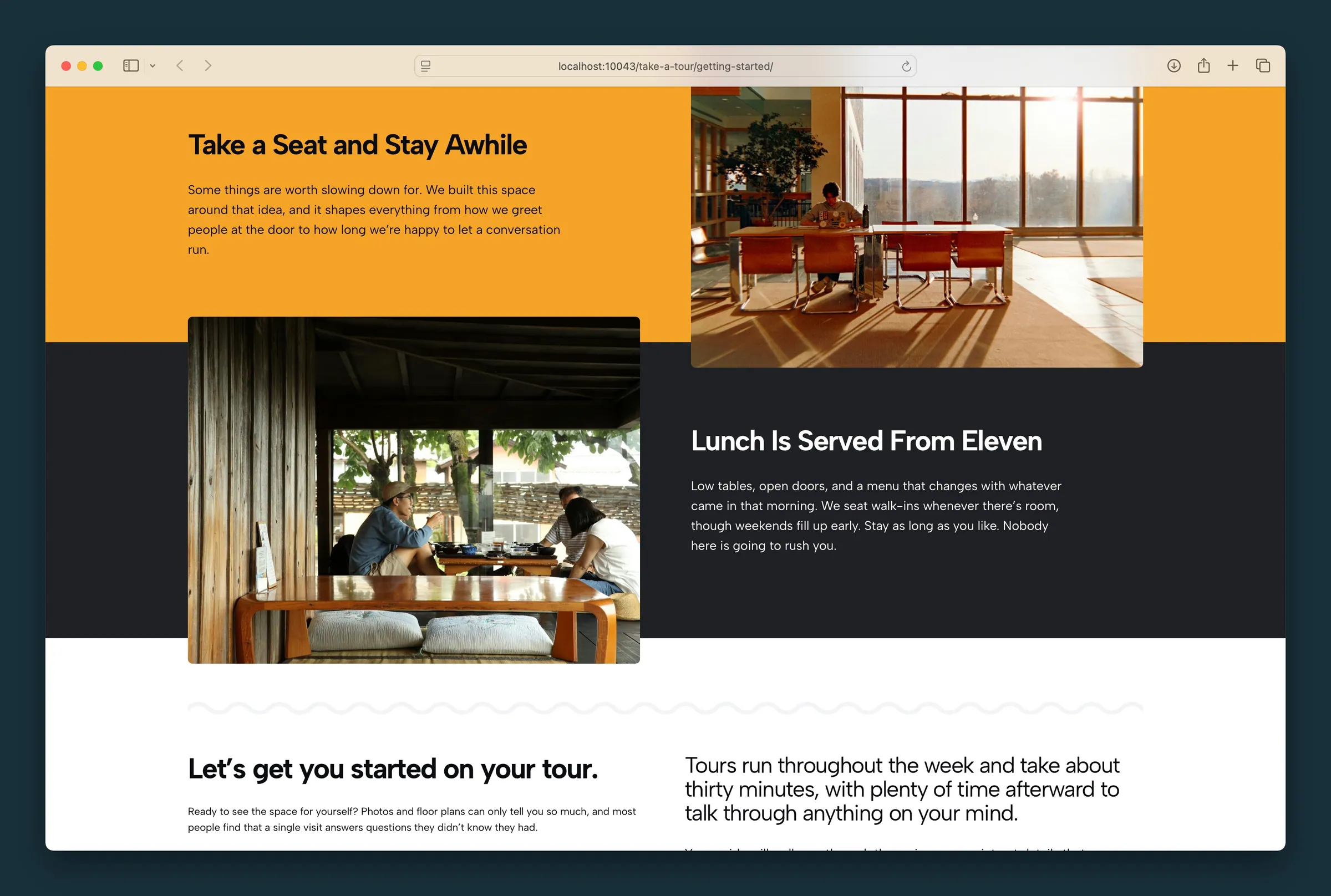
Stacked strips with offset overhang — photos bridge the yellow and dark sections on alternating sides.
Editor
-
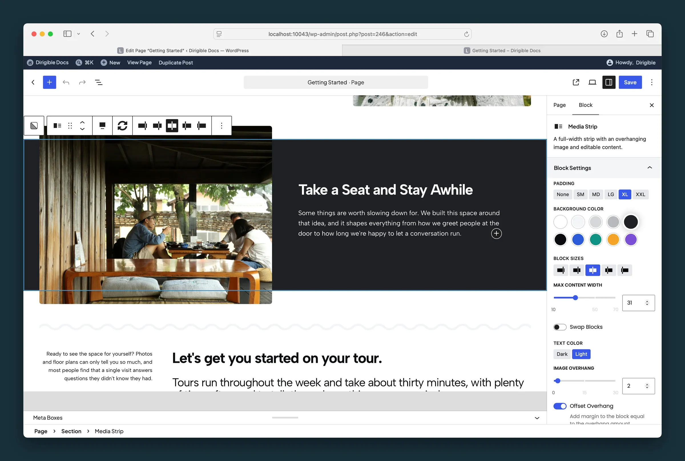
Block Settings — Padding, Background Color, Block Sizes, Max Content Width, Swap Blocks, Text Color, Image Overhang, and Offset Overhang. -
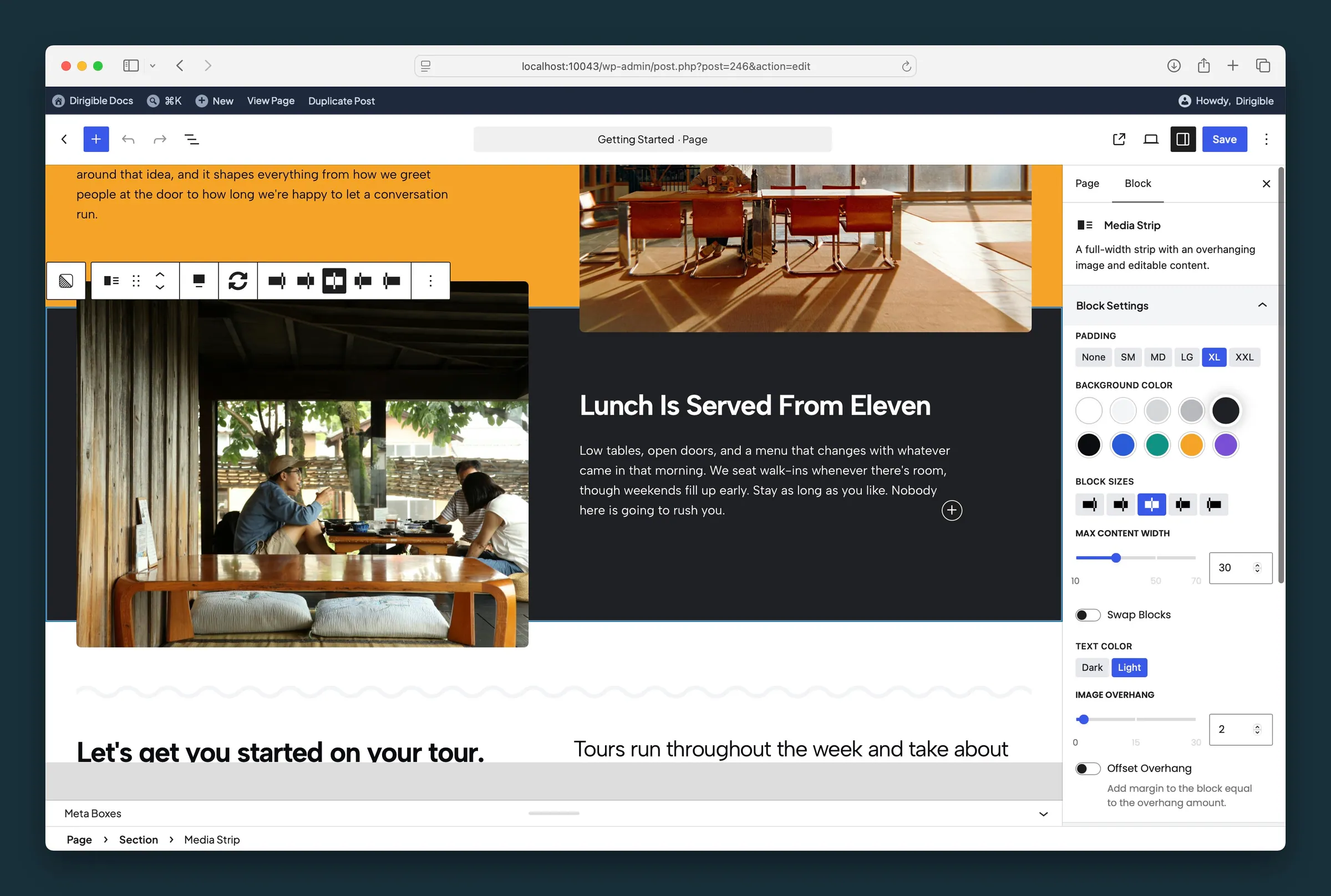
Second strip selected — dark background, light text, and Image Overhang with Offset Overhang off.
Settings
Block Settings
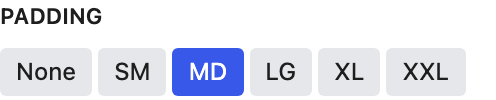
Space above and below the content. Each step is a little smaller on mobile.
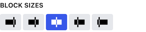
Column width ratio between the photo and content areas — larger left, slightly larger left, even, slightly larger right, or larger right.
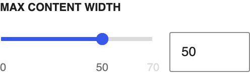
Caps how wide the text column gets. Lower values keep lines shorter and easier to read.

Swaps the photo and content on desktop. On mobile, the photo stays above the content.

Light text for dark background colors. Choosing a background color picks Dark or Light for you, whichever reads better on that color; change it any time.
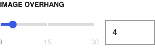
How far the photo sticks out above and below the colored strip on desktop.
Adds space above and below the strip to match the overhang, so the photo doesn't run into the blocks around it.
Image

Applies rounded corners to the photo.

The photo beside the content. Choose it here or click the placeholder in the editor.

Keeps the important part of the photo in view when it's cropped to fit. It follows the image's focal point from the Media Library until you move it here; after that it's this block's own.