

Preview Panel
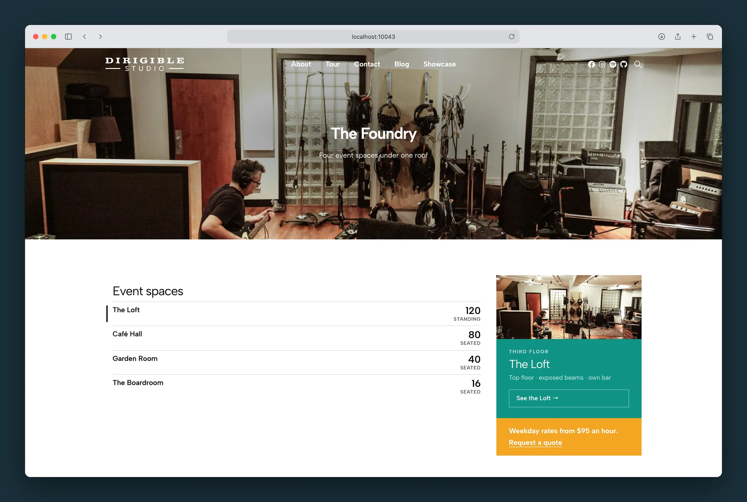
A list of links with a photo panel that previews the one being pointed at.
Usage
Preview Panel puts a list of links on the left and a photo panel on the right. When a visitor points at a link, or tabs to it, the panel shows that link's photo, an eyebrow line, its name, its summary and a button to the page. It's made for mega menus, such as a hotel's rooms or a venue's spaces, and works on any page.
The block has two parts, and you can't remove or reorder them:
- Preview Panel Links, on the left. Add anything here: headings, Columns, Preview Link blocks, and a row of links at the bottom. A Group block with a top border works well for that bottom row; it stays at the foot of the panel.
- Preview Panel Footer, under the photo. Use it for a promotion or a few links. Leave it empty and it doesn't show.
Each Preview Link is one row in the list:
- Title: type it on the row. Add the link with the Link button in the block toolbar (you can set it to open in a new tab there).
- Summary: the one line under the title, also typed on the row. The photo panel repeats it.
- Lines under the row: add paragraphs (or Icon + Text lines) under the summary for related links, such as the accessible version of a room. Their links work on their own; the rest of the row links to the title's page.
- Eyebrow, Photo and Focal Point: in the sidebar. These only show in the photo panel. The photo also comes from Add Photo in the block toolbar.
- Measure and Measure Unit: in the sidebar, optional. A number shown big at the end of the row with a few words under it, such as 500 / seated or 350 / with dance floor. A word works too (Ready / room). When a row has a measure, its summary shows in the photo panel only (screen readers still read it on the row); on phones it stays on the row.
The photo panel shows the first link until the visitor points at another one, or the link to the page they're already on. Select a link in the editor to preview it.
Photo panel (parent)
- Panel Color: the background behind the preview. Picking a color also picks Light or Dark text to suit it.
- Panel Text: Light Text or Dark Text in the preview.
- Photo Layout: Above (the photo on top, then the name, summary and button) or Fill (the photo fills a wider panel, the name and summary sit over its foot, and the photo itself is the link, with no button). The footer stays a strip under the photo either way.
- Button Label: the first word on the preview's button. The link's title follows it, with a leading "The" in lower case: "See" and "The Presidential Suites" read "See the Presidential Suites".
Measures (parent)
- Measure Bars: a bar under each link whose Measure is a number, filled to that number over the largest in the panel, so the rows read as a ladder (500 seated is full, 50 seated a tenth). The row being previewed or pointed at shows its bar in the full accent color. Rows with a word or no measure have no bar.
Footer
Select Preview Panel Footer to set its Background Color and Text Color.
Phones and touch screens
On phones, in the mobile menu, in any narrow space, and on touch screens, the block is one column of links with their summaries and lines, and the footer follows the list. There's no photo panel, and the lines' links are large enough to tap.
Tips
- Keep summaries to one short line. The panel is sized by the list, so a short list keeps the whole menu on screen; the photo gets the room the text leaves.
- Use photos at least 800 pixels wide. Set a Focal Point when the subject isn't in the middle.
- Everything in the photo panel is also in the list, so visitors using a keyboard or screen reader get the same information without it.
- Leave the Eyebrow empty when the rows don't need one.
- Use Measure for one comparable number per row (seats, square feet, guests). Keep the unit to two or three words.
- Placed alone in a column beside a taller one, the panel grows to the column's height, so the photo runs to the bottom.
Settings
Photo Panel
Above: the photo on top, then the name, summary and button. Fill: the photo fills a wider panel with the name and summary over it, and the photo is the link.
The background behind the photo preview. Picking a color also picks Light or Dark text to suit it.
Light or dark text in the photo preview.
The first word on the preview's button, followed by the link's title: "See" reads "See the Presidential Suites".
Measures
A bar under each link whose Measure is a number, filled to that number over the largest in the panel.
Off by default.
