

Text Columns
Flow long text across two or three newspaper-style columns.
Usage
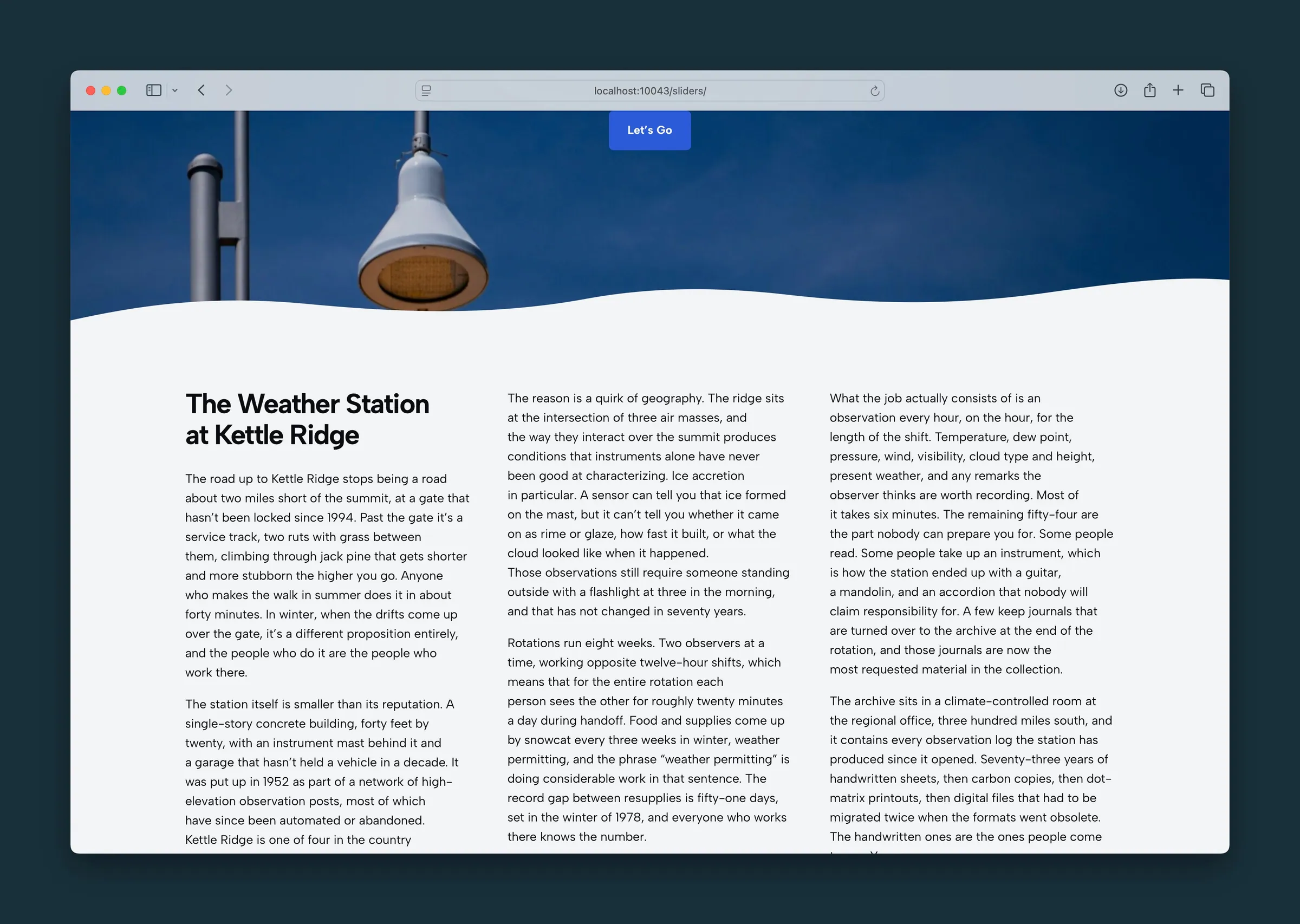
Text Columns flows your text across columns like a newspaper or magazine, instead of placing separate blocks side by side. Use it for long paragraphs, editorial copy, bios, or any text that reads well in multiple columns.
The block starts with four sample paragraphs. Replace them with your own headings, paragraphs, lists, images, buttons, separators, or Spacer blocks.
Unlike the Columns block, Text Columns doesn't give you separate left and right panels. Your content runs top to bottom and continues into the next column automatically.
Columns
Sidebar controls under Block Settings:
- Columns: Two (default) or Three.
- Column gap: space between columns, from 0 to 4. Default is 2.
On smaller screens
- Under 768px: one column.
- 768px and up: two columns, for both Two and Three.
- 1024px and up: Three switches to three columns.
Paragraphs and images try not to split across two columns.
Allowed content
You can add these blocks inside Text Columns:
- Heading, Paragraph, List, Image, Button, Separator
- Spacer, for extra space within the flow
For side-by-side layouts with other kinds of blocks, use Columns instead.
Block width
Text Columns supports Wide and Full alignment from the block toolbar and starts at Wide.
Tips
- Use Two for body copy. Three suits shorter snippets or dense reference text on wide pages.
- Break up very long paragraphs. They can leave columns uneven.
- Use Columns instead when an image and text need to sit in their own panels.
Screenshots
Front-end
-
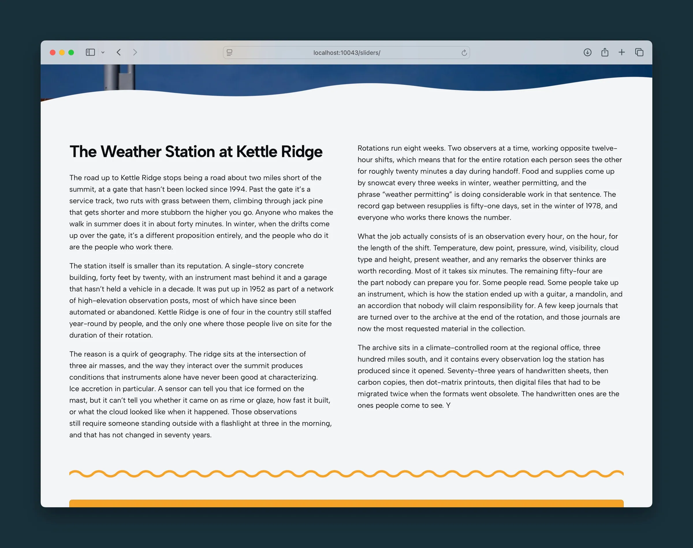
The same story in two wider columns. -
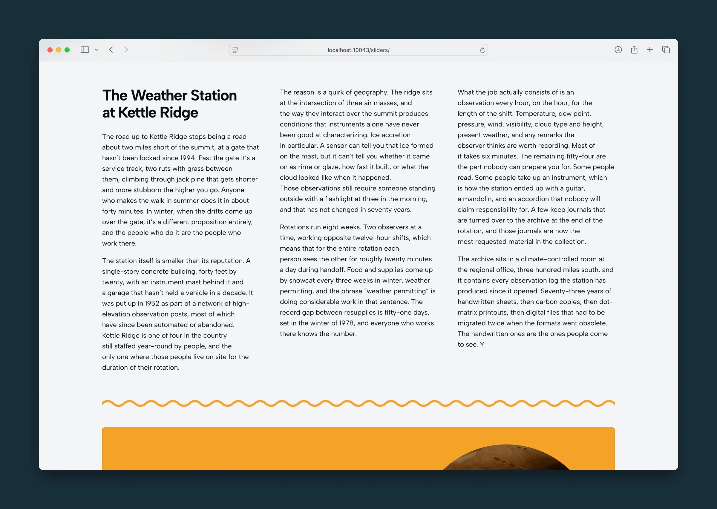
Three columns again, with the headline wrapping in the first column.
Editor
-
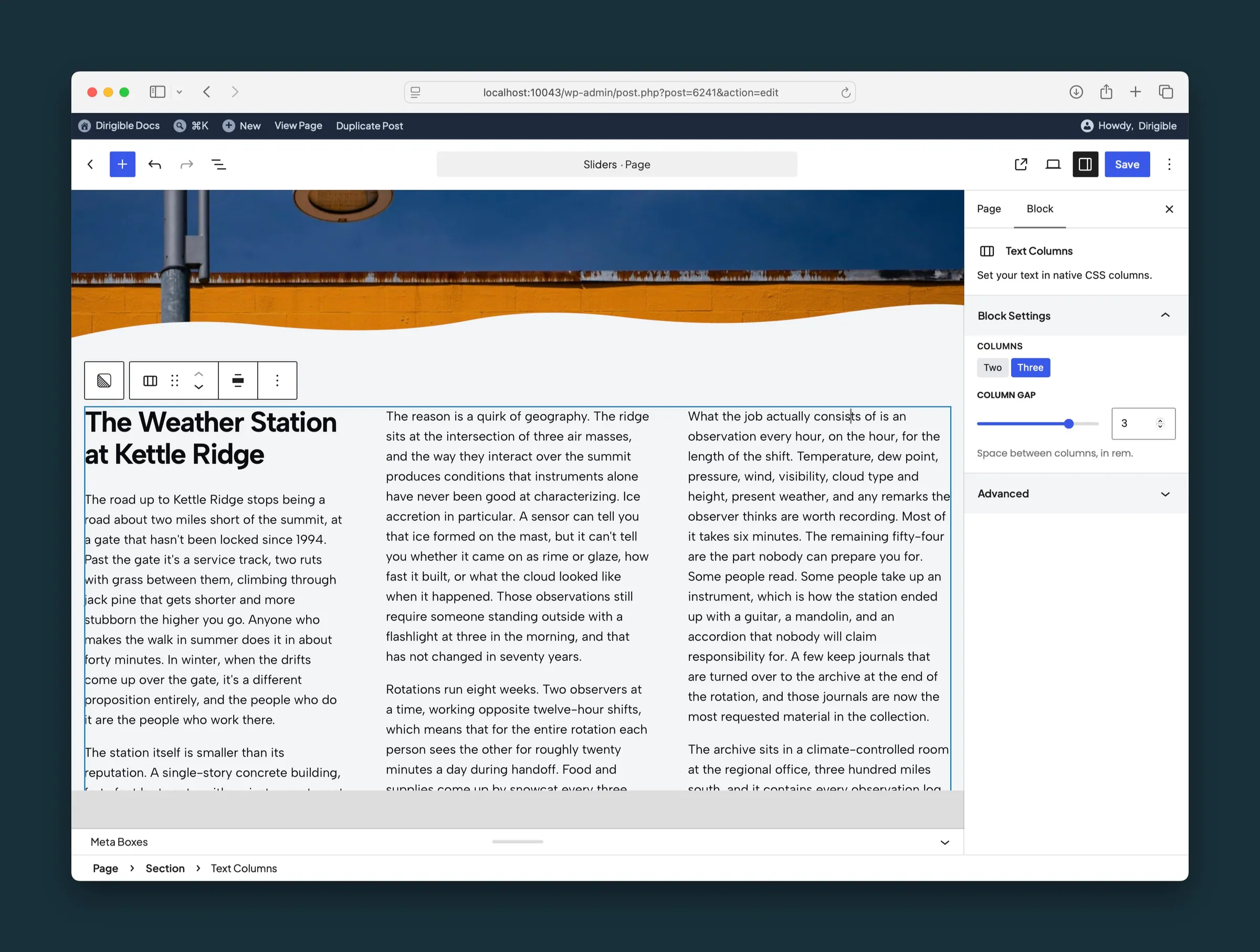
Text Columns set to Three, with Column Gap at 3. -
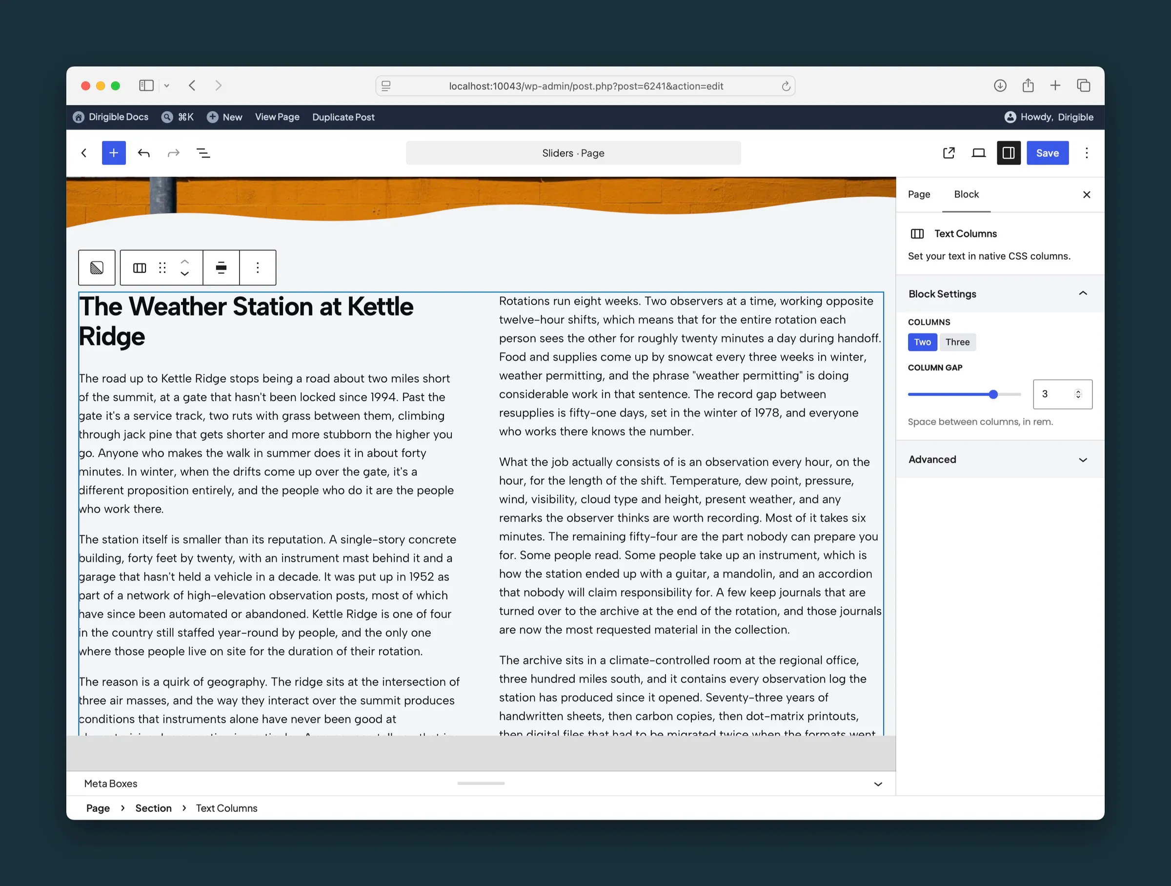
The same block set to Two columns, with the gap unchanged.
Settings
Block Settings

Two or three columns on wide screens. Three shows as two columns from 768px and three from 1024px. Under 768px, text stays in one column.
Space between columns, from 0 to 4. The default is 2.