

Tabs
Organize related content into tabs visitors click between.
Usage
Tabs puts related content into labeled panels that visitors switch between by clicking the tab labels. Use it when showing everything at once would make the page long: service categories, product details, team bios, FAQs grouped by topic, and similar content.
The block starts with three tabs named One, Two, and Three. Each tab can hold any blocks: paragraphs, images, columns, grids, and more.
On the live site, one panel shows at a time. The other panels are still part of the page, just hidden until their tab is clicked.
Parent and child blocks
The outer Tabs block holds one or more Tab blocks.
Select Tabs for tab label style, alignment, and panel style. Select a single Tab to edit what's inside that panel.
Rename tabs in the tab bar: click a label to make it active, then type. Only the active tab's label is editable.
Tab bar (editor)
When the Tabs block is selected, two buttons appear beside the tab labels:
- Add tab (+) adds a tab named "New Tab" at the end.
- Remove tab (trash) deletes the active tab.
Reorder tabs by moving them in List View.
Tab Settings (parent)
Sidebar controls under Tab Settings:
- Tab Style: how the tab labels look.
- Tags: pill labels using your site's tag styling
- Inset (default): labels inside a rounded track; the active tab fills with your primary color
- Pill: fully rounded label buttons
- Underline: text labels with a line under the active tab
- Tabs: the classic connected, bordered tab look
- Tab Align: places the row of labels Left, Center (default), or Right.
- Content Style: styling for the panel below the labels.
- Default: no border or background
- Outlined: a border around the panel
- Well (default): a subtle rounded background
Individual tabs (child)
Select a Tab to add content to that panel. It starts with one paragraph, but you can add any block.
Only the active panel shows in the editor. Click another tab label to switch which panel you're editing.
Block width
Tabs supports Wide alignment from the block toolbar and starts at Wide. Full width isn't available.
Tips
- Keep tab labels to one or two words. Long labels wrap on phones.
- Use Tags when tabs should match tag styling elsewhere on your site.
- Pair Outlined or Well with the Tabs or Underline label styles to clearly separate labels from the panel.
- If visitors need to see all the content without clicking, use a Section or Grid instead.
Screenshots
Front-end
-
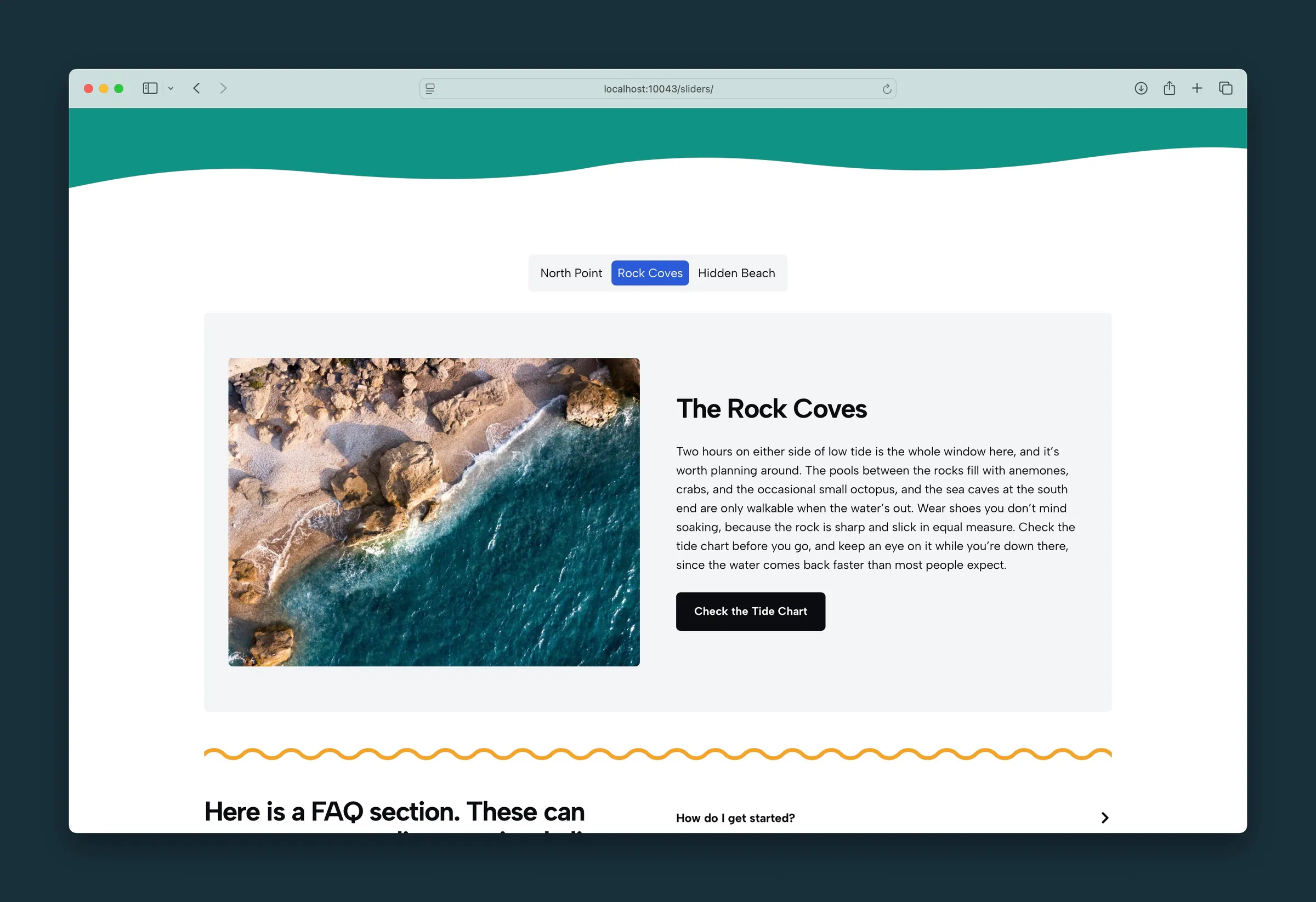
Inset tabs, centered, with Rock Coves open in a well. -
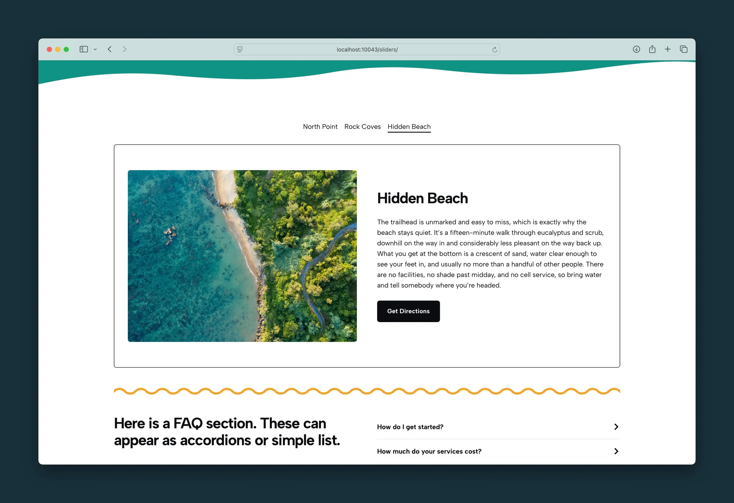
Underline tabs, left aligned, with Hidden Beach in an outlined panel.
Editor
-
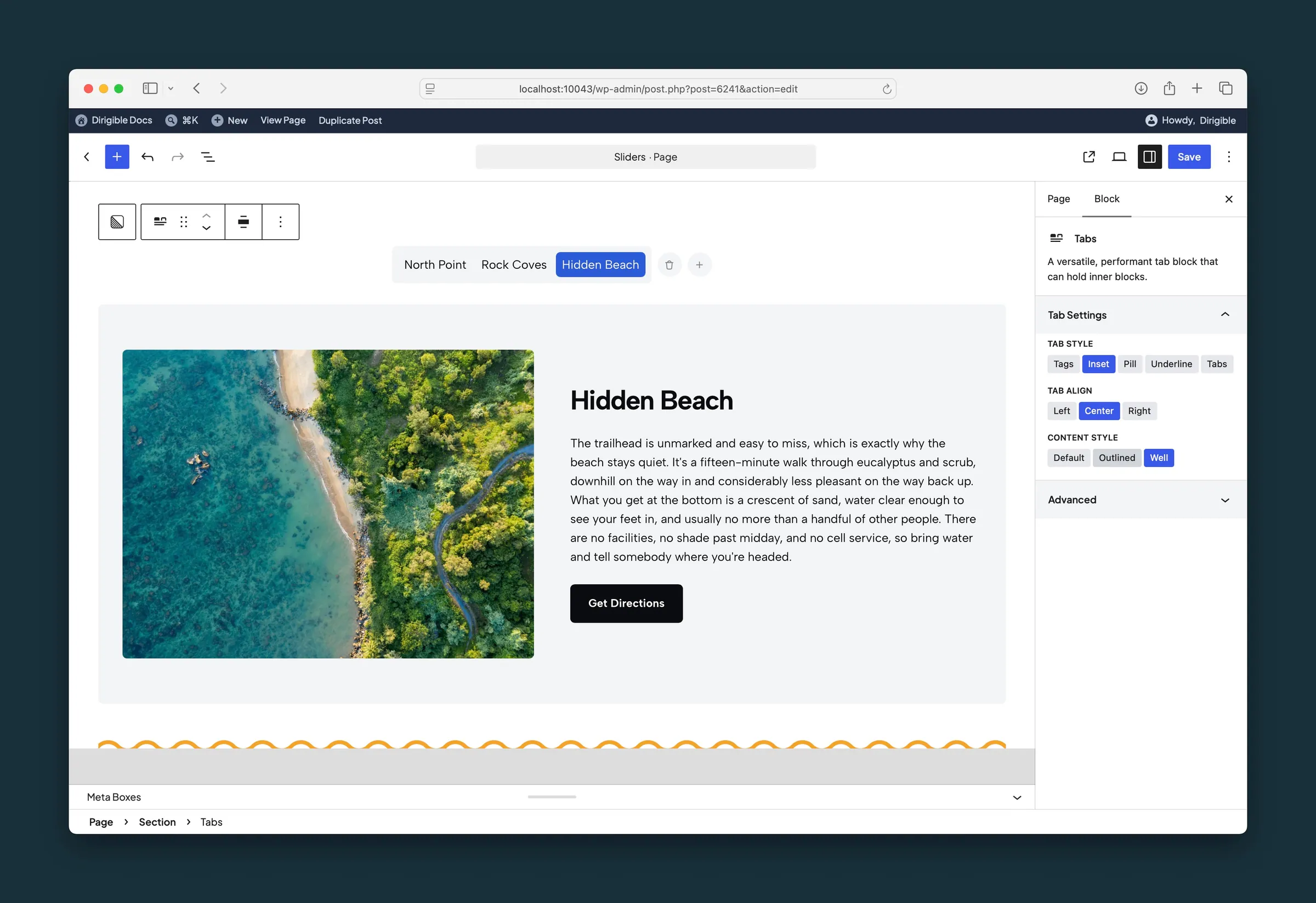
Tab settings on Inset, Center, and Well, with add and remove on the tab bar. -
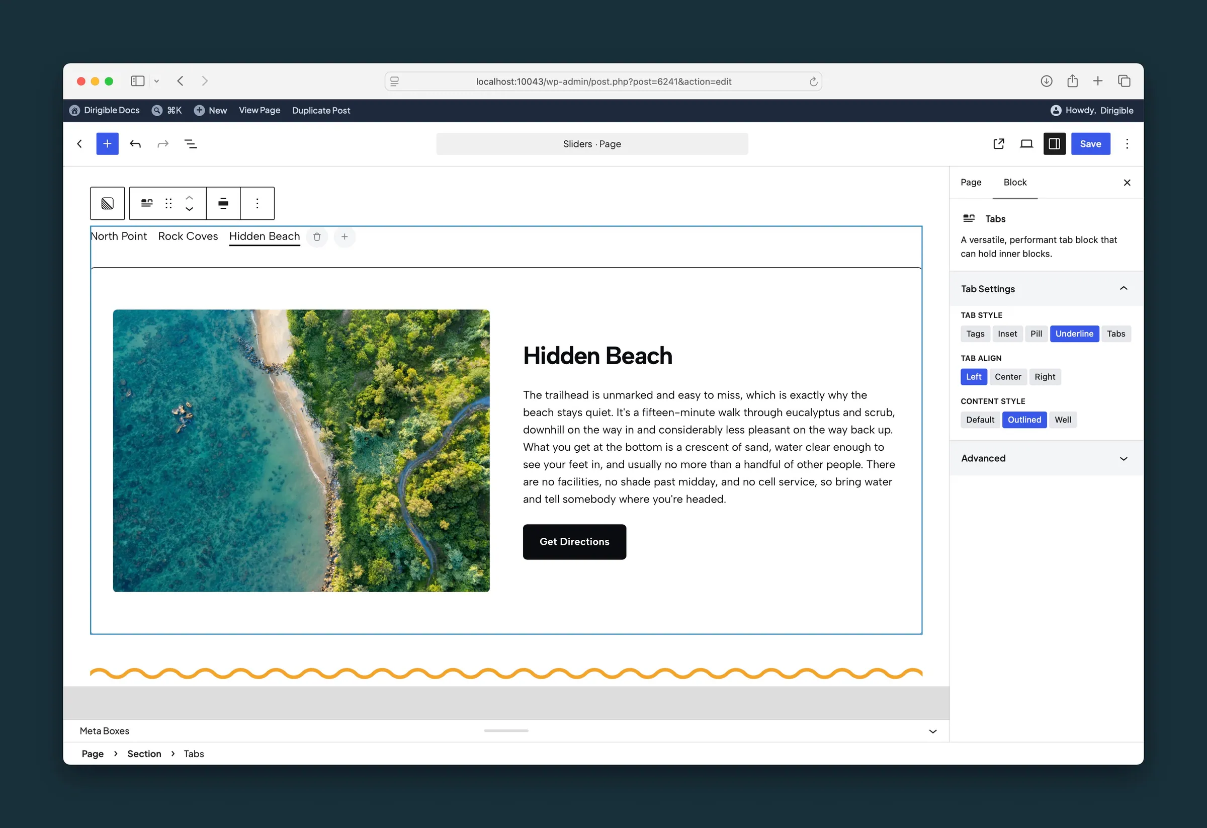
The same block set to Underline, Left, and Outlined.
Settings
Tab Settings
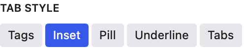
How the tab labels look. Tags matches your site's tag styling; Tabs is the classic bordered look.
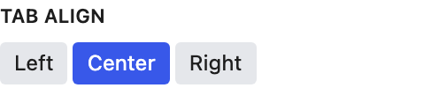
Places the row of tab labels left, center, or right.

Styling for the panel below the tab labels: none, a border, or a subtle background (Well).