

Counters
Animated count-up stats in a responsive grid — milestones, metrics, and highlights.
Usage
Counters shows key numbers as animated stats. Each Counter counts from a start value to an end value when it scrolls into view. Use it for milestones, metrics, years in business, or any number you want to stand out.
Counters only count up (not down). Add as many child counters as you need; the parent grid controls how many appear per row on desktop.
Parent and child blocks
The Counters parent sets layout and shared typography. Each Counter child holds its own number, headline, description, icon, and optional link.
Select the parent to change grid settings in the sidebar or toolbar. Select a child to edit that counter's values and content. Use the block toolbar breadcrumb, parent button, or List View to switch between them.
How the animation works
On the live site, each counter animates once when it scrolls into view. Set Start Number, End Number, and Duration (milliseconds) in the child sidebar — lower duration means a faster count. Prefix and suffix fields add characters before and after the number (e.g. $, %, +).
Numbers format with commas and support decimals when needed.
Grid settings (parent sidebar)
- Columns — maximum counters per row (1–5); cards wrap to the next row and reflow on smaller screens
- Headline Style — typography preset for each counter's title
- Counter Style — typography preset for the animated number
- Link Style — Button, Understated, or Hidden for child links
- Link Entire Card — makes the whole counter card clickable when a URL is set
- Grid Gap — spacing between cards
- Counter Size Adjust — scales the number (and affixes) relative to the counter style
- Icon Size and Icon Display — size of optional icons; Top or Side placement
Block toolbar (parent)
- Alignment — text alignment for child content
- Toggle Background — adds a subtle card background on each counter
- Toggle Text Size — switches description text between normal and small
- Columns — quick access to the per-row column count
Counter settings (child)
Edit inline on the card or in the child Content sidebar panel:
- Start Number and End Number — range for the count-up animation
- Duration — animation length in milliseconds
- Choose Icon — optional image above or beside the counter
- Headline, Prefix, Suffix — label and affixes around the number
- Link URL and Link Text — optional CTA below the description
- Description — paragraph or list content under the headline
Tips
- Use three counters across on desktop for balanced stat rows; the grid wraps automatically on tablet and phone.
- Pair Toggle Background with wide or full block width for a band of stats across the page.
- Set a low duration (e.g. 800ms) for a quick count; use a longer one for a slower build.
Screenshots
Front-end
-
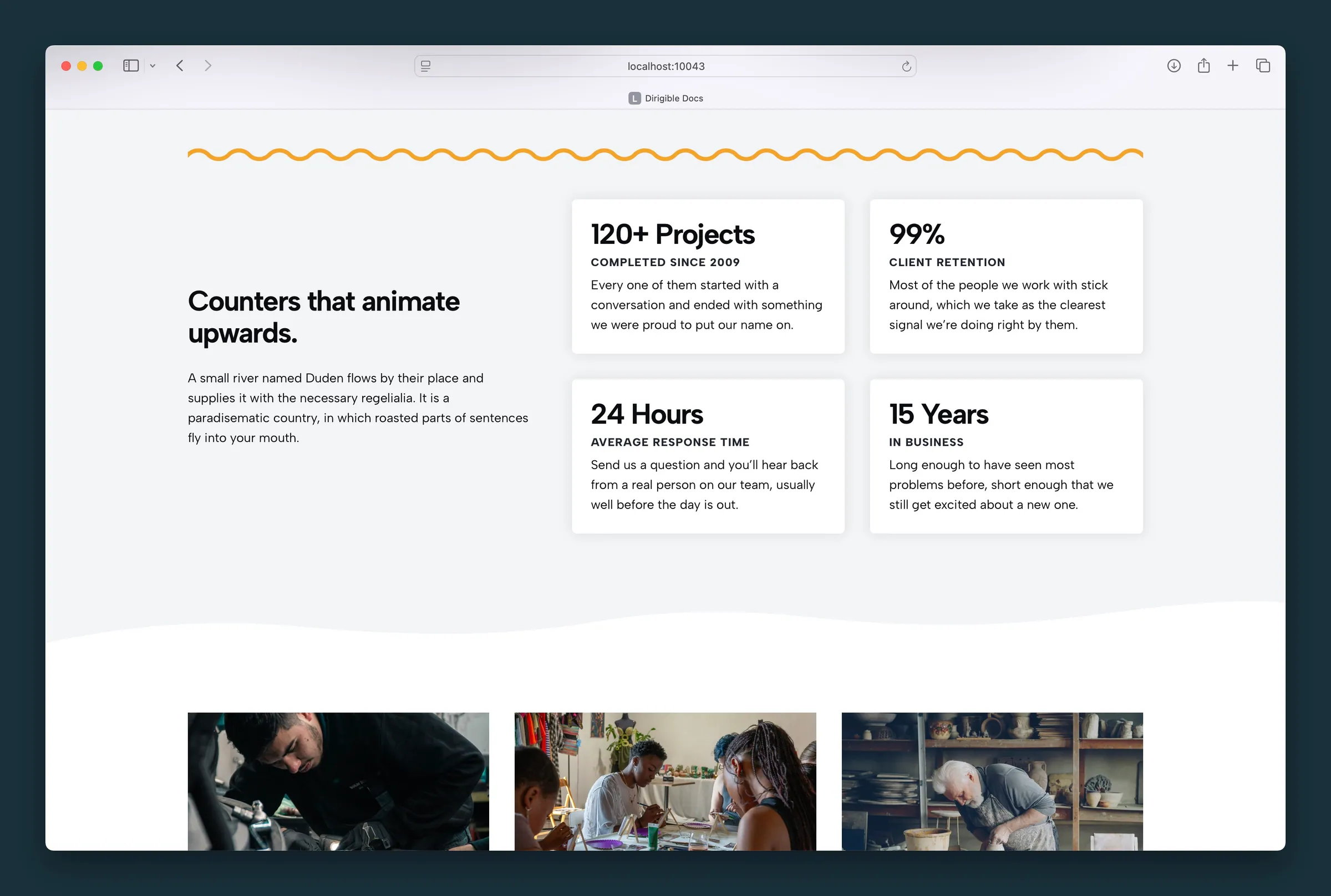
Same two-by-two counter grid with metrics for projects, retention, response time, and years. -
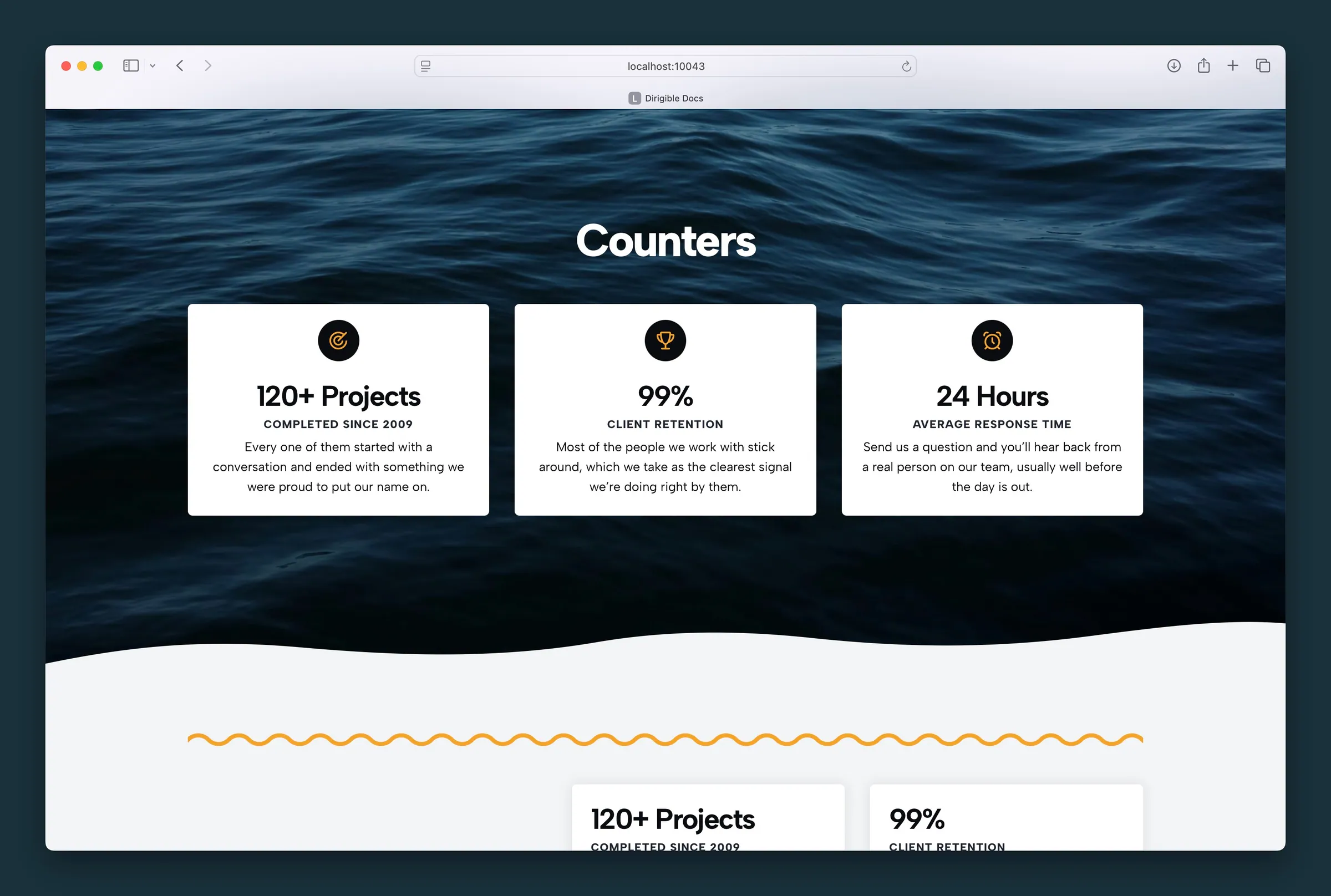
Three icon counters on a photo section — icons above each number and description.
Editor
-
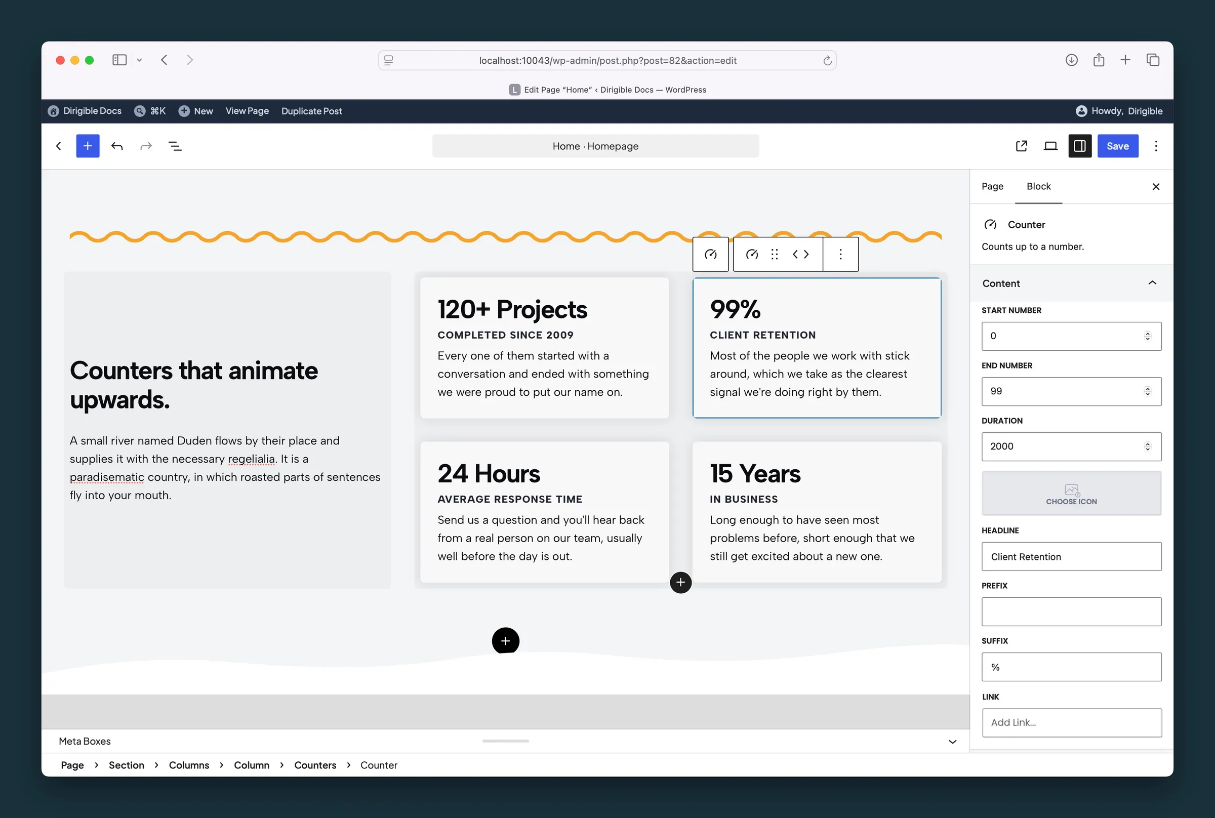
Counter child settings — start/end number, duration, headline, prefix, and suffix. -
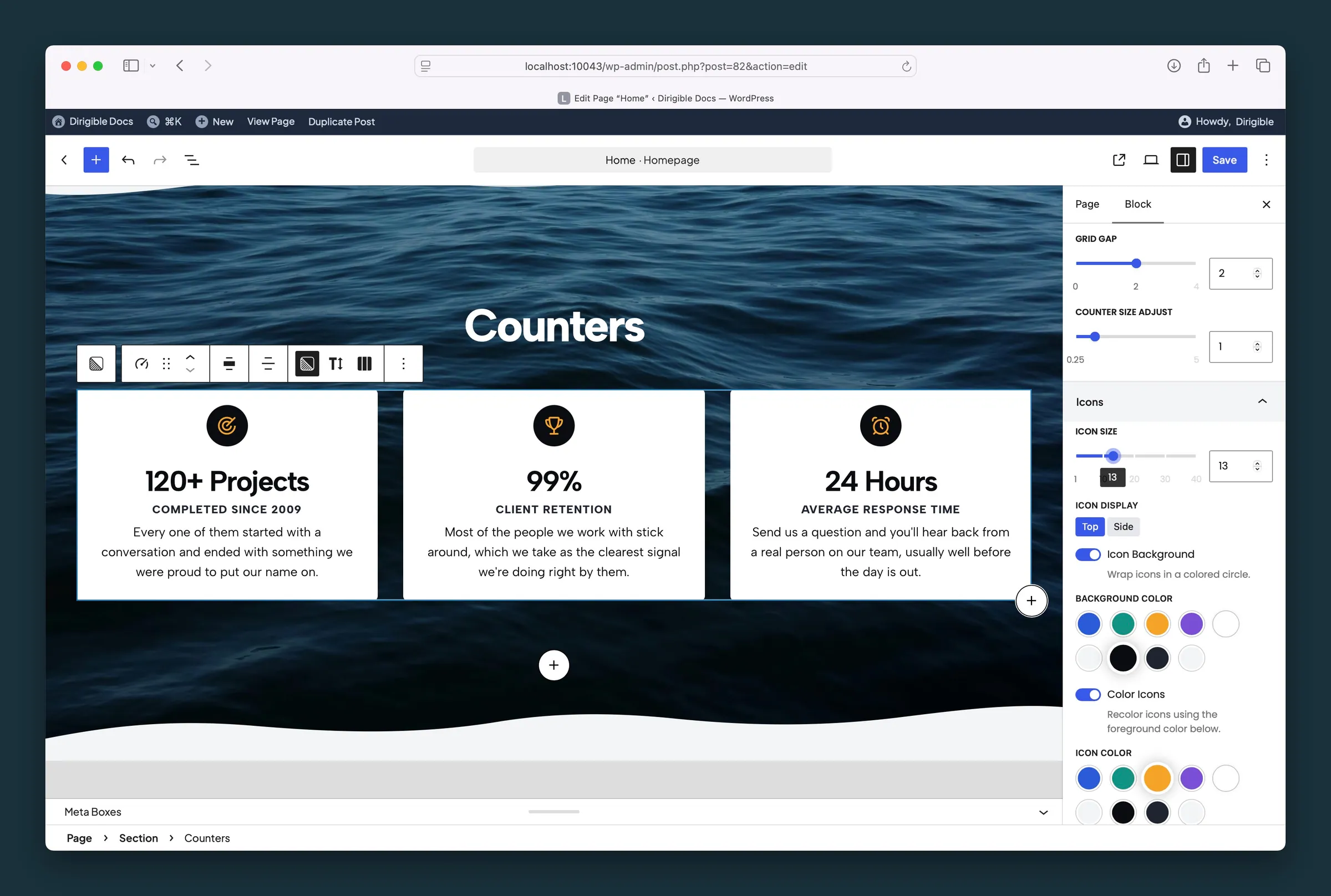
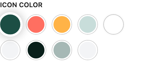
Counters parent settings — grid gap, counter size, icon size, display, and icon colors.
Settings
Grid Settings
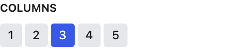
Most counters per row on desktop (1–5). Extra counters wrap to the next row, and rows get narrower on smaller screens.
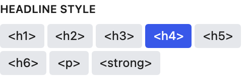
Which text style each counter's headline uses.
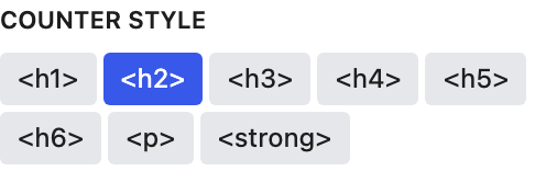
Which text style the animated number uses.
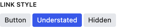
How each counter's link looks: a filled Button, an Understated text link, or Hidden when Link Entire Card already makes the card clickable.

Makes the whole counter card clickable when that counter has a Link URL.


Dark or Light text on the card background. Choosing a card background color picks one for you, whichever reads better on that color; change it any time.

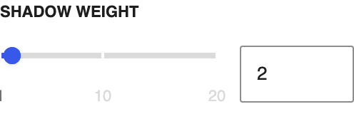
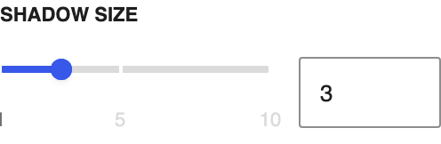
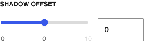
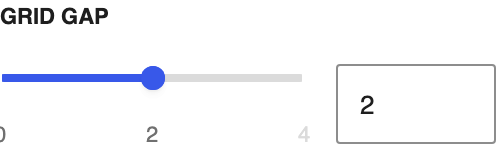
Space between counter cards.
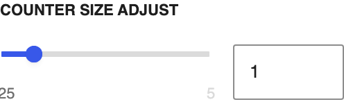
Makes the number, prefix, and suffix larger or smaller than the Counter Style preset.
Icons
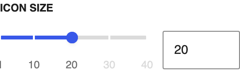
Icon size in pixels, for counters that have an icon.

Puts each counter's icon above the number (Top) or beside it (Side).



Content
The label under the number. You can also edit it on the block.
Text shown before the number, such as a currency symbol.
Text shown after the number, such as % or +.
Optional destination for this counter. Leave it empty if the number should not be a link.