

Stacked Cards
Tell a short story as a stack of cards visitors flip through.
Usage
Stacked Cards shows a deck of cards, one on top at a time. Use Add Card above the deck and put blocks inside each card. Visitors tap or click the top card to bring up the next one, or use the arrows when Add Arrow Navigation is on.
When to use it
Use for step-by-step reveals, product comparisons, or mobile-first stories where a full grid would feel crowded. Each card can hold headings, images, and buttons like a mini section.
Tips
- Select the outer Stacked Cards block for border, rounding, shadow, and arrows. Its previous/next buttons in the editor switch which card you're editing.
- Keep each card's content roughly similar in height so the stack looks even.
- Select a single card to add a Badge such as "Most Popular."
Screenshots
Front-end
-
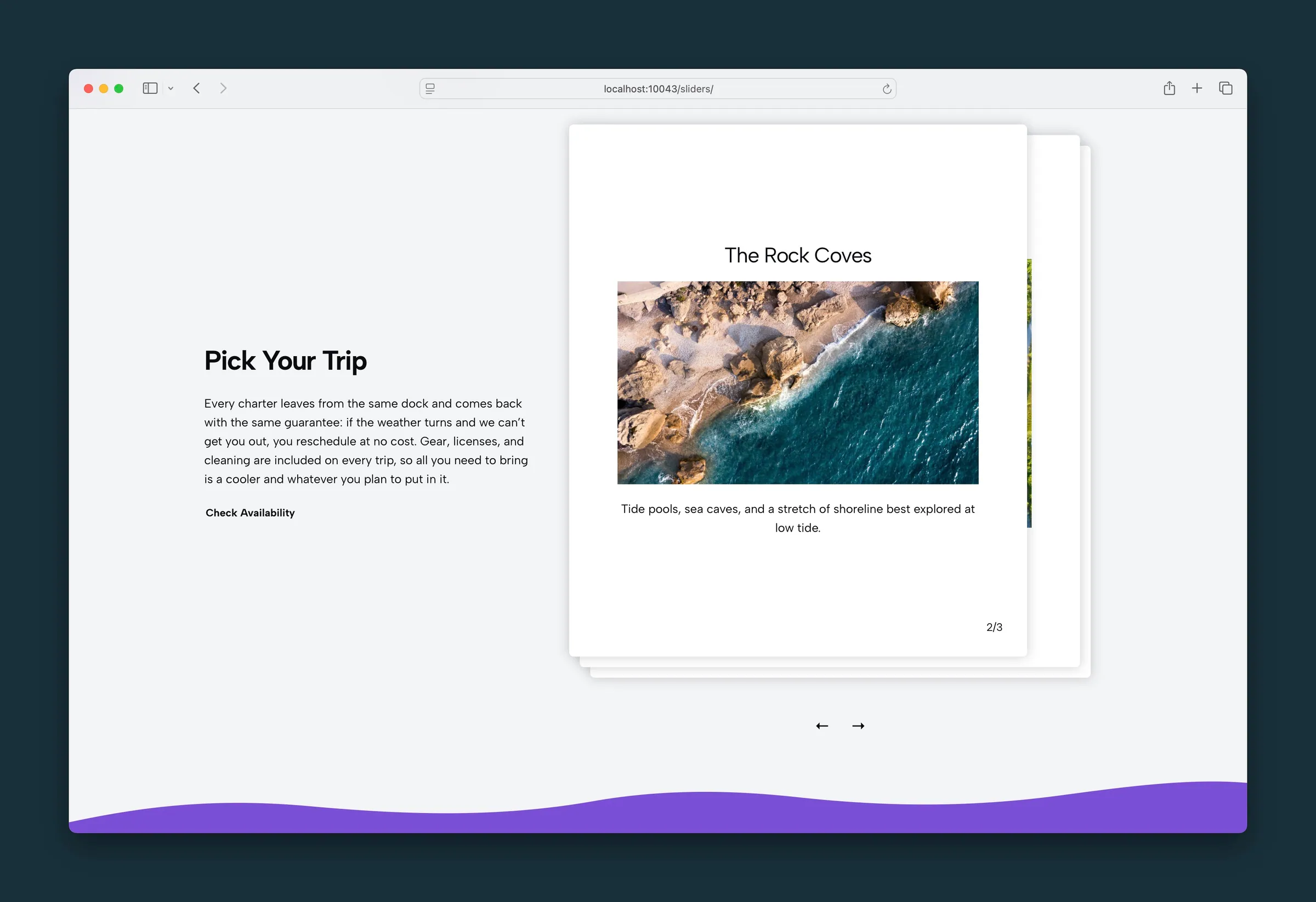
Card 2 of 3 — The Rock Coves on top of the deck, with arrows below. -
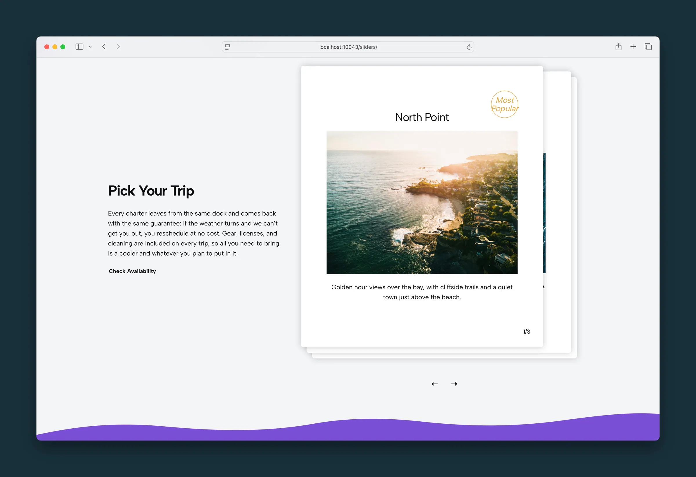
Card 1 of 3 — North Point with a Most Popular badge.
Editor
-
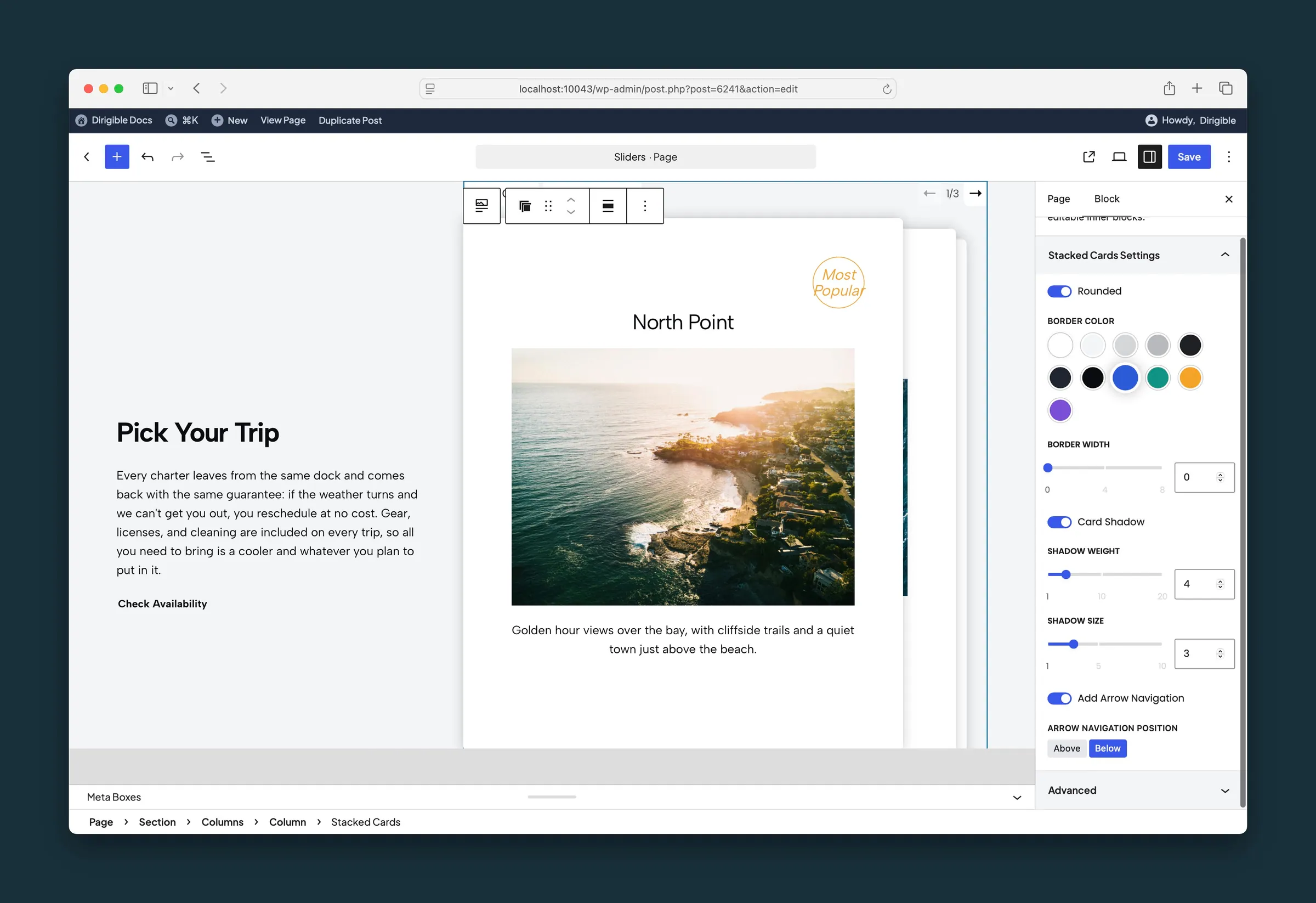
Stacked Cards sidebar — Rounded, border, shadow, and arrow navigation below the deck. -
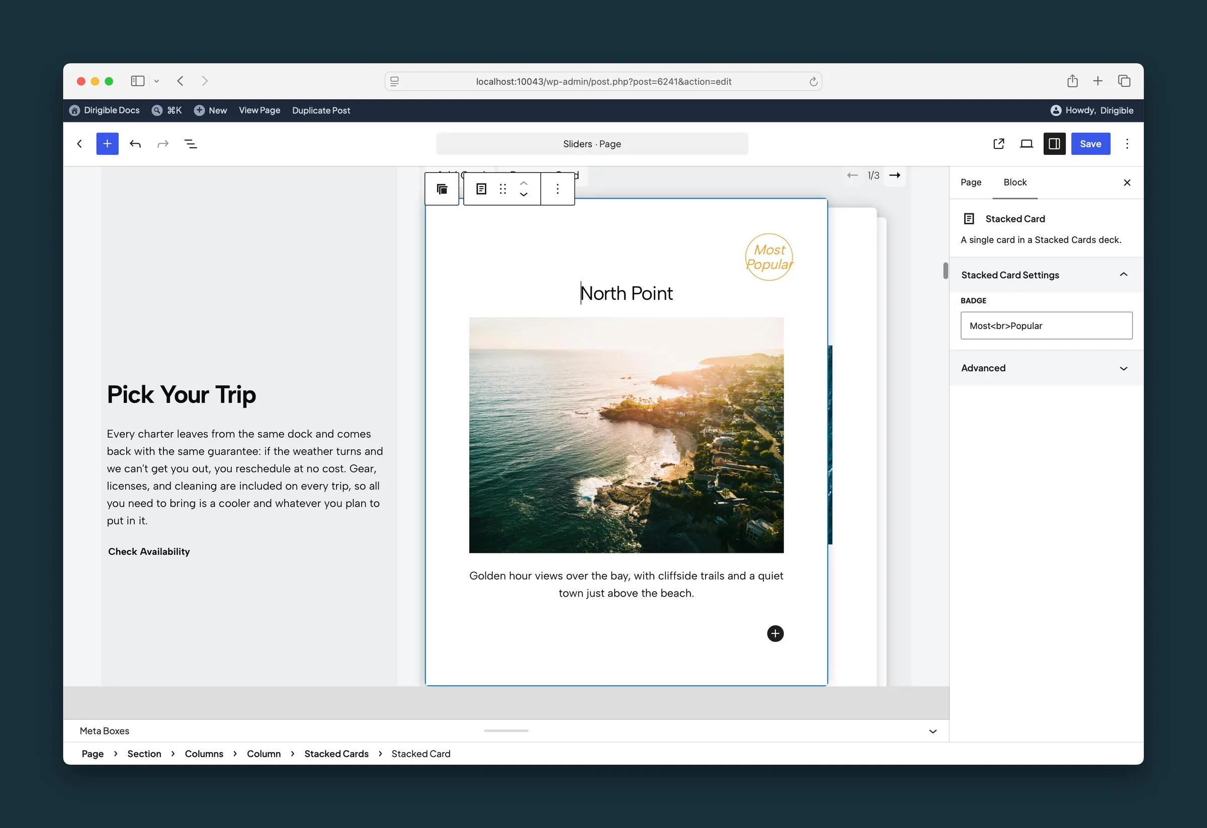
A child card selected — the Badge field for Most Popular.
Settings
Stacked Cards Settings

Rounded

Border Color
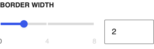
Border Width

Card Shadow
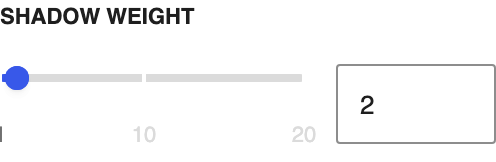
Shadow WeightAvailable when Card Shadow is enabled
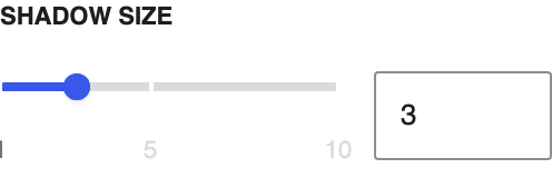
Shadow SizeAvailable when Card Shadow is enabled

Add Arrow Navigation

Arrow Navigation PositionAvailable when Add Arrow Navigation is enabled
Stacked Card Settings
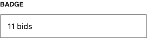
Badge
A small label on the card, such as a bid count. Leave it empty to hide the badge.