

Comparison Matrix
Compare up to six products across a shared feature list — table on desktop, cards on mobile.
Usage
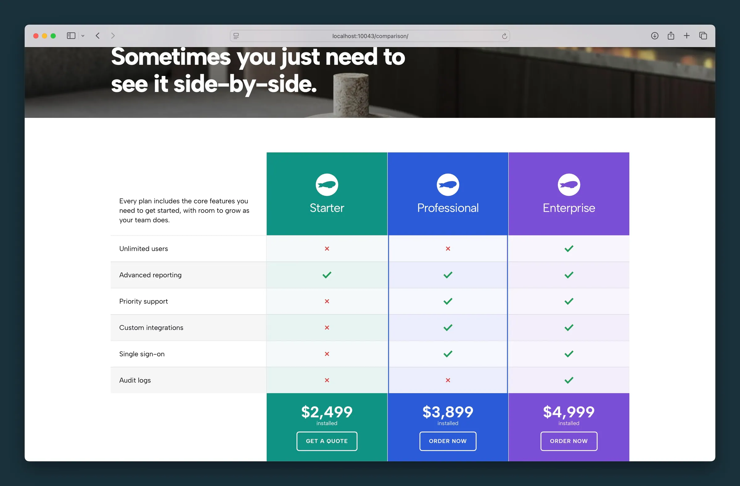
Comparison Matrix is a feature comparison chart: up to six products or plans checked against one shared list of features. On desktop, it shows as a table: feature labels in the left column, one product per column, and check or X icons in each cell. On mobile, each product becomes its own card that lists only the features checked for that product.
The block ships with sample HVAC tier content when first inserted. Use Add Product and Add Feature in the editor toolbar to build your matrix, then check the boxes in each row to mark which features apply to each product.
Building the matrix
- Add Product — adds a column (up to six). Each product header supports image, name, optional price and CTA, and per-column styling.
- Add Feature — adds a row to the shared feature list. Edit labels inline in the left column.
- Checkboxes — toggle whether a feature applies to each product.
- Reorder — arrow controls on each product header and feature row move columns left/right or rows up/down.
- Remove — trash icon on products and features.
Product column settings
These controls appear in each product header on the block canvas (not the sidebar):
- Choose Image — product photo or logo; height is controlled globally from the sidebar.
- Product name — inline headline for the column.
- Accent column — primary-color outline around the whole column to highlight a recommended tier.
- Brand color — fills the product header and footer and tints feature rows with a subtle wash.
- Light header text — appears when a brand color is set; switches the product name, price, and CTA to light text for dark brand colors.
- Price and CTA — shown when enabled in the sidebar; price value and unit are inline, CTA text plus URL field.
Sidebar settings
- Show Price — toggles price and unit in each product footer.
- Show CTA — toggles the call-to-action button (on by default).
- Product Image Height — one shared height for all product images so columns stay aligned.
- Striped Row Color — alternating row background for the label column and product cells.
- Feature Style — typography preset for feature labels (Label is the default uppercase look).
- Icon Style — Circle (badge) or Simple (flat check and X).
- Color Icons — use site success and failure colors for check and X icons.
Desktop vs mobile
On desktop, feature names live in the left column; product columns show icons only. On mobile, the label column is hidden and each product card shows checked features with both icon and label — unchecked features are omitted to keep cards scannable.
Brand color tinting applies on desktop rows; mobile cards use a cleaner white row treatment.
Comparison Table
Use Comparison Table when each tier is mostly standalone copy in its own card. Use Comparison Matrix when multiple products share the same feature checklist and you want a true side-by-side grid on desktop.
Tips
- Keep feature labels short. Desktop columns show icons only, so the left column carries all the meaning.
- Highlight your recommended tier with Accent column and optionally a Brand color.
- Leave Show Price off for feature-only comparisons.
Screenshots
Editor
-
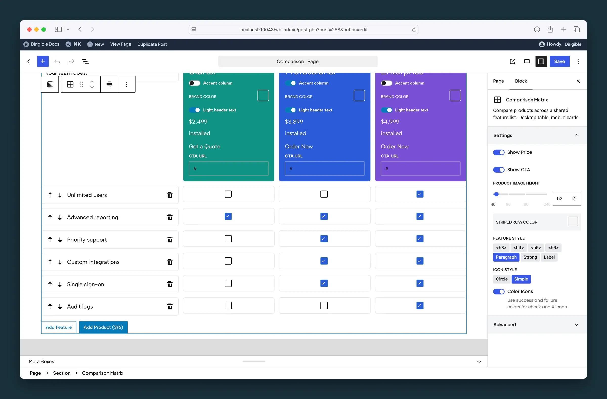
Editor matrix — products, features, and toggles for price, CTA, striped rows, and icon style.
Settings
Settings

Shows a price and price unit in each product footer.

Shows a button in each product footer, so each column can link to a product or checkout page.
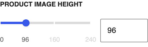
One shared height for all product images, so columns stay lined up on desktop.
Background color for every other row, in both the label column and product cells.
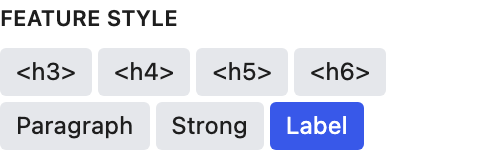
Text style for feature labels, both in the left column on desktop and beside the checks on mobile cards. Label is the default bold uppercase look.

Circle puts check and X icons inside a round badge; Simple shows them flat.

Checks use your site's success color and X icons use its failure color, instead of neutral black and gray.