

Hero
A page-top hero banner with flexible backgrounds, heights, and text placement.
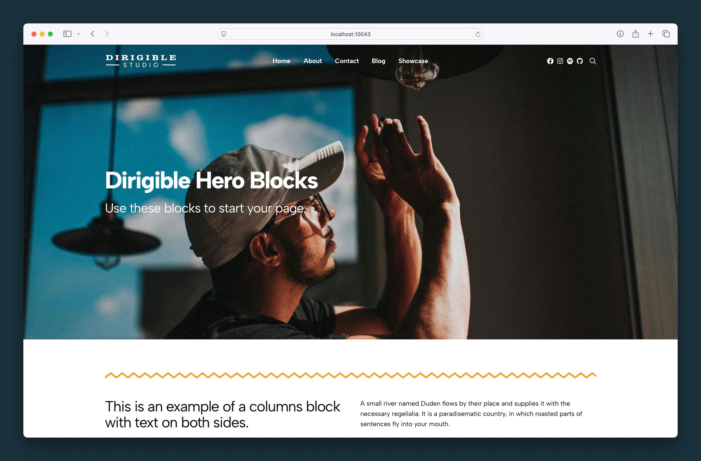
Usage
The Hero is the banner at the top of a page: a big headline, a supporting line, and usually a button, over a photo, video, or color. New pages include one at the top automatically, and the block has plenty of appearance options so you can shape it to fit each page.
A site-wide Customizer setting controls whether your navigation blends into the Hero when it's the first block on a page, or stays separate above it.
Content fields
The Hero has four content fields: Headline, Subheadline, Button, and Logo. Edit them right on the block or in the sidebar. If you delete a field on the block, it disappears from the editor until you add text again in the sidebar.
By default the Headline is the page's H1 and the Subheadline is an H2. Change the heading level with Tag under each field in the Content panel; it appears once the field has text. How the text looks is set separately with Style, so a headline can stay an H1 in the page outline while looking smaller.
- Headline and Subheadline — edit on the block or in the Content sidebar panel
- Link URL — set in the toolbar or sidebar; Link Text appears once a URL is added (defaults to "Learn More")
- Logo — upload with Choose Logo; SVG is recommended. Size sets the logo width in pixels, and the height follows. Remove it with Remove Logo
Layout
- Text Position — places the headline, subheadline, button, and logo within the hero and aligns the text to match. For example, lower-right puts content in that corner and right-aligns it. Right alignment switches to left on mobile.
- Content Width — Wide (default) or Full for the area that holds the text
Typography and button
- Style (under Headline and Subheadline) — text style presets from your Customizer (H1–H6 or paragraph). These change the look only, not the heading level.
- Link Style — Button, Alt, Hollow, Secondary, Ghost, or Subtle for the call to action
Turn on White Text in the block toolbar, or set Text Color to Light in the sidebar, on dark backgrounds. It applies to everything in the hero, so you don't need to set text color on each piece.
Size and height
Size presets set the hero height:
- Auto — same as a small hero on desktop, but grows to fit the content on mobile
- SM, MD, LG, XL — preset heights for desktop and mobile
- Full — fills the screen
Fine-tune with the Desktop Height (VH) and Mobile Height (VH) sliders, measured as a percentage of the screen height.
Text legibility
Help text stand out on busy image or video backgrounds with Overlay (Text Legibility):
- Overlay — a gradient or solid color over the background (Overlay Style, Overlay Color, Overlay Opacity)
- Text Box — puts the content in a box with its own background; follows the Text Color setting
- Text BG — a colored background behind the text area only; often removes the need for an overlay
Overlay Opacity moves in steps of 1%, so you can land on exactly the strength a photo needs; type a number in the field for a precise value. Choose the clear overlay swatch or set opacity to 0% to turn the overlay off.
Text Color follows your choices: picking a background Color sets it to whichever of Dark or Light reads better, switching the Type to Image or Video sets it from the Overlay Color at full strength, and changing the overlay color, style, or opacity re-checks it once the overlay is strong enough to set the tone (a dark overlay from its default opacity up, a light one from 70% up). Change it any time.
Background
Use Type to choose a background, much like the Section block:
- Color — a solid color from your palette
- Image — a photo with focal point, loading options, and optional blur
- Pattern — a repeating texture with a Background Size control; SVG or seamless PNG recommended
- Video — a background video; its first frame is used as the poster and mobile fallback
Image and video backgrounds have BG Focal Point, Disable Lazy Load, and High Fetch Priority. Image backgrounds also have Blur and Blur Amount.
If the video is large or a .mov (as phone videos usually are), a note under it offers Optimize for web: your browser makes a small MP4 copy and the hero switches to it, while the original stays in the Media Library. See Optimize background videos.
Block width
The Hero supports Wide and Full alignment from the block toolbar (Full is the default). Full-width heroes span the whole screen; Wide follows your content width.
Screenshots
Front-end
-

Contact-page hero with bottom-left copy over a photo, followed by an image-and-text band. -
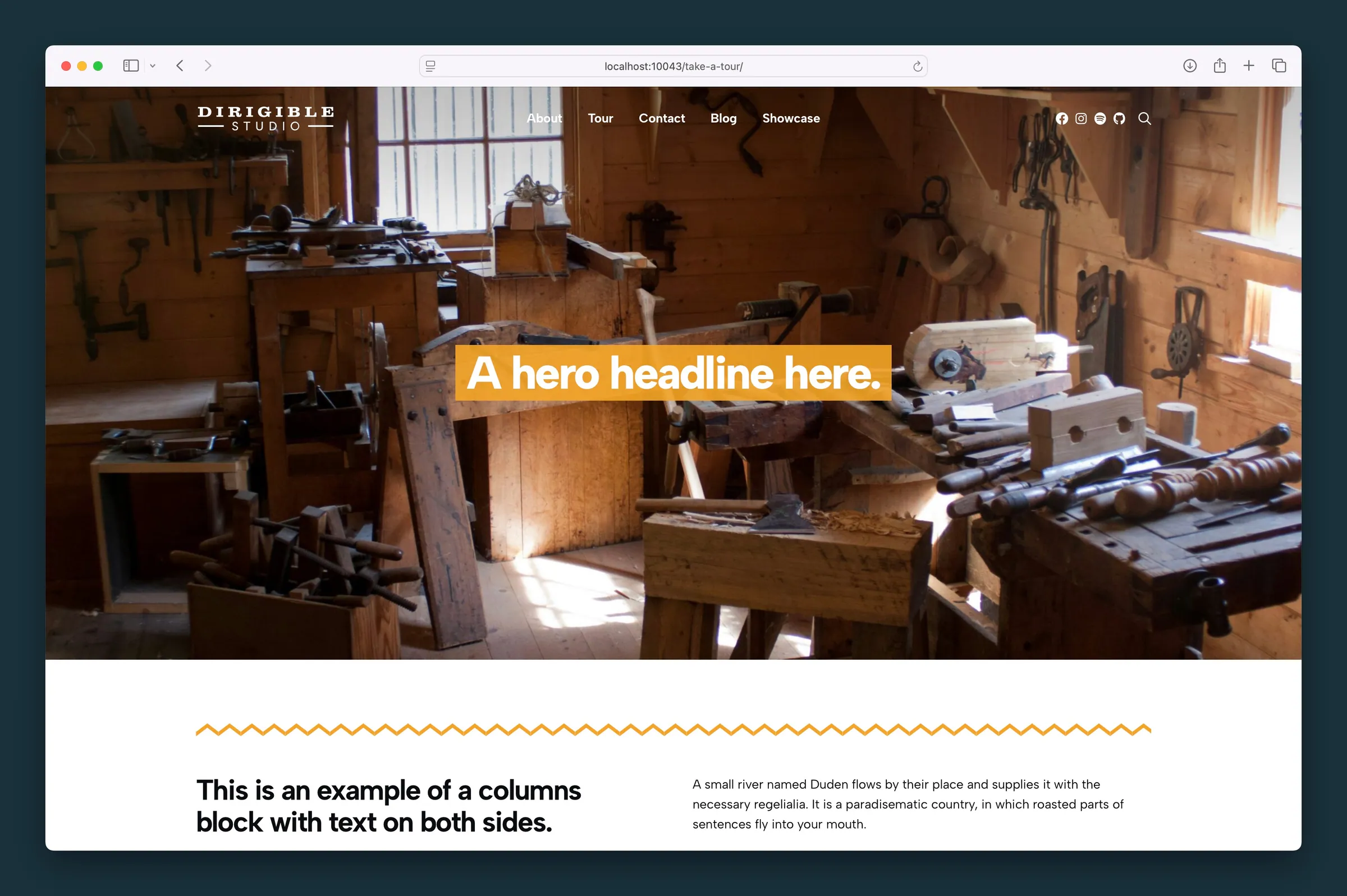
Hero with a boxed headline over a photo background and a zigzag edge into columns.
Editor
-
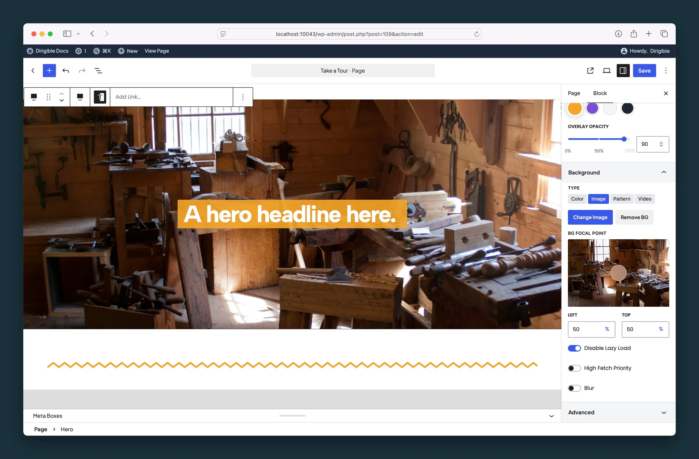
Image background settings — overlay opacity, focal point, and lazy-load options. -
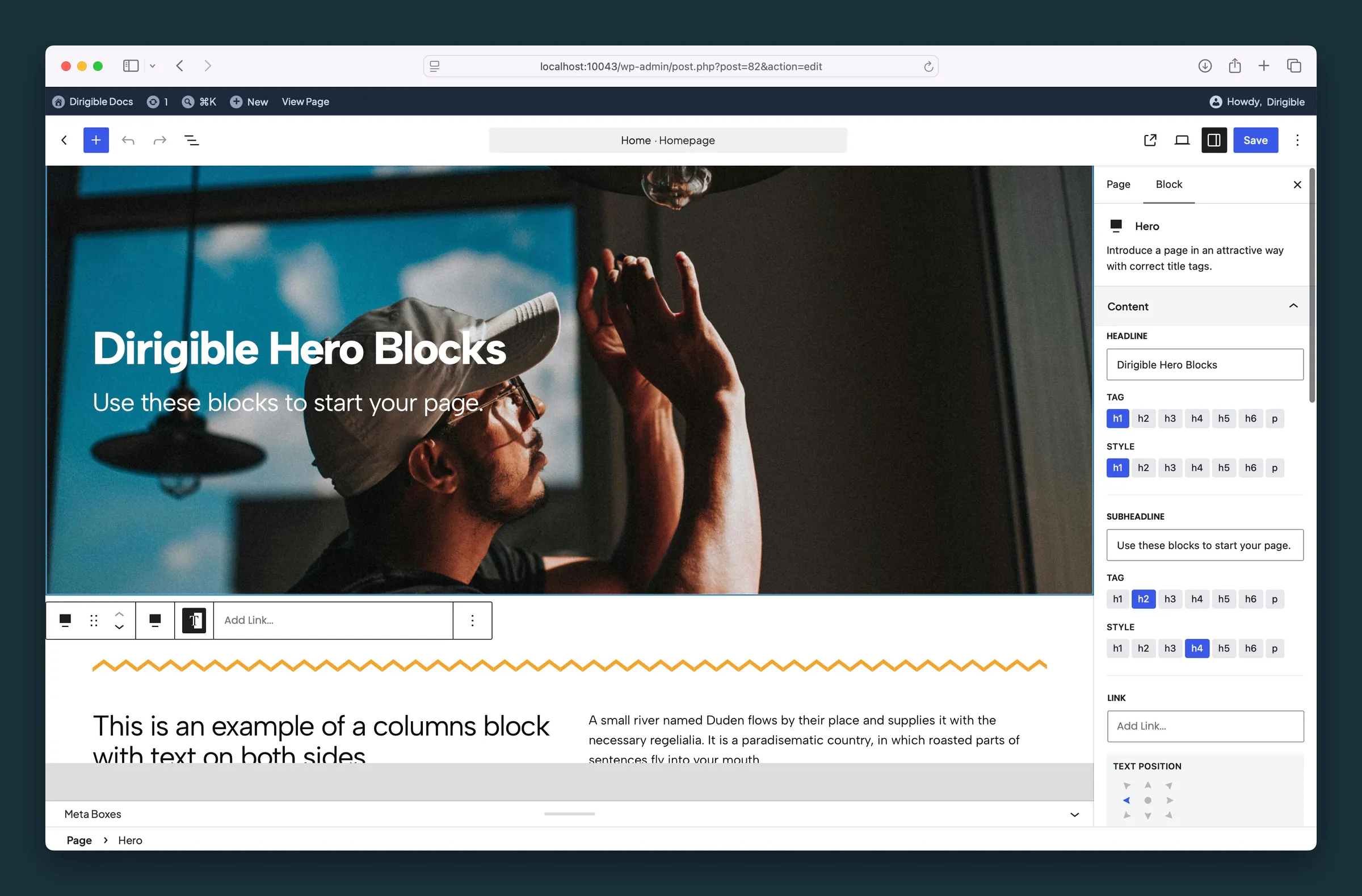
Hero content settings — headline, subheadline tags and styles, and text position.
Settings
Content

The main heading of the hero. You can also edit it right on the block.
How the headline looks. It doesn't change the heading level; use Tag for that.
A supporting line below the headline. You can also edit it right on the block.
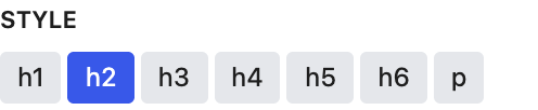
How the subheadline looks. It doesn't change the heading level; use Tag for that.

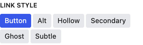

Appears once Link URL is set.
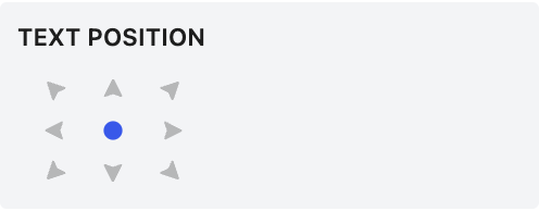
Where the content sits in the hero, with text aligned to match. Right alignment switches to left on mobile.

An optional logo above the headline. SVG files stay sharp at any size.
Logo width in pixels. The height follows automatically.
Appearance

Whether the text area spans the full width of the hero or stays within the wide content width.
Auto matches SM on desktop but grows to fit the content on mobile. Full fills the screen.

Hero height on desktop, as a percentage of the screen height. Choosing a Size preset resets this.
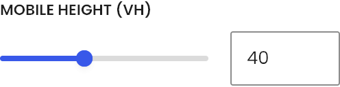
Hero height on phones, as a percentage of the screen height. Choosing a Size preset resets this.
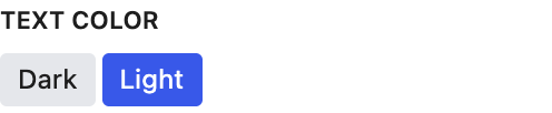
Light switches all the hero's text to light colors for dark backgrounds. Set it here rather than on individual pieces, so you can change the background later without restyling. Choosing a background color picks Dark or Light for you, whichever reads better on that color; change it any time.

Helps text stand out on image or video backgrounds. Overlay tints the whole background, Text Box puts the content in a box, and Text BG adds a background behind just the text.

Gradient fades the overlay color across the background; Overlay covers it evenly. Changing it re-checks Text Color from the overlay color and opacity.
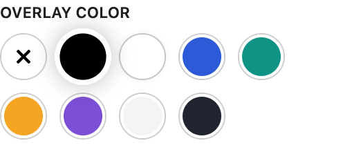
Tints the background with a palette color, black, or white, so text reads more easily. Changing it also sets Text Color when the overlay is strong enough to set the tone: a dark overlay from the default opacity up, a light one from 70% up. Change Text Color any time.
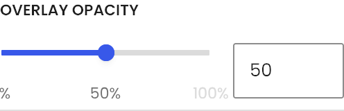
How strong the overlay is, in steps of 1%. 100% is a solid color; 0% turns the overlay off. Dragging it also updates Text Color as the overlay starts or stops dominating the image; a dark overlay counts from the default opacity, a light one from 70%. Change Text Color any time.
Background
What fills the hero background: a solid color, image, repeating pattern, or video. Each type shows its own settings below. Switching to Image or Video sets Text Color from the Overlay Color as if it were at full strength (black suggests Light, a near-white overlay suggests Dark); switching to Color reads the color. Change Text Color any time.


Drag the dot to the most important part of the image. That spot stays in view as the hero crops on different screen sizes. It follows the image's focal point from the Media Library until you move it here; after that it's this block's own.

Loads the background right away instead of waiting until it's needed. In a Slider, this applies to the first slide; later slides load just before they appear.

Tells the browser to load the background image before other images, so the hero appears sooner.

Blurs the background image. Helpful when a busy photo makes text hard to read.
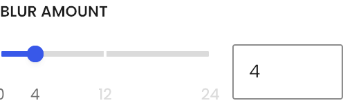
Higher values blur the background image more.
An image that repeats across the hero background. Good for subtle textures.
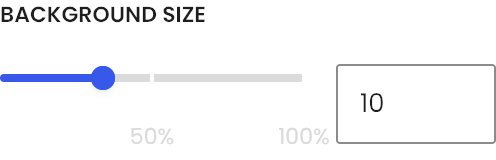
Scale of the repeating pattern.

The video plays behind the hero. Its first frame is used as the poster and mobile fallback. A large or .mov video shows an Optimize for web note, which swaps in a small MP4 copy.