

Link in Bio
Because you shouldn't have to pay extra to promote your brand.
Usage
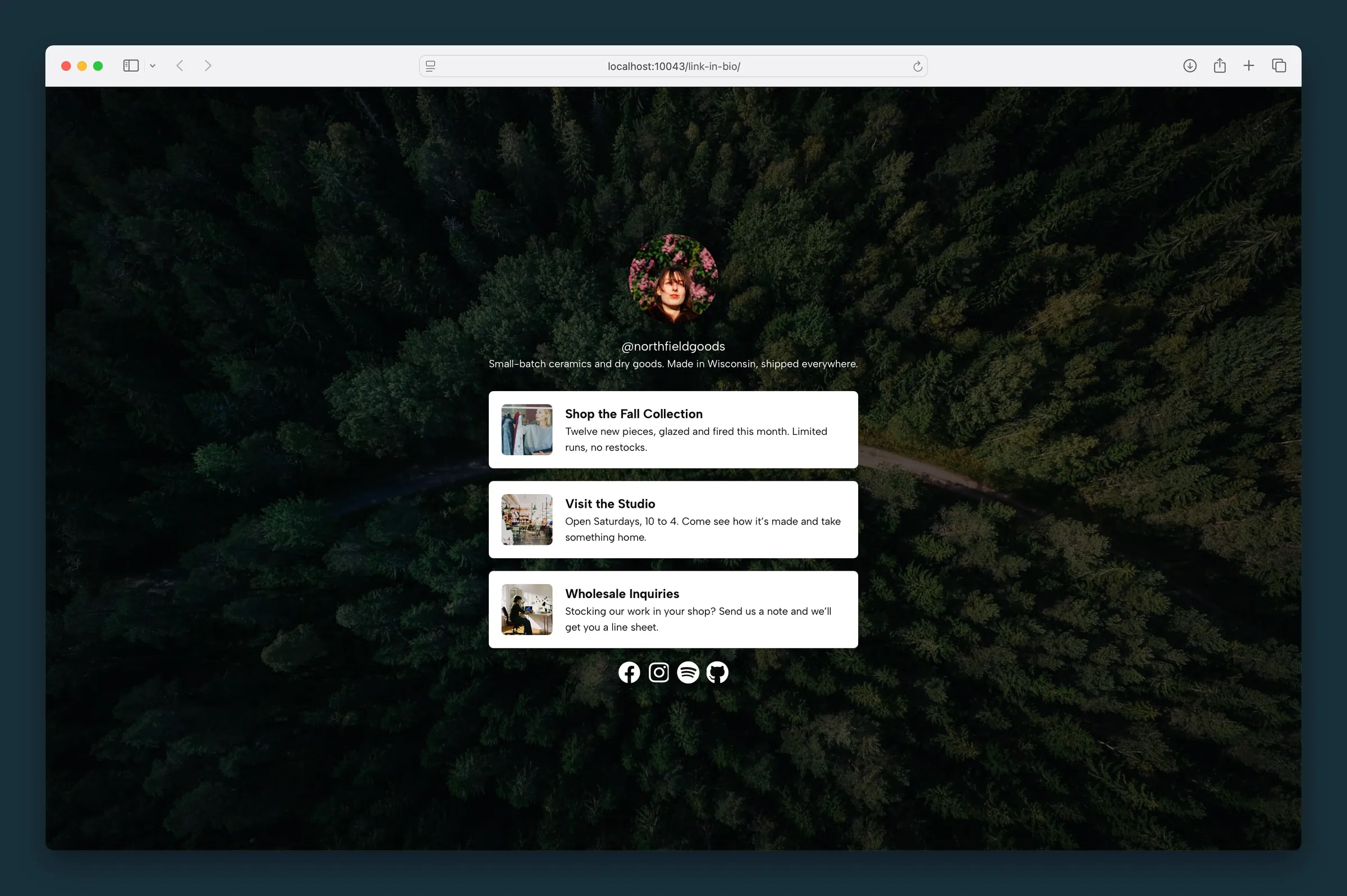
Build a link in bio page on your own site — the one link you put in your Instagram, TikTok, or other social profile — without paying for a third-party service. The Link in Bio block shows your photo, handle, a short bio, and a stack of link cards for partnerships, new products, or anything you want followers to find.
Dedicated link-in-bio pages come with this block already in place. They hide the site header and footer so visitors see only your links. Their web address always includes /link-in-bio/.
To use a custom URL instead, add a Link in Bio block to any regular page and choose Page → Template → Landing Page to strip the header and footer. You can even set that page as your homepage while building out the rest of the site.
Content fields
Three profile fields at the top of the block:
- Avatar Image — circular profile photo with Avatar Focal Point and Avatar Size
- Handle — short identifier (defaults to
@your-handle); edit inline or in the sidebar - Bio — short description below the handle
Deleting a field inline removes it from the canvas until you add content again from the sidebar.
Parent and child blocks
The Link in Bio parent contains Link Card children (plus optional Socials in the default template). New pages start with three link cards.
Select the parent for avatar, handle, bio, link styling, and page background. Select a Link Card child to edit that link's URL, headline, body, image, and visibility.
Use the parent button in the toolbar, breadcrumb path, or List View to move between parent and child blocks.
Link styles (parent)
Settings in the Links sidebar panel apply to every link card:
- Headline Style — changes how link titles look
- Text Size — Default or Small for link descriptions
- Corners and Image Corners — Sharp, Rounded, or Circle on cards and thumbnails
- Padding — space inside each card
- Image Size — thumbnail size
- Text Color (reverse print) — light text on dark link backgrounds
- BG and BG Opacity — card background color and transparency, in 1% steps
Individual links (child)
Each Link Card supports:
- Link URL — destination
- Headline and Body — title and description (editable inline)
- Image — optional thumbnail with focal point
- Show / Hide / Scheduled — visibility control. Scheduled links expose Start Date and End Date pickers; links outside that window appear dimmed in the editor and are hidden on the front end. A link appears and disappears on time by itself, in the site's timezone, even on pages the host has cached; you don't need to update the page. Leave a date empty to keep that end of the window open
Block settings (parent)
- Text Color (reverse print) — light text for the handle, bio, and other content on dark page backgrounds
- Max Width — caps how wide the content column gets (default 40)
- Background Type — Color, Image, Gradient, or Pattern (same options as Section/Landing Page)
Image and pattern backgrounds include overlay color and opacity (in 1% steps). Gradients support start/end colors and direction.
Block width
Link in Bio supports Wide and Full alignment from the block toolbar (default is full width). The block fills the height of the screen, laid out first for phones.
Screenshots
Editor
-
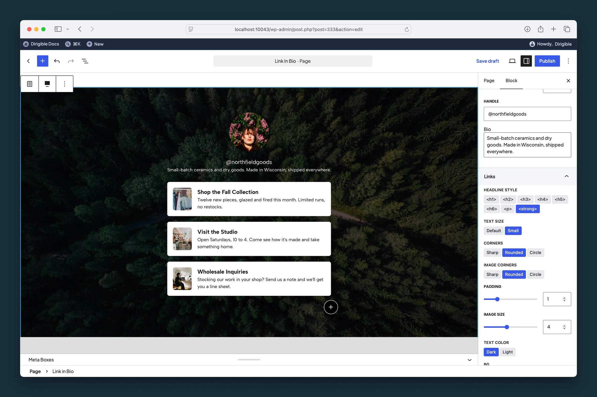
Link in Bio parent Links panel — handle, bio, and shared card styling for every link row. -
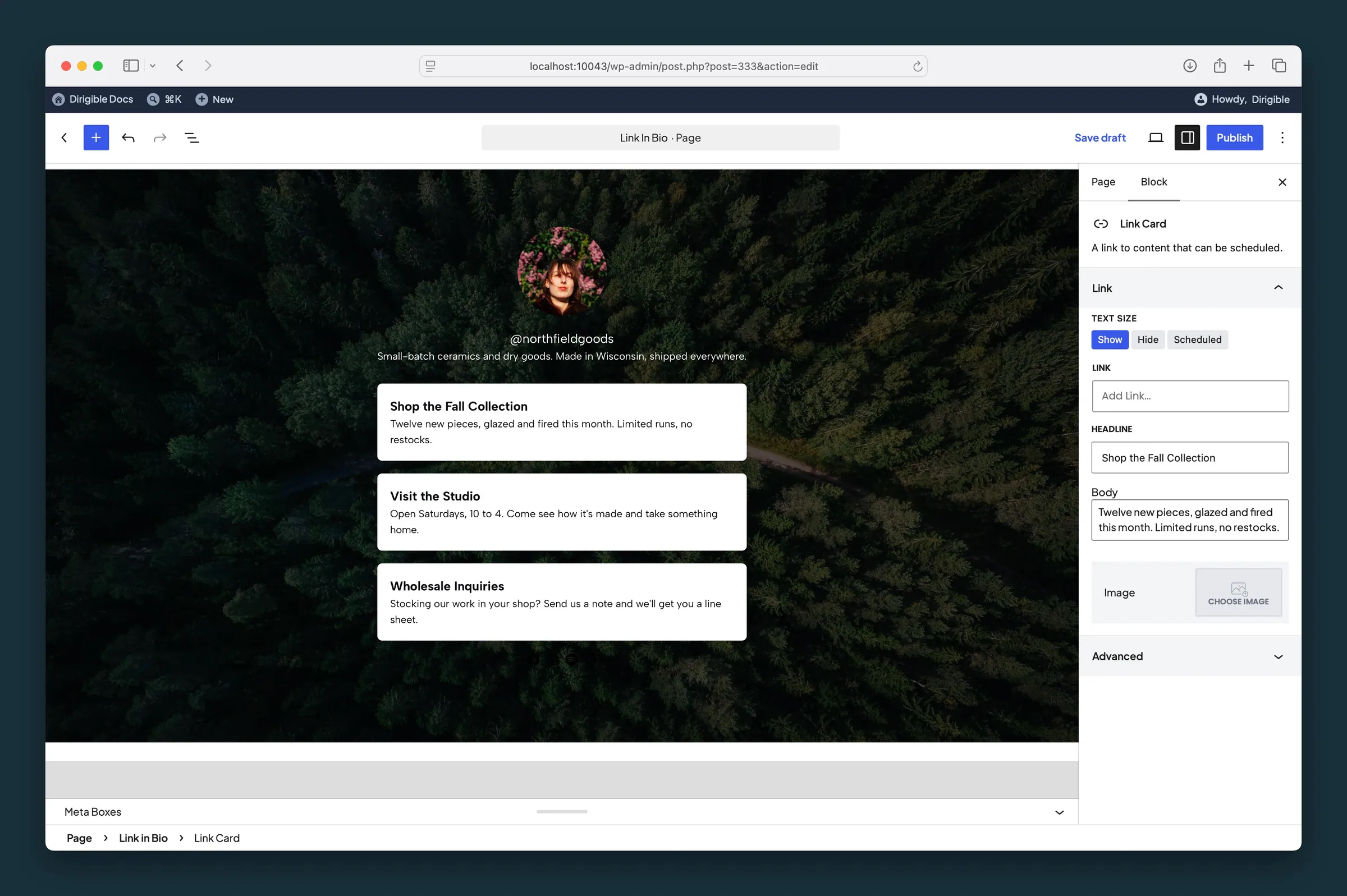
Link Card child settings — URL, headline, body, thumbnail, and Show / Hide / Scheduled visibility.
Settings
Content

Sets the focal point for the circular avatar image. It follows the image's focal point from the Media Library until you move it here; after that it's this block's own.
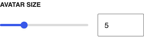
How large the round profile photo appears.
Social handle or short name displayed below the avatar (e.g. @your-handle).
Links
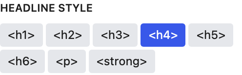
Changes how the headline looks on every link card, using your Customizer type styles.
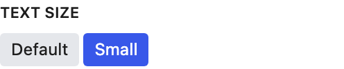
Text size for the description on every link card.

Corner shape of each link card.
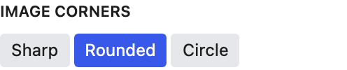
Corner shape of each link card's thumbnail.
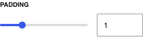
Space inside each link card.
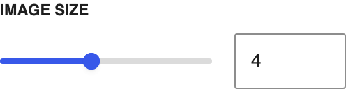
Size of the thumbnail on each link card.
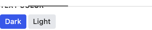
Light or dark text on the link cards. The **Text Color** under **Block Settings** controls the handle and bio separately.
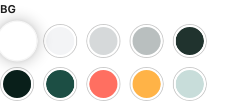
Background color for each link card.
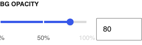
How see-through the link card background is, in steps of 1%.
Block Settings
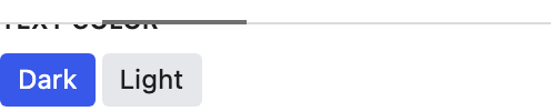
Light text for the handle, bio, and other content on a dark page background. Choosing a background color picks Dark or Light for you, whichever reads better on that color; change it any time.
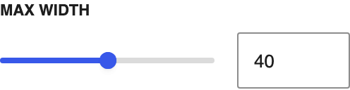
Caps how wide the centered column can get.

Focal point for the page background image. It follows the image's focal point from the Media Library until you move it here; after that it's this block's own.


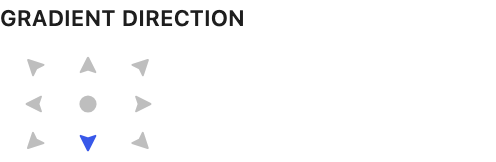
Gradient flow direction, including radial center.

Tints an image or pattern background so text stays readable. Changing it also sets Text Color when the overlay is strong enough to set the tone: a dark overlay from the default opacity up, a light one from 70% up. Change Text Color any time.
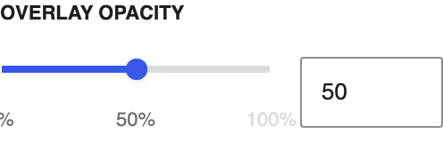
Overlay strength from transparent to solid, in steps of 1%. Dragging it also updates Text Color as the overlay starts or stops dominating the image; a dark overlay counts from the default opacity, a light one from 70%. Change Text Color any time.
Scale of the repeating background pattern.
Link
Shows or hides this link. The sidebar label says Text Size, but the choices control visibility. Hide keeps it off the live page. Scheduled shows it only between the start and end dates you set.
- Show defaultAlways visible.
- HideHidden on the live page.
- ScheduledVisible only between Start Date and End Date.
Where this link goes.
The link title. You can also edit it on the block.
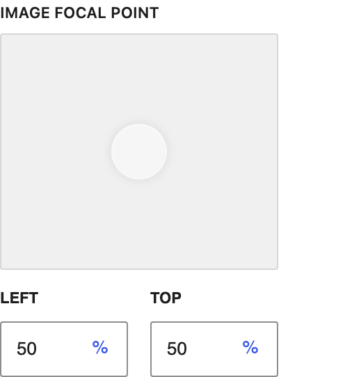
Drag the dot to the part of the photo that should stay in view. Appears after you choose an image. It follows the image's focal point from the Media Library until you move it here; after that it's this block's own.