

Link Row
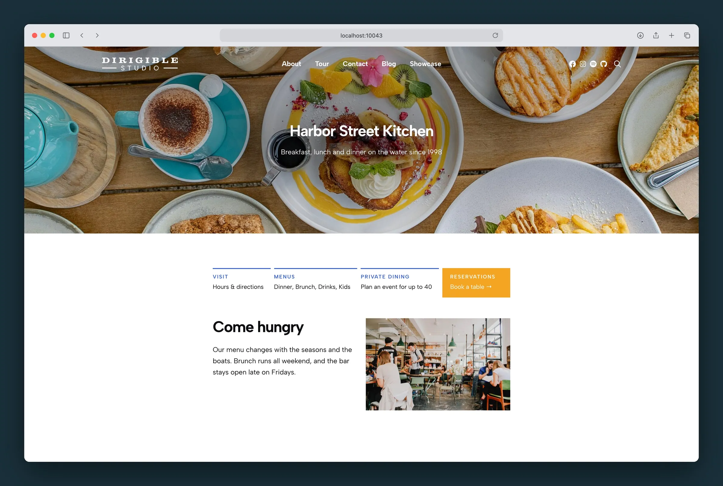
A quiet row of labelled links side by side, with an optional colored callout.
Usage
Link Row puts a few groups of links side by side: the line of quick links under a mega menu, a row of contacts above a footer, a "more in this section" strip at the end of a page. Each Link Row Item has a small uppercase label and one or more lines of links under it.
Item widths follow their content: short items get just the room they need, an item with more to say (a list of five services) gets the rest, and the row always fills its full width.
Every label looks the same and every link is the same size and color, so the row stays calm and readable. The one thing that stands out is an item you give a background color, such as a "Get started · Book a free call →" callout at the end of the row.
Type a label right on the item, then the links under it. Links are ordinary paragraph links: select words and press the link button. An item can hold paragraphs, a list, or Icon + Text lines when a link needs an icon.
Use Add Item under the row to add more.
When to use it
- Link Row is for a handful of short, quiet links in labelled groups, where no single link should shout. It suits menus, footers and the end of a page.
- Action Strip is one big call to action across the page with a headline. Use it when there is one thing to do, not several.
- Pills are short tags or categories in a wrapping row, each a rounded label. Use them for filters or topics, not for groups of links.
- Columns with paragraphs can make the same layout, but every color, size and spacing is set by hand on every paragraph. Link Row keeps them all in step for you, lines the labels up, and stacks itself on phones.
Items
Select an item to set:
- Link URL — makes the whole item one link. A click anywhere on the item follows it, the keyboard stops on it once, and a screen reader reads its label and text together ("Get started, Book a free call"). Use it for a callout. Leave it empty to link words inside the item instead. An item with a Link URL can't hold links of its own (a link can't sit inside another link): the sidebar warns you and offers Remove Links Inside, which keeps the words.
- Background Color — fills the item. Picking one sets Text to whichever of Dark or Light reads better on it.
- Text — Dark or Light text for the label and links, as on the Section block. Light also turns the keyboard focus line white.
- Text Color — a palette color for the label and links instead. Leave it on Text for the dark or light text above, and check that a color you pick still reads on the background.
Settings
Select the Link Row (the parent) for:
- Gap — the space between items, from 0 to 48 pixels (24 by default). With Lines on, it's also the break between one line and the next.
- Pad Every Item — gives items without a background the same inner spacing as items with one. Off (the default), plain items line up with the content around the row and only filled items are inset.
- Label Color — the color of every label. An item with Light text or its own Text Color uses that instead.
- Lines — a line over each item, as wide as the item, with the gap between one and the next. A filled item's color runs up to the top of its line, so a colored callout lines up with the lines beside it. The lines don't push the labels down, so labels stay level. Line Color is the row's Label Color until you pick another (Use the Label Color goes back to it), and Line Width is 1 to 4 pixels (2 by default). For one line across the whole row, put a Separator above it instead.
- Margin (under Dimensions) — space above and below the row. A negative top margin pulls the row up closer to the block above it.
On phones and narrow spaces
Where the row is narrower than about 600 pixels (a phone, a sidebar, a mobile menu), the items stack one per row, each at full width. A filled item stays filled across the width.
Tips
- Keep it to two to five items, and labels to one or two words.
- Labels sit level whether an item has a background or not, so a filled callout can sit at the end of a plain row.
- Lines with a small Gap (around 8 pixels) and one filled item make the row read as a set of tabs, with the colored one standing out.
- Type a text arrow (→) at the end of a callout's text rather than adding an icon: it stays the same size and color as the words.
- For an icon in front of a link, use an Icon + Text line inside the item.
Settings
Settings
The space between items, from 0 to 48 pixels. With Lines on, it's also the break between one line and the next.
0 to 48, in steps of 4. Default 24.
Gives items without a background the same inner spacing as items with one. Off, plain items line up with the content around the row and only filled items are inset.
Off by default.
The color of every item's label. An item with Light text or its own Text Color uses that instead.
Lines
A line over each item, as wide as the item, with the gap between them. A filled item's color runs up to the top of its line. For one line across the whole row, put a Separator above it instead.
Off by default.
The color of the lines. Until you pick one it's the row's Label Color; Use the Label Color goes back to it.
How thick the lines are: 1 to 4 pixels.
Link
Makes the whole item one link, for a callout with its own background color. A click anywhere on the item follows it, and a screen reader reads the label and text as the link. Leave it empty to link words inside the item instead.
Colors
Fills the item with a palette color. Picking one sets Text to whichever of Dark or Light reads better on it.
Dark or Light text for the item's label and links, as on a Section. Light also turns the keyboard focus line white.
A palette color for the item's label and links instead of the dark or light text. Check that it still reads on the background.
