

Media Callout
Showcase your media in a side-by-side layout.
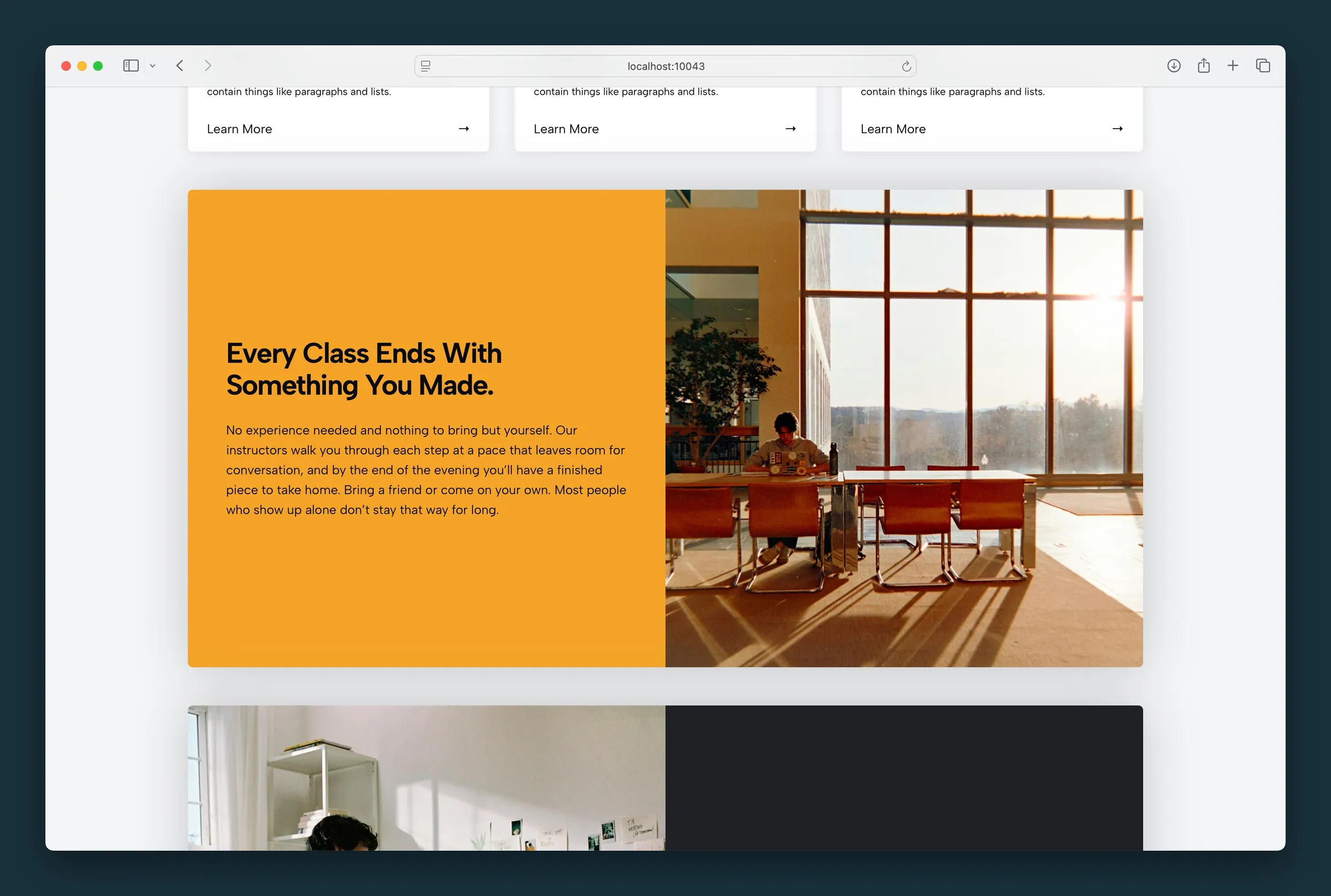
Usage
Media Callout puts an image, video, or embed beside a column of text, so visitors take in the picture and the message together. Use it for a feature highlight, a program or class spotlight, or a call to action with a photo.
You can size the columns, round the corners, add a drop shadow, swap the sides, and style the text column's background, text color, and content position.
Parent and child blocks
The Media Callout parent holds two fixed child columns:
- Media — holds one Image, Video, or Embed block
- Copy — holds a heading, paragraph, and other blocks
Select the Media Callout parent for column sizing, rounded corners, shadow, and swap order. Select Copy for background color, text color (reverse print), and content position. Select Media to replace or edit the media inside that column.
Use the parent button in the toolbar, breadcrumb path, or List View to jump between parent and child blocks.
Parent options
- Columns Size — five presets from larger-left through even to larger-right (toolbar icons or sidebar)
- Rounded — rounds the corners of the whole callout
- Swap Blocks — swaps media and copy on desktop; on mobile the media always comes first
- Add Shadow — optional drop shadow with Shadow Weight, Shadow Depth, and Shadow Offset
Copy column
Select the Copy child block to style the text column:
- Change content position — a grid that positions text within the column and aligns the blocks inside it (toolbar or sidebar). Right-aligned layouts switch to left alignment on mobile for readability.
- Text Color (reverse print) — light text on dark backgrounds, applied to everything in the column. Use this instead of coloring each heading and paragraph, so the text stays readable if you change the background later.
- Color — background fill from your site palette
Media column
The Media column holds a single Image, Video, or Embed block. To change it, select the media column and pick a different image or block type.
Block width
Media Callout supports Wide alignment from the block toolbar and is wide by default, which gives both columns room.
Tips
- Use Swap Blocks when the photo’s subject faces the wrong direction for your layout.
- Turn on Text Color (reverse print) whenever you pick a dark background Color.
- Keep copy concise — the layout works best with a short headline and one or two paragraphs beside the media.
Screenshots
Front-end
-
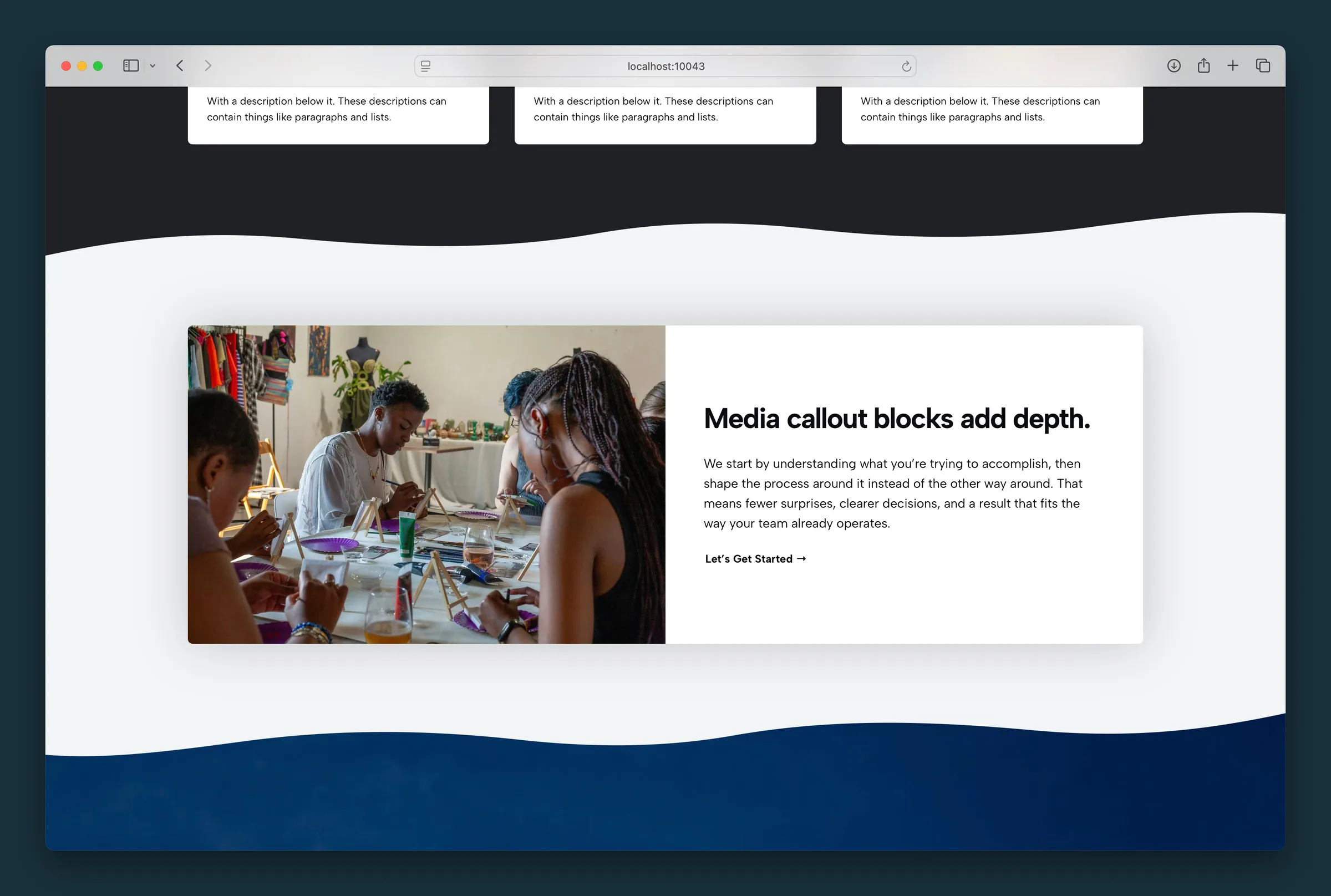
Wide callout on a wavy section — painting class photo, headline, and CTA with rounded corners and shadow. -
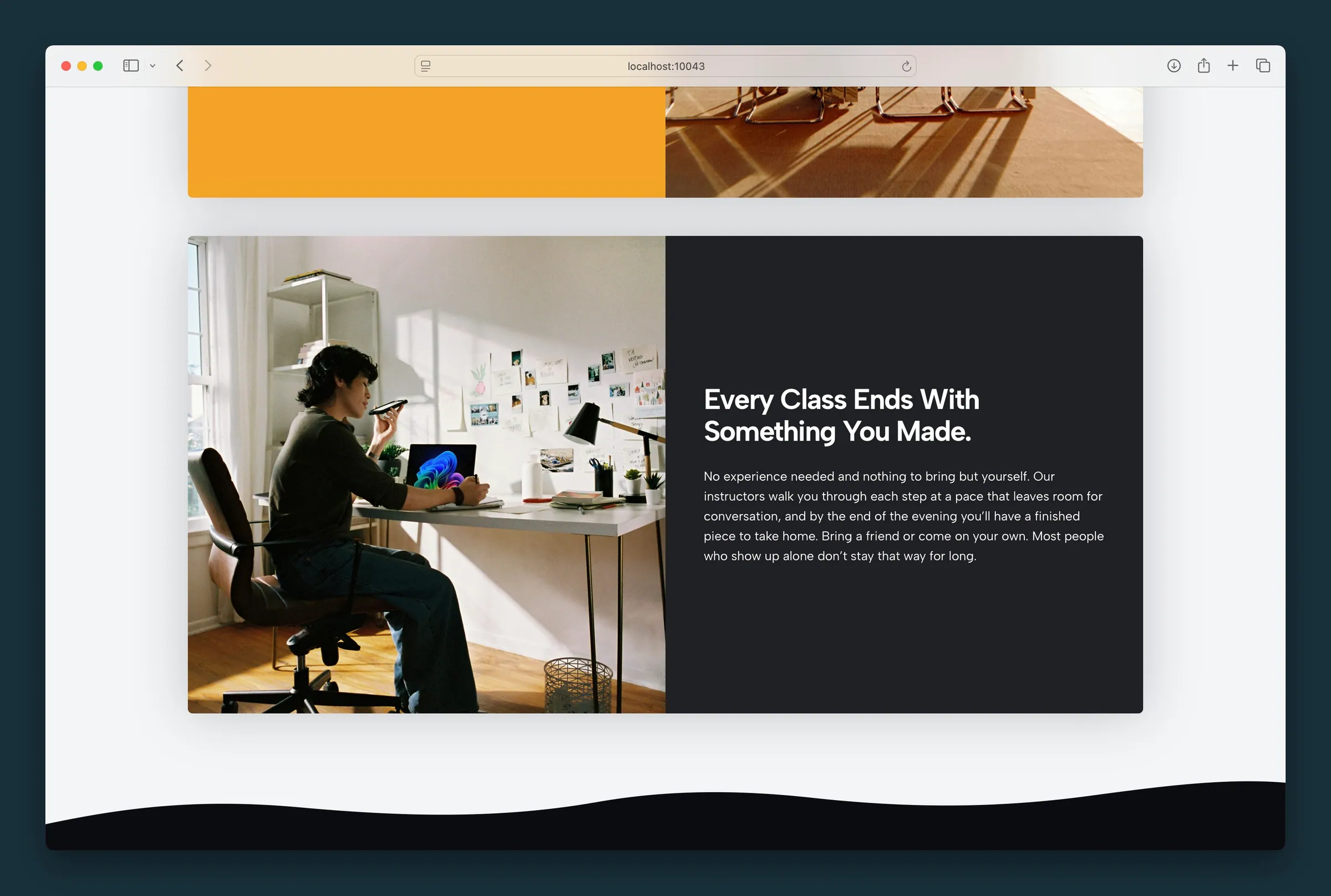
Swapped columns on desktop — dark copy on the left, photo on the right.
Editor
-
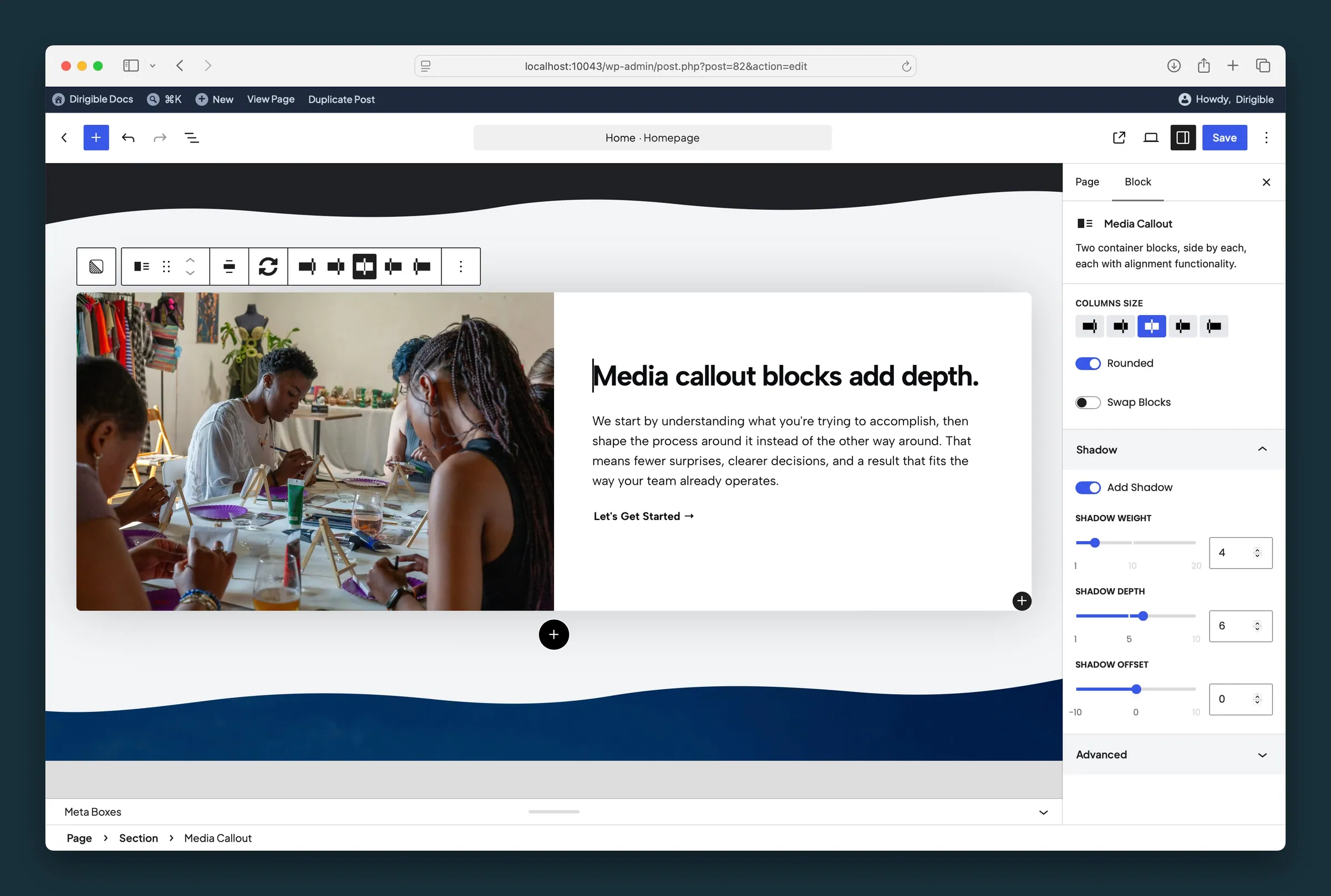
Parent settings — Columns Size, Rounded, Swap Blocks, and Shadow weight, depth, and offset. -
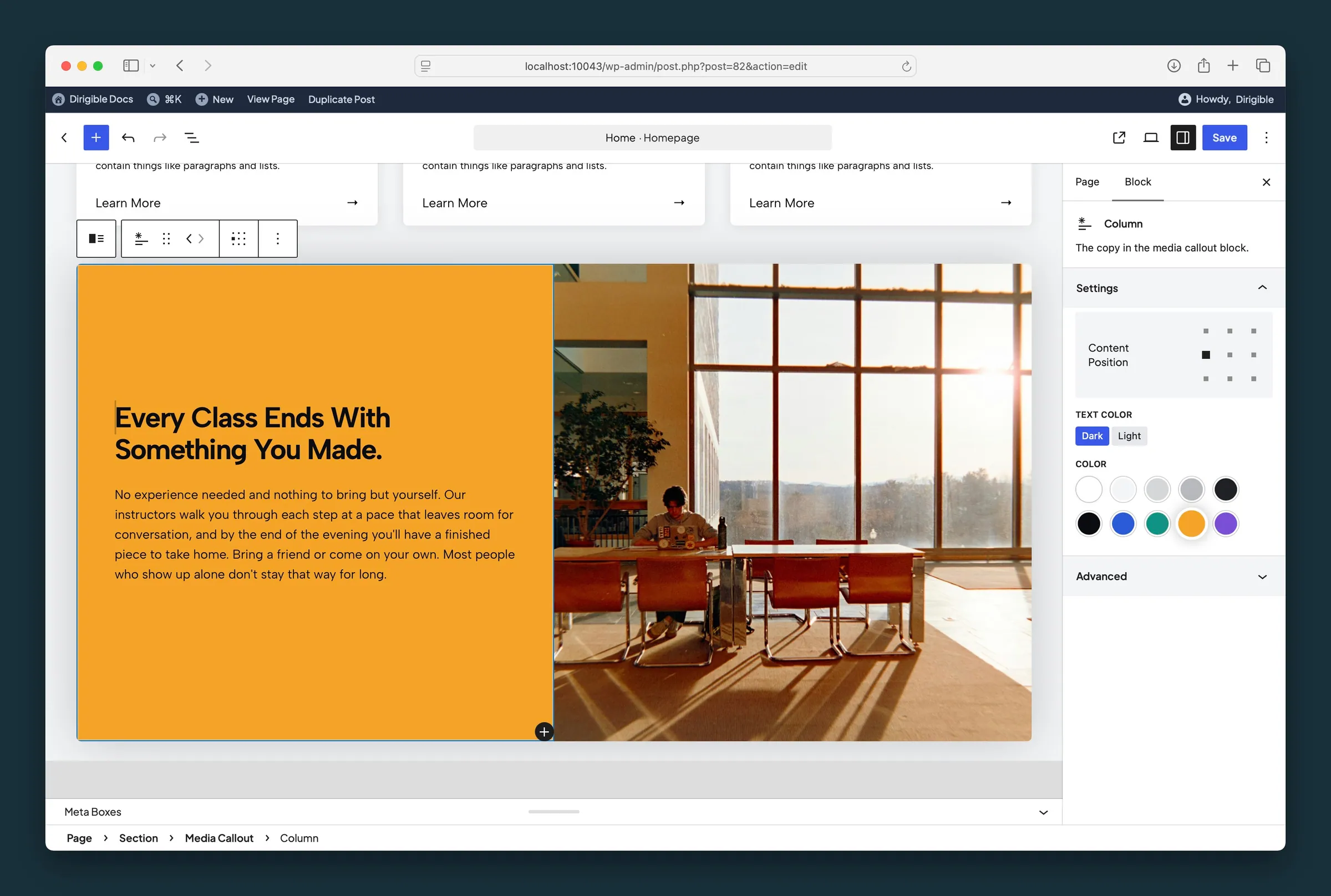
Copy column — Content Position matrix, Text Color (reverse print), and background Color.
Settings
Settings
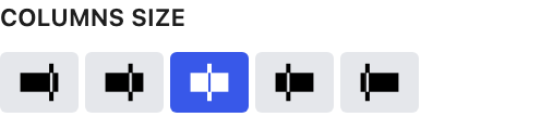
Choose how the two columns are sized relative to each other — larger left, slightly larger left, even, slightly larger right, or larger right.

Rounds the corners of the whole callout, both the media and the copy column.

Swaps the media and copy columns on desktop. On mobile, the media always comes first.
Shadow

Adds a drop shadow behind the callout band. Adjust weight, depth, and offset when shadow is on.
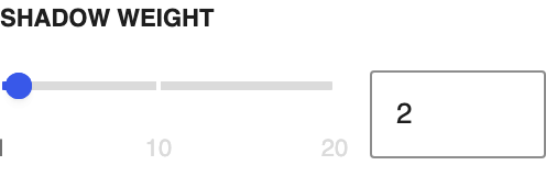
How strong the shadow appears.
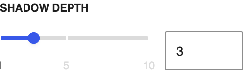
How far the shadow spreads from the block.
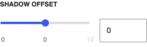
Shifts the shadow horizontally. Negative values move it left; positive values move it right.
Settings
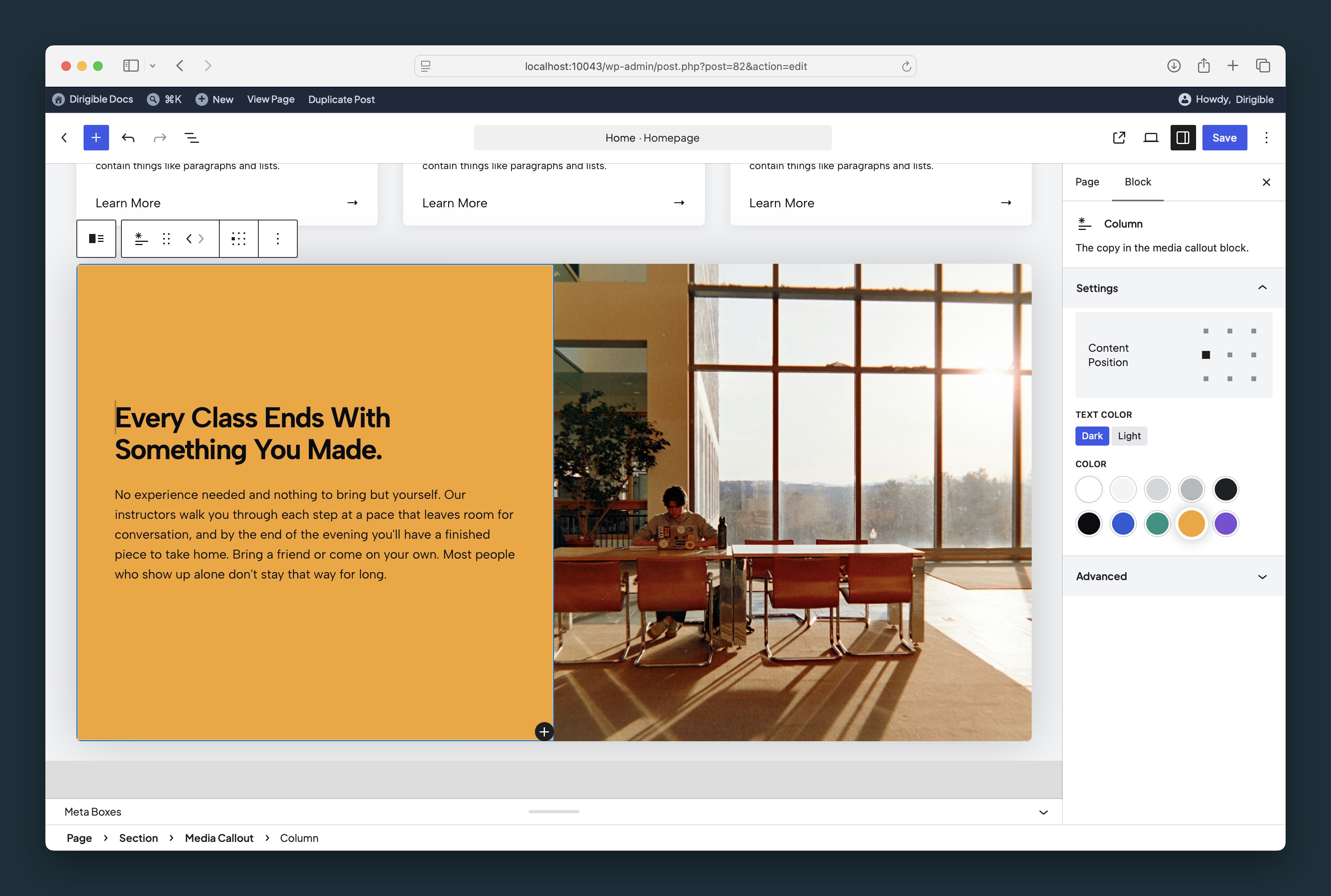
Light text for dark backgrounds. Applies to everything in the copy column, so you don't need to color each heading and paragraph.