

Rollover Cards
Build a grid of image cards with hover effects, headlines, and links.
Usage
Rollover Cards is a grid of image cards with text over each photo. Add a Rollover Card for each tile, then set its image, headline, and link. Settings on the parent Rollover Cards block control columns, aspect ratio, text style, overlay, and what appears on hover for every card.
When to use it
Use it for team members, portfolio tiles, services, or linked promo cards where the photo leads and the details appear on hover. Keep the text short so it fits over the photo.
Tips
- Select the parent block for grid-wide settings. Select a single card to change its image and text.
- Aspect Ratio keeps every card the same shape, even when your photos differ.
- Set Text Color to light when the overlay is dark.
Screenshots
Front-end
-
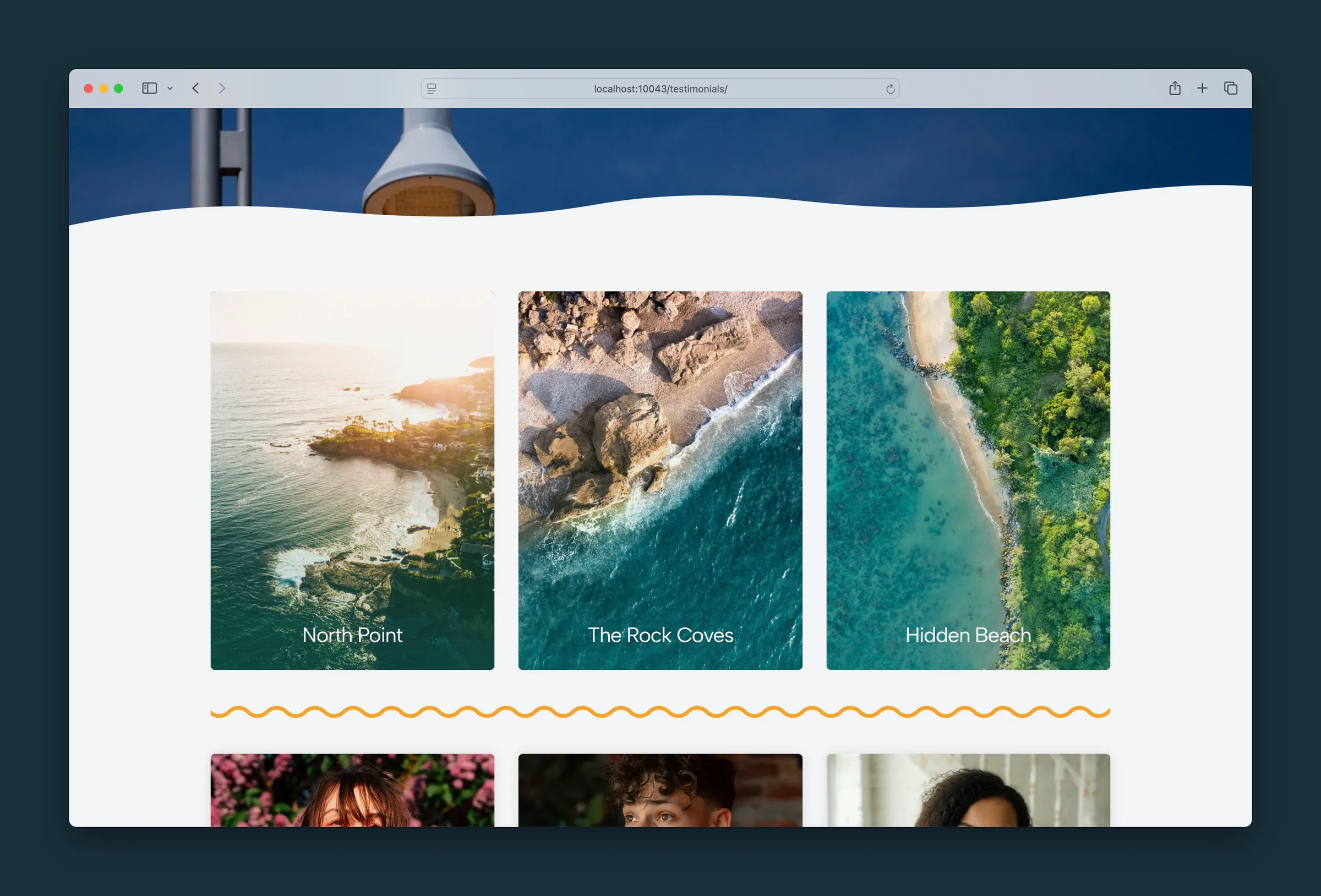
Three image cards in a row, each with a title at the bottom of the photo. -

The middle card on hover — teal overlay, description, and a button over the photo.
Editor
-
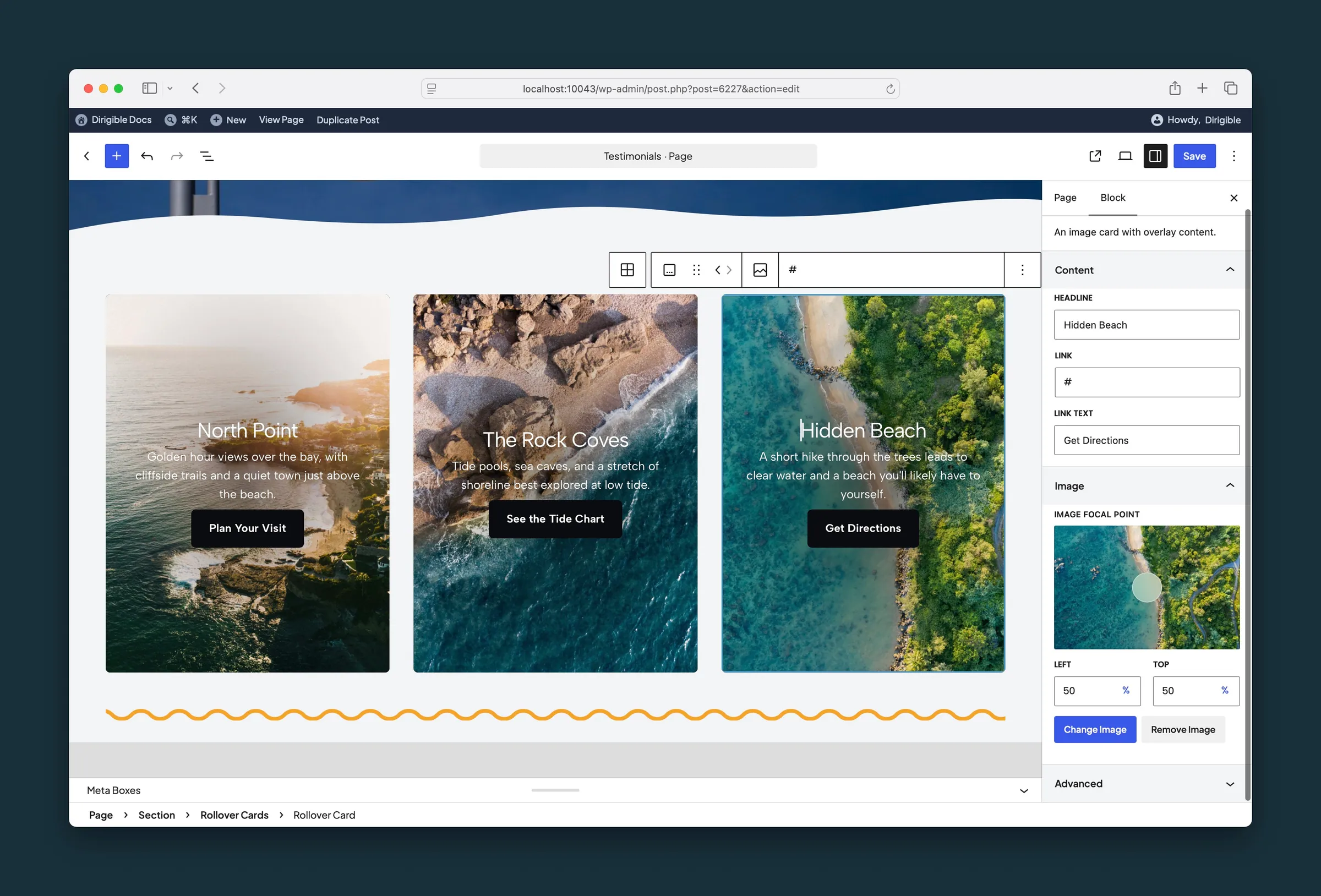
A child card selected — headline, link, link text, and image focal point. -
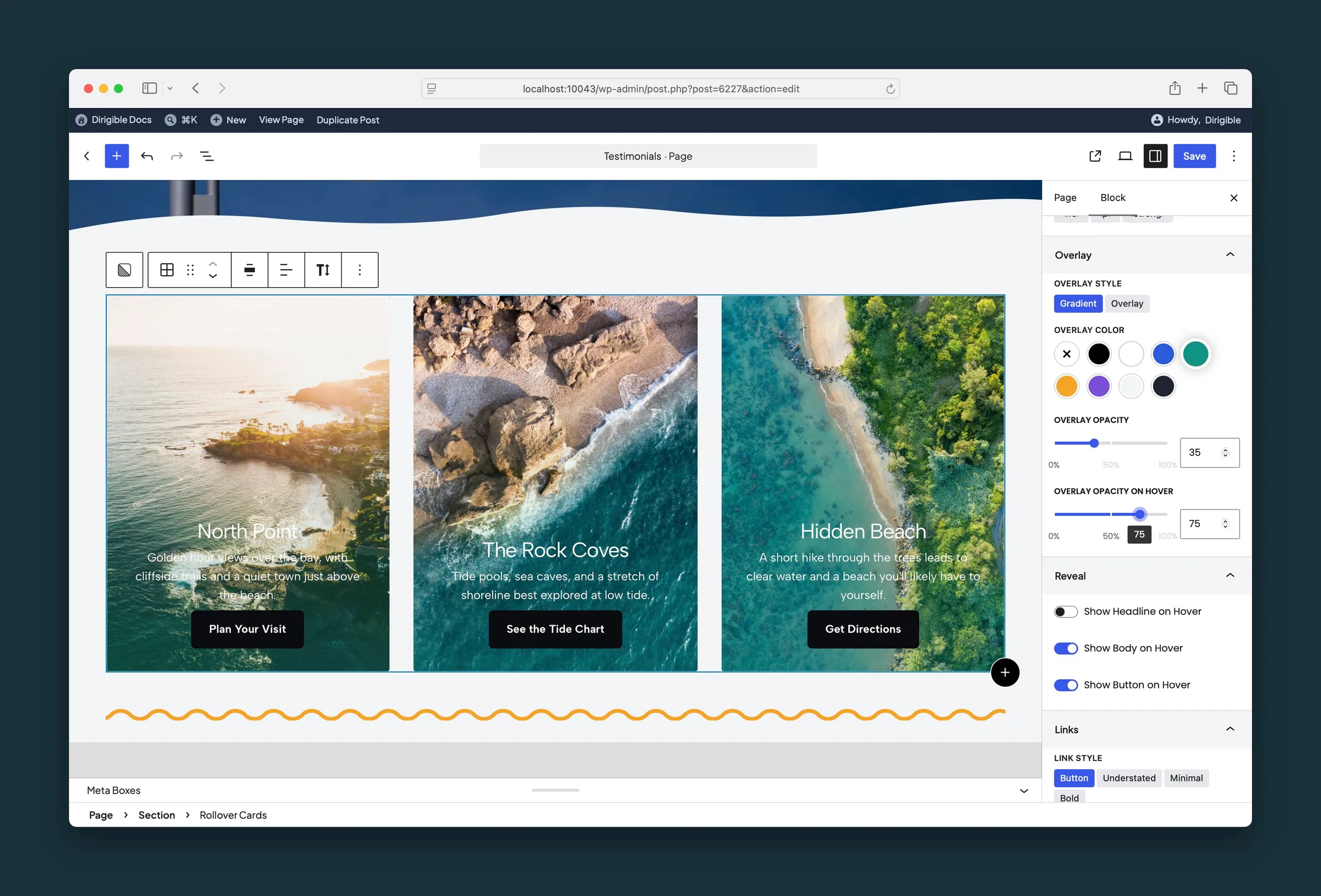
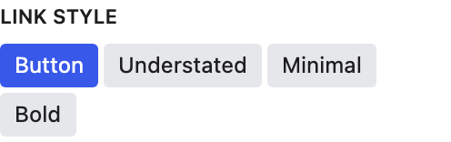
Rollover Cards sidebar — overlay style and opacity, what to show on hover, and link style.
Settings
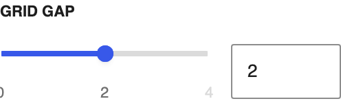
Grid Settings

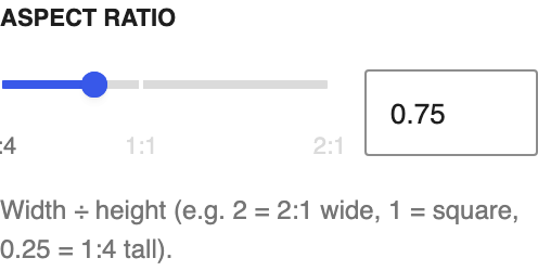

Content

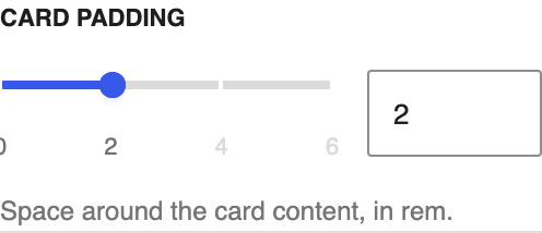


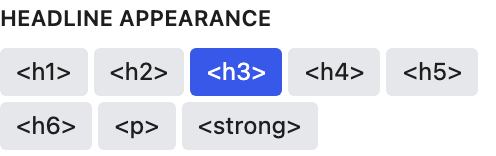
Headlines

Overlay


Color of the overlay on the images. Changing it also sets Text Color when the overlay is strong enough to set the tone: a dark overlay from the default opacity up, a light one from 70% up. Change Text Color any time.
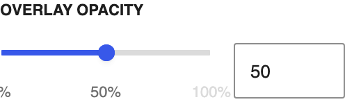
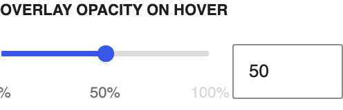
Strength of the overlay, 0–100%, in steps of 1%. Dragging it also updates Text Color as the overlay starts or stops dominating the image; a dark overlay counts from the default opacity, a light one from 70%. Change Text Color any time.
Reveal



Links
Appearance

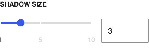
Content
The card headline. You can also edit it on the block.
Where this card links. Link Text appears once a URL is set.
The link label. Appears after you set Link URL.
Image

Drag the dot to the part of the photo that should stay in view. It follows the image's focal point from the Media Library until you move it here; after that it's this block's own.