Columns
A Dirigible-native alternative to core Columns with mobile-first stacking and golden-ratio sizing.
Usage
Columns puts two blocks of content side by side, like an image next to text, and stacks them neatly on mobile. It's similar to the core WordPress Columns block, with extra layout controls. Dirigible Columns always contain two Column blocks, a left and a right. Each column can hold most Dirigible and core blocks; only very complex blocks are left out, so you can only drag allowed blocks into a column.
Like all Dirigible blocks, Columns has a blue icon in the inserter so you can tell it apart from the core Columns block.
Search for Photo & Text or Video & Text in the inserter to insert that layout directly, or insert Columns (blue icon) and choose a starter from the layout picker.
Photo & Text starter
Photo & Text is a Columns starter: a photo in one column and a content column beside it on desktop, stacked on mobile. The template includes a Heading, Paragraph, and optional Button in the content column. Replace the image or edit inner blocks as needed. It is also the first card in the Columns starter picker.
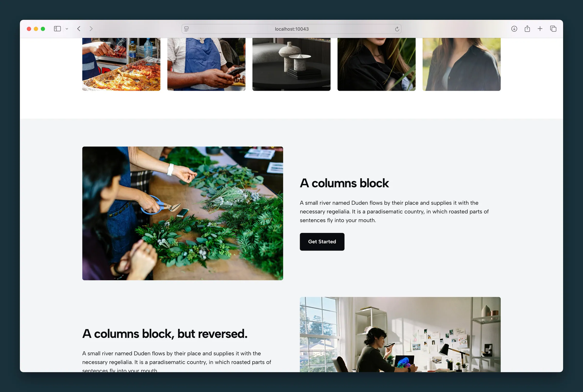
Use Swap Columns when the photo should sit on the opposite side. Columns Size, Separator, and Split Scroll are available when you need more than the default even split.
Video & Text starter
Video & Text is a Columns starter: a core Video on the left and a content column on the right. The template includes a Heading, Paragraph, and optional Button. It inserts at Wide width with an even split. Switch to Full from the block toolbar when the band should span the page. To show a YouTube video instead of an uploaded file, choose Insert from URL in the Video block and paste the YouTube link. WordPress switches it to a YouTube embed automatically.
Use Swap Columns and Columns Size the same way as Photo & Text.
Content-panel backgrounds from the older Video & Text block (color, image, pattern, and light text) are not carried over. After conversion the text column is a normal Column.
Older Photo & Text and Video & Text blocks
Pages created before these changes may still contain the legacy blocks.
Photo & Text converts to Columns when you open the post in the editor, or when you run Tools & Maintenance → Update blocks.
Video & Text converts when you open the post in the editor. Save the page to persist the update on the live site.
Parent and child blocks
The parent Columns block controls layout options that apply to both columns: sizing, swap order, split scroll, and the optional separator. Select the parent to change those settings.
Each Column child controls its own content. Select a column to edit what's inside it or to change Content Position (text alignment and placement within the column). The two children are interchangeable — they default to the common pattern of media on one side and copy on the other, but you can put any allowed blocks in either column.
Selecting the parent: While a child is selected, click the parent block name in the block toolbar above the content, use the breadcrumb path at the bottom of the editor, or open List View to jump to Columns.
Block width
Columns supports Wide and Full alignment from the block toolbar. Wide follows your content column; Full spans the whole screen. On mobile, columns stack vertically regardless of width setting.
Columns Size
Use Columns Size in the sidebar (or the sizing icons in the block toolbar) to change how space is split on desktop:
- Even — 50% / 50% (default)
- Large left or right — golden-ratio split at 61.8% / 38.2%
- Larger left or right — emphasizes one column further using the same ratio pattern
Sizing is independent from Swap Columns. If the left column is set larger, the leftmost column stays larger on desktop even when swap is enabled.
Swap Columns
Swap Columns reverses column order on desktop only. On mobile, columns always stack with the first column on top.
Use it when you want media on the right on desktop but still want the copy to appear first on mobile.
Split Scroll
Scrolling → Split Scroll pins column content to the top or bottom of the screen as the visitor scrolls on desktop. It does not affect the mobile stacked layout.
Use it when one column is much taller than the other and you want the shorter column to stay visible while the longer column scrolls.
Separator
Enable a vertical rule between columns from the Separator panel:
- Enable Separator — draws a border between columns on desktop
- Enable on Mobile — also shows a horizontal rule between stacked columns on small screens
- Width — border thickness (0–4)
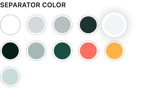
- Separator Color — palette color for the rule
Column settings (child)
Select an individual Column block to access Content Position in the sidebar or from the block toolbar matrix control. This sets both where content sits inside the column and the text alignment applied to nested blocks.
For example, lower-right placement positions content in that corner and applies right alignment to children. Right alignment reverts to left on mobile for readability.
Tips
- Combine Swap Columns with uneven sizing to keep copy first on mobile while balancing visual weight on desktop.
Screenshots
Front-end
-
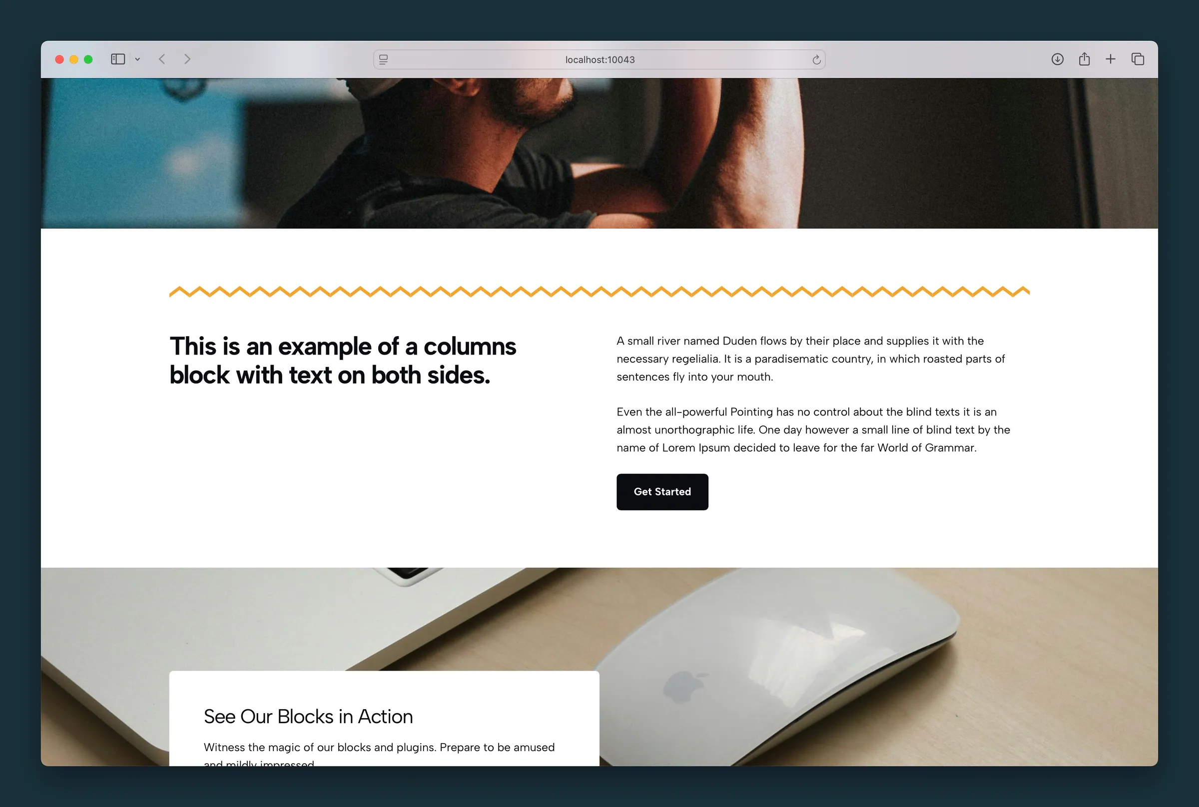
Text-only columns under a photo section, with a zigzag separator and a button in the second column. -
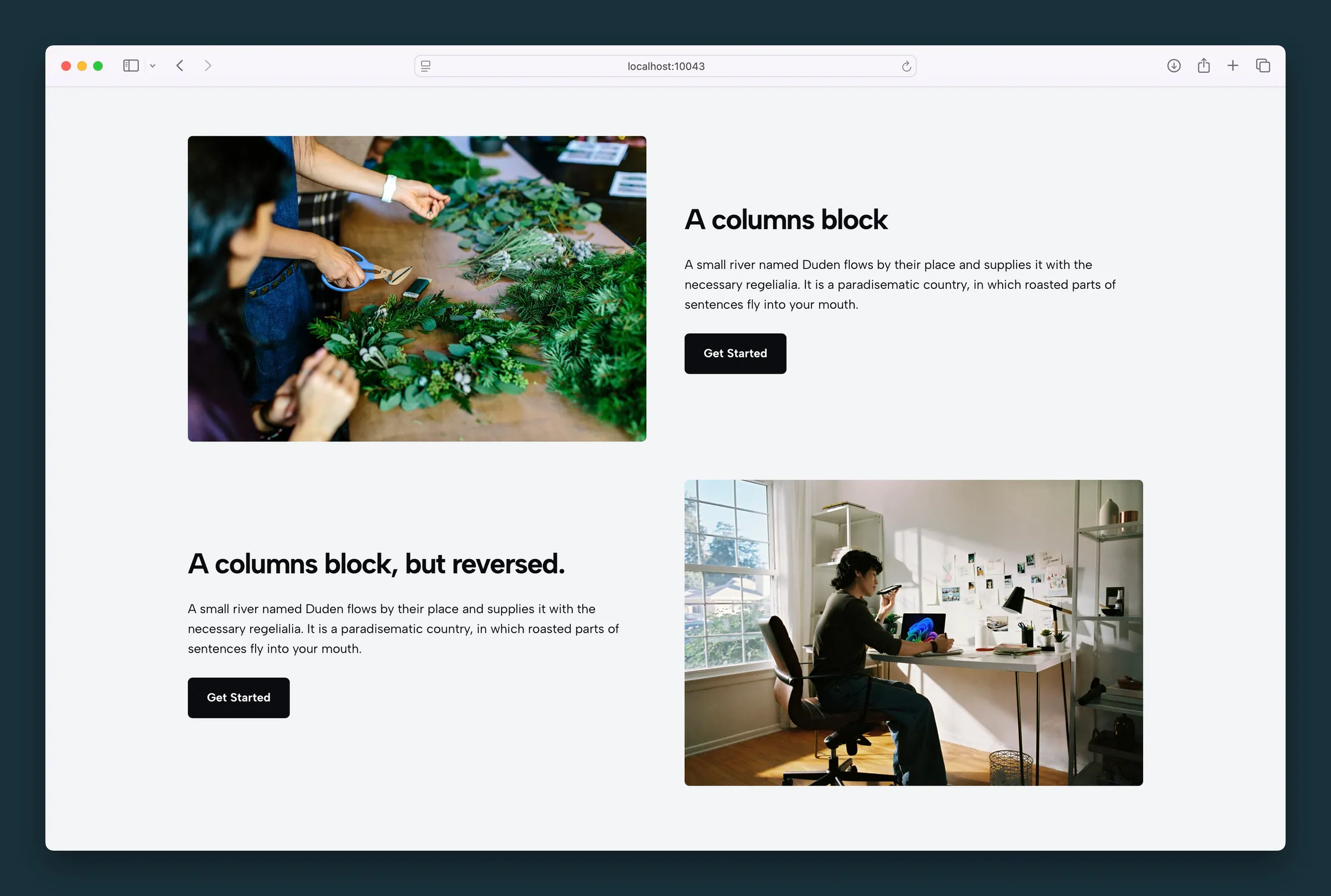
Media in one column and headline, body, and button in the other — then Swap Columns on the next band.
Editor
-
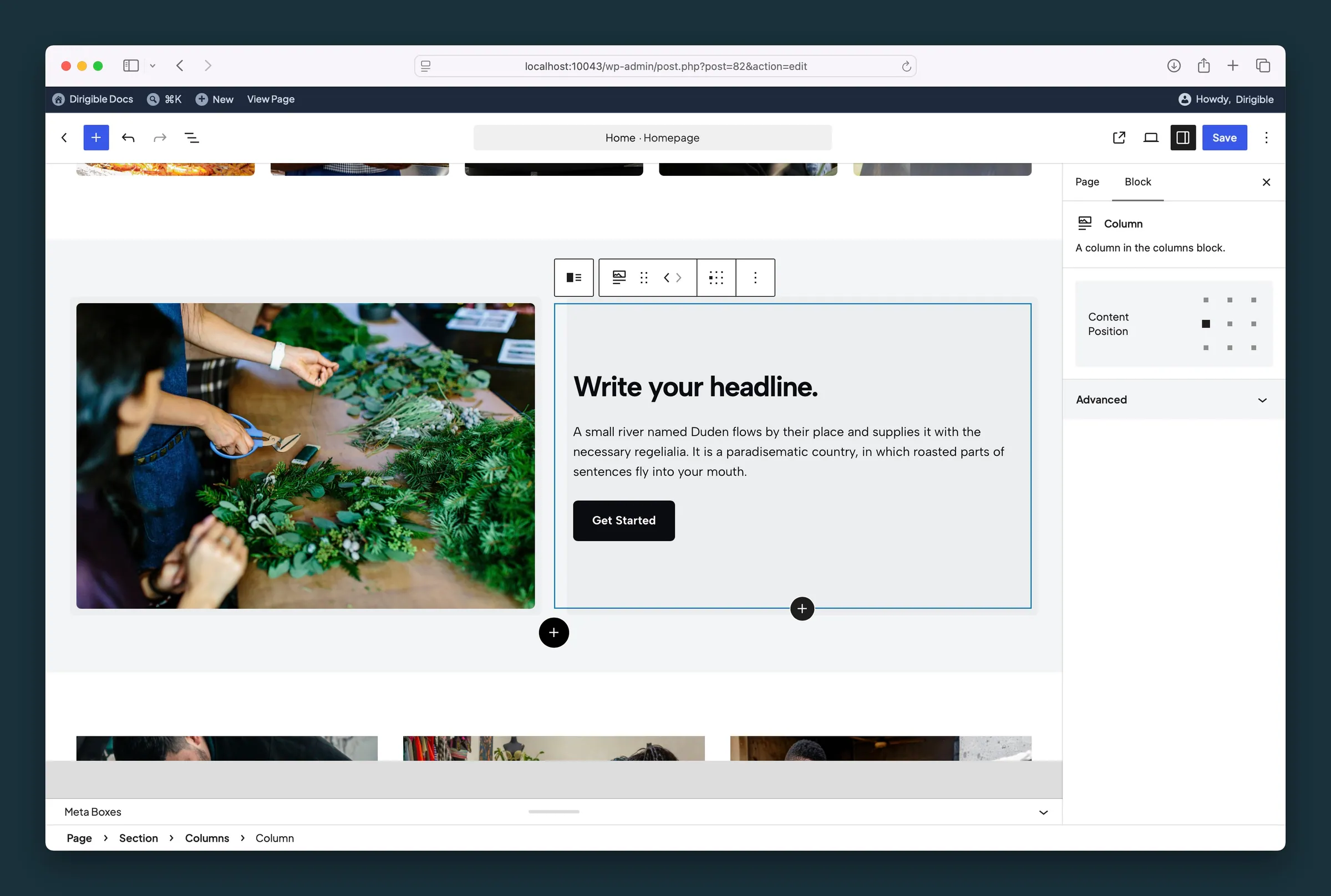
Column child Content Position matrix — placement inside a media-and-copy pair. -
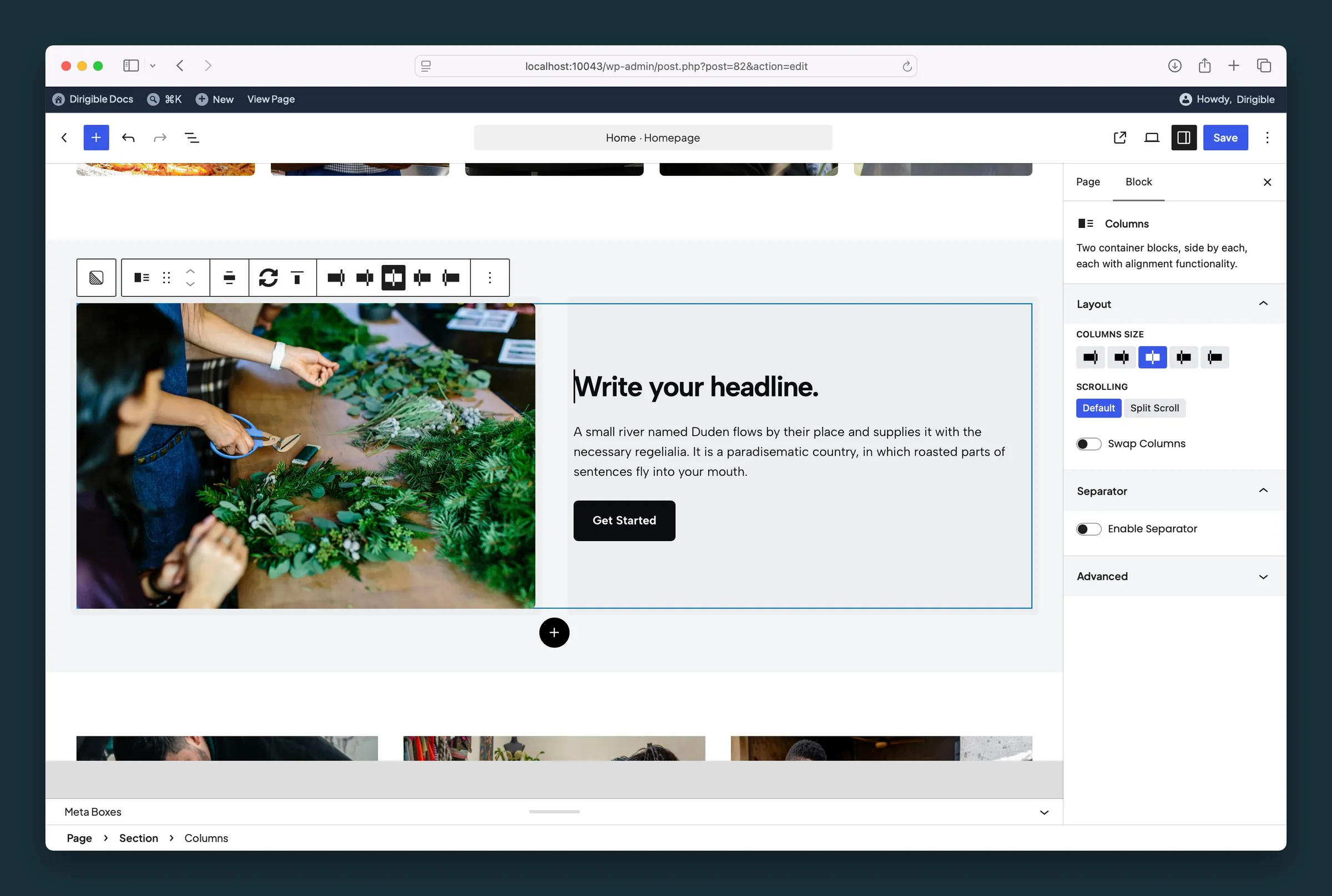
Columns Size, Scrolling, and Swap Columns in the parent block sidebar.
Settings
Layout
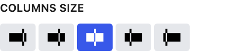
How desktop space is split between the two columns. Even is 50/50; the large and larger presets use the golden ratio (61.8% / 38.2%). The side you make larger stays larger even with Swap Columns on.

Split Scroll pins column content to the top or bottom of the screen as visitors scroll on desktop. Useful when one column is much taller than the other.

Reverses column order on desktop only. On mobile the first column always stacks on top, so you can keep copy first on phones while placing media on the right on desktop.
Separator

Adds a vertical line between the columns on desktop.

Also shows the separator as a horizontal line between the stacked columns on mobile.
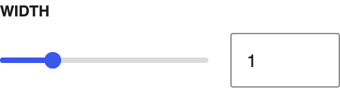
Line thickness, from 0 to 4.