

Spacer
Add responsive vertical space between blocks.
Usage
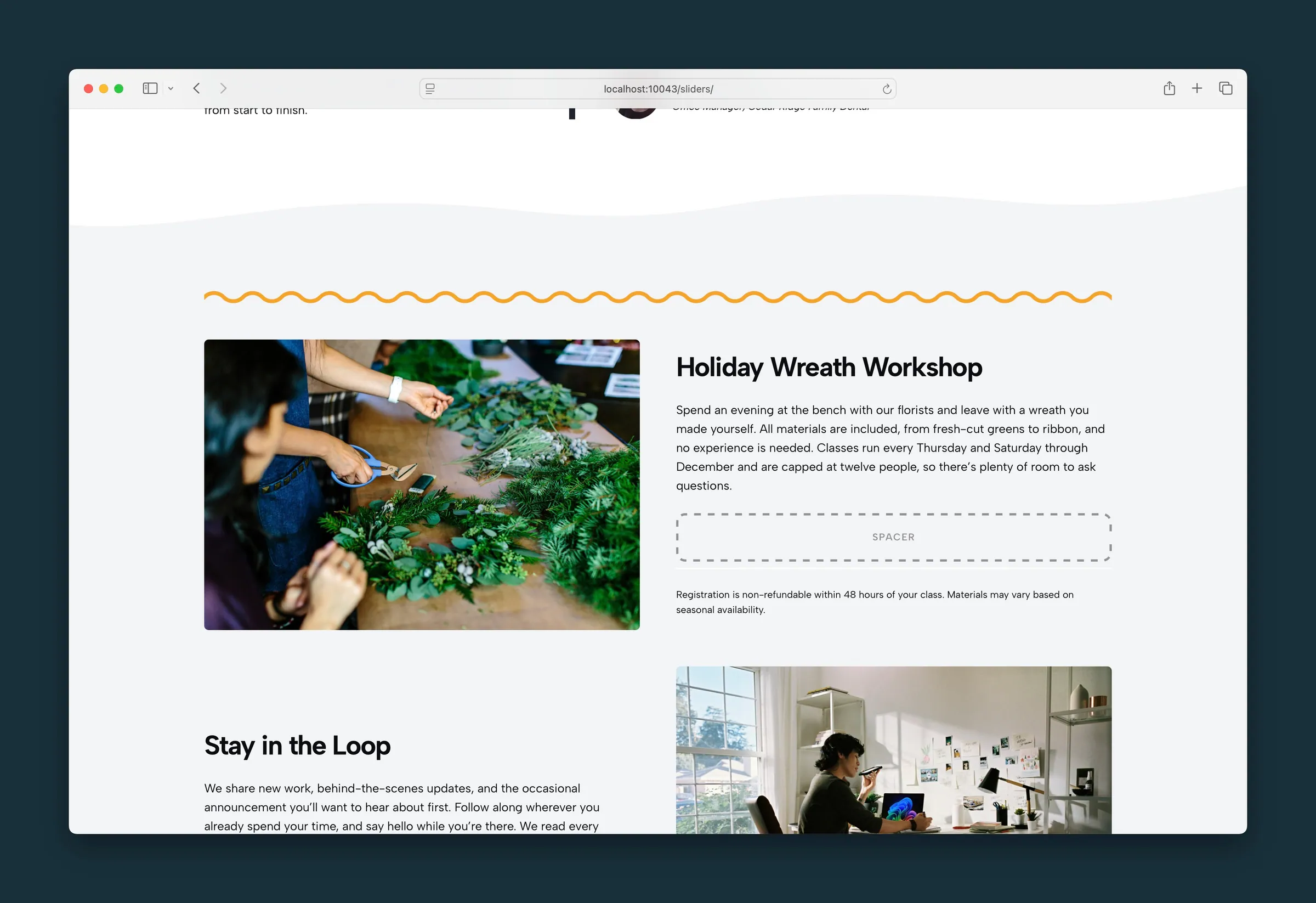
Spacer adds vertical space between blocks without extra padding on a Section or empty paragraph tricks. Set a Mobile Size and Desktop Size independently so spacing can tighten on small screens and breathe more on large ones.
Visitors don't see the Spacer itself, only the gap it leaves. In the editor it shows as a labeled placeholder so you can find and adjust it.
Sizes
Mobile (all viewports; overridden on desktop when a desktop size is set):
- None — 0
- Small — 1rem (default)
- Medium — 2rem
- Large — 3rem
Desktop (640px and up):
- None — keep the mobile height
- Small — 2rem
- Medium — 4rem (default)
- Large — 6rem
Tips
- Use Mobile: None with a desktop size when you only want extra space on larger screens.
- Use Desktop: None when mobile spacing is enough at every breakpoint.
- Prefer Spacer over manual margin when you need consistent, named spacing steps across a page.
- Stack multiple Spacers sparingly — a single Large desktop preset is usually cleaner than several small ones.
Screenshots
Front-end
-
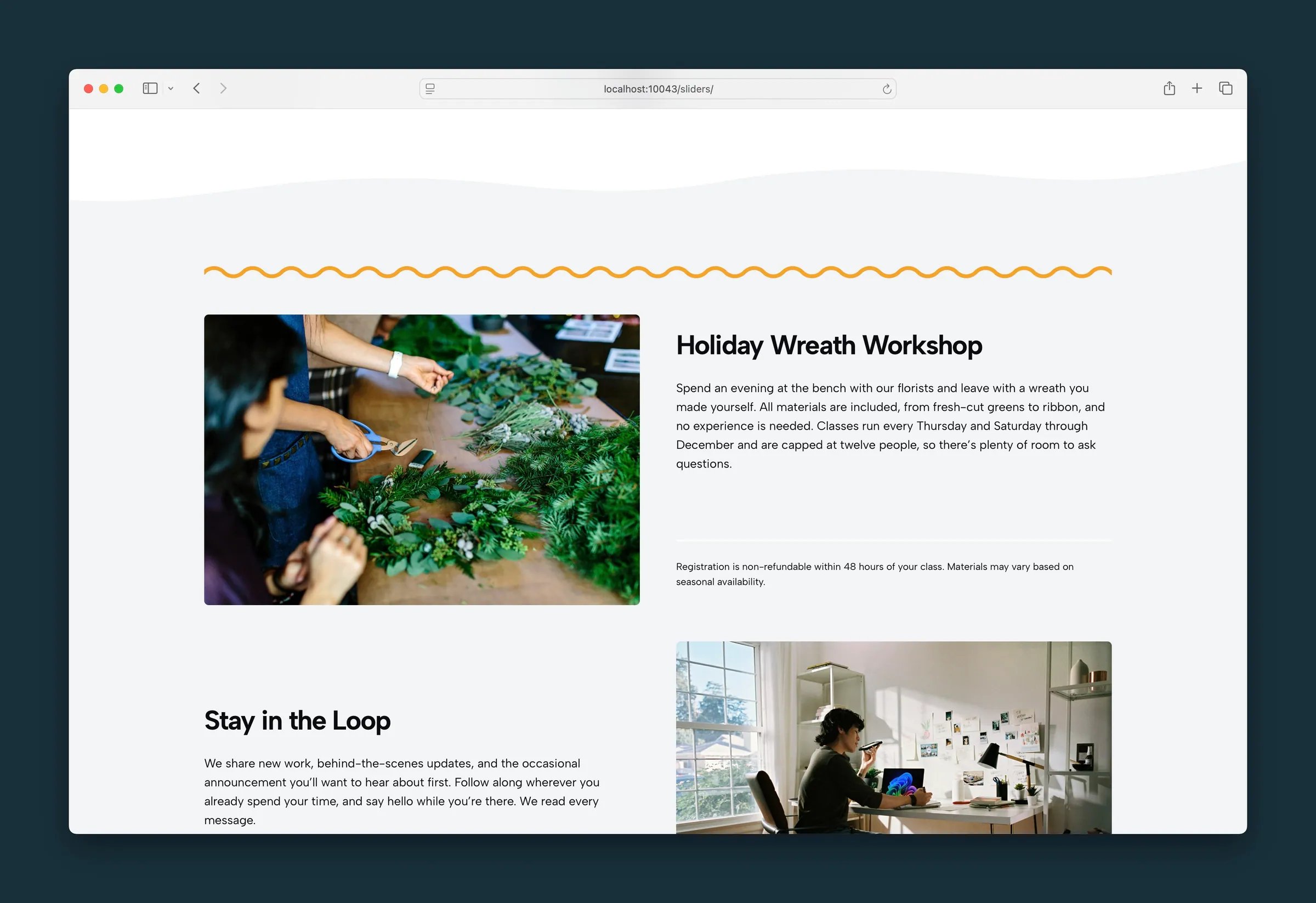
The same spot on the page — the gap stays, and the Spacer label is gone.
Editor
-
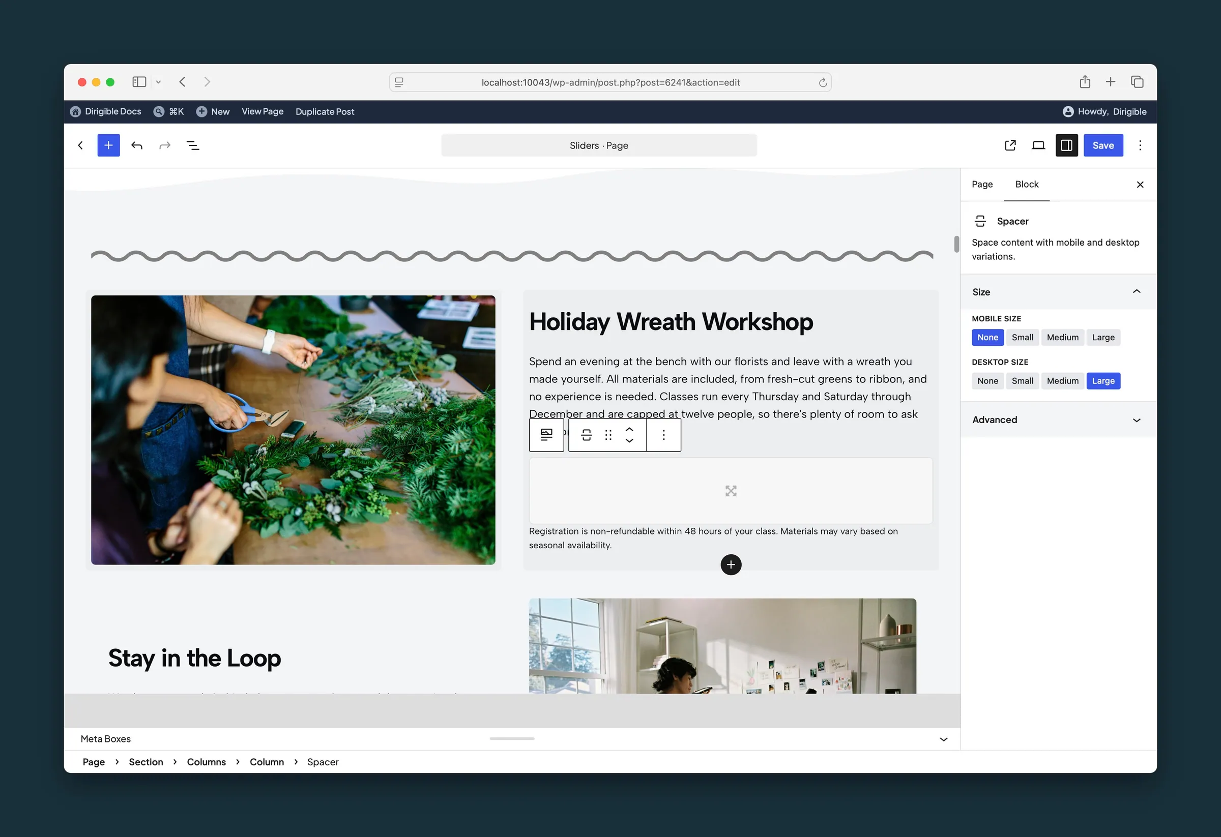
Spacer selected — Mobile Size None and Desktop Size Large.
Settings
Size

Height on phones, and on larger screens too unless Desktop Size overrides it. None (0), Small (1rem), Medium (2rem), or Large (3rem).
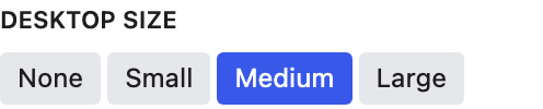
Height on screens 640px and wider. None keeps the Mobile Size height; Small (2rem), Medium (4rem), or Large (6rem).