

Slideshow
A slider of free-form slides, each built from any blocks.
Usage
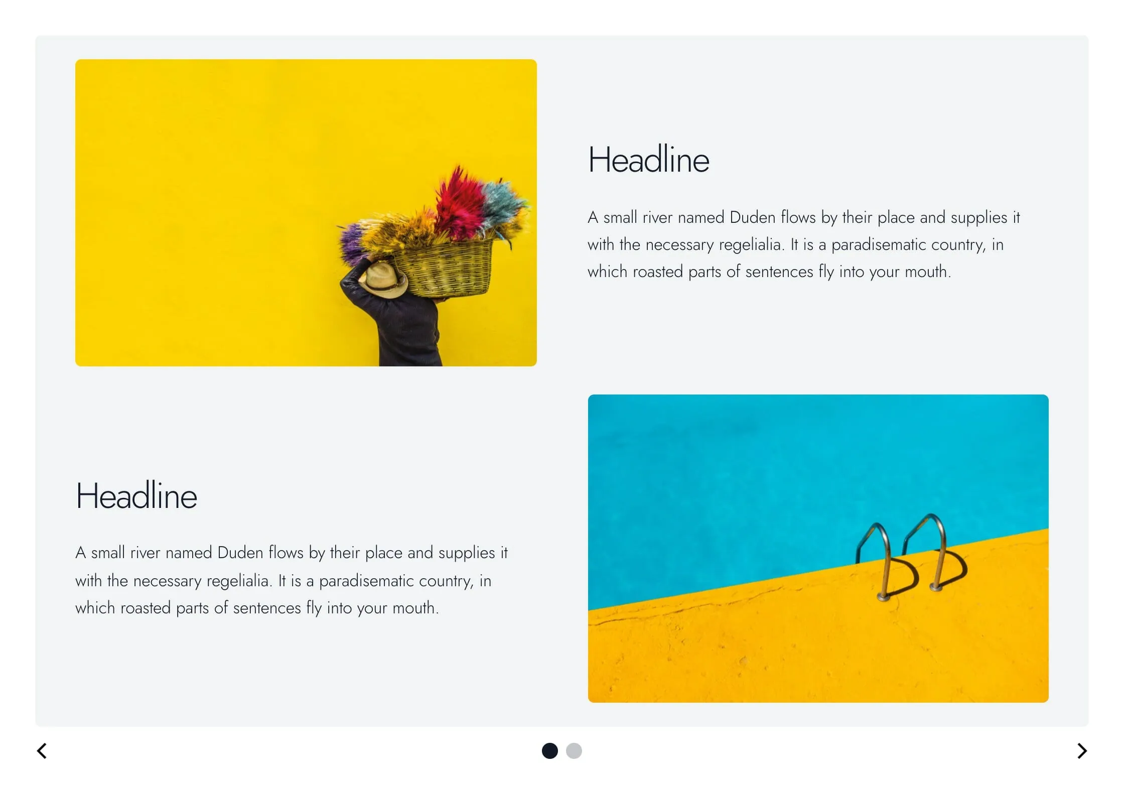
Slideshow is a free-form content slider. Each Slide is a panel you fill with any blocks: headings, paragraphs, images, columns, lists, or other Dirigible blocks.
On screens 768px and wider, visitors see one slide at a time and move through them with the arrows and dots below, by scrolling sideways on a trackpad, by swiping, or with the arrow keys once the slider has keyboard focus. Every slide is as tall as the tallest one, and shorter slides sit centered, so the page below never jumps. On phones, the slides stack one under another and there is no slider.
A new Slideshow starts with two empty slides. Click the + in a slide to add blocks to it. To add a slide, select the Slideshow and click the + below the last slide. Reorder slides with Move up and Move down in a slide's toolbar, or by dragging in List View.
In the editor, all slides show at once, stacked. The slider only runs on the site.
Slideshow settings
Select the Slideshow block for settings that apply to every slide:
- Wraparound: on by default. The slider loops from the last slide back to the first. When it's off, the slider stops at each end.
- Autoplay: off by default. Turn it on to advance slides automatically.
- Autoplay Interval (seconds): time between slides (default 3). Appears when Autoplay is on.
Autoplay keeps going when a visitor hovers over the slider. It doesn't run for visitors who've turned on reduced motion in their device settings. Visitors can stop it with a small pause button at the bottom right, which appears when they hover over the slider or reach it with the keyboard (on touch screens it's always shown).
Slide settings
Select a single Slide for these settings:
- Horizontal Padding: space inside the slide on the left and right (default 8).
- Vertical Padding: space inside the slide on the top and bottom (default 6).
- Corners: Rounded (default) or Sharp.
- Reverse Print: light text, for dark backgrounds.
- Background: the slide color from your theme palette (default Gray), or None.
Each padding step is a quarter of your site's base text size (8 is about 32 pixels). Padding applies on screens 600px and wider. Smaller screens use a fixed, smaller padding so slides don't crowd a phone.
Blocks inside a slide can use the slide's full width.
Block width
Slideshow supports Wide, Full, and Center alignment and defaults to Wide.
Tips
- Don't put essential content on later slides. Most visitors never move past the first one.
- Keep slides about the same height. One tall slide makes the slider that tall, with empty space around the short ones.
- Set Background and Reverse Print on each Slide rather than recoloring headings, so palette changes stay easy.
- For a full-width banner of Hero or Section slides, use Slider instead.
Screenshots
Front-end
-
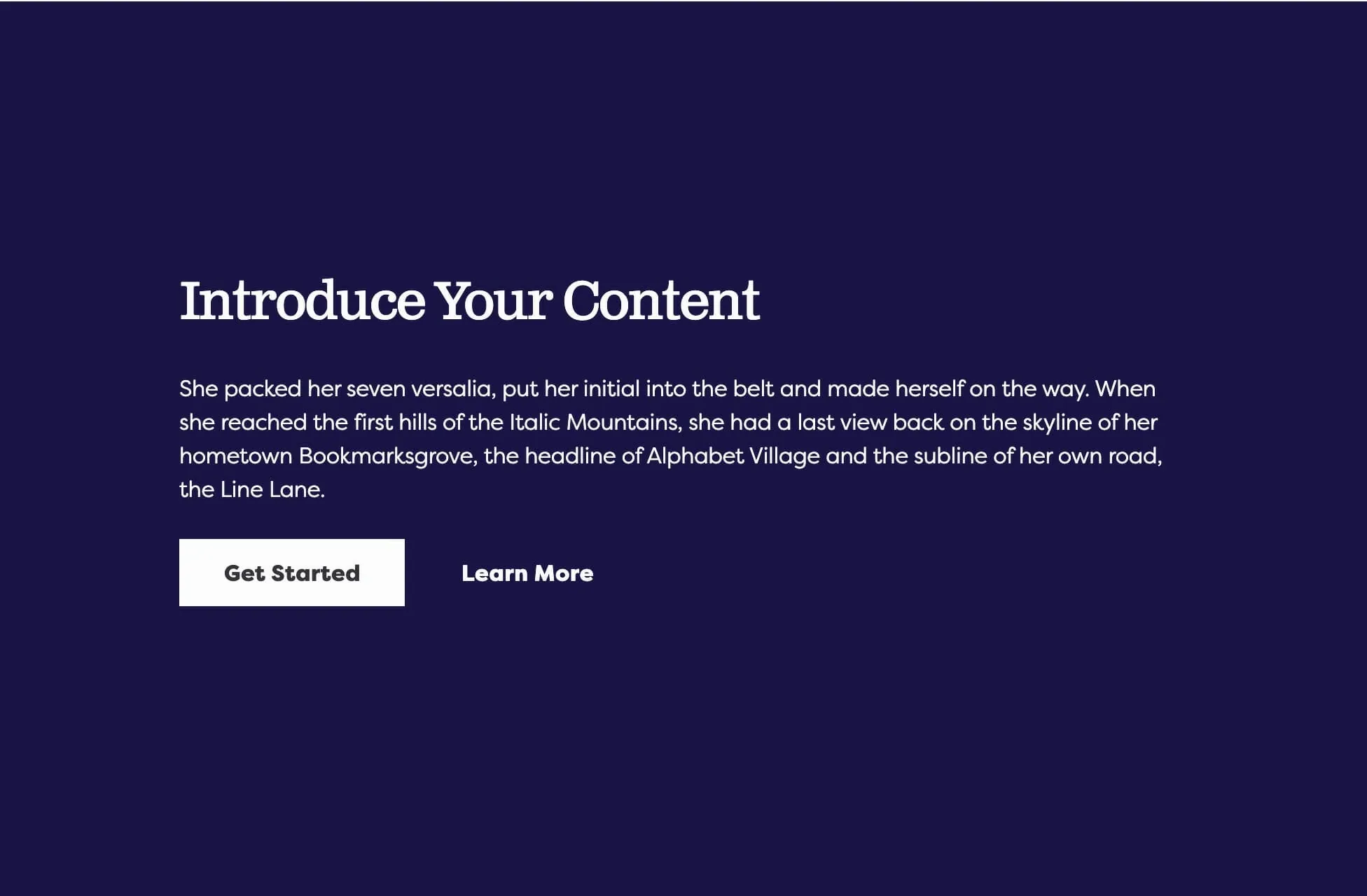
A slide with a background color and several blocks inside.
Settings
Slideshow Settings
Loops from the last slide back to the first. When it's off, the slider stops at each end.
Advances slides automatically on screens 768px and wider. It keeps going when a visitor hovers, and doesn't run for visitors who've turned on reduced motion in their device settings.
Seconds between slides. Appears when Autoplay is on.
Slide Settings
Space inside the slide on the left and right, on screens 600px and wider. Each step is a quarter of your site's base text size.
Space inside the slide on the top and bottom, on screens 600px and wider. Each step is a quarter of your site's base text size.
Rounded uses your theme's corner radius. Sharp keeps the slide square.
Switches the slide's text to light, for dark backgrounds.
The slide's color, from your theme palette. None leaves it clear. Picking a color also sets Reverse Print to match it: on for dark colors, off for light ones. You can still change Reverse Print afterwards.
