

Quote Blocks
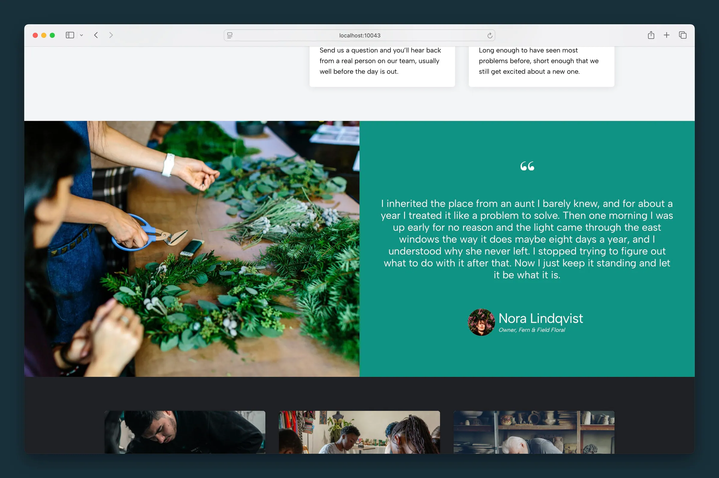
A testimonial beside a large photo, in a side-by-side layout.
Usage
Quote Blocks puts a testimonial next to a featured photo, half and half. It's laid out like Blocks, but built for quotes: the quote side has quote marks, the quote text, a round headshot, a name, and a job title.
Use it for a featured customer testimonial, a case study highlight, or an editorial quote where the photo matters as much as the words.
Layout
On desktop, the block has two sides:
- Quote side — quote text, decorative quote marks, optional headshot, name, and job title
- Photo side — a full-height photo (click it in the editor to replace it)
On mobile, the photo always sits above the quote, whatever you choose for Swap Blocks.
Settings
- Swap Blocks — toolbar button that swaps the quote and photo sides on desktop
- Text Color — light or dark text on the quote side
- Text Size — Small (normal paragraph size), Medium (default), or Large. Medium and Large grow and shrink with the screen width.
- BG Color — background color of the quote side
Images
The block uses two photos:
- Featured image — the large photo. Click the photo area in the editor or upload from the sidebar. Set Featured Image Focal Point to keep the subject in frame when the photo is cropped.
- Headshot — small round photo beside the name. Click the headshot placeholder or upload from the sidebar, then set Headshot Focal Point.
Without a headshot, the name and job title center beneath the quote.
Content
Type directly on the block:
- Quote — the testimonial text
- Name — the person being quoted
- Job Title — a line below the name
Block width
Quote Blocks defaults to Full width and also supports Wide from the block toolbar.
Tips
- Set Text Color to light when you pick a dark BG Color.
- Use Swap Blocks when the person in the photo faces away from the quote. Mobile still shows the photo first.
- For a quote without a photo beside it, use the Quote block.
Screenshots
Editor
-
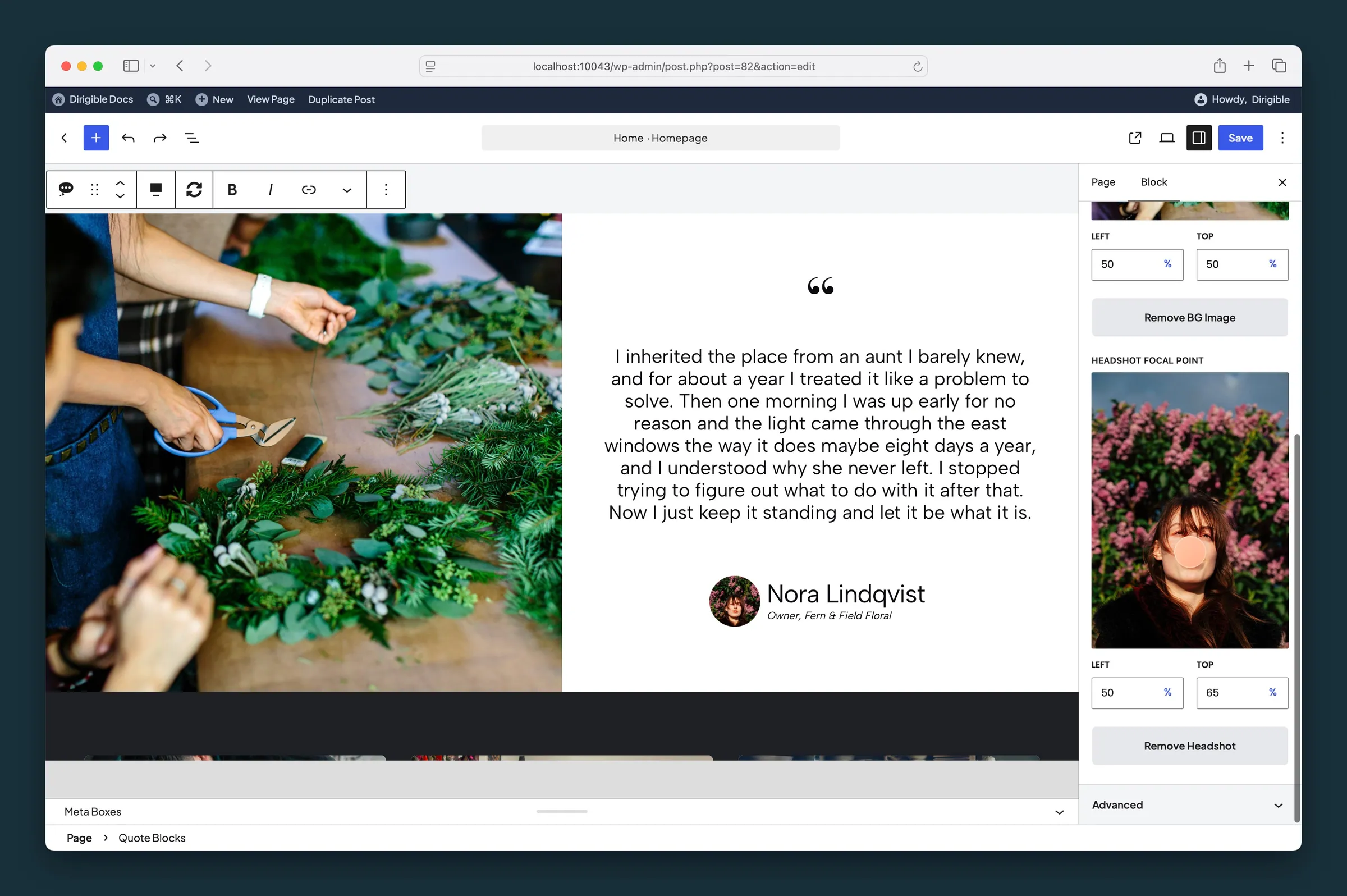
The same layout in the editor, with focal point controls for the featured image and headshot. -
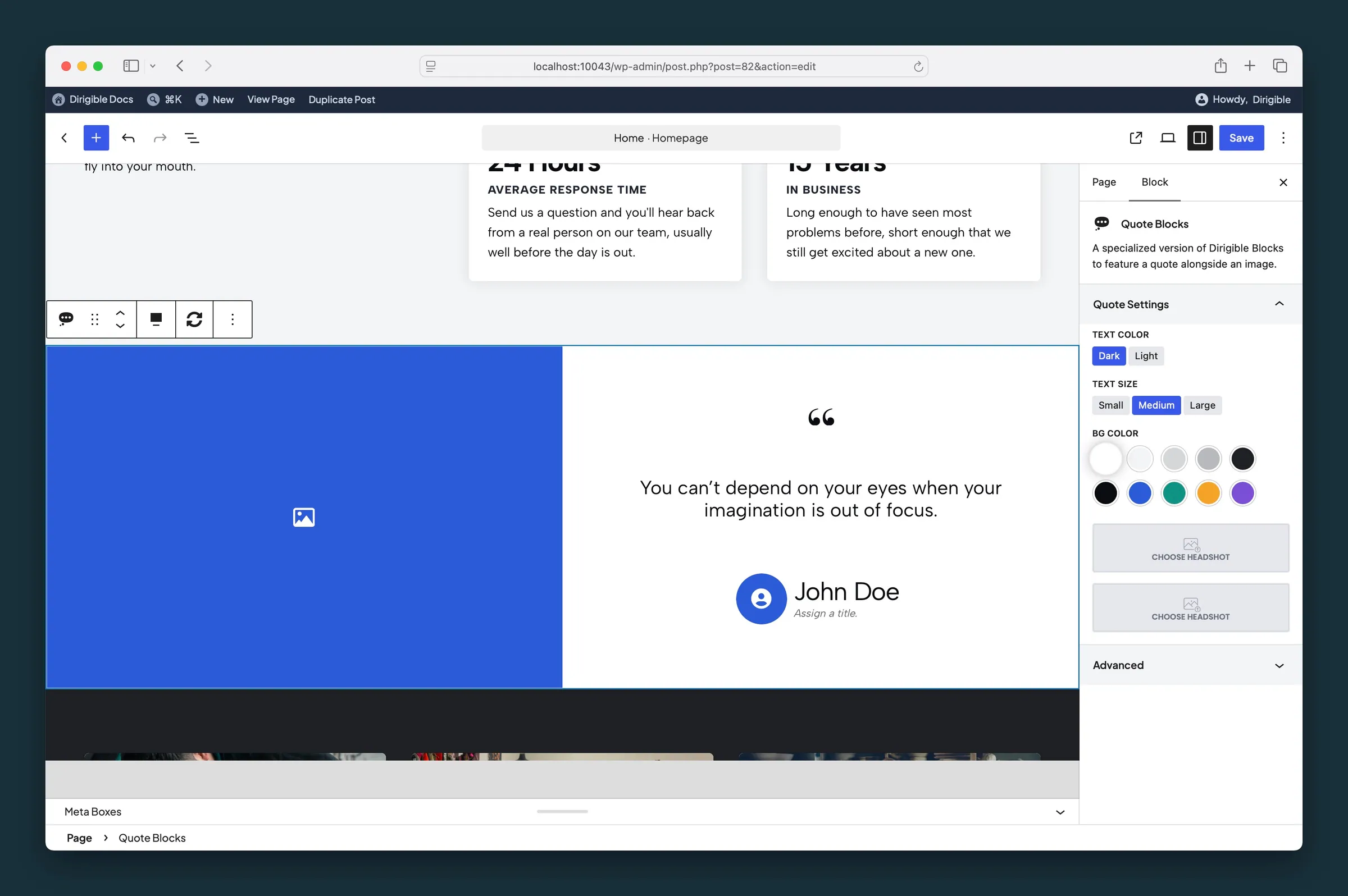
Quote Blocks sidebar — Text Color, Text Size, BG Color, and headshot.
Settings
Quote Settings
Use light text when the quote side has a dark background color. Choosing a background color picks Dark or Light for you, whichever reads better on that color; change it any time.
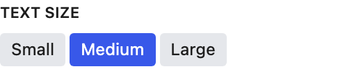
Small matches normal paragraph text. Medium and Large are bigger and scale with the screen width.

Keeps the important part of the featured photo in view when it's cropped. It follows the image's focal point from the Media Library until you move it here; after that it's this block's own.

Keeps the face centered when the headshot is cropped. It follows the image's focal point from the Media Library until you move it here; after that it's this block's own.