

Icon + Text
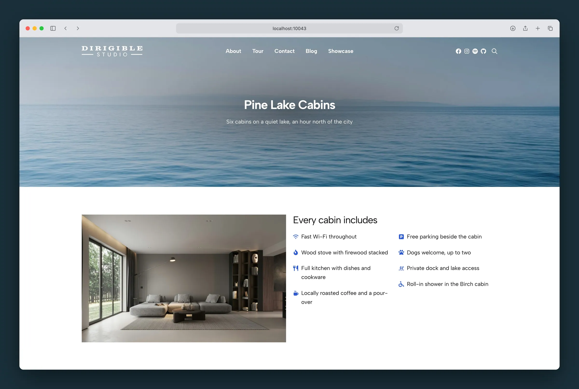
A line of text with an icon in front of it, like a paragraph with an icon.
Usage
Icon + Text is a paragraph with an icon in front of it, or after it. Type the text as you would in a paragraph: links, bold and italic all work. In front, the icon sits beside the first line, and longer text wraps beside the icon, never under it. After the text, the icon follows the last word, like an arrow on "All rooms & suites →", and always stays on the same line as that word.
Choose the icon from the block toolbar or under Icon in the sidebar. It comes from the same icon library as Icon List and Grid (Font Awesome, Phosphor or Lucide), or upload your own image to the Media Library.
Press Enter at the end of a line to start another Icon + Text line with the same icon and settings, so a run of lines builds up like a list. Press Enter on an empty line to finish the run and carry on with a paragraph. Backspace at the start of a line joins it onto the line before. Shift+Enter adds a line break inside the same line.
When to use it
- Icon + Text: a single line or short paragraph with an icon, with no card, headline or background. Use it for accessible-room links in a menu, contact details (phone, email, address), short amenity or feature lines, or a note with a warning icon.
- Icon List (its items are Icon Cards): cards with a headline and body text beside an icon, often with a colored circle behind the icon, a card background or a shadow. Use it for a features or services section.
- Structured List (its items are List Cards): rows or a grid of items with a headline and description, led by a number, an uploaded icon or a short label. Use it for numbered steps, feature rows or labeled lists.
If a line needs a headline above it, use Icon List or Structured List instead.
Icon settings
Sidebar controls under Icon:
- Icon: Choose Icon opens the icon library; Upload Custom Icon uses an image from the Media Library instead. Remove Icon takes it off.
- Icon Position: Before Text (default) or After Text. Use After Text for a trailing arrow or an external-link mark. The block toolbar has the same switch.
- Icon Size: by default the icon is the size of the text, and grows or shrinks with it. Move the slider to set a size instead, on the same scale as Icon List and Grid, from 1 to 20 (5 is about the size of body text); Reset matches the text again. The icon stays centered on the first line (or, after the text, on the last line). An icon taller than the text makes room for itself, so it never overlaps the lines or blocks around it: in front of the text it sits at the top, with the first line centered beside it; after the text, its line grows to fit it.
- Color Icon: off by default, so the icon uses the text color (a link's line uses the paragraph's text color, not the link color). Turn it on to pick a color from the site palette.
- Read Icon Name Aloud: off by default, so screen readers skip the icon, since the words beside it say what it means. Turn it on when the icon adds meaning the words don't, for example a wheelchair icon in front of a room name that doesn't say "accessible". Screen readers then say the icon's name (such as "Wheelchair") where it sits, before or after the text. An uploaded icon uses its Alternative Text from the Media Library; without one there's nothing to read, so the toggle is off.
Text size and spacing
Both are on the sidebar's Styles tab (the half-filled circle next to the gear), as on a paragraph:
- Typography → Font Size: by default a line is the site's paragraph size. Pick a size (Small up to 3XL) or set your own, for example 14px to match smaller links beside it in a menu. The icon grows and shrinks with the text, unless Icon Size sets its own size, and stays centered on the first line.
- Dimensions → Margin: the space above and below the line. Set the top to 0 to line an Icon + Text line up with paragraphs beside it that have no top margin.
Lines started with Enter keep the size and margin of the line before.
Switch to and from a paragraph
To turn paragraphs into Icon + Text lines, select them, click the block icon at the left of the toolbar and choose Icon + Text under Transform to. Each paragraph becomes one line with its text, links, formatting, font size and top and bottom margin; choose each line's icon afterwards. A paragraph's color, weight and other text styles aren't kept. To go back, choose Paragraph: the text, size and margin stay and the icon is dropped.
Tips
- An uploaded icon is drawn in one color, like the library icons, using the shape of the image. Upload a single-color SVG or a PNG with a transparent background; a photo or a full-color logo shows as a solid shape.
- A line that is only a link gets a click area at least 24 pixels tall, so links in a menu are easy to tap. The text doesn't move.
- By default lines are spaced like paragraphs. Change the space above or below one line under Dimensions → Margin on the Styles tab.
Settings
Icon
Where the icon goes. Before the text, it sits in front of the first line and the text wraps beside it. After the text, it follows the last word, like an arrow, and never ends up on a line by itself. The block toolbar has the same switch.
- Before Text defaultThe icon in front of the text (the default).
- After TextThe icon after the last word, for an arrow or an external-link mark.
How big the icon is next to the text. By default it matches the text size; the slider sets a size on the same scale as Icon List and Grid, from 1 to 20, and Reset matches the text again. It stays centered on the first line at every size.
Off, the icon uses the text color. Turn on Color Icon to pick a color from the site palette.
Off, screen readers skip the icon, since the words beside it say what it means. Turn it on when the icon adds meaning the words don't: screen readers then say the icon's name before the text. An uploaded icon needs Alternative Text in the Media Library for this.
Off by default.
