Hero Slider
Pair one headline with several rotating background photos.
Usage
Hero Slider keeps your headline, subheadline, and button in place while background images slide or fade behind them. Add images under Background Images in the sidebar, then set text position, overlay, and timing.
In the editor, the images slide or fade as they do on the site, with the same arrows and dots, but without autoplay. Click + after the dots to add more images (with Show slide navigation on; otherwise use Edit Images). Remove this image (trash can) in the toolbar takes the image on screen out of the slider; it stays in your media library, and Undo brings it back. Edit Images in the toolbar reorders them.
When to use it
Use it when one message fits several photos: seasonal campaigns, multiple locations, or a product family. Use the standard Hero block when one background image is enough.
Tips
- Check that the overlay keeps text readable on every image, not just the first.
- Text Position sets where the text sits over the images.
- Keep to a few images. Visitors rarely wait for a long slideshow.
- Visitors can swipe or use the arrows and dots; dragging with a mouse doesn't move the images. On screens narrower than 1200px the arrows are hidden (the headline would cover them), so visitors use the dots or swipe. Autoplay doesn't run for visitors who've turned on reduced motion in their device settings. Visitors can stop it with a small pause button at the bottom right, which appears when they hover over the block or reach it with the keyboard (on phones and tablets it's always shown).
Screenshots
Front-end
-
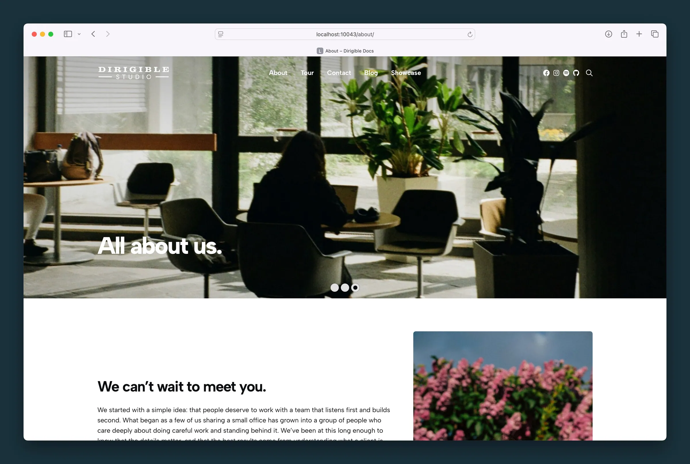
About-page hero with bottom-left headline over a bright interior slide, followed by a text-and-photo band. -
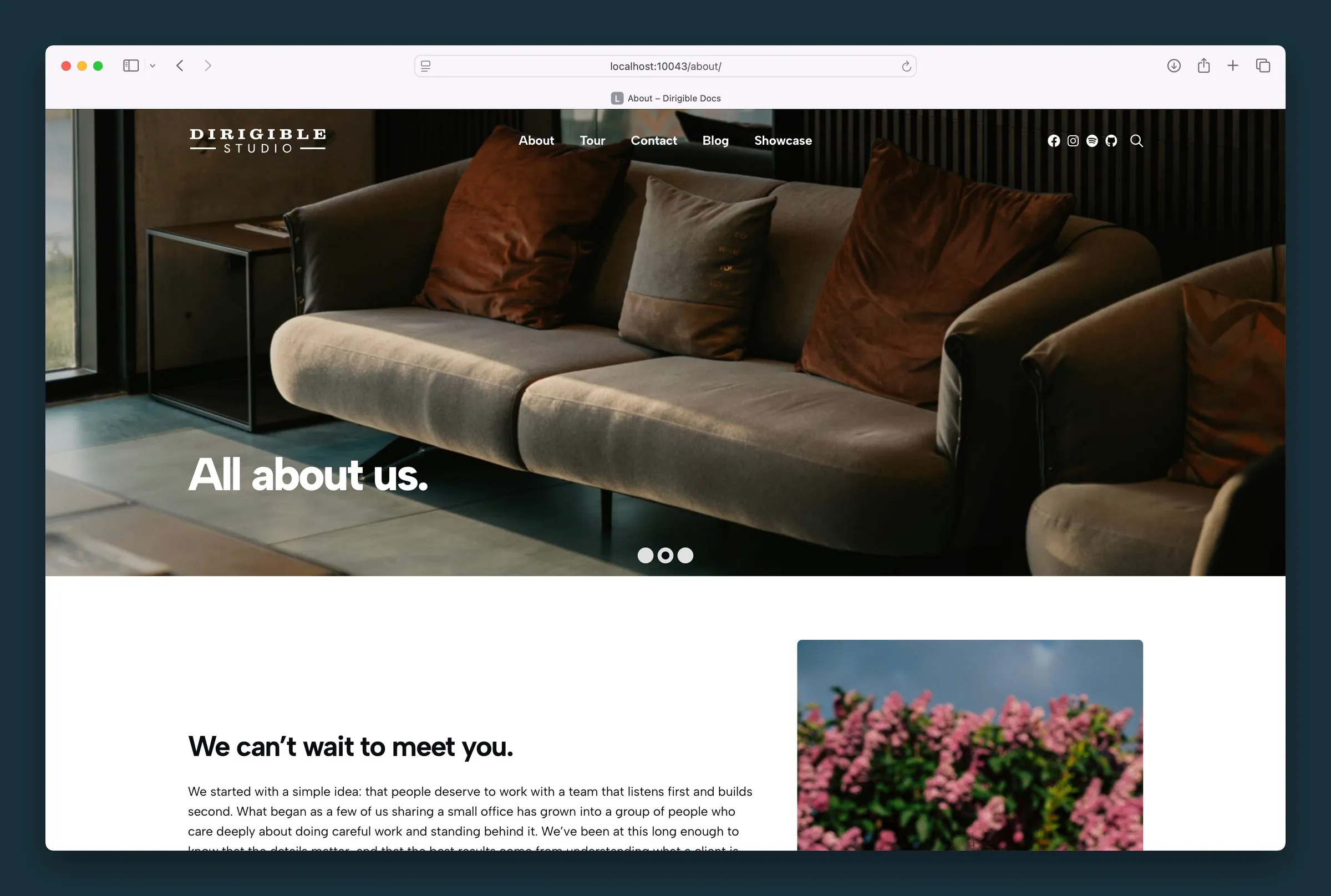
Same headline over a darker lounge slide — background changes while copy stays put.
Editor
-

Content settings — enable text, headline, link, and text position over the slider. -
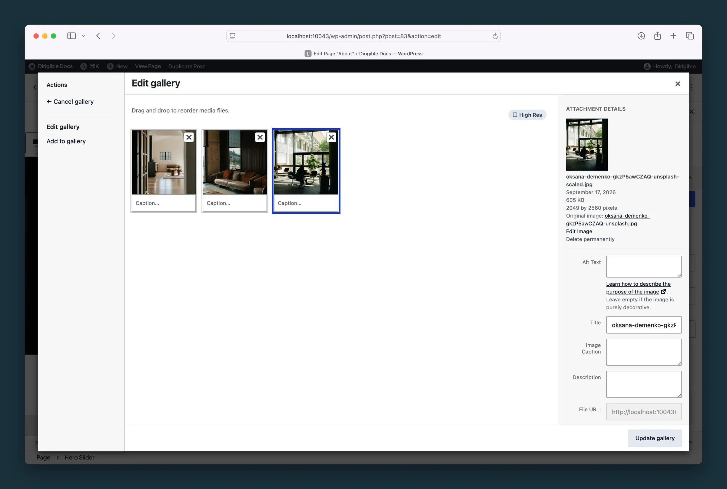
Background Images gallery — add, reorder, and caption the slides behind the hero copy.
Settings
Content






Options



Overlay / Text




Color of the overlay on the images. Changing it also sets Text Color when the overlay is strong enough to set the tone: a dark overlay from the default opacity up, a light one from 70% up. Change Text Color any time.
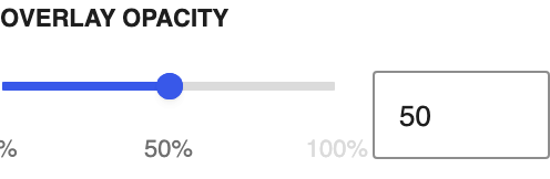
Strength of the overlay, 0–100%. Dragging it also updates Text Color as the overlay starts or stops dominating the image; a dark overlay counts from the default opacity, a light one from 70%. Change Text Color any time.
Background Images






Loads the first image right away instead of waiting until it's needed. Later images always load just before they slide in.