

Structured List
Feature lists with a title and description per item, plus optional numbers, icons, or labels.
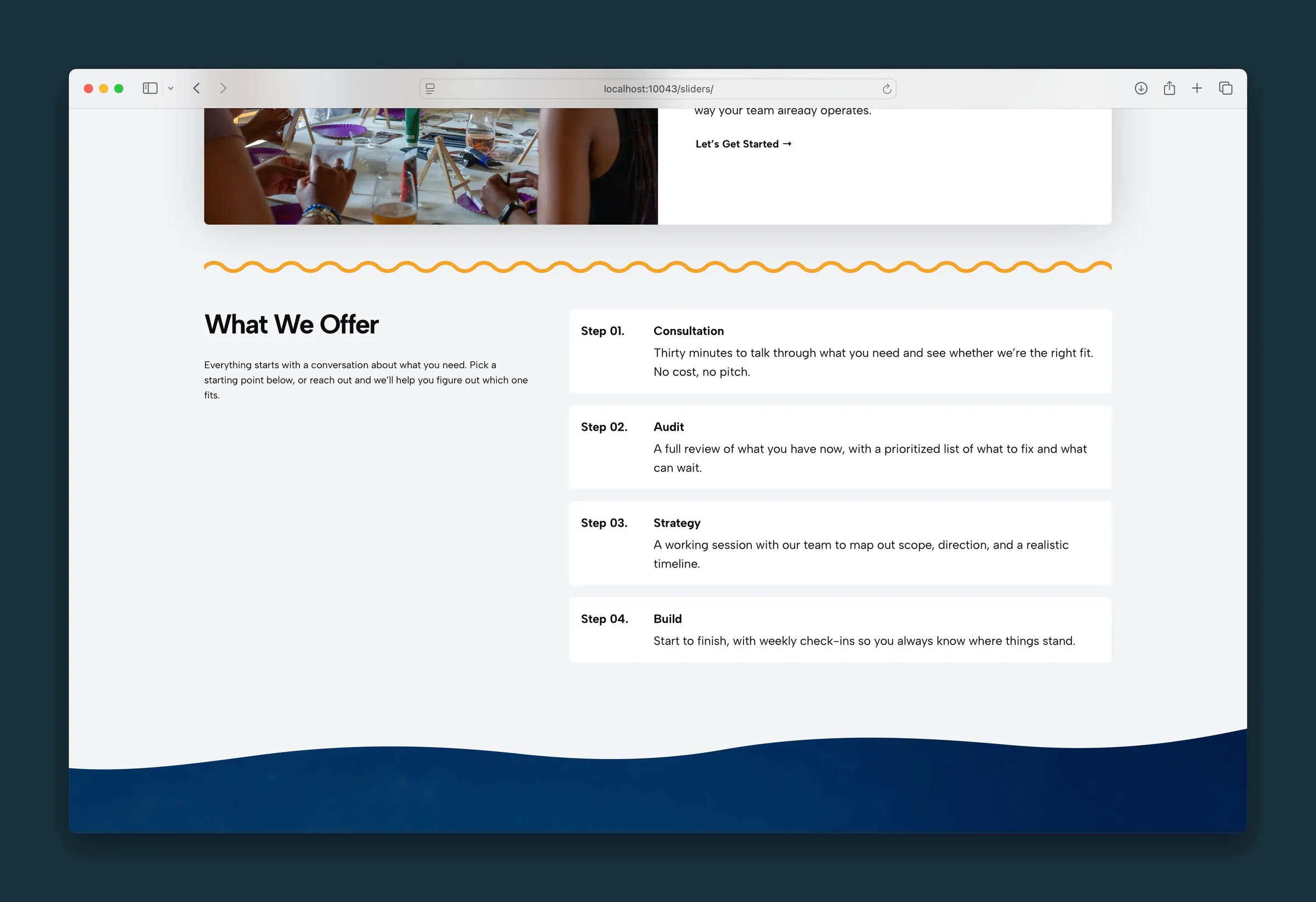
Usage
Structured List builds feature lists that go beyond the standard WordPress List block. Each item has a Headline and body text, and can lead with a number, an icon, or a short custom label called a Runner.
Use it for service highlights, feature grids, process summaries, or anything that reads better as labeled rows than bullet points.
The block starts with three List Card items. In List layout, add more with Add List Item below the block. In Grid layout, use the block inserter.
Parent and child blocks
The outer Structured List block holds one or more List Card items.
Select Structured List for layout, style, and text settings that apply to every card. Select a single List Card for its type, headline, body, icon, runner text, or link.
Layout (parent)
- Layout: List (default) stacks items, or Grid places them in columns.
- Columns: with Grid layout, choose 2 (default), 3, 4, or 5 items per row. Items wrap onto more rows on smaller screens.
Style (parent)
One look for every card. Select the outer block, not a single card, before changing Style:
- Outlined (default): subtle bordered cards with space between them
- Cards: a rounded background on each item
- Compact: stacked rows separated by lines
- Separator: minimal rows with space above and below, no outer border
- Primary: a left accent border in your primary color
- Naked: no background or border
Typography (parent)
Shared across all list cards:
- Headline Style: how item titles look, using your site's heading styles. Default looks like H4. Titles always stay H4 in the page outline, whatever look you pick.
- Text Size: Regular (default) or Small for the text under each headline.
- Icon Size: size of the icon on Icon cards (1–40).
- Runner Size: width of the leading column on Numbered, Icon, and Runner cards (0–6; default 2.5).
- Runner Style: how numbers and runner text look. Default looks like H3.
Toggle Text Size in the block toolbar switches between Regular and Small without opening the sidebar.
Card types (child)
Select a List Card and set Type in the List Card panel:
- Default: headline and body only.
- Numbered: a number in the leading column. The number is the card's position in the whole list, so a Numbered card in third place shows 3 even if the cards above it are other types.
- Icon: an image in the leading column. Click the placeholder in the editor or use Choose Icon in the sidebar. SVG icons stay sharp at any size.
- Runner: your own short text in the leading column, such as a letter, symbol, or "Step 1." Edit it on the canvas or in the Runner field.
Every card type also has:
- Headline: the item title, edited on the canvas or in the sidebar.
- Body: paragraphs and lists below the headline.
- Link URL: when set, the whole card becomes one link.
Block width
Structured List supports Wide and Full alignment from the block toolbar.
Tips
- Set Style, Headline Style, and Text Size on the outer block first, then fill in each card.
- Use Numbered for automatic numbers. If you mix card types, use Runner instead so you control each label.
- Grid suits short feature comparisons. List reads better for longer descriptions.
- For numbered circles joined by a line, use Step by Step. For dated events, use Timeline.
Screenshots
Front-end
-
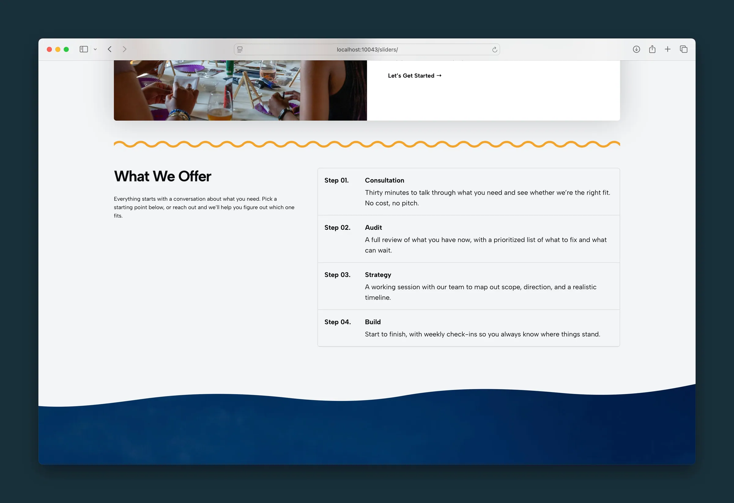
The same steps as one outlined list, with a divider between rows. -
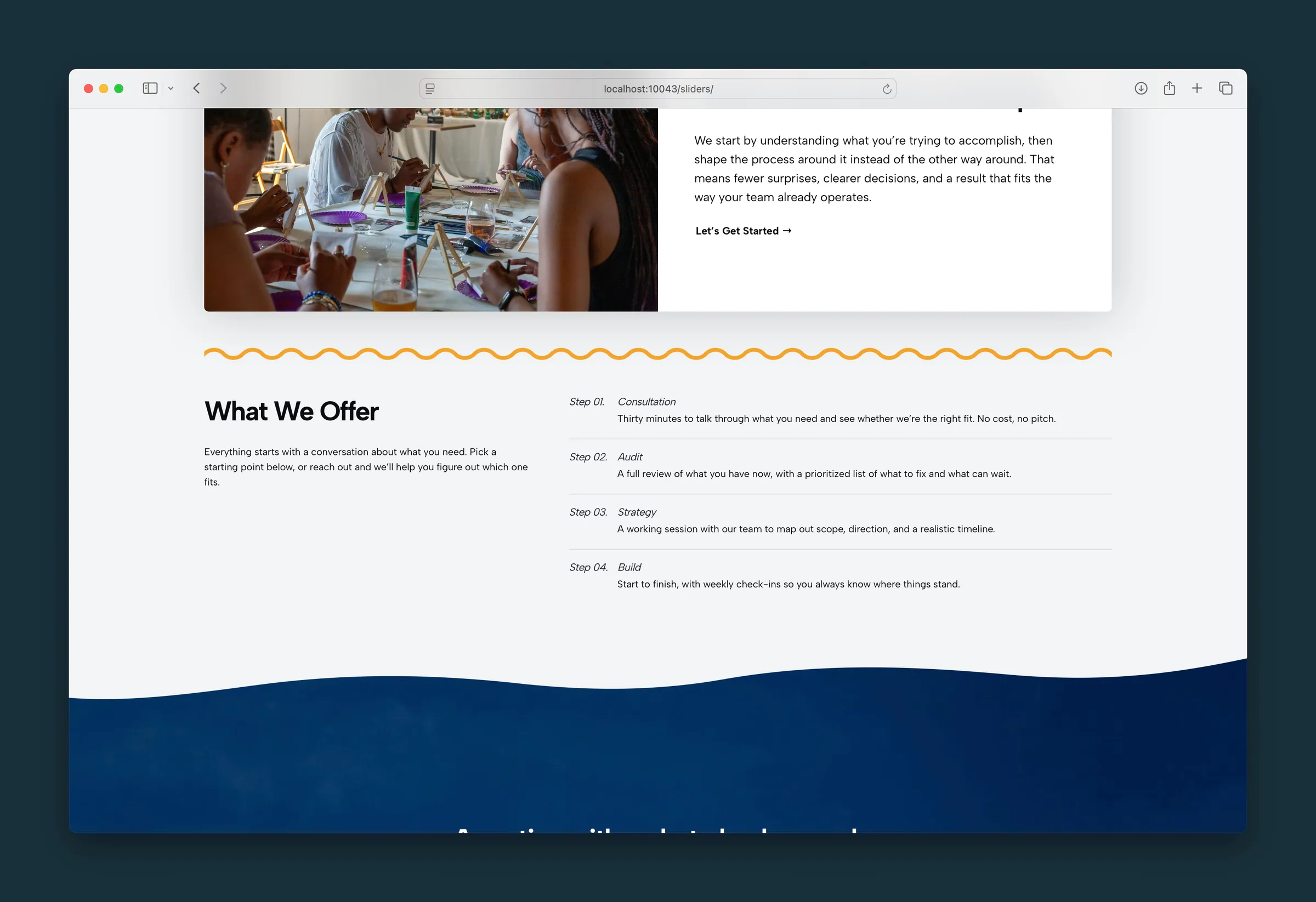
A lighter list — the step label and title on one line, with a rule under each item.
Editor
-
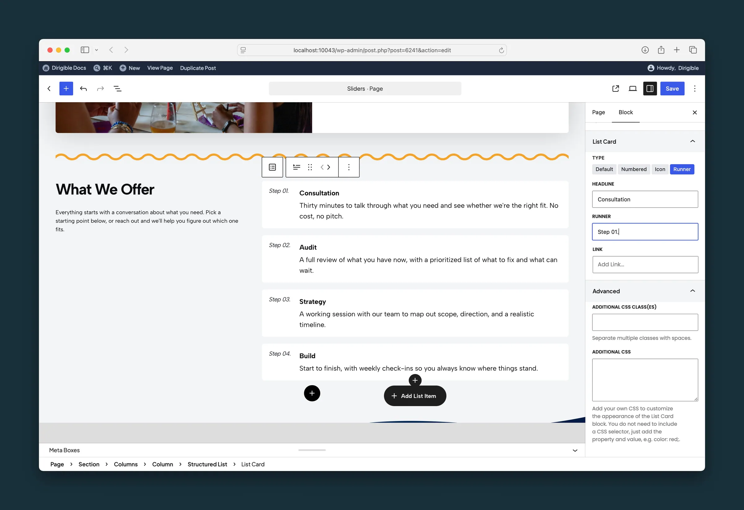
A List Card selected as a Runner, with the runner text set to Step 01. -
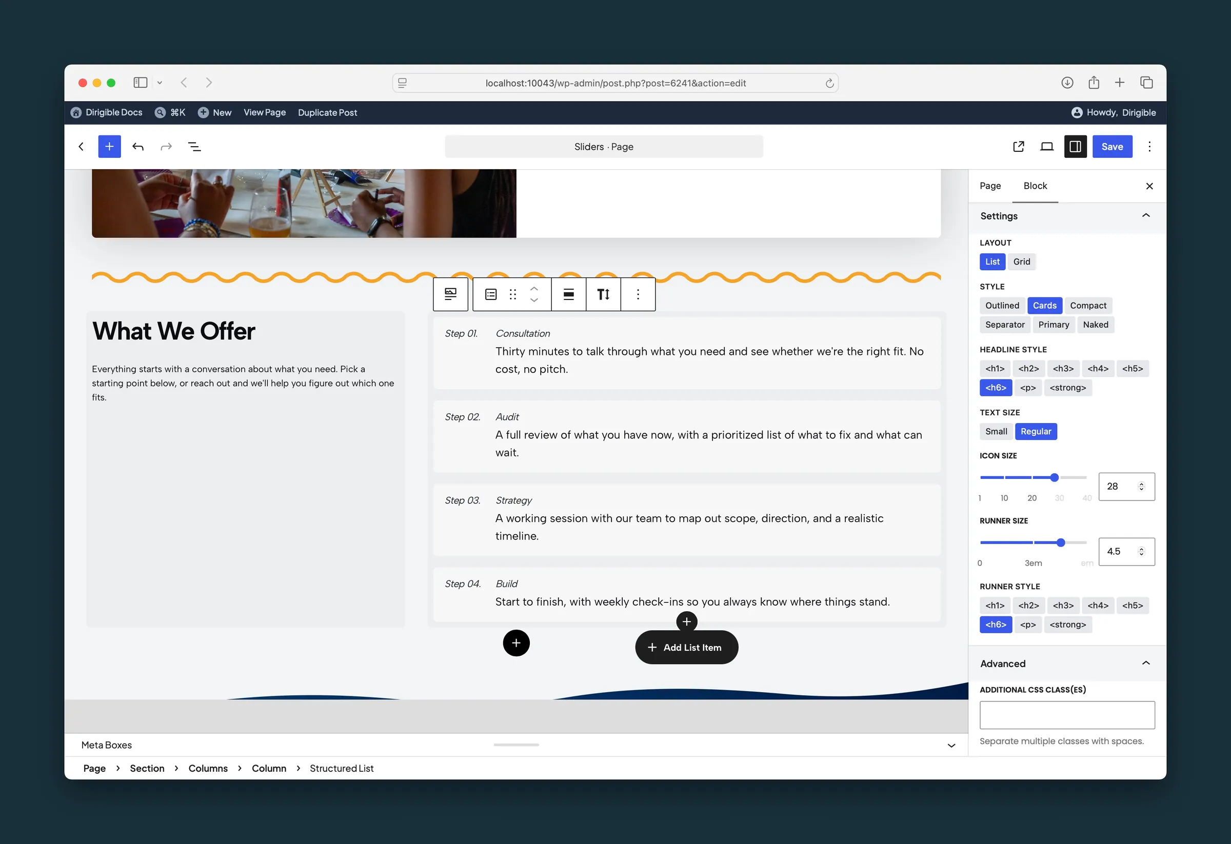
Structured List sidebar — List layout, Cards style, headline, text size, and runner size.
Settings
Settings
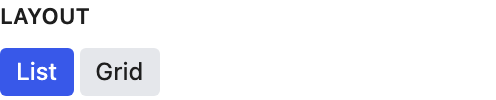
List stacks items. Grid places them in columns.
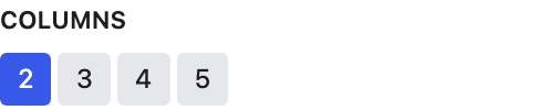
Items per row when Layout is Grid.
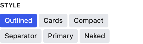
One look for every card in the list. Select the outer block, not a single card, before changing it.
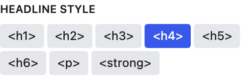
How item titles look, using your site's heading styles. Titles stay H4 in the page outline whichever look you pick.

Size of the text under each headline.
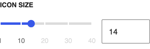
Size of the icon on Icon cards.
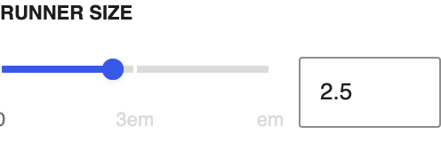
Width of the leading column on Numbered, Icon, and Runner cards.
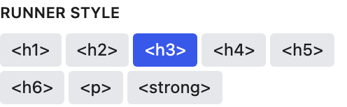
How the numbers on Numbered cards and the text on Runner cards look.
List Card
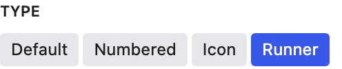
What leads this row. Select the row, not the whole list.
- Default defaultHeadline and link only.
- NumberedA number from the list’s runner style.
- IconAn icon you choose for this row.
- RunnerA short runner you type for this row.
The row headline.
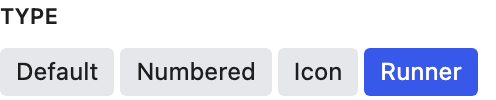
The short text in front of the headline. Appears when Type is Runner.
Optional destination for this row.