

Breakout Grid
Put one big idea in a circle, then break it out into a row of cards.
Usage
Breakout Grid puts a main idea in a circular bubble at the top, then breaks it out into a row of supporting cards below. Use it for numbered steps, key points, or services that roll up to one theme.
The layout has three parts:
- Bubble: a circle holding your Icon and Headline.
- Transition Image (optional): a full-width image between the bubble and the cards, shown on large screens only.
- Cards: one to five cards in a row. The number of columns matches the number of cards.
Type the headline and the card text right on the block. Choose the images, sizes and heading looks in the sidebar.
Bubble
- Icon: the image inside the bubble.
- Icon Size: how tall the icon is (default 2).
- Headline: a short title under the icon. Type it in the bubble, or in the sidebar.
- Headline Style: which heading look to use (default h4). This changes the look only; the headline's place in the page outline doesn't change.
- Bubble Size: how wide the circle is (default 6).
Transition image
Transition Image is optional. On large screens it spans the full width between the bubble and the cards. On smaller screens it's hidden, and the bubble leads straight into the cards.
Cards
Select the block and click Add Card below the cards to add one, up to five. Each card has:
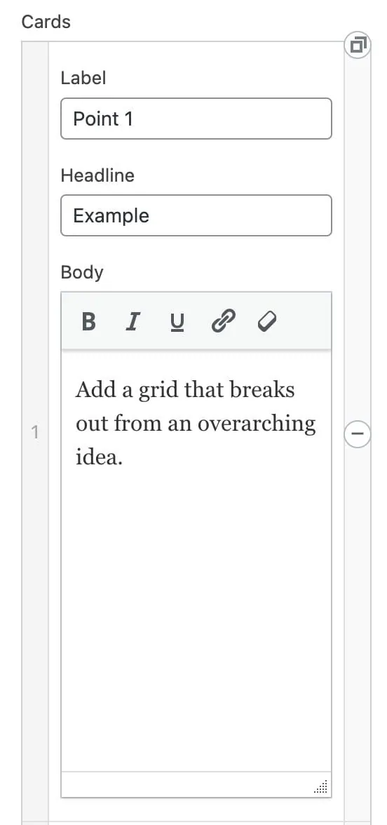
- Label: short text on a colored badge. Use it for step numbers, letters, or short tags. New cards are numbered for you.
- Card title: the card's heading.
- Card text: the card's copy. Press Enter for a new line, and twice for a new paragraph. Bold, italic and links work as in any text block.
A part you leave empty isn't shown on the page.
The arrows at the top of a card move it left or right, and the trash can removes it.
Card Title Style and Card Label Style set the heading look for every card's title and label. Titles default to h4 and labels to h2.
Block width
Breakout Grid supports Wide and Full alignment and defaults to Wide.
Tips
- Keep the bubble Headline short, since it shares a circle with the icon.
- For a simpler list without the bubble, try Structured List. For numbered steps with more copy, try Step by Step.
Screenshots
Front-end
-
The bubble, transition image, and card row on the live page.
Settings
Bubble
How tall the icon is inside the bubble. Make the bubble bigger too if a large icon crowds the headline.
The main idea, shown in the bubble under the icon. You can also type it right in the bubble. HTML you type here, like <em> or <center>, is kept; scripts are removed.
The heading look for the bubble headline. Changes the look only, not the page outline.
How wide the circle at the top is. Make it bigger if the icon and headline feel cramped.
Cards
The heading look used for every card title. Changes the look only, not the page outline.
The heading look used for the label badge on every card.
