

Comparison Table
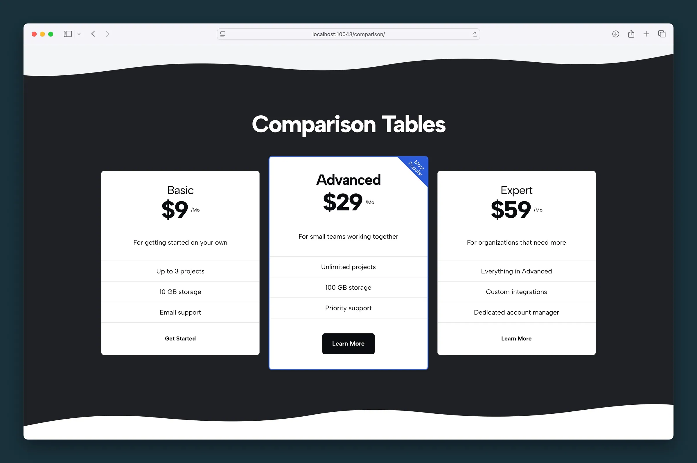
Pricing tier cards in a row on desktop, stacked on mobile — each card styled independently.
Usage
Comparison Table is a pricing table made of Card blocks, one per plan or product tier. Cards display in a row on desktop and stack on mobile. You can add as many cards as you like, but three or four reads best.
Cards expand to fit their content. A common pattern is to put your recommended tier in the middle and use Prominent or a Flag on that card to guide visitors toward it.
The block inserts with three sample tiers (Basic, Advanced, Expert) so you can start editing immediately.
Parent and child blocks
Select the Comparison Table parent to change block-wide settings. Select an individual Card to edit that tier's content and styling.
While a card is selected, use the block toolbar breadcrumb, parent button, or List View to jump back to the parent table. Use the + appender to the right of the last card to add another tier.
Crop Images (parent)
Crop Images is enabled by default. When on, each card's header image covers the full card width (edge to edge at the top). Turn it off for logos or icons, so they shrink to fit instead of being cropped like a photo.
Card content
Edit these fields inline on each card:
- Title — tier name (e.g. Basic, Pro)
- Price and price suffix — dollar amount and unit (e.g.
$10and/Mo) - Description — short line under the price
- Features — a core List block with one item per feature (checkmark bullets on Default style)
- Button text — appears when a link URL is set in the sidebar
Card settings (sidebar)
Each card has its own sidebar panel:
- Style — Default, Compact, or Simple (see below)
- Prominent — primary-color border, larger title typography, and elevated visual weight; on mobile the prominent card sorts to the top
- Flag — short promotional text in a diagonal ribbon (e.g. "Best Deal")
- Link URL — when set, shows a CTA at the bottom of the card
- Link Style — Button (filled) or Understated (text link); appears after a URL is added
- Background Image — photo at the top of the card
- Image Focal Point and Size — appear when an image is set; height in pixels (32–512)
- Parent Crop Images affects how the header image fills the card width
Card styles
- Default — feature list with rounded pill rows and checkmark icons
- Compact — table-like bordered rows, inline price and suffix, no checkmark bullets
- Simple — lighter feature list without pill backgrounds
Keep styles consistent across cards so differences in Prominent, Flag, or copy stand out as intentional cues.
Comparison Matrix
Use Comparison Table when each tier is mostly standalone marketing copy in its own card. Use Comparison Matrix when multiple products share one checklist and you want a true feature grid on desktop.
Tips
- Use Button link style on the featured tier and Understated on the others to point visitors toward it.
- Match feature list length across cards so they line up on desktop.
Screenshots
Front-end
-
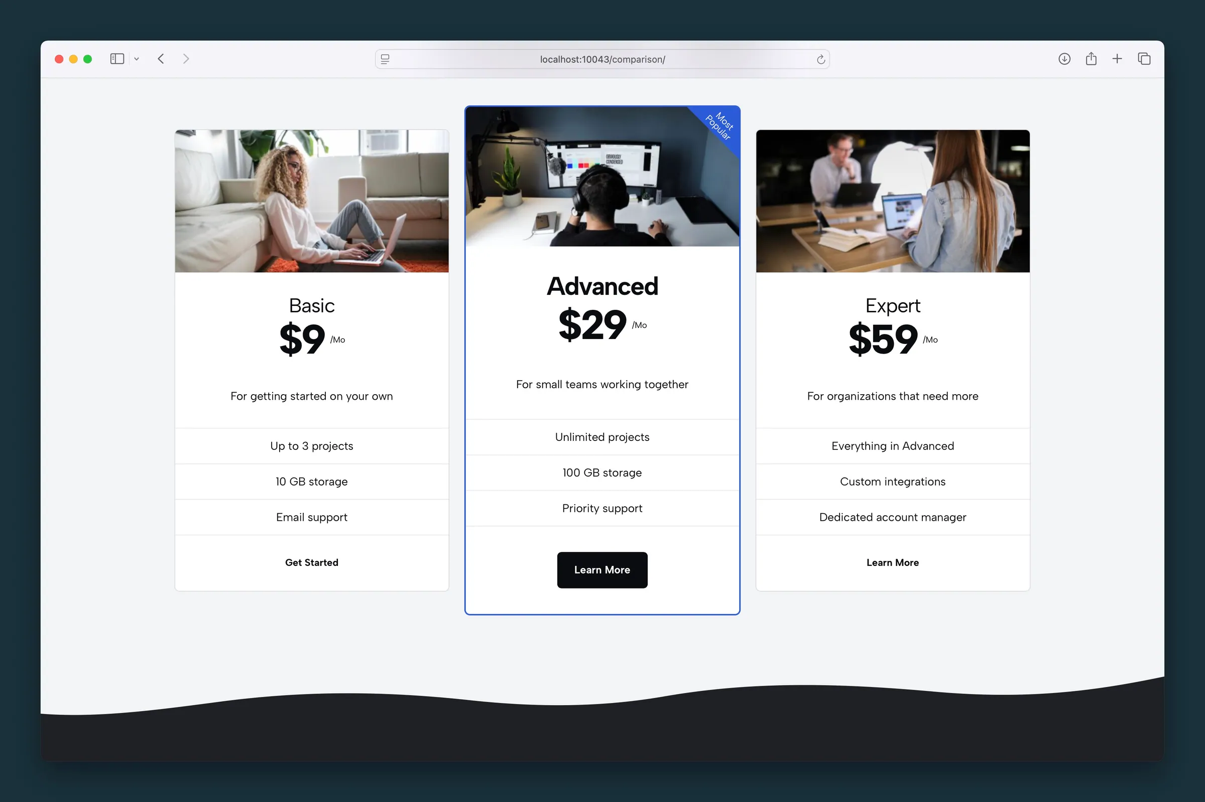
Same three tiers with header photos on each card and a Most Popular ribbon on Advanced. -
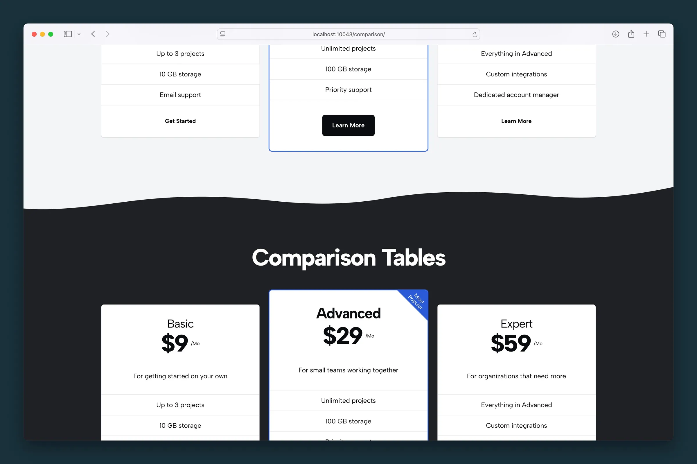
Text-only tier cards on a dark section with the middle card prominent.
Editor
-
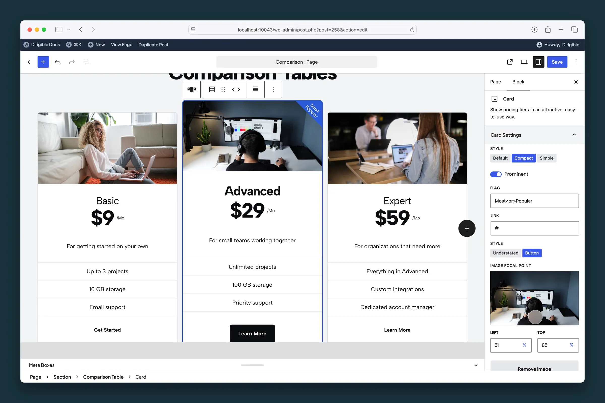
Card settings — Compact style, Prominent, Flag, button link style, and image focal point. -
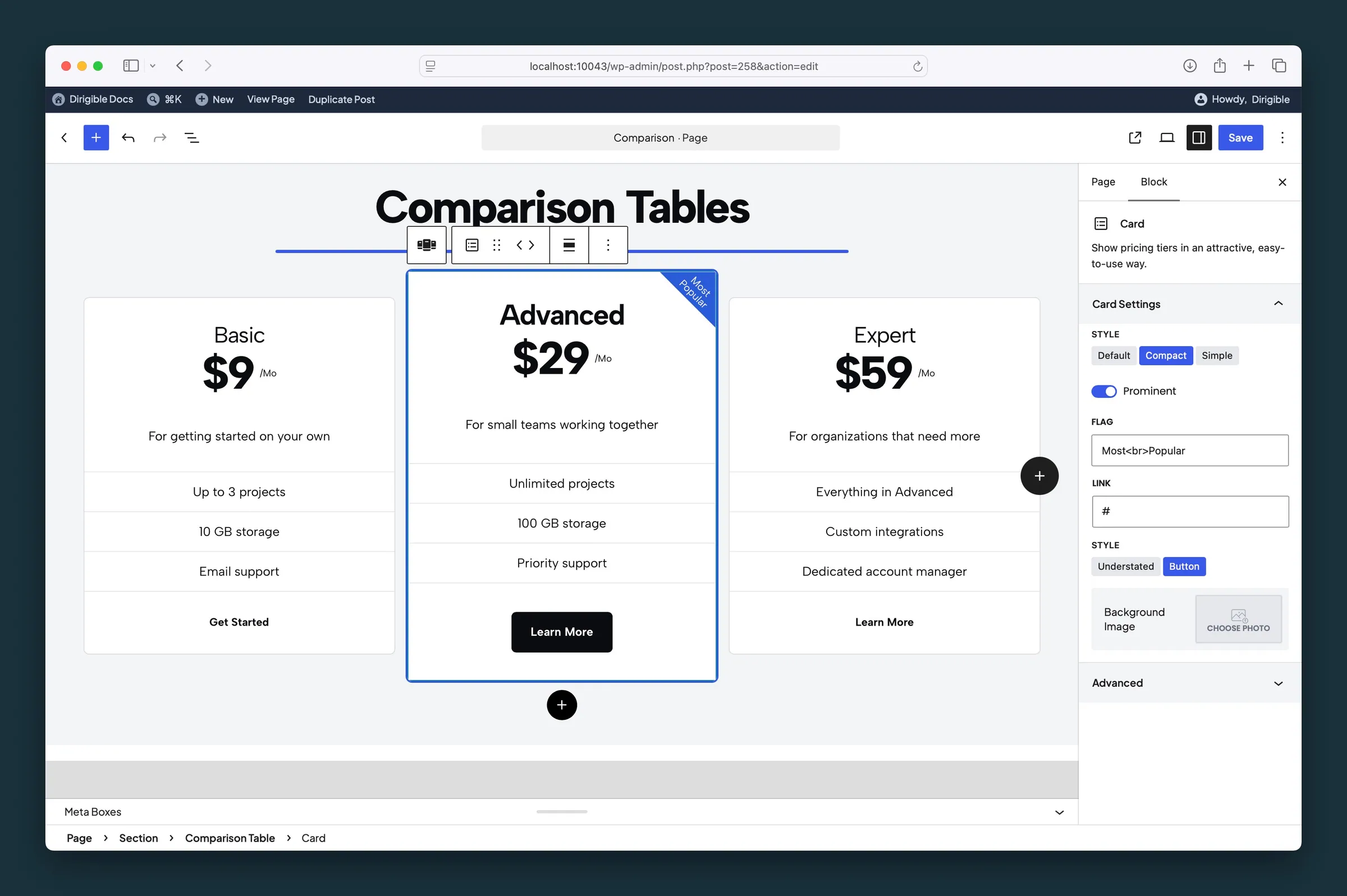
Same Card sidebar without a photo — Compact, Prominent, Flag, and Choose Photo.
Settings
Settings

When on, each card's header image fills the full card width. Turn it off for logos or icons that should shrink to fit instead of being cropped.
Card Settings

How this column is laid out. Select the column, not the whole table.
- Default defaultThe standard card, with checkmarks beside each feature.
- CompactA tighter list with dividers and no checkmarks.
- SimpleA plain feature list without row backgrounds.

Outlines this column, enlarges the title, and moves it to the front of the row.
A short corner label, such as Popular. Leave it empty to hide the flag.
Where this column’s link goes. Link Style appears after you add a URL.

How the column link looks. Only appears after you set Link URL.
- UnderstatedA text link.
- Button defaultA filled button.

Drag the dot to the part of the image that should stay in view. Appears after you choose a background image. It follows the image's focal point from the Media Library until you move it here; after that it's this block's own.
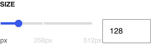
Height of the column image, from 32 to 512 pixels. Appears after you choose a background image.