

Step by Step
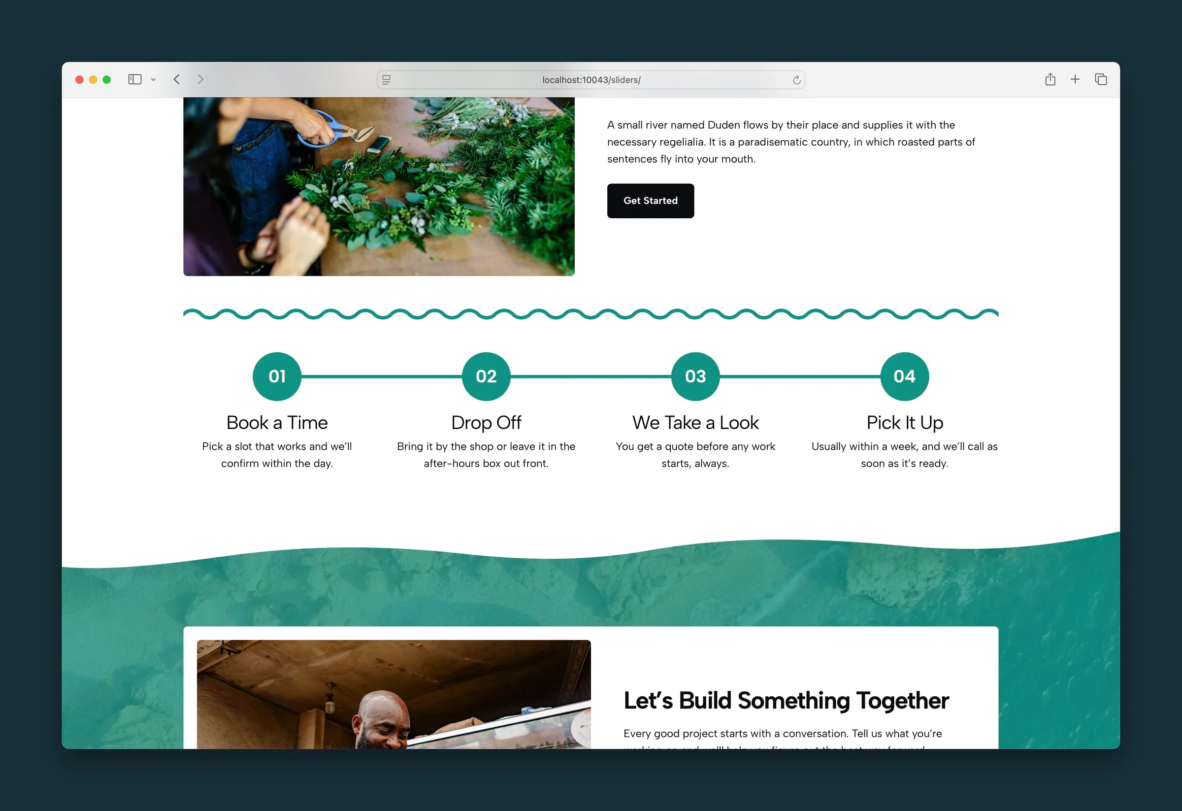
Show a step-by-step process as numbered steps with connecting lines.
Usage
Step by Step lays out a numbered process as a grid of steps, each with a circular counter, a title, and a description. Use it for onboarding flows, how-it-works sections, service steps, or any sequence where order matters.
The block starts with four Step blocks. Numbers fill in automatically, so you never type them yourself.
Parent and child blocks
The outer Step by Step block holds one or more Step blocks. Add or remove steps with the block inserter.
Select Step by Step for layout, counter styling, and connector options. Select a single Step to edit its title and description.
Layout (parent)
- Columns: 2, 3, 4 (default), 5, or 6 steps per row. Steps wrap onto more rows on smaller screens.
- Alignment: Left or Center for the counter, title, and text in each step.
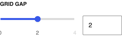
- Grid Gap: space between steps (0–4).
- Small Text: makes the description text smaller in every step.
- Card Background: adds a subtle rounded background behind each step.
- Connector Line: lines linking the counters on screens 768px and wider. The last step has no line after it.
- Connector Width: line thickness in pixels (1–24).
- Connector Color: palette color for the line.
Headlines (parent)
- Headline Tag: the heading level step titles use in the page outline (H2–H6, or a plain paragraph). Default is H4.
- Headline Appearance: how titles look, using your site's heading styles. Default looks like H5.
The two are independent. A title can stay an H4 in the outline while looking smaller.
Counter (parent)
Shared styling for every step's numbered circle:
- Counter Appearance: which of your site's text styles the number uses.
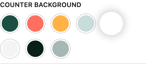
- Counter Text Color, Counter Outline Color, Counter Background: palette colors.
- Counter Outline Width: border thickness in pixels (0–12).
- Counter Size: circle size on a 4–40 scale (about 1rem to 10rem across).
- Counter Font Size Adjust: fine-tunes the number size inside the circle.
- Counter Prefix: text before the number. The default
0gives 01, 02, 03. - Counter Suffix: text after the number, such as
.for 1.
Individual steps (child)
Each Step has a title you type directly on the canvas and a paragraph below it for the description. Add more paragraphs if a step needs them.
Numbers update on their own when you reorder, add, or remove steps.
Block width
Step by Step supports Wide and Full alignment from the block toolbar and starts at Wide.
Tips
- Set Columns to match your step count when you can. Four steps in four columns reads better than three plus one wrapped.
- Clear Counter Prefix for plain 1, 2, 3.
- Turn on Card Background when steps sit on a busy Section background.
- For dated events rather than numbered steps, use Timeline instead.
Screenshots
Editor
-
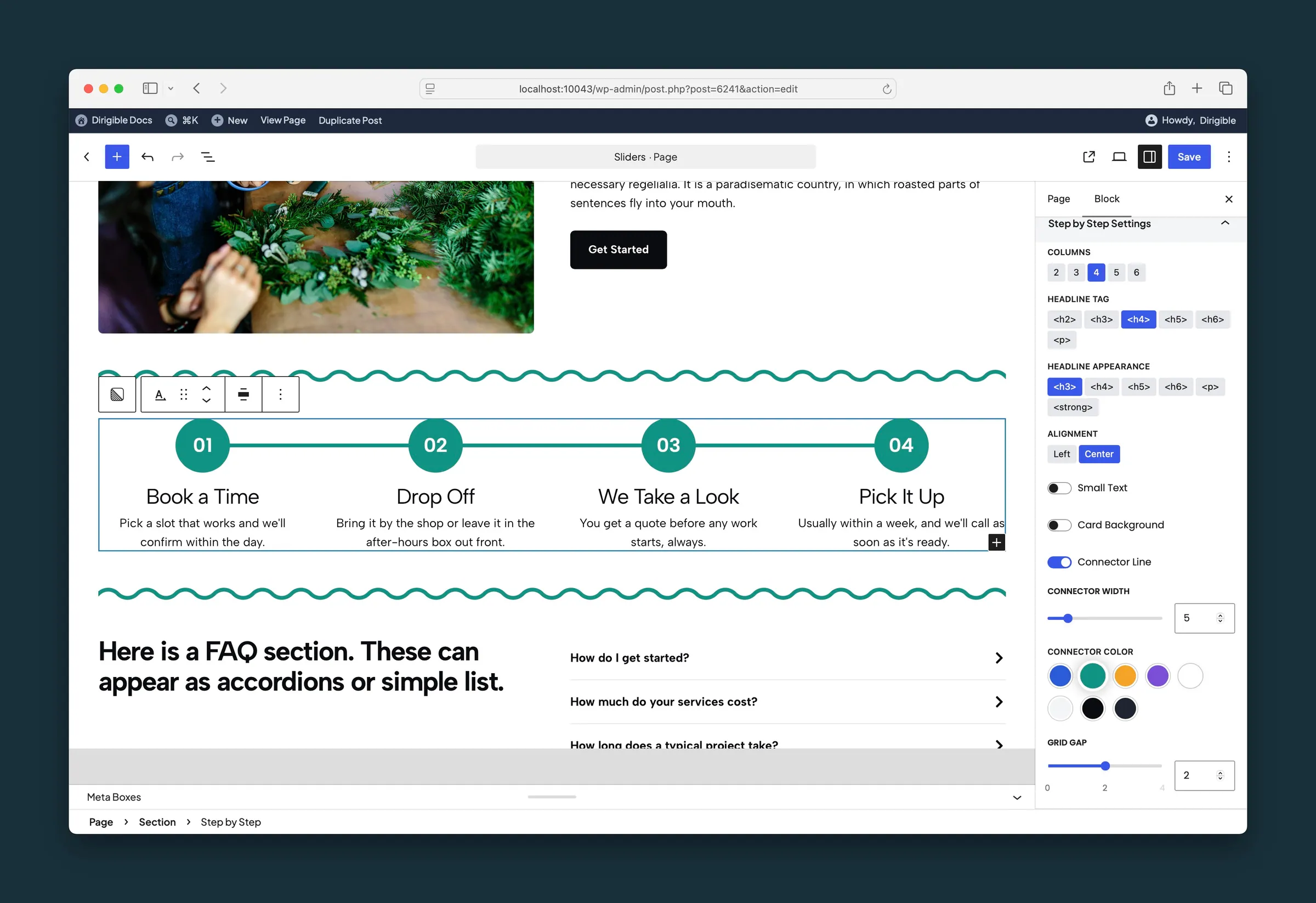
Step by Step sidebar — columns, headline, alignment, connector line, and grid gap. -
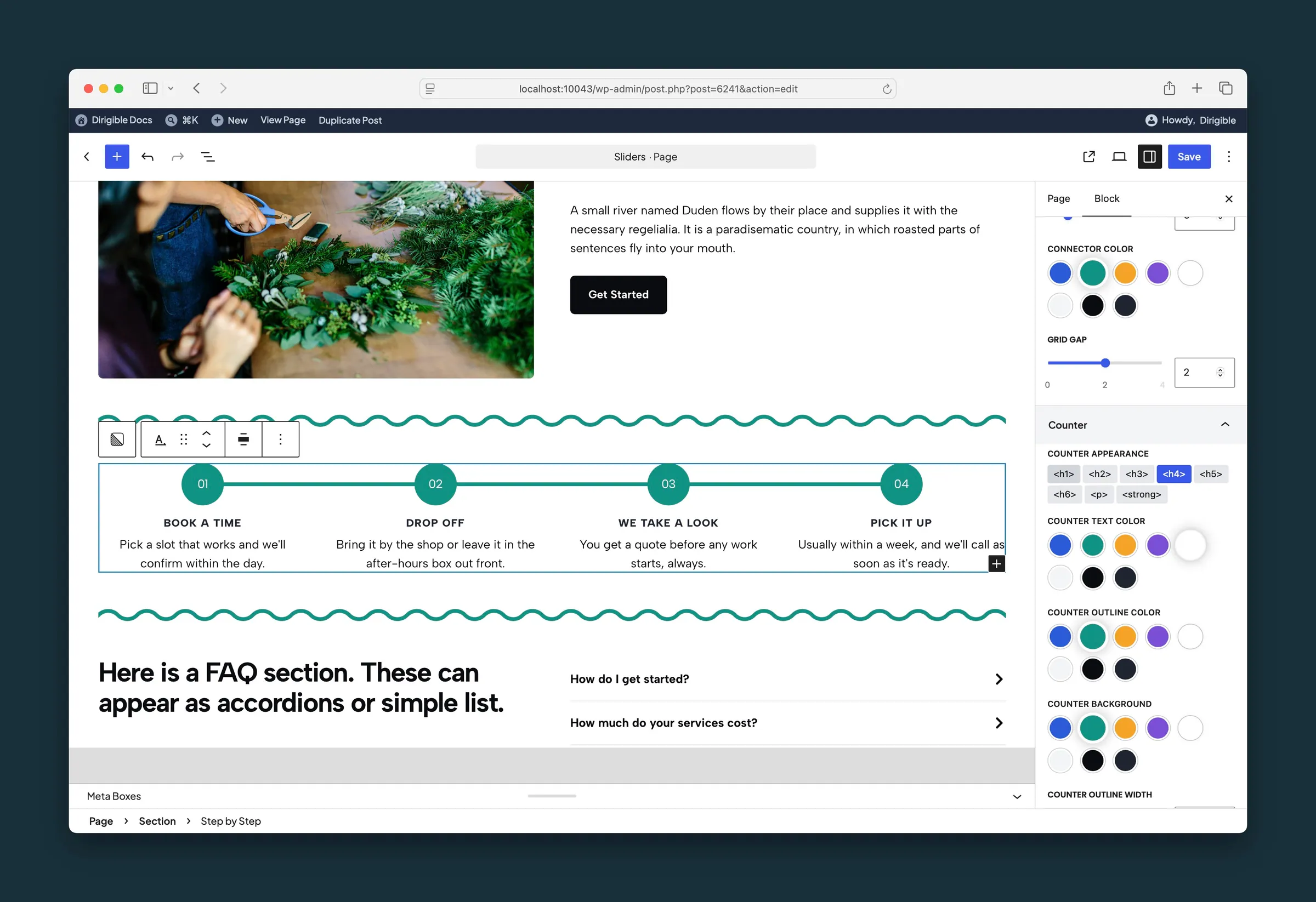
Counter settings — appearance, text color, outline, and background.
Settings
Step by Step Settings

Steps per row. Steps wrap onto more rows on smaller screens.

The heading level step titles use in the page outline. Use Headline Appearance to change how they look.
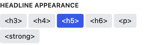
How step titles look, using your site's heading styles. Doesn't change Headline Tag.

Align counter, title, and body text left or center within each step.

Makes each step's description text smaller.

Adds a subtle rounded background behind each step.

Draws lines between the step counters on screens 768px and wider. The last step has no line after it.

Thickness of the connector line in pixels (1–24).

Counter
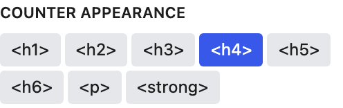
Which of your site's text styles the number uses.

Border thickness of the counter circle in pixels (0–12).
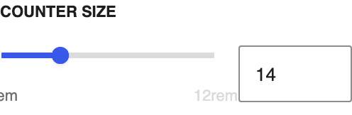
Counter circle diameter on a 4–40 scale (about 1–10rem). Default 14 is about 3.5rem.

Fine-tunes the size of the number inside the circle.
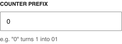
Text before the number. The default 0 gives 01, 02, 03.
Text after the counter number, such as a period.