

Map & Text
Show a Google Map beside your address, hours, or directions.
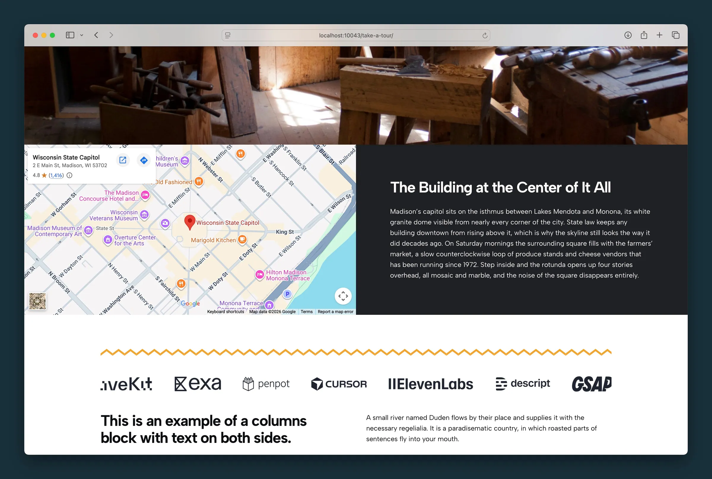
Usage
Map & Text puts a Map embed beside a Content column in a two-column band. It follows the same layout as the Photo & Text and Video & Text Columns starters and Call To Action. Use it on contact pages, for location highlights, or anywhere you want a map next to directions.
The two sides are fixed: map on one side, content on the other. You can't add or remove columns, but you can edit everything inside each side.
Layout (parent)
- Block Size — even 50/50 split, larger map column, or larger content column (sidebar Block Settings)
- Swap Blocks — toolbar control that swaps map and content on desktop only; on mobile, the map stays above the text
Map column (child)
The map column uses the Map block. Paste the embed code from Google Maps or OpenStreetMap into the Embed field.
Getting a Google Maps embed code
- Open your location in Google Maps and click Share
- Choose Embed a map
- Click Copy HTML
- Paste the code into the Map block's Embed field in the editor
The map fills its half of the band. You don't need an API key.
Content column (child)
The other column is a Content block that holds regular blocks. It starts with a heading, paragraph, and button; replace or add to them with any blocks the Content area allows.
Use the Content block's own sidebar settings for background, text position, and reverse print on that column.
Block width
Map & Text supports Wide and Full alignment from the block toolbar (default is full width).
Tips
- Paste the whole embed code exactly as Google gives it to you.
- Use Swap Blocks when the map should appear on the right on desktop.
- Keep the content column focused: address, hours, and a single call to action button work well beside a map.
Screenshots
Editor
-
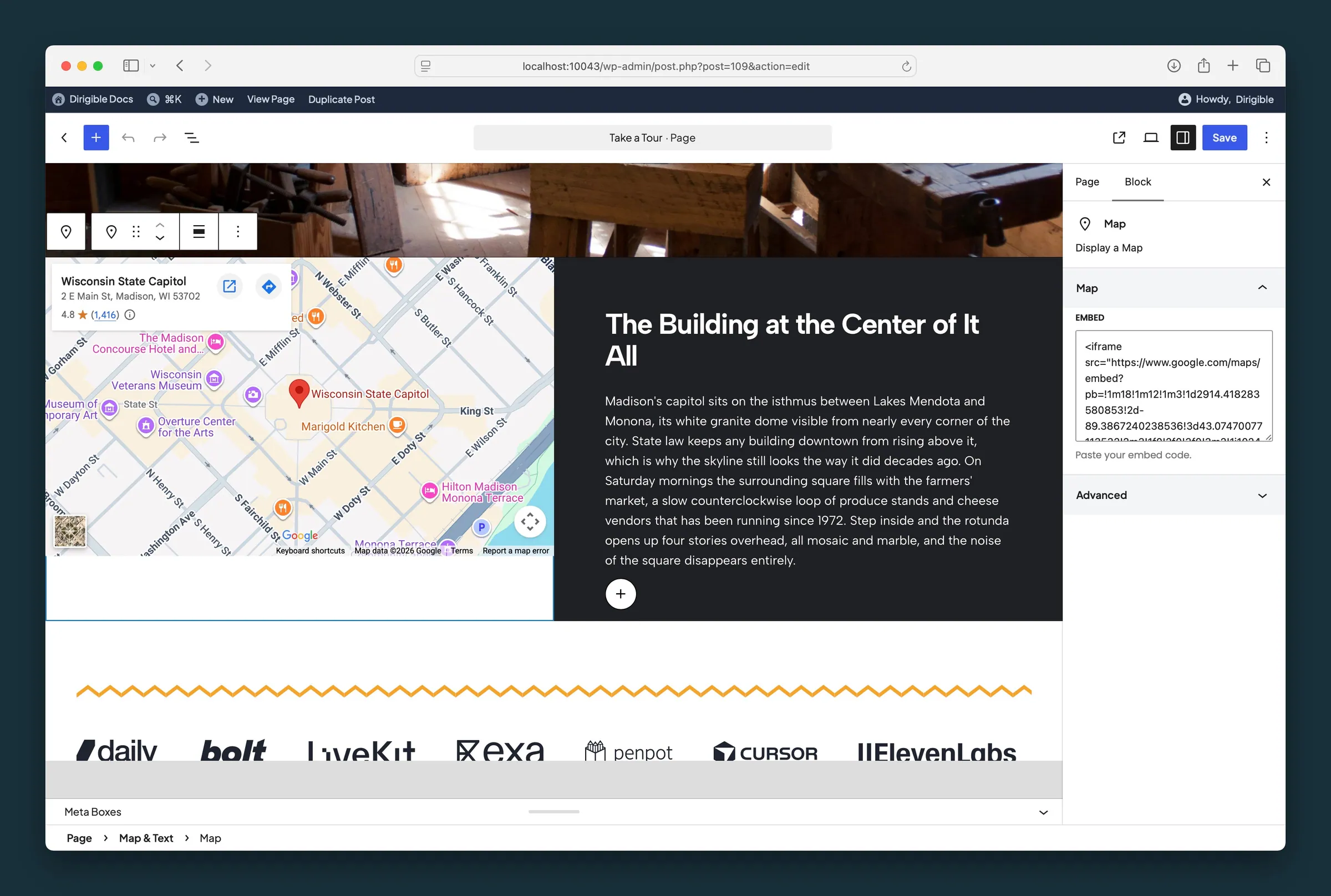
Map child selected — paste a Google Maps iframe into Embed; the map preview updates in the left column. -
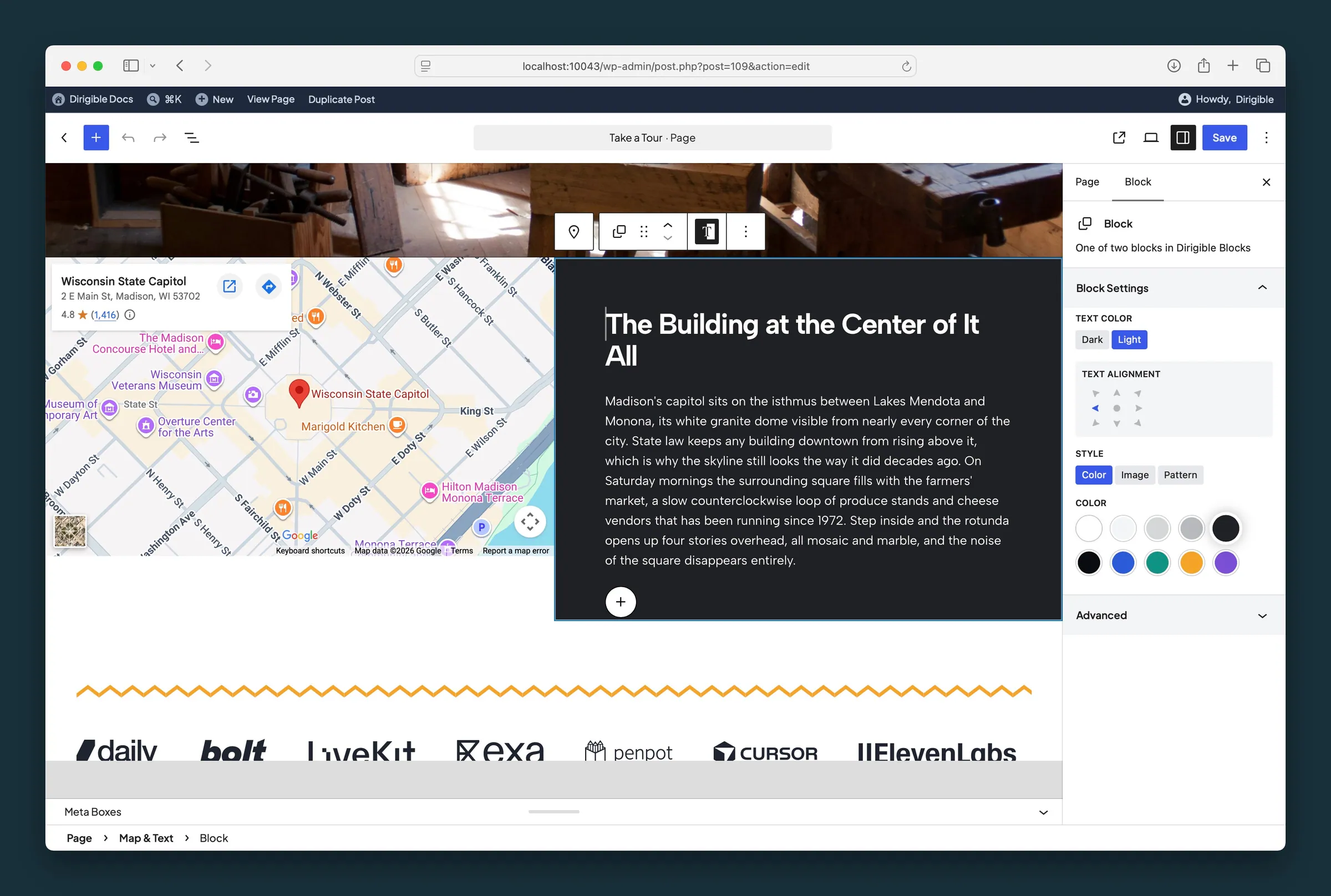
Content child selected — Text Color, Text Alignment, Style, and background color for the right column.
Settings
Block Settings
How the width is split between the map and the content on desktop: even, larger map, or larger content. On mobile the columns stack with the map on top.