

Pills
A row of tag-style pills for categories, features, or status labels.
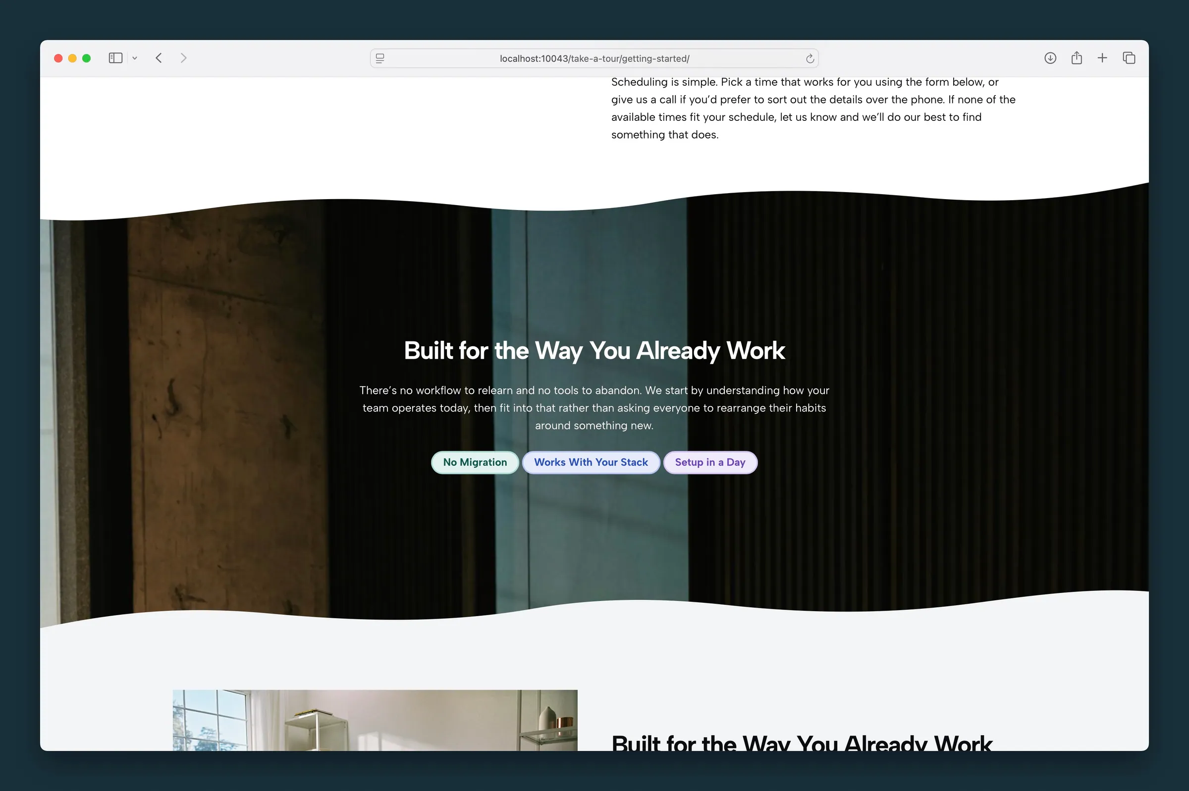
Usage
Pills shows a row (or column) of short tag-style labels: categories, feature highlights, skills, or status tags like "Live" or "New". Each Pill can be plain text or a link, with its own color and an optional indicator dot.
Select the parent Pills block for layout and styling shared by every pill. Select an individual Pill to edit its label, link, color, and indicator. Add more pills with the block inserter or by duplicating one.
Layout (parent)
- Justify — Start, Center, End, or Space Between
- Orientation — Horizontal (default) or Vertical
- Gap — space between pills (0–12)
Pill style (parent)
These settings apply to every pill in the group:
- Quick-Set Color — applies a color to every existing pill at once (Primary, Secondary, Accent, Variant, Gray, White, Black, or Transparent). You can still change individual pills afterward. Pills you add later start as Primary.
- Padding X / Padding Y — space inside each pill
- Font Size — text size (0.5–2)
- Border Radius — Square, Rounded, or Full (pill-shaped, default)
- Border Width — outline thickness in pixels (0–4)
- Font Weight — 100–1000 in steps of 100
- Text Transform — Normal, Uppercase, Title Case, or Lowercase
Individual pills (child)
Select a Pill to set:
- Text — type the label directly on the pill. Bold is available from the formatting toolbar.
- URL — optional link, from the sidebar URL field or the Link toolbar button. Leave it empty for a plain label.
- Color — Primary, Secondary, Accent, Variant, Gray, White, Black, or Transparent (no fill with a gray outline; set the parent Border Width to 0 to remove the outline)
- Show Indicator — a slowly pulsing dot before the label
Block width
Pills supports Wide and Full alignment from the block toolbar.
Tips
- Use Space Between for a filter bar that spans the full width of its container.
- Show Indicator suits "Live" or "Now enrolling" tags.
- Set Orientation to Vertical for a stacked tag list in a sidebar column.
- Use Quick-Set Color to match every pill, then change one or two pills that need more emphasis.
Screenshots
Front-end
-
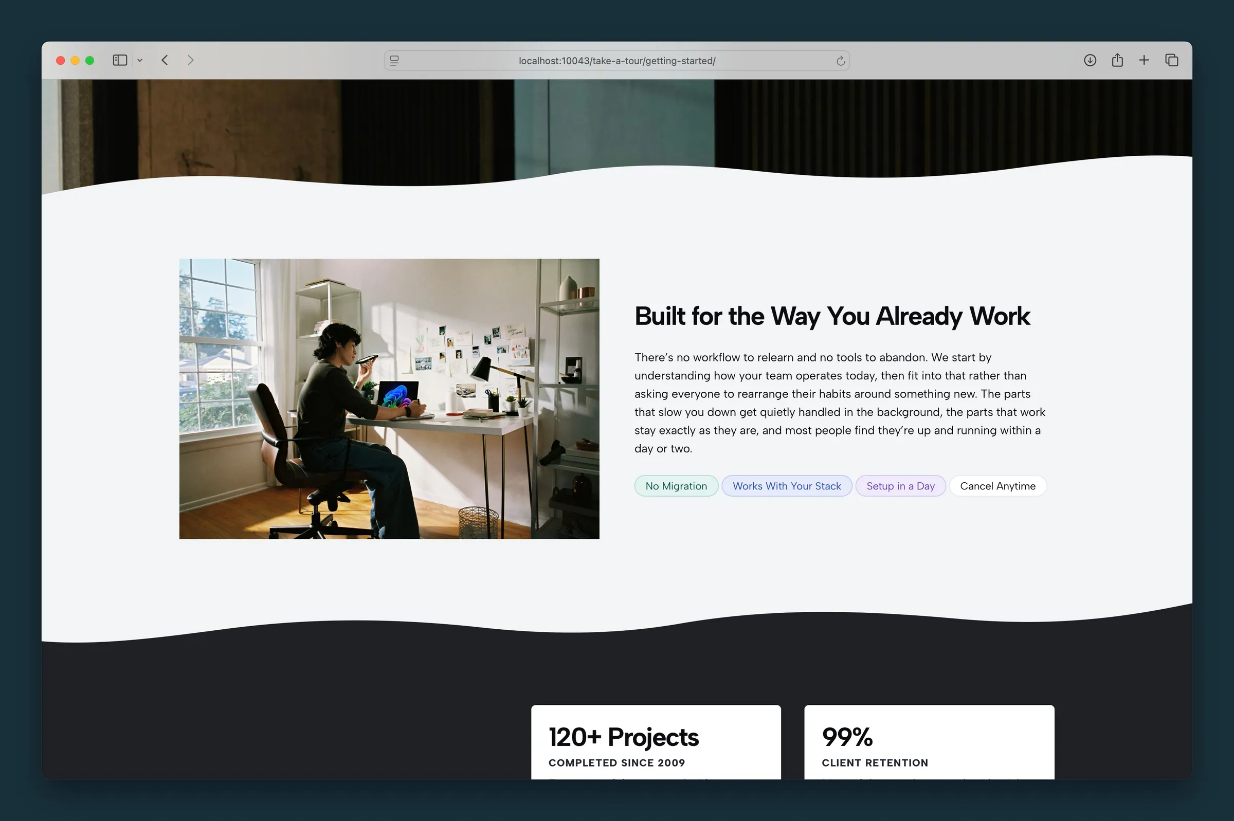
Four pills beside copy in a columns layout — mixed color presets including a transparent outlined Cancel Anytime pill.
Editor
-
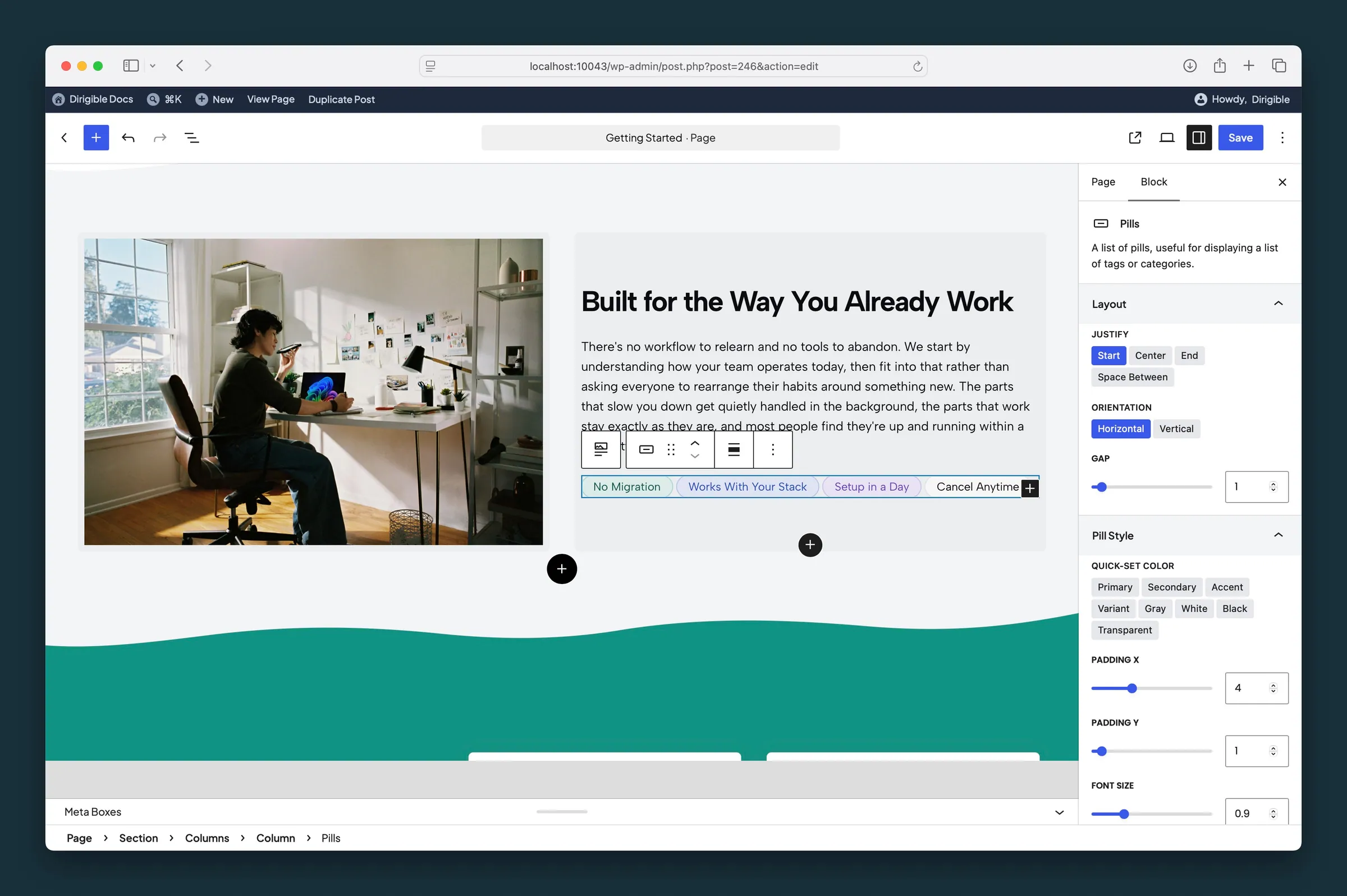
Parent Pills selected — Layout panel with Justify, Orientation, Gap, and the start of Pill Style. -
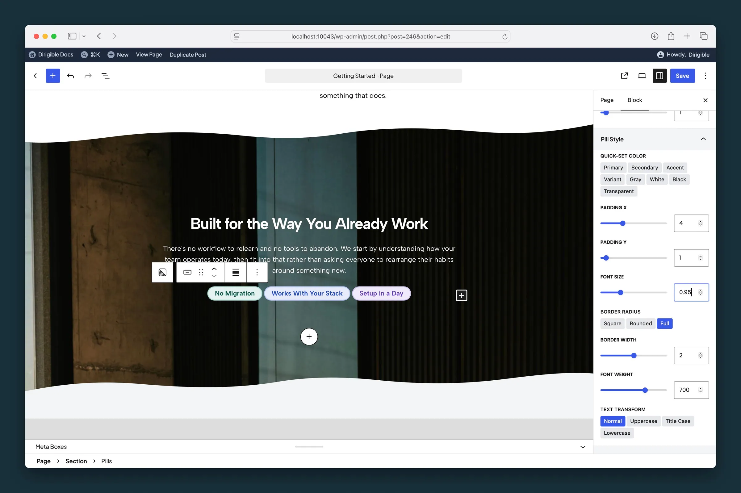
Pill Style panel — Quick-Set Color, Padding, Border Radius Full, Font Weight 700, and Text Transform.
Settings
Layout
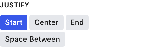

Horizontal row (default) or vertical stack.
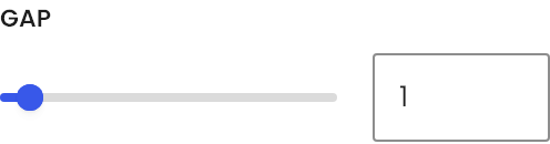
Space between pills (0–12).
Pill Style
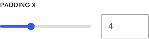
Space on the left and right inside each pill. Applies to every pill in the group.
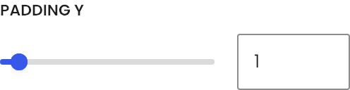
Space above and below the text inside each pill. Applies to every pill in the group.
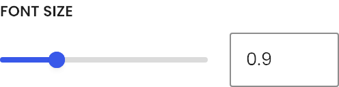
Text size inside each pill (0.5–2).

Corner shape for all pills — square, rounded, or full (pill-shaped, default).
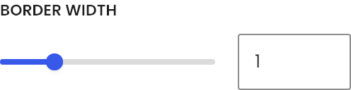
Border thickness around each pill in pixels (0–4).
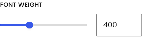
Font weight for pill text (100–1000).
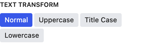
Capitalization for all pill labels — normal, uppercase, title case, or lowercase.