

Storyboard
A two-column portfolio grid that mixes photos and story text.
Usage
Storyboard is a two-column grid for portfolio pages, project case studies, interior-design galleries, and any layout where copy should be scattered among the photos rather than grouped in one column.
The grid holds two kinds of blocks:
- Image: the standard WordPress Image block
- Storyboard Text: a text passage for headings and paragraphs
Insert a Storyboard block, then use Add Image and Add Text below the grid to build your layout. Items fill left to right, then top to bottom, in the order you arrange them. A tall portrait can set the height of its row while a shorter neighbour sits beside it. That uneven rhythm is intentional.
Parent and child blocks
Select the outer Storyboard block for grid-wide settings. Select an image or text passage to edit it.
Use the block toolbar's parent button or List View to move between the grid and the items in it. Drag items to reorder them. What you see in the editor is the order visitors see.
Only Image and Storyboard Text can go inside the grid.
Grid layout
- Desktop: two equal columns.
- Mobile: one column on screens 781px and narrower.
- Odd number of items: the last item may sit alone in its row. This is expected.
Storyboard Settings (parent)
- Gap: space between items (0–16; default 4).
- Crop to fill: crops each image to fill its whole grid cell, so it matches the height of a taller neighbour.
Images
Images use the standard WordPress Image block, so you get the usual media library, aspect-ratio, and link options.
Natural height (default): leave Aspect ratio unset. The image keeps its own proportions and can be the tall item that sets the row height.
Matched pairs: when two images share a row and should be the same height, turn on Crop to fill, or set an Aspect ratio on the images. Cropping follows each image's focal point from the media library, so portraits aren't cut off at the face.
Alt text comes from the media library, so if you update an image's alt text there, every placement of that image picks it up.
Storyboard Text (child)
Each Storyboard Text block is one passage made of Heading and Paragraph blocks. Add, remove, and reorder them as needed.
Under Storyboard Text Settings:
- Vertical Alignment: Top, Center (default), or Bottom when a neighbouring image is taller.
Block width
Storyboard supports Wide and Full alignment from the block toolbar and starts at Wide.
Tips
- Alternate a pair of images with a text passage for a scattered, story-told feel.
- Leave most images at their natural shape. Use Crop to fill or an aspect ratio only where two images need to match.
- Set focal points on portrait-heavy galleries before cropping.
Screenshots
Front-end
-
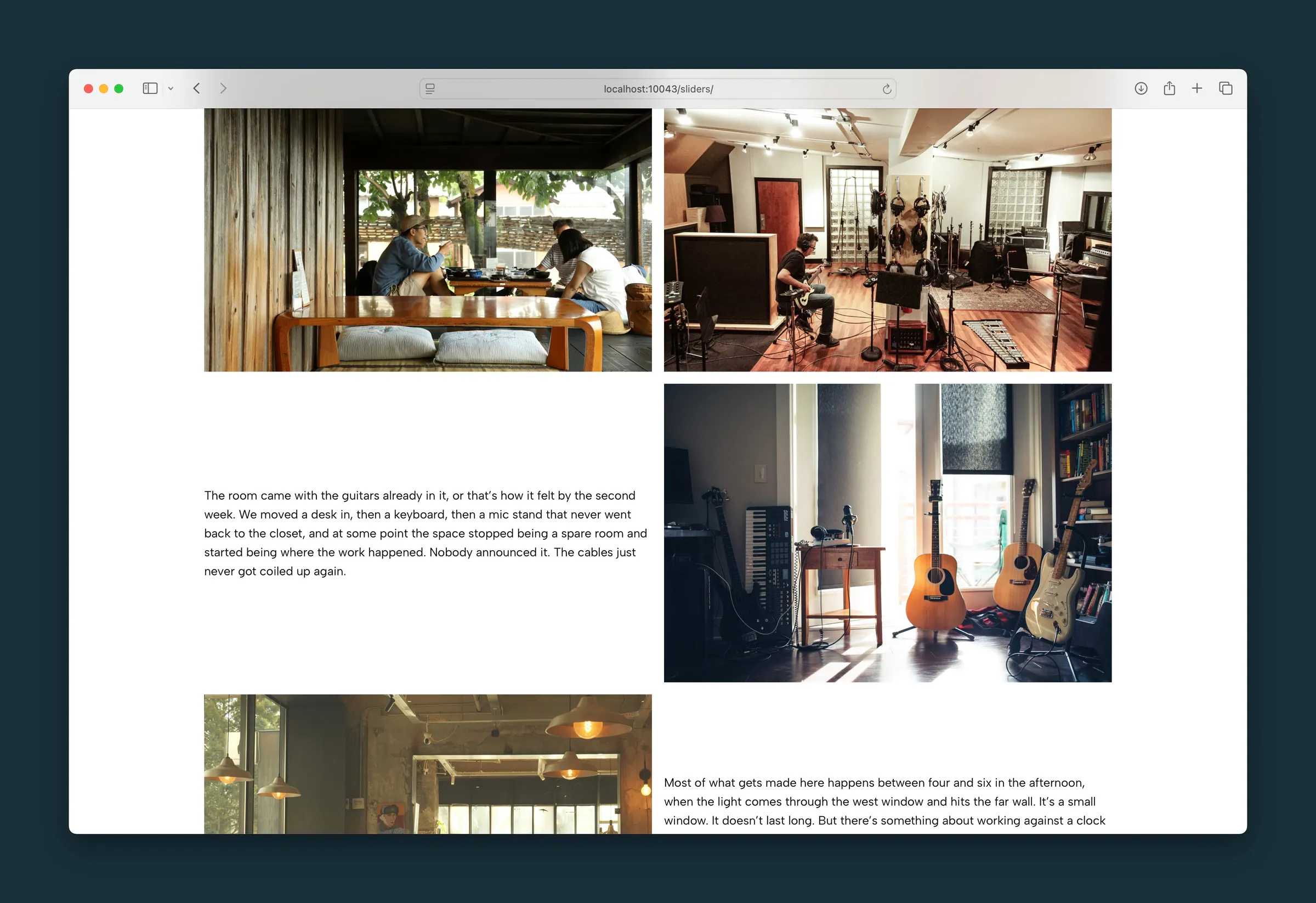
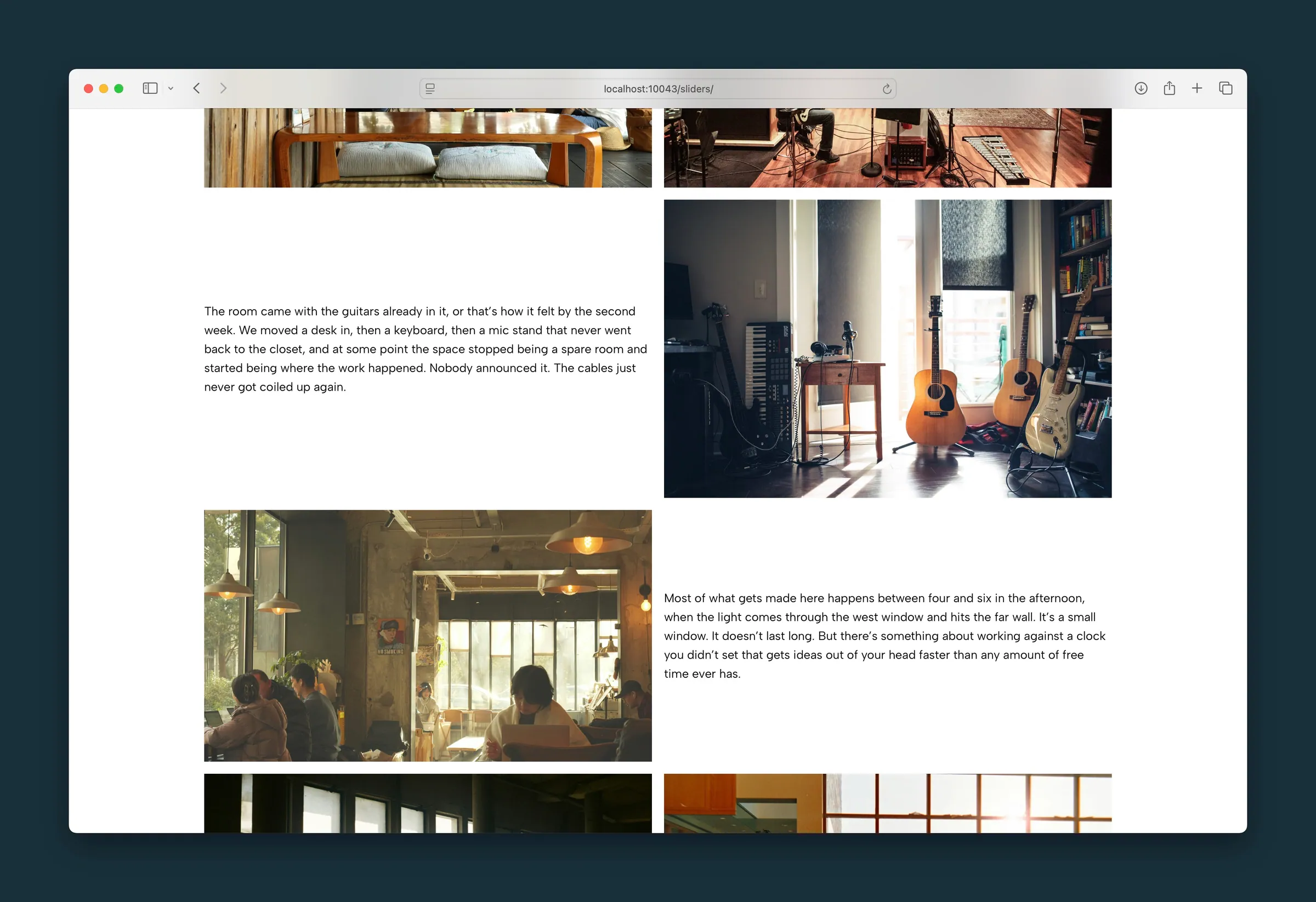
The top of the grid — a wide photo pair, then copy beside the guitar room. -
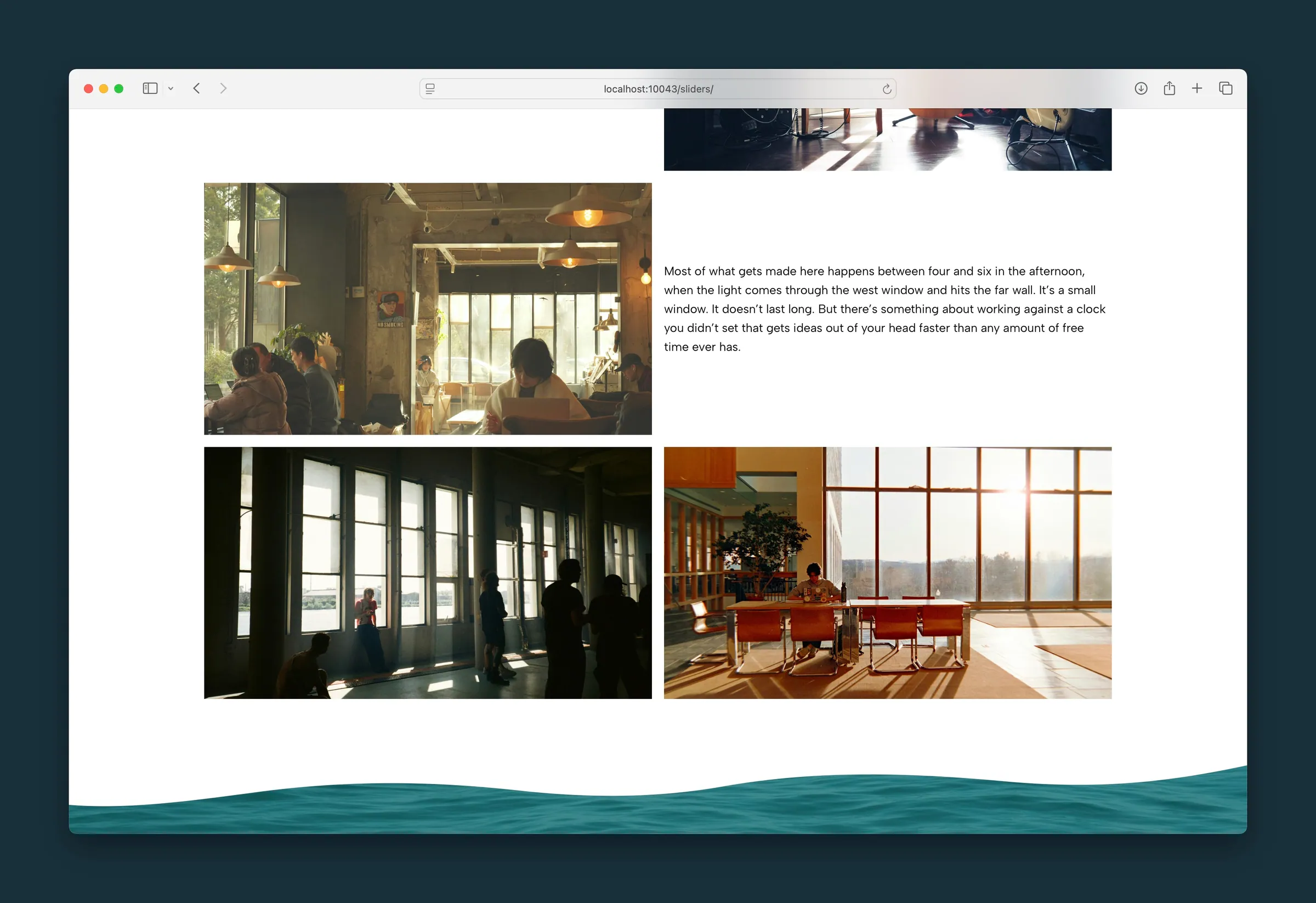
Further down — a story passage beside the cafe photo, then two images in a row.
Editor
-
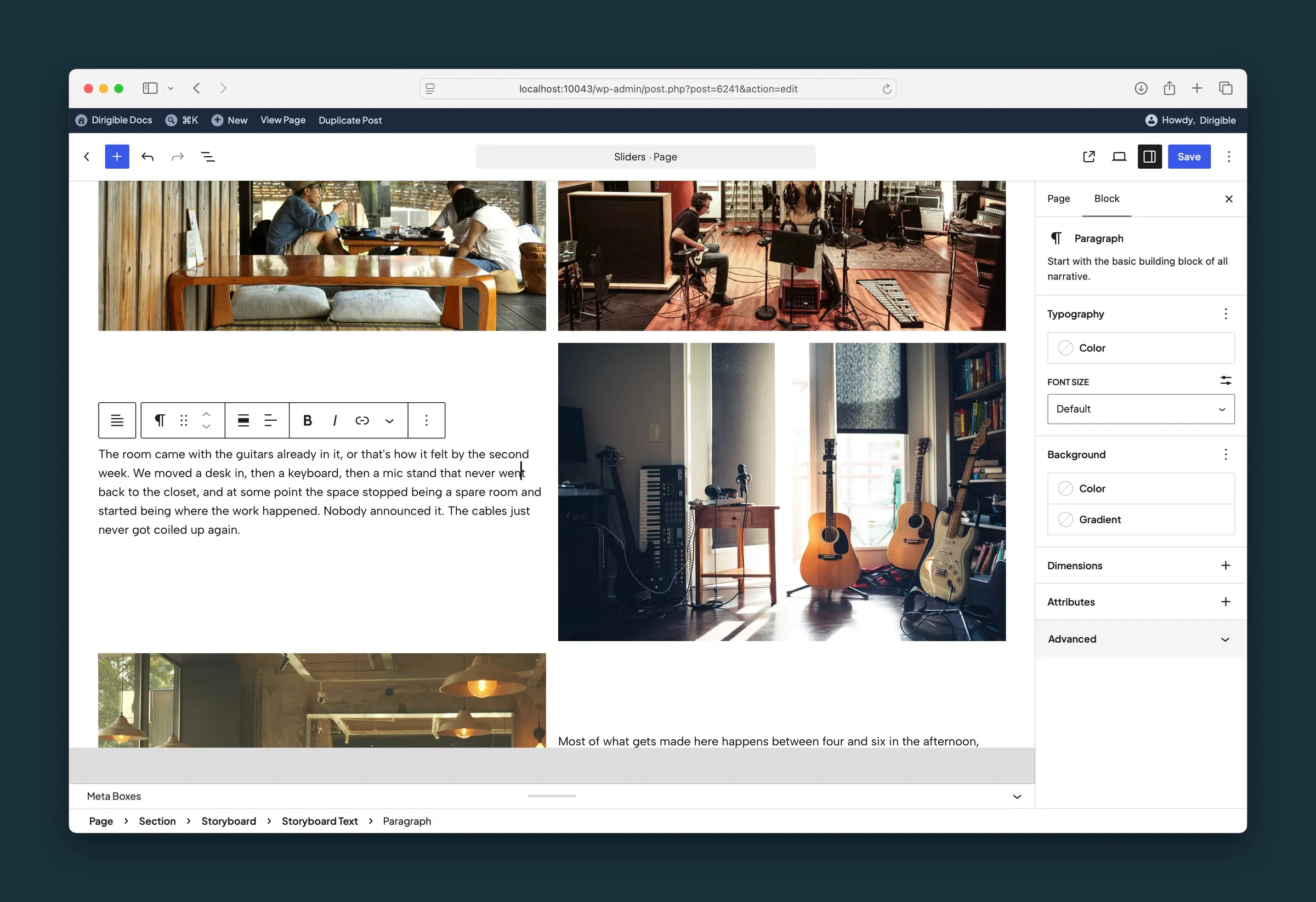
A story paragraph selected inside Storyboard Text. -
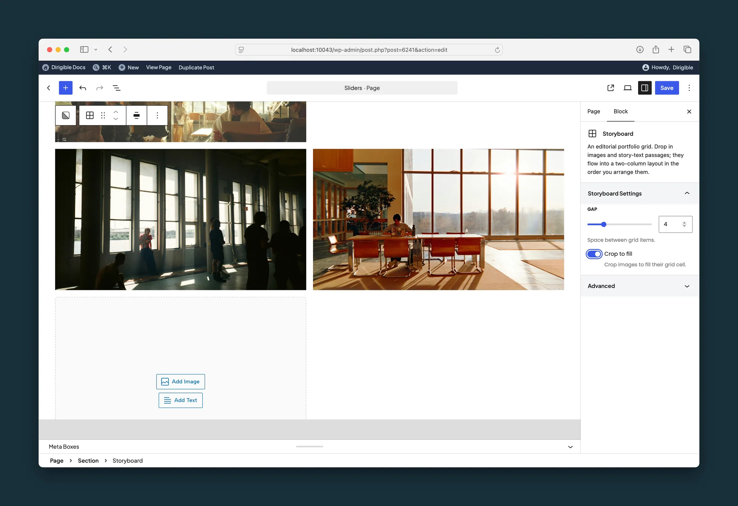
Storyboard selected — Gap and Crop to fill, with Add Image and Add Text.
Settings
Storyboard Settings
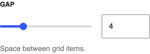
Space between items, both across and down.

Crops each image to fill its grid cell, so it matches the height of a taller neighbour instead of keeping its own shape.
Storyboard Text Settings
Where the text sits in its row when a neighbouring image is taller.