Section
Organize page structure and control backgrounds in one block.
Usage
The Section block lets you nest other components inside a container and apply a background color, image, overlay, video, pattern, or gradient underneath your content. Any block can live inside a Section — including other Sections. On design-heavy pages, wrapping content in Sections makes it easier to move groups around in the editor and establish visual rhythm on the page.
Section blocks can also be used as slides inside the Slider block.
A note: Background is now Section
Previously, this block was called the Background block. We still support every background option from that era, but the rename reflects how teams actually use it: as a structural container first, with background treatment second.
Block width
Sections support Default, Wide, and Full widths from the block toolbar. Default follows your Customizer content width (~50–60 characters per line for readability). Wide uses 75% of the page or your content width — whichever is larger. Full spans 100% of the viewport. Adjacent full-width sections sit flush against each other; mixing widths adds breathing room between blocks.
Background styles
Use the Style control in the sidebar to choose a background type:
- Color — solid palette fill, with optional gradient overlay
- Image — photo background with focal point, attachment, overlay (color and opacity in 1% steps), and lazy-load options
- Pattern — repeating texture with size and overlay controls
- Video — background video; the first frame becomes the poster and mobile image automatically
- Two-Color Gradient — a smooth blend between two palette colors
- Two-Color Split — a hard split between two colors, with optional phone-specific angle and position
For a large or .mov video, a note under it in the sidebar offers Optimize for web: your browser makes a small MP4 copy and the section switches to it, while the original stays in the Media Library. See Optimize background videos.
Choosing a background Color sets Text Color to whichever of Dark or Light reads better on it. Switching the Style to Image or Video sets it from the Overlay Color as if the overlay were at full strength, and changing the overlay color or opacity re-checks it once the overlay is strong enough to set the tone (a dark overlay from its default opacity up, a light one from 70% up). Change Text Color any time; it carries down to every block inside the section, so you don't need to set text color on individual headings. Pattern and two-color backgrounds leave Text Color as it is.
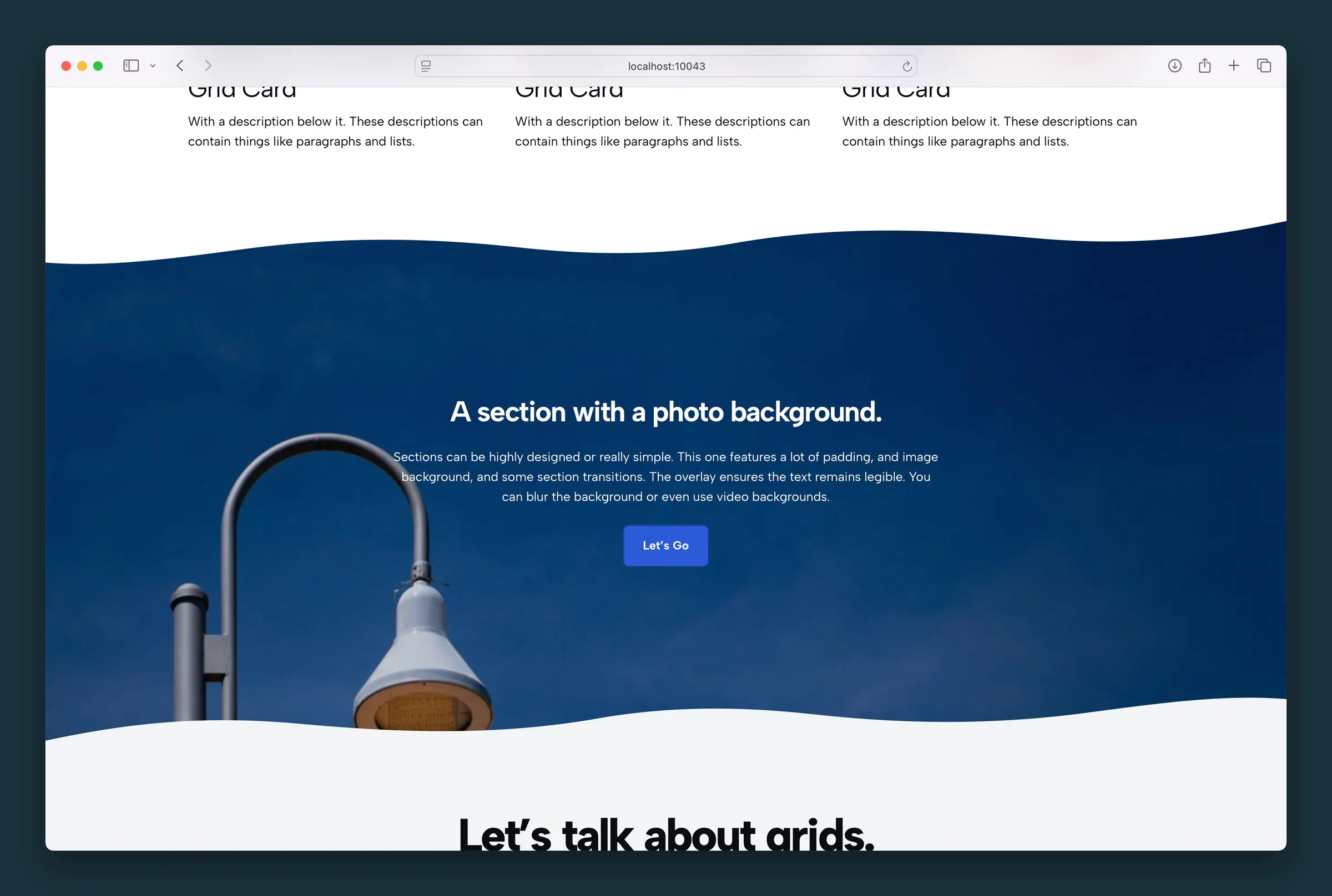
Transitions (top and bottom) add shaped dividers between sections. Set the transition color to match the neighboring block's background so the two join cleanly.
Turn on Animate under a transition to slide its shape slowly along the edge, the way an animated Separator moves. Reverse Direction sends it the other way and Speed sets the pace. Shapes whose two ends don't meet repeat as the shape and its mirror image, so the motion never jumps; where that mirror crease shows, the editor plays the animation so you see exactly what visitors will. Visitors who ask their device for reduced motion see the still shape. The moving shape is drawn as a wide graphics layer, so a very tall animated transition (a large Size on a full-width section) costs graphics memory on phones; keep animated transitions to modest heights.
Block CSS
For a one-off style the settings can't cover, open Advanced → Block CSS and write CSS for this section only. Properties typed on their own (no selector) apply to the section itself, and rules like h2 { … } apply only to blocks inside it. See Styling one section with Section block CSS for examples.
Screenshots
Front-end
-
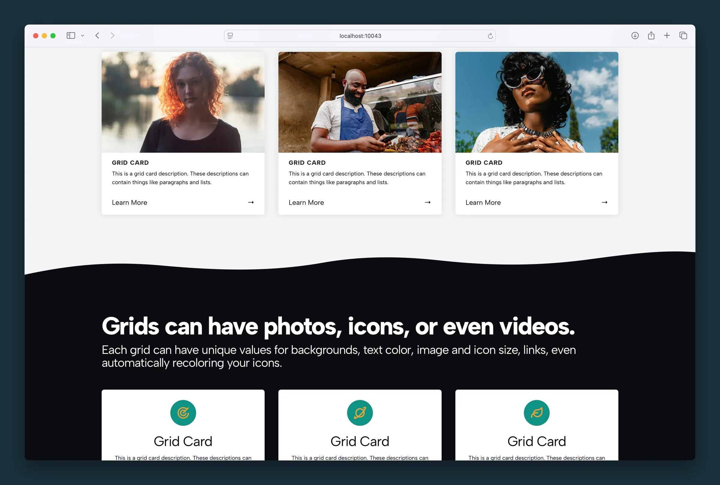
Dark section with a wavy top transition wrapping a headline and icon grid. -
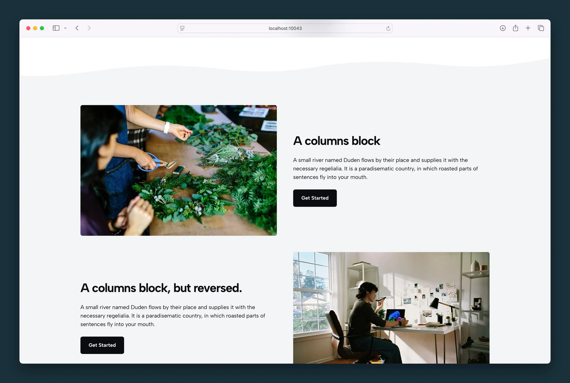
Light section holding media-and-copy columns, with a wavy divider above.
Editor
-
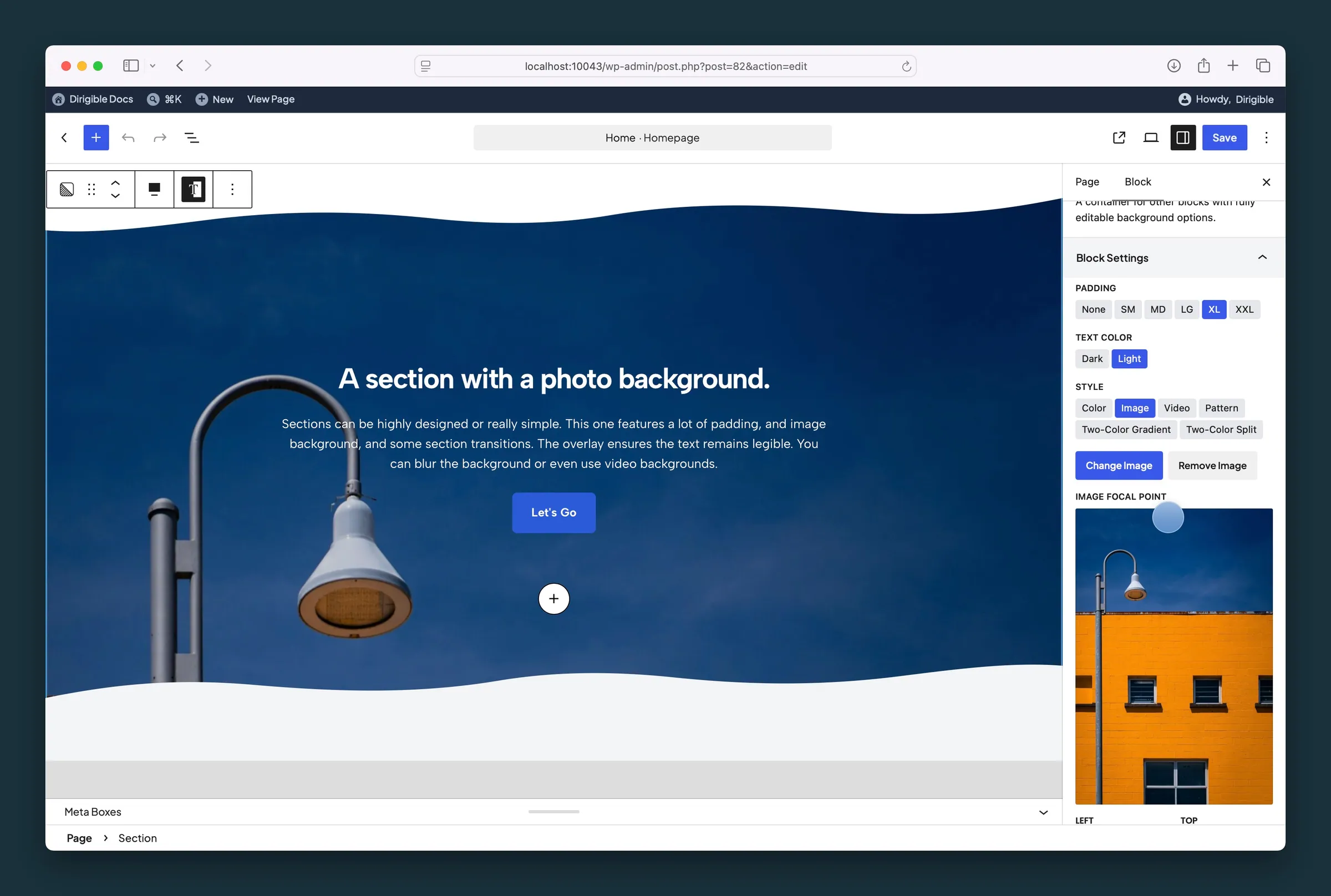
Image style settings — padding, light text, background image, and focal point. -
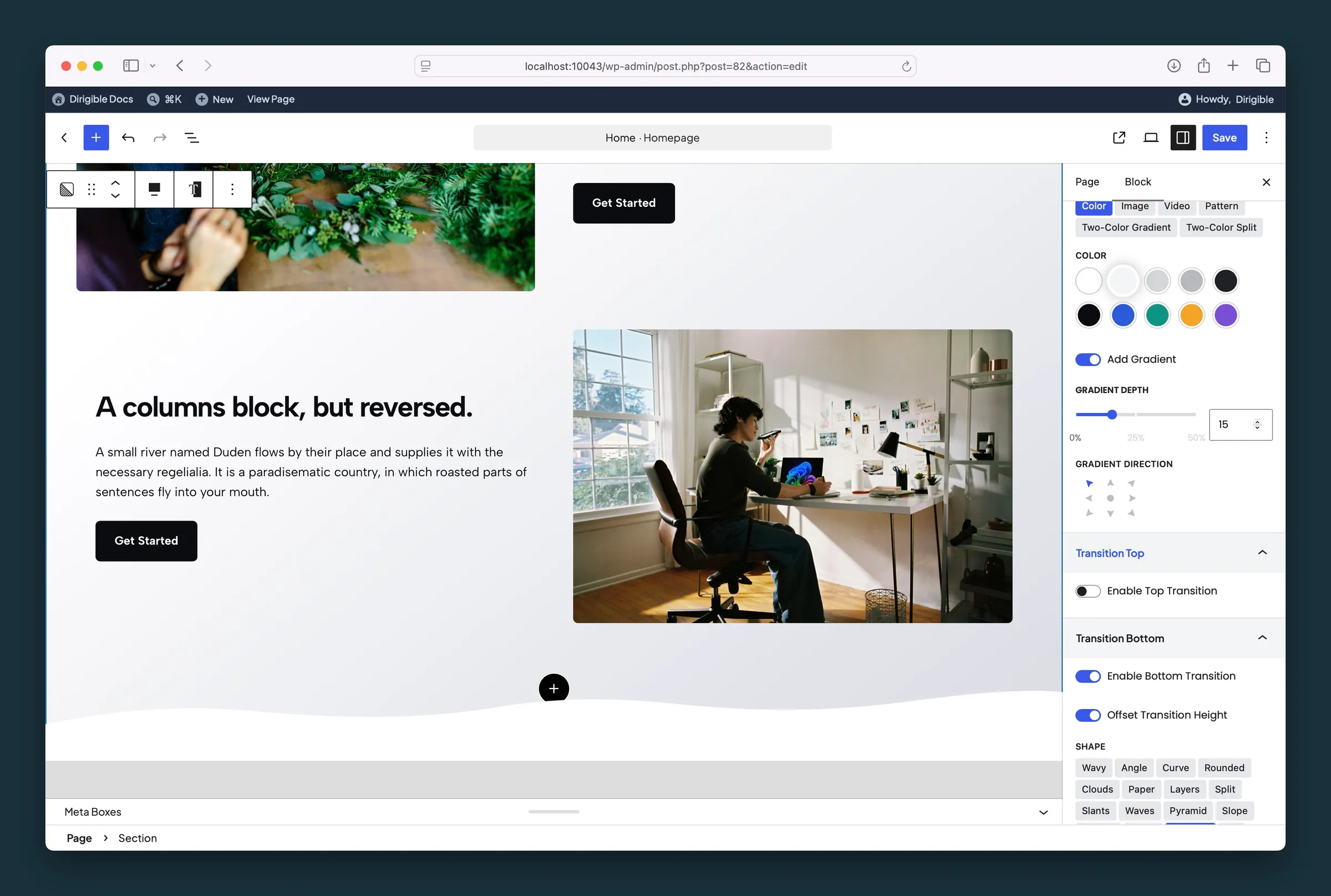
Color background with gradient overlay and a wavy bottom transition.
Settings
Block Settings
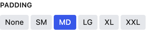
Space inside the section around your content. Sizes step down on smaller screens, so LG is smaller on mobile than on desktop.

Light switches text in this section and every block inside it to light colors for dark backgrounds. Choosing a background Color picks Dark or Light for you, whichever reads better on that color; change it here any time. Set it here rather than on individual headings, so you can change the background later without restyling each one.
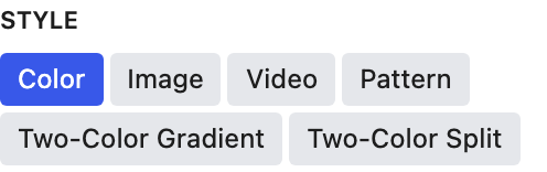
Chooses what fills the section background. Each style shows its own related settings below. Switching to Image or Video sets Text Color from the Overlay Color as if it were at full strength (black suggests Light, a near-white overlay suggests Dark); switching to Color reads the color. Change Text Color any time.
- Color defaultA solid color from your palette.
- ImageA photo or graphic behind the section content.
- VideoA looping background video. The first frame is used as the poster and mobile fallback.
- PatternA repeating texture or pattern image.
- Two-Color GradientA smooth blend between two colors.
- Two-Color SplitA hard split between two colors.

Adds a gradient fade over the solid color. Turn it on to reveal Gradient Depth and Gradient Direction.
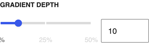
How strong the gradient overlay is, in steps of 1. Higher values make the fade more noticeable.
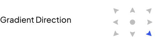
Where the gradient starts. Center creates a radial fade out from the middle.
Choose the photo that fills the section. Set Style to Image first so these controls appear.
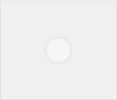
Drag the dot to the most important part of the image. That spot stays in view as the section crops on different screen sizes. It follows the image's focal point from the Media Library until you move it here; after that it's this block's own.
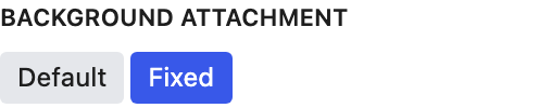
Default scrolls the background with the page. Fixed holds it in place while content scrolls over it, for a parallax-like effect.

Loads the background image right away instead of waiting until it scrolls into view. Only appears when Background Attachment is Fixed.

Tints the background image, video, or pattern with a palette color, black, or white. Use it when text needs more contrast against the media. Changing it also sets Text Color when the overlay is strong enough to set the tone: a dark overlay from the default opacity up, a light one from 70% up. Change Text Color any time.
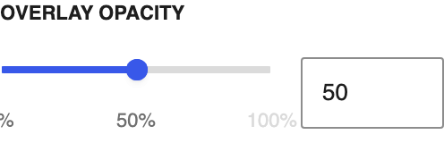
How strong the overlay is, in steps of 1%. 100% is a solid color; 0% turns the overlay off. Dragging it also updates Text Color as the overlay starts or stops dominating the image; a dark overlay counts from the default opacity, a light one from 70%. Change Text Color any time.

Blurs the background image. Helpful when a busy photo makes text hard to read.
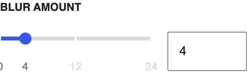
Higher values blur the background image more.
The video plays on a silent loop behind the section. Its first frame is used as the poster and mobile fallback. A large or .mov video shows an Optimize for web note, which swaps in a small MP4 copy.

The first color in a Two-Color Gradient or Two-Color Split.

The second color in a Two-Color Gradient or Two-Color Split.
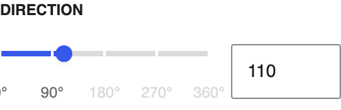
Angle of the split between the two colors.
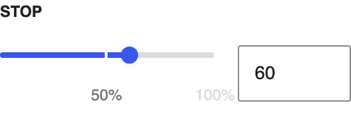
Where the split falls. Higher values give the start color more of the section.

Turn on to set a different Direction and Stop for phones.
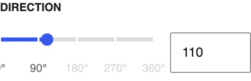
Angle of the split on phones. Overrides the desktop Direction.
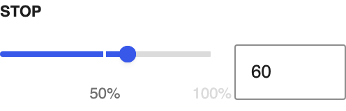
Where the split falls on phones. Overrides the desktop Stop.

An image from your media library that repeats across the background. Good for subtle textures.
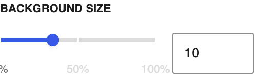
Scale of the repeating pattern. Smaller sizes show more repeats.
Transition Top

Adds a shaped divider along the top edge of the section.

Adds space at the top of the section equal to the transition's height, so content doesn't sit on top of the shape.
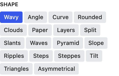
Each tile previews the shape in the transition's color, reflected if Reflect is on. Hover a tile to see its name. Each shape reacts differently to Size, so preview it in the editor before publishing.

Flips the shape horizontally.
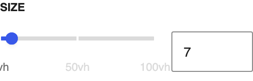
Height of the transition as a percentage of the screen height (vh), so 10 means 10% of the screen. Applies on tablet and desktop.
Height of the transition on phones.

Match this to the background of the block above so the shape blends into it.

Slides the shape sideways along the edge, slowly and continuously. Shapes whose ends don't meet repeat as the shape and its mirror image, so the motion stays seamless. Off by default; respects visitors who ask for reduced motion.

Moves the shape from right to left instead of left to right. Appears when Animate is on.
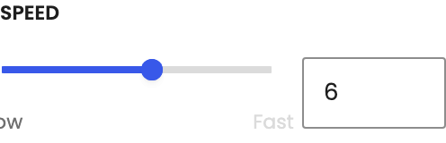
How fast the shape travels, from a slow drift (1) to a brisk slide (10). Appears when Animate is on; shares the scale of the animated Separator.
Transition Bottom

Adds a shaped divider along the bottom edge of the section.

Adds space at the bottom of the section equal to the transition's height, so content doesn't sit on top of the shape.
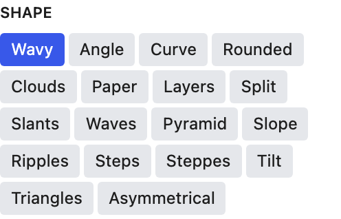
Each tile previews the shape in the transition's color, reflected if Reflect is on. Hover a tile to see its name. Each shape reacts differently to Size, so preview it in the editor before publishing.

Flips the shape horizontally.
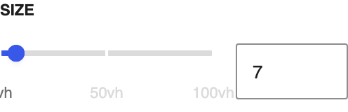
Height of the transition as a percentage of the screen height (vh). Applies on tablet and desktop.
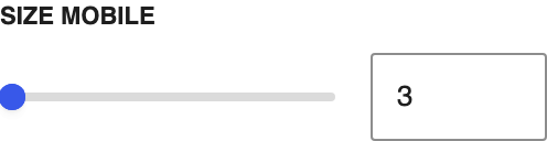
Height of the transition on phones.

Match this to the background of the block below so the shape blends into it.

Slides the shape sideways along the edge, slowly and continuously. Shapes whose ends don't meet repeat as the shape and its mirror image, so the motion stays seamless. Off by default; respects visitors who ask for reduced motion.

Moves the shape from right to left instead of left to right. Appears when Animate is on.
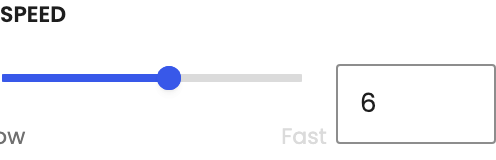
How fast the shape travels, from a slow drift (1) to a brisk slide (10). Appears when Animate is on; shares the scale of the animated Separator.
Advanced
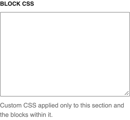
Custom CSS that applies only to this section and the blocks inside it. For cases the regular settings can't cover.