

Well
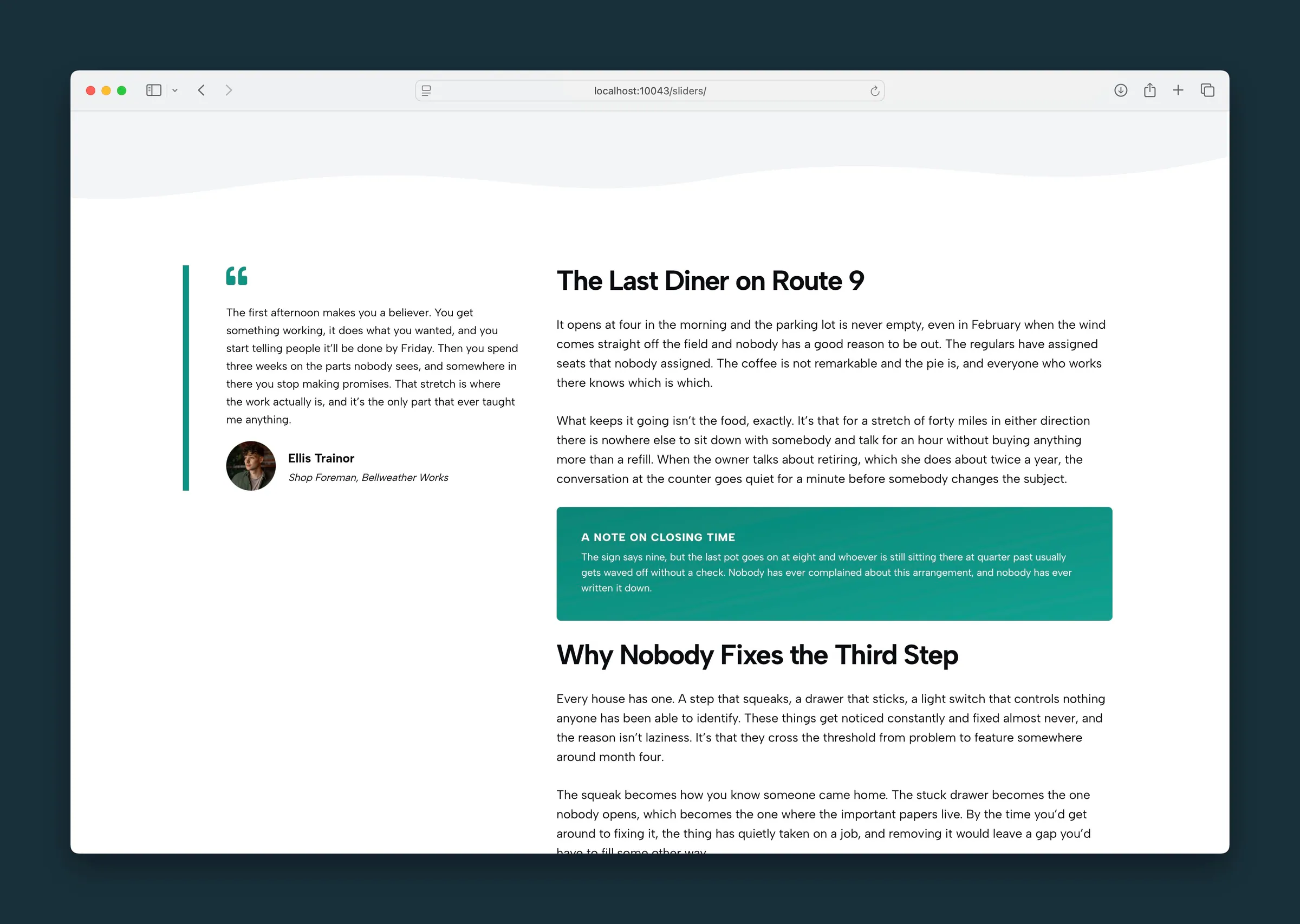
A colored callout box for notes, highlights, and grouped content.
Usage
Well puts content in a padded box with a solid background color. Use it for callouts, notes, sidebar-style boxes, or a group of blocks that should stand apart from the page around it.
The block starts with a heading and a paragraph. Add more blocks inside as needed.
Well is simpler than Section: a background color, an optional gradient, padding, and rounded corners. There are no image, video, or pattern backgrounds. Use Section for full-width bands, transitions, or photo backgrounds.
Well Settings
Sidebar controls under Well Settings:
- Background Color: the panel color (default gray).
- Text Color: Inherit (default), Dark Text, or Light Text. Inherit follows the section around the Well. Dark Text and Light Text stay fixed when that section uses the other color. Light Text also applies to the blocks inside the Well.
- Rounded: rounded corners (on by default).
- Padding: space inside the panel edges, from 0 to 24 (default 8).
- Small Text: makes the text inside the Well smaller.
- Add Gradient: a subtle gradient over the background color.
- Gradient Depth: how strong the gradient is, 0–50 in steps of 1 (default 10).
- Gradient Direction: a nine-position picker, from upper-left to lower-right (default lower-right).
Allowed content
You can add these blocks inside a Well:
- Heading, Paragraph, List, Buttons, Separator, Image
- Columns, FAQ, Quote, Icon List, Action Strip, Step by Step, Structured List, Socials, Marquee, Pills
For other blocks, use Section instead.
Block width
Well supports Wide and Full alignment from the block toolbar. With no alignment set, it matches the normal content width.
Tips
- Use Small Text for disclaimers or compact FAQ-style content.
- Put an FAQ or Structured List inside a Well to set it on a tinted panel instead of the page background.
Screenshots
Front-end
-
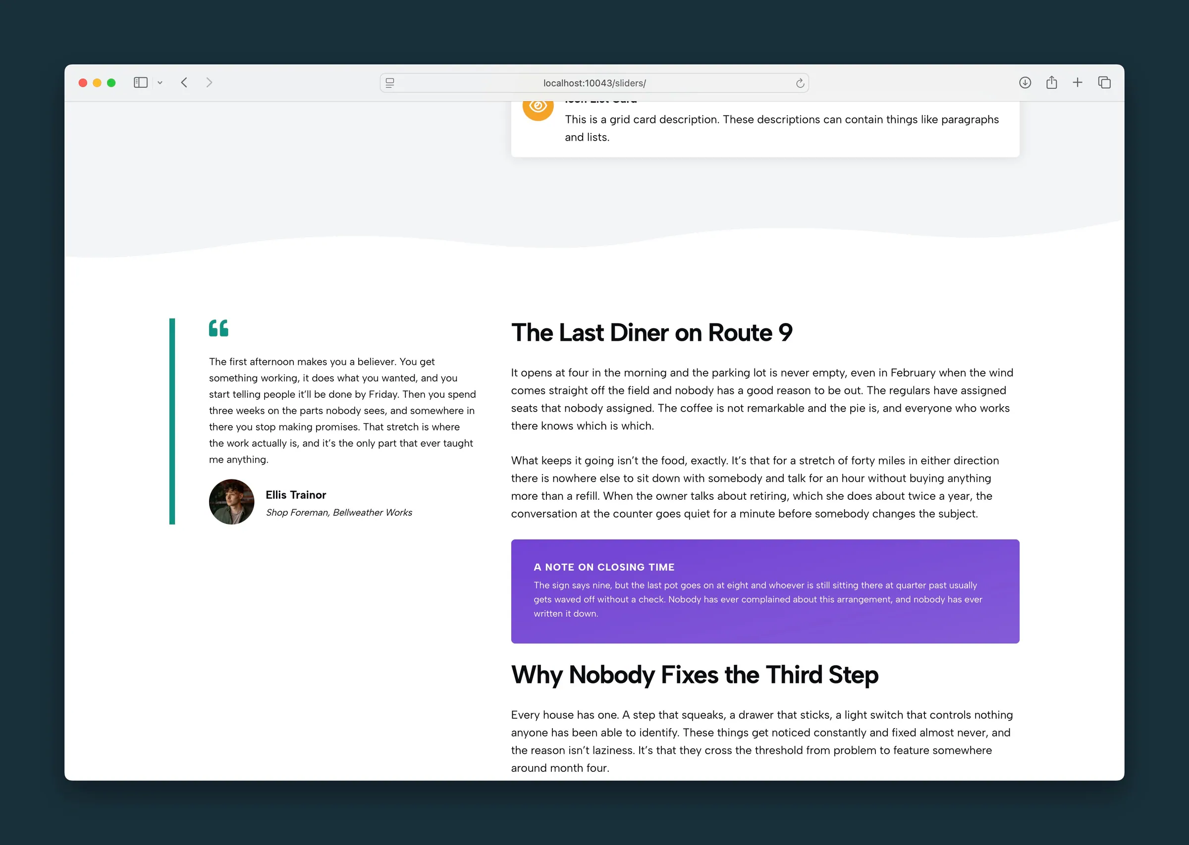
The same note in a purple well with light text. -
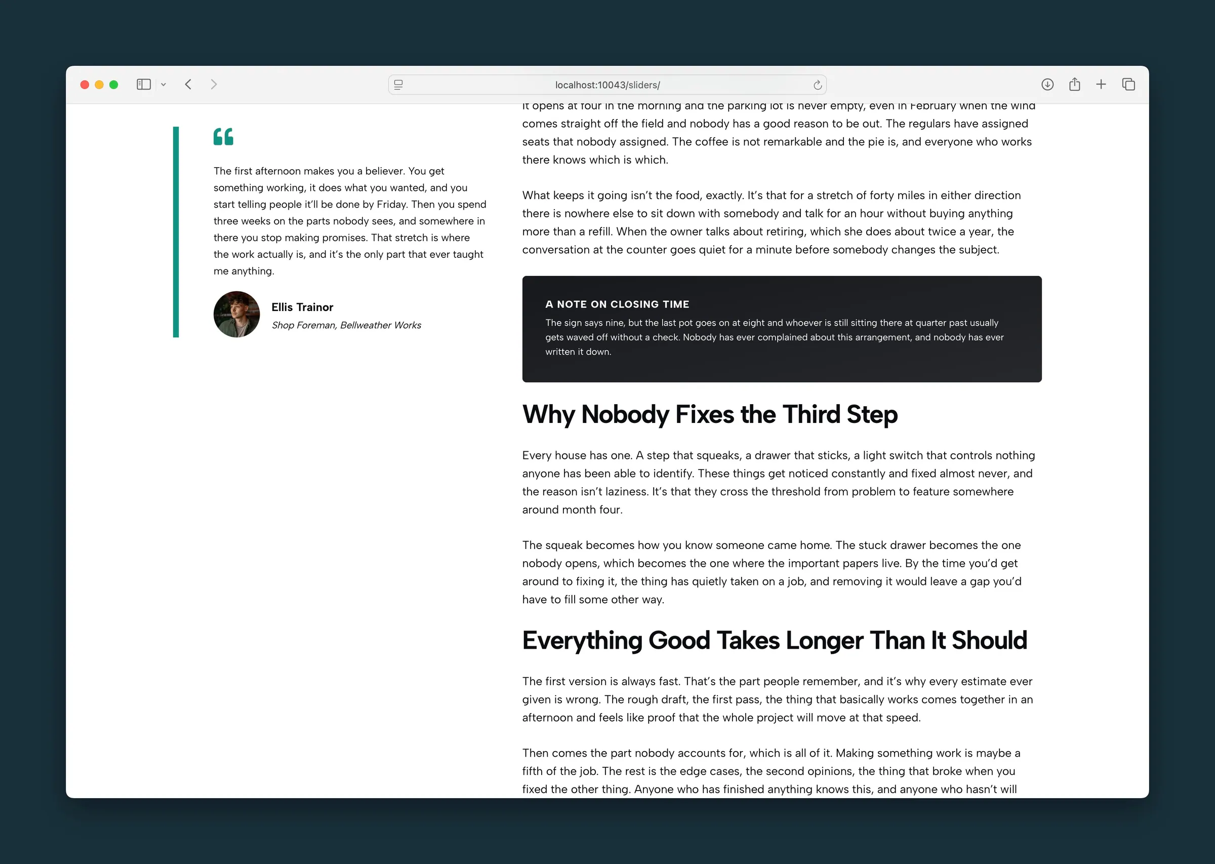
The note in a dark well, still with light text.
Editor
-
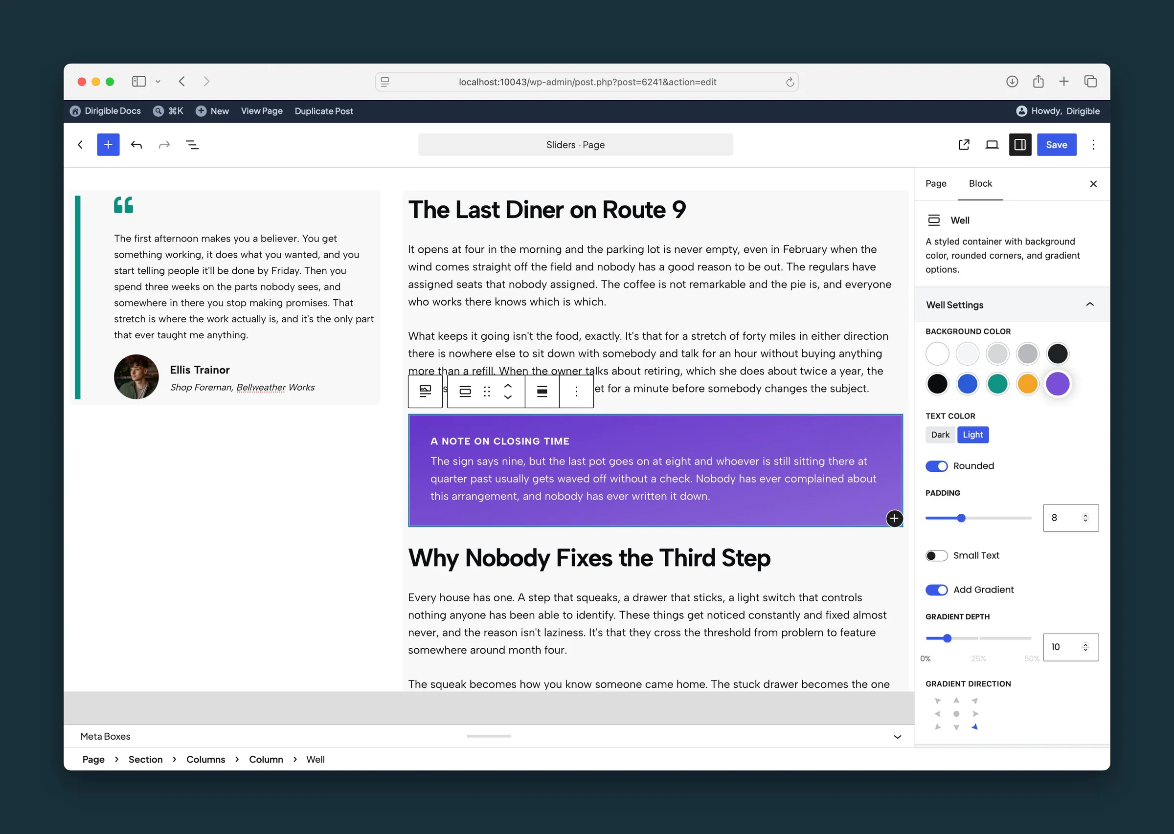
Well settings for the purple panel — light text, rounded corners, padding, and a gradient. -
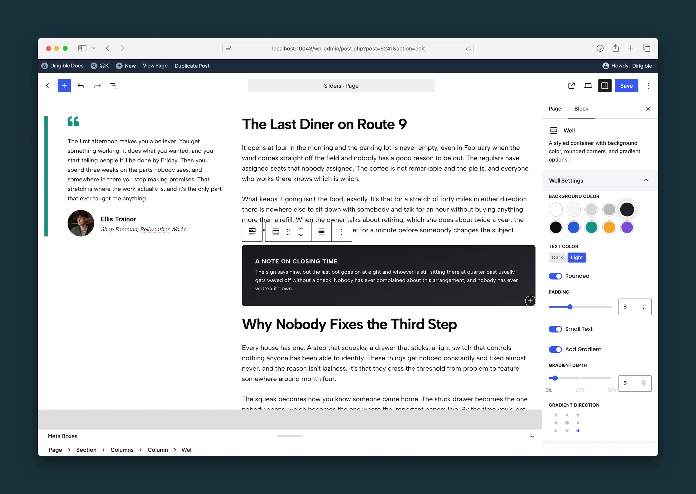
The same well set to a dark background, with a shallower gradient.
Settings
Well Settings

Inherit follows the section around the Well. Dark Text and Light Text stay fixed when that section uses the other color. Choosing a background color picks Dark or Light for you, whichever reads better on that color; change it any time.
- Inherit defaultUses the text color of the surrounding section.
- Dark TextKeeps dark text, even inside a light section.
- Light TextLight text, for a dark background color. Applies to the blocks inside the Well.

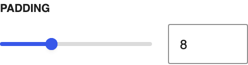
Space between the panel edge and the content inside.

Makes all the text inside the Well smaller.

Adds a subtle gradient over the background color, the same kind Section uses. Turn it on to see Gradient Depth and Gradient Direction.
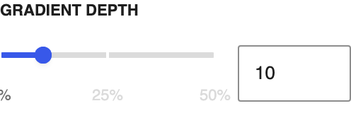
Higher values make the gradient stronger; moves in steps of 1.
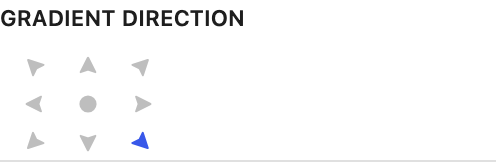
Which way the gradient runs across the panel.