

Photo Strip
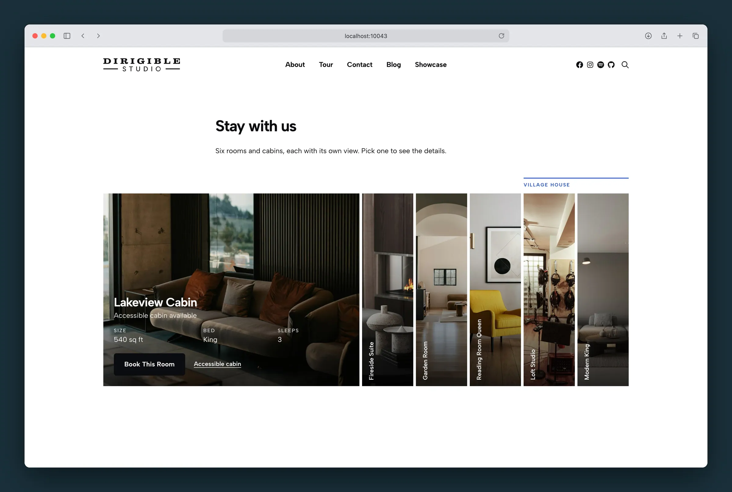
A row of tall photos, one open wide with its details, the rest slim.
Usage
Photo Strip shows a set of choices side by side as tall photos: rooms and suites, venues, services, programs. One panel is open wide, with its photo, headline, subheadline, a short row of facts, a button and an optional second link. The others are slim slivers that show only their name, set sideways. When a visitor points at a sliver, tabs to it, or taps it, it opens and the panel that was open slims down.
It works best with 4 to 12 panels and photos that still read when cropped narrow (a room, a table, a view). Use Rollover Cards or a Grid when every card should show its details at once.
Panels
The block holds Photo Strip Panel blocks, one per photo. Select a panel to edit it: it opens in the editor so you can type its headline and subheadline in place. The sidebar has the rest:
- Photo — choose the photo and its Focal Point. The slim panel shows a narrow slice around the focal point, so put it on what matters.
- Links — Link URL is where the panel goes: the headline, the button and the whole photo all lead there. Button Text is the button's wording (leave it empty for no button). Secondary Link Text and its URL add a second, smaller link, for example to the accessible version of a room.
- Facts — label and value pairs shown side by side under the headline (Size: 1,000 sq ft, Beds: King). They stay on one row across the panel; a long value wraps inside its own column, so keep it to three or four facts. Add Fact adds one; the arrows reorder them. Empty rows don't show.
- Group — Group Label starts a new group at this panel (see below).
The subheadline also shows under the name on the slim panel, so keep it short ("ADA available").
Use Add Panel below the strip to add more, up to 24.
Group labels
Groups sort the panels into runs with a label and a line above each run, like "Lake view" over the first four rooms and "Classic" over the last. To start a group, select its first panel and type a Group Label. Every panel after it belongs to that group until the next panel with a label.
Select the Photo Strip (the parent) to set how the labels look:
- Show Group Labels — turn it off to hide every label and line without clearing them.
- Label Style — Eyebrow (small uppercase letters, the default) or one of your Customizer text styles.
- Label Color — the color of the labels and their lines.
Settings
Select the Photo Strip (the parent) for:
- Headline Tag — whether panel headlines are headings in the page outline. None (default) keeps them as plain text, which suits a menu or a short list. Pick h2–h6 when the strip is part of a page, such as a Rooms page where each room is a section, and match the level to the headings around it.
- Facts Size — the facts in your Customizer paragraph size (Normal) or its small size (Small). The subheadline stays at the paragraph size.
- Open First — the panel that's open when the page loads. It goes by position, so moving panels changes which one opens.
- Height — the height of the photos, in pixels.
- Open Width — how many slim panels wide the open panel is.
On phones and narrow spaces
Where the strip is narrower than about 600 pixels (a phone, a sidebar, a mobile menu), the panels stack as short rows with their names across, and the open one is taller with its details. Every panel stays on screen; nothing scrolls sideways.
For visitors
- Mouse: pointing at a panel opens it. The last one opened stays open.
- Keyboard: Tab moves from panel to panel and opens each one; Enter follows its link.
- Touch: the first tap on a slim panel opens it; a tap on the open panel follows its link.
- Visitors who ask their device for less motion see panels switch without sliding.
Block width
Photo Strip supports Wide and Full alignment from the block toolbar.
Tips
- Use photos taken the same way (all rooms, all from the door) so the slivers read as a set.
- Give every panel a link: a panel without one can still open, but there's nowhere to go.
- Keep facts to three or four short values so they fit in one or two lines.
Settings
Settings
The panel that's open when the page loads. It goes by position, so moving panels changes which one opens. In the editor, the panel you select is the open one.
Whether panel headlines are headings in the page outline. None keeps them as plain text, which suits a menu. Pick h2–h6 when the strip is part of a page, matching the headings around it.
The size of the facts under the headline: Normal uses your Customizer paragraph size, Small its small paragraph size. The subheadline stays at the paragraph size.
The height of the photos in pixels, where the strip is wide enough for a row. On phones the panels stack as short rows instead.
240 to 800. Default 440.
How many slim panels wide the open panel is. Higher gives the open photo and its facts more room; lower keeps the slim panels wider.
3 to 8. Default 5.
Group Labels
Shows a label and a line above each group of panels. A group starts at any panel with a Group Label. Off hides them without clearing the labels.
On by default.
How the group labels look: Eyebrow (small uppercase letters) or one of your Customizer text styles.
The color of the group labels and their lines.
Photo
The part of the photo to keep in view when it's cropped. It follows the photo's focal point from the Media Library until you move it.
Links
Where the panel goes. The headline, the button and the whole photo all lead there.
The button's wording. The button goes to the panel's link. Leave it empty for no button.
A second, smaller link beside the button, for example to the accessible version of a room. It shows once it has text and a URL.
Where the secondary link goes.
Group
Starts a new group at this panel. The label and a line run above it and the panels after it, up to the next panel with a label.
