

Grid
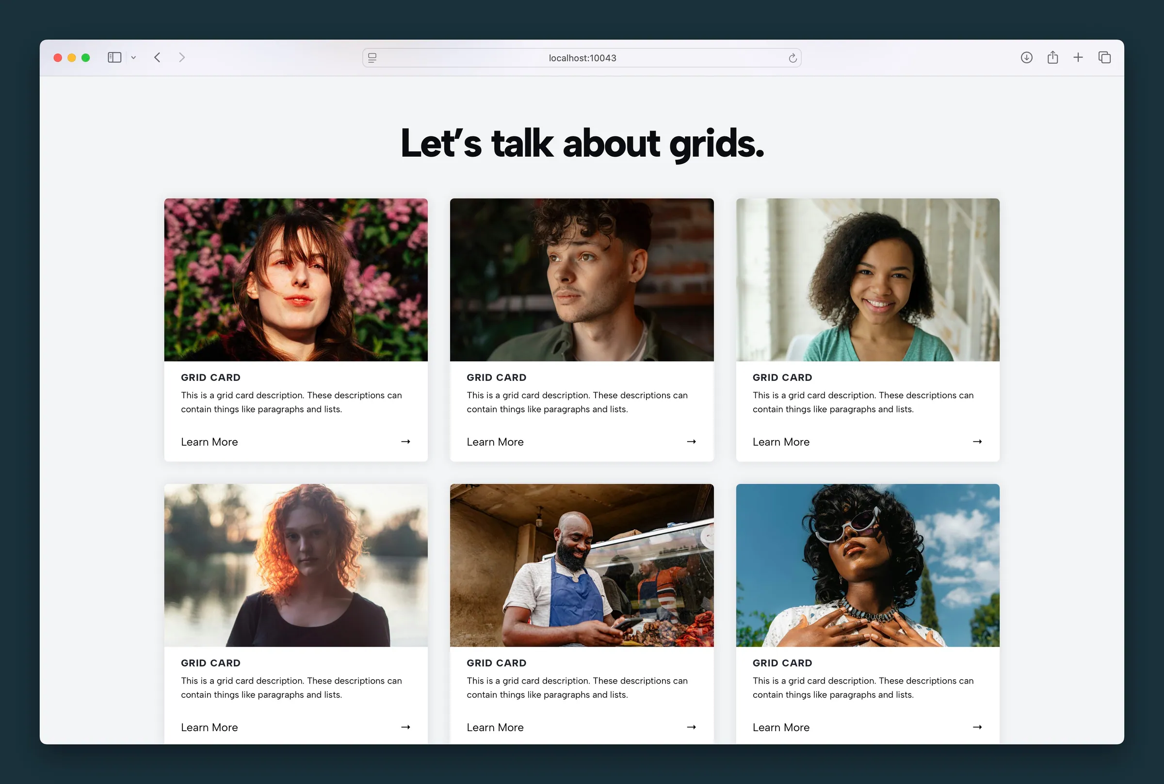
Responsive card grids with image, icon, text, video, and YouTube card types.
Usage
The Grid block lays out cards in rows, like a set of services, features, or linked image tiles. You could approximate this with core Columns, but Grid rearranges cards automatically to fit smaller screens.
The Grid holds Card blocks. New grids start with image cards, and you can add, remove, or change card types. Most grids use one card type throughout, but you can mix them.
Parent and child blocks
Select Grid for layout, styling, and link behavior that applies to all cards. Select an individual Card to edit its media, headline, description, and link URL.
Click the inserter prompt after the last card to add more. Use the parent block button, breadcrumb path, or List View to jump between grid and card.
Columns and responsive layout
Columns sets the most cards per row (1–7 on desktop). Extra cards wrap to the next row, and the grid drops to fewer columns on smaller screens on its own.
Match Height equalizes card height when content lengths vary.
Card types
Change a card's type from the child sidebar, or use Quick-Set Card Type on the parent to convert all cards at once:
- Image (default) — photo at the top; crop controlled by parent Image Aspect Ratio (choose Original to show whole images)
- Icon — image icon instead of a photo; Icon Size and icon color settings on the parent
- Emoji — emoji character instead of a photo or uploaded icon
- Text — headline and copy only, no top media
- Video — hosted video at the top (autoplay, loop, muted)
- YouTube — an embedded YouTube video; paste the video ID in the card sidebar (the part after
v=in the YouTube URL)
Links (parent)
- Link Style — Button, Understated, Tab, Minimal, Prominent, or Bold for the bottom CTA
- Link Arrow — character shown beside link text (default
→) - Image Links — make the card image clickable
- Title Links — make the headline clickable
- Hide Button — hide the bottom link when image or title linking is enough
Set each card's URL in the child sidebar or toolbar when the card is selected. Link text defaults to "Learn More" and is editable inline.
Appearance (parent)
- Card Background — fill behind each card, with Background Color and Text Color (dark or light)
- Card Shadow — optional depth with Shadow Weight and Shadow Size
- Small Text — reduces body copy size (not the headline); also toggled from the block toolbar
- Image Aspect Ratio — Default, Original (no cropping: each image keeps its own shape), or fixed ratios (1:1, 4:3, 16:9, 9:16, etc.)
- Corners — Sharp, Rounded, or Full on card media
- Grid Gap, Content Spacing, Media Spacing — space between cards and inside cards
Headlines (parent)
- Headline Tag — the heading level card titles use in the page outline (H2–H6, or plain paragraph)
- Headline Appearance — how card titles look, using your Customizer text styles
Icons (parent)
For icon and emoji cards:
- Icon Size, Icon Background (colored circle), Color Icons, and Icon Color
Block toolbar (parent)
- Alignment — text alignment within cards
- Toggle Background — card background on/off
- Toggle Text Size — normal vs small body text
Card content (child)
Each card supports a headline, description (paragraphs/lists), optional media (image, icon, emoji, video, or YouTube), and a link. Click media in the editor to replace it.
Block width
Grid supports Wide and Full alignment.
Tips
- For a large or
.movcard video, click Optimize for web in the card sidebar to swap in a small MP4 copy (see Optimize background videos). - Three or four columns suits most grids.
- Turn on Image Links or Title Links with Hide Button for cleaner cards that are still clickable.
Screenshots
Front-end
-
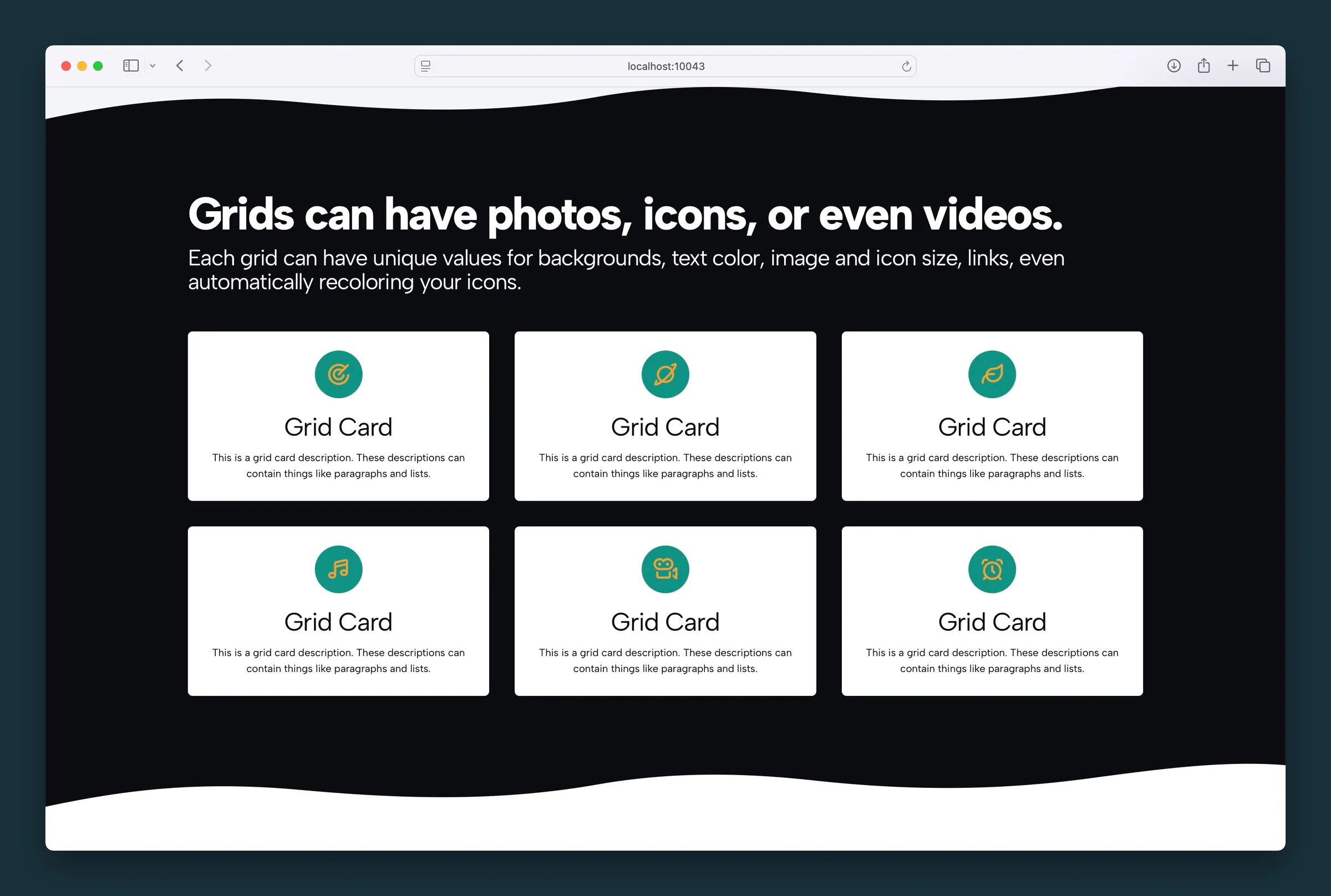
Icon cards on a dark section — rounded cards with recolored icons in colored circles. -
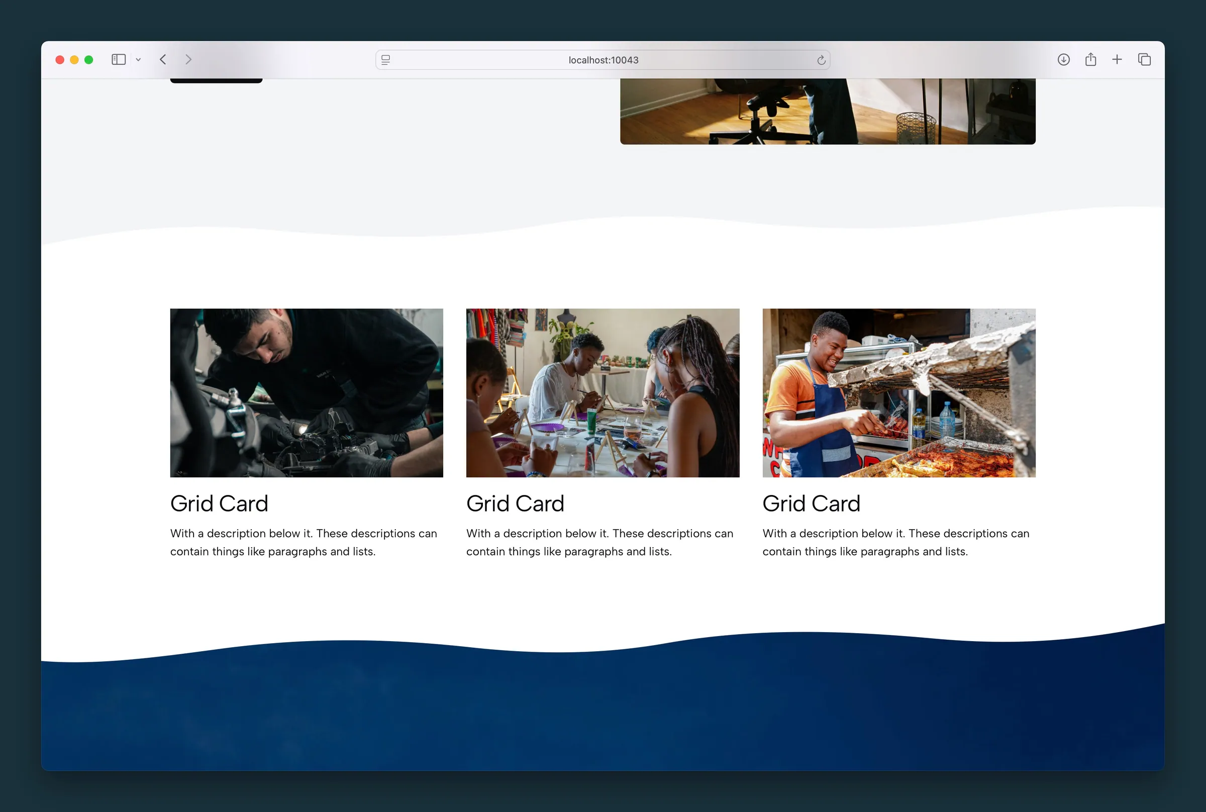
Three image cards with headline and description between wavy section transitions.
Editor
-
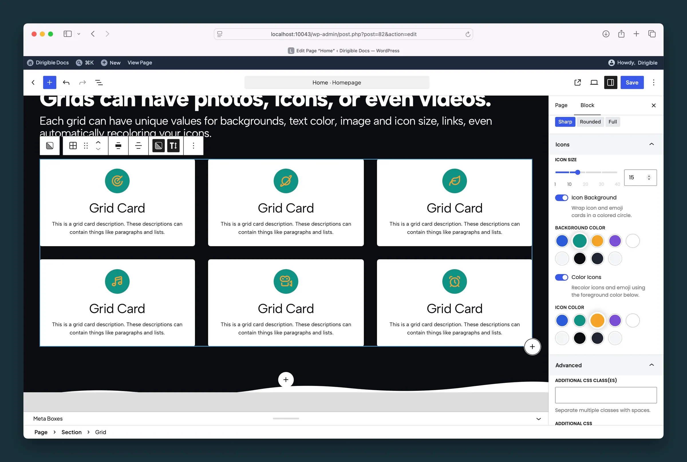
Grid parent settings — card style, icon size, icon background, and icon color. -
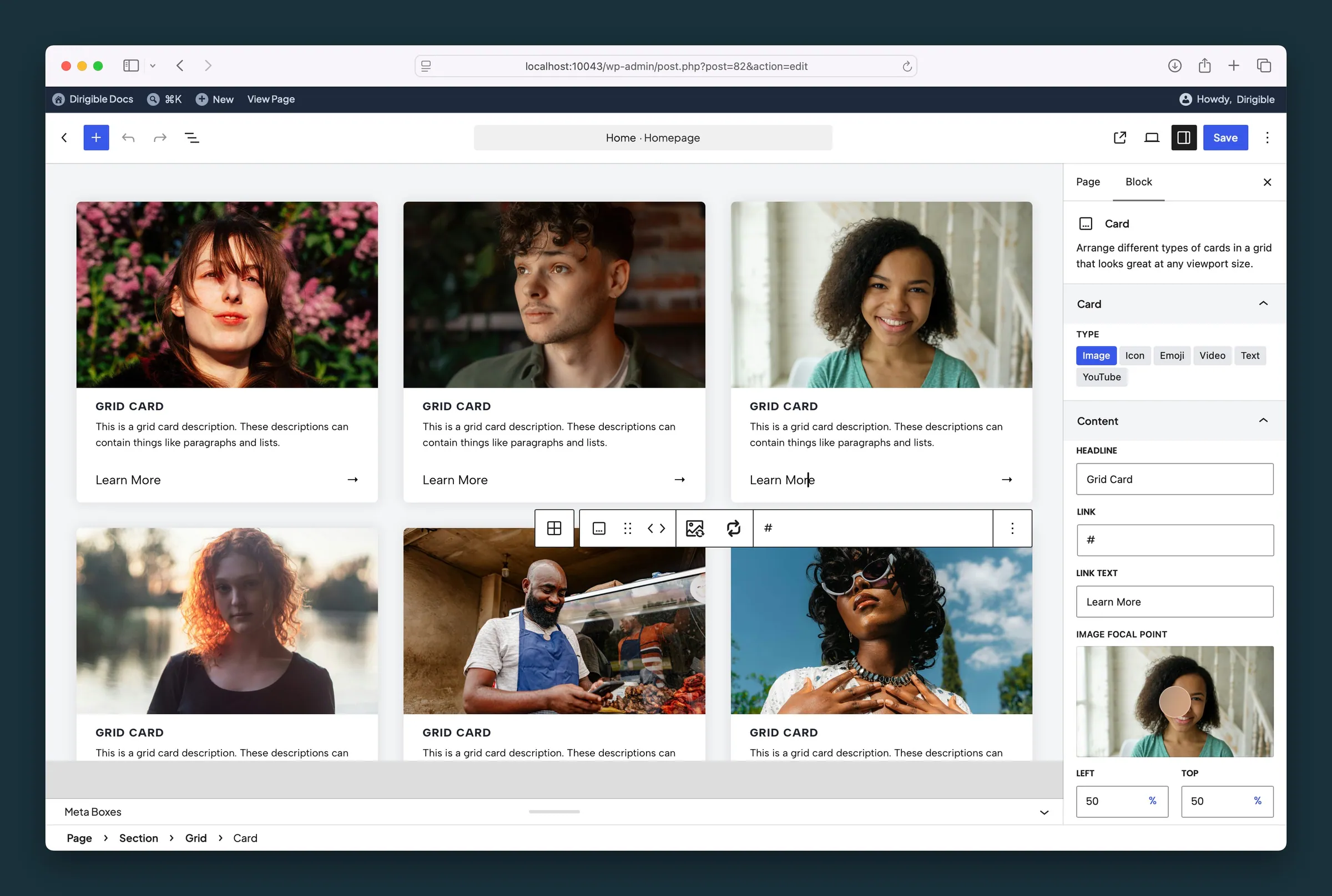
Card child settings — type, headline, link text, and image focal point.
Settings
Grid Settings

Most cards per row (1–7). Cards wrap to the next row and drop to fewer columns on tablet and mobile.

Makes every card the same height, even when their text lengths differ.

Makes each card's image link to the card's URL.

Makes each card's title link to the card's URL.

Hides the link at the bottom of each card. Use it when Image Links or Title Links already make the card clickable.

Adds a background color behind each card.
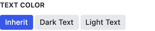
Appears when Card Background is on. Choose Light for dark card colors. Choosing a background color picks Dark or Light for you, whichever reads better on that color; change it any time.

Adds a drop shadow so cards appear to lift off the page.
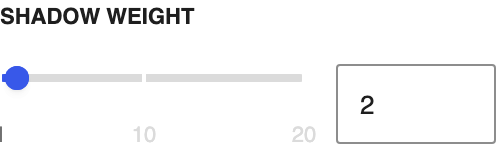
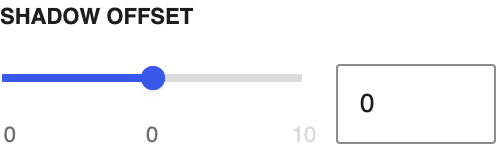
How dark the shadow is. Appears when Card Shadow is on.
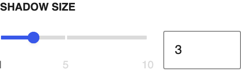
How far the shadow spreads. Appears when Card Shadow is on.

Makes card descriptions smaller. Headlines stay the same size.
Headlines

The heading level card titles use in the page outline. Match it to the headings around the grid.
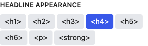
How card titles look. It's separate from Headline Tag, so a title can look like an H2 while staying an H4 in the page outline.
Links
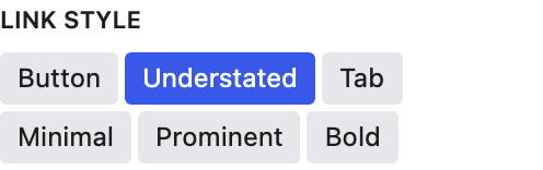
How the link at the bottom of each card looks.
The character shown after each card's link text.
Spacing
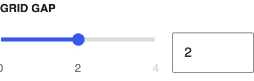
Space between cards, across and down.
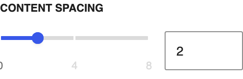
Space between the edge of each card and its content.
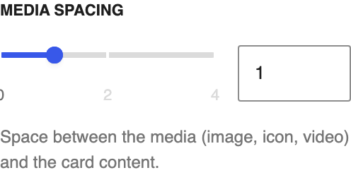
Space between the image, icon, or video and the text below it.
Images
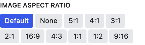
One shape for every image and video card. Original shows each one whole, at its own shape, with no cropping; fixed ratios range from 5:1 to 9:16. Selecting an image card points back here.
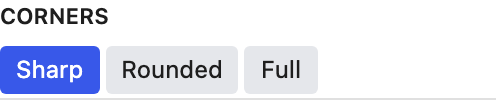
Corner shape of each card's image or video.
Icons
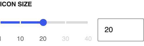
Icon size in pixels.
Puts each icon in a colored circle.

Recolors icons and emoji with the Icon Color you pick below.

Card
What fills this card. Image, icon, video, and YouTube each show their own fields.
- Image defaultA photo.
- IconAn icon image.
- EmojiA single emoji.
- VideoAn uploaded video. A large or .mov one shows an Optimize for web note in the card sidebar, which swaps in a small MP4 copy.
- TextText only, with no media.
- YouTubeA YouTube clip.
Content
The card headline. You can also edit it on the block.
Where this card links. Link Text appears once a URL is set.
The link label. Appears after you set Link URL.

Drag the dot to the part of the photo that should stay in view. Appears on image cards; hidden when the Grid's Image Aspect Ratio is Original, since nothing is cropped. It follows the image's focal point from the Media Library until you move it here; after that it's this block's own.
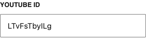
The YouTube video ID for this card. Appears when Type is YouTube.
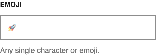
One emoji or character for this card. Appears when Type is Emoji.