

Call To Action
A two-column CTA band with image, copy, and button — similar layout controls to Columns.
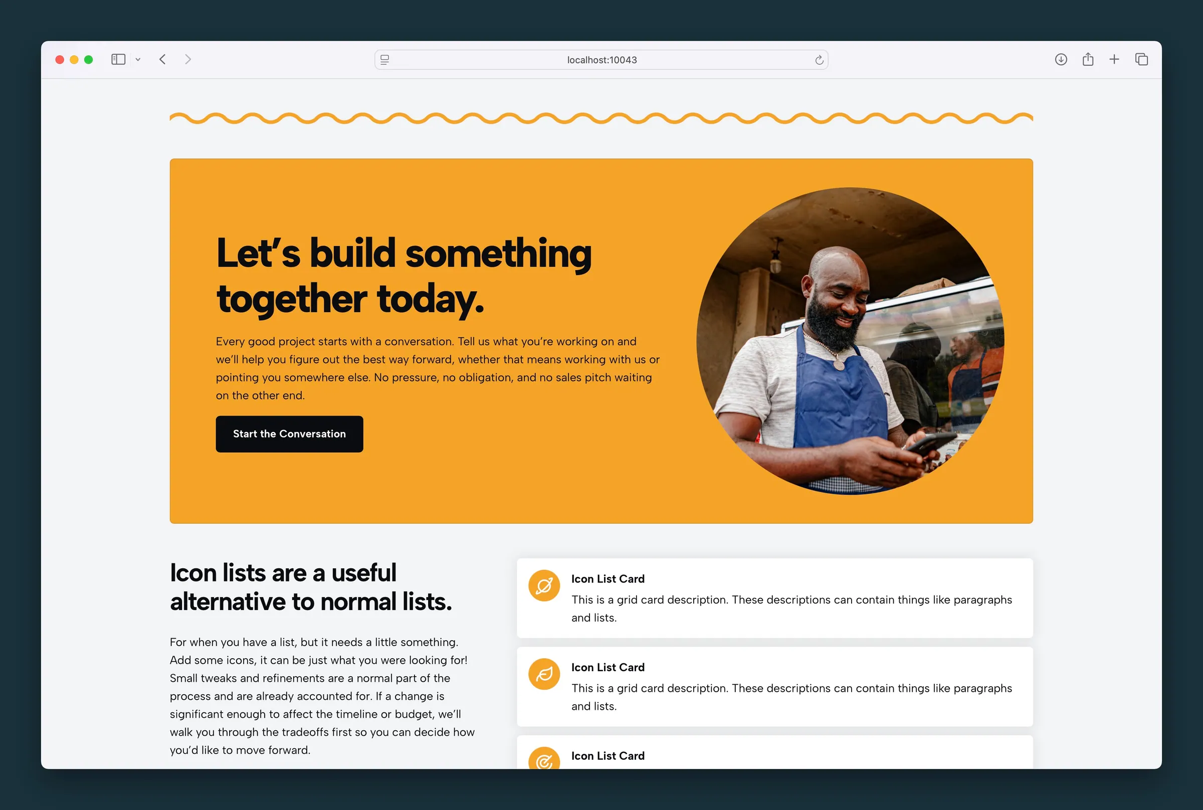
Usage
The Call To Action block is a banner that prompts visitors to take the next step. It pairs a media column (image) with a content column (headline, subheadline, body copy, and link) in a single band. The layout works like Columns, but it's built specifically for CTAs.
Use it for a signup, purchase, contact prompt, or any message you want to stand out. You can add paragraphs and lists in the copy area for short supporting detail.
Layout
The block splits into two sides on desktop and stacks on mobile, with the image above the copy. The layout controls match Columns:
- Columns Size — even 50/50 split or golden-ratio emphasis (61.8% / 38.2%) on the larger side
- Swap Blocks — reverses media and content on desktop only; on mobile, media stays above copy
- Content Position — the grid control in the block toolbar sets where text sits in the content column and how it aligns; right alignment switches to left on mobile
Appearance
- Image Style — Sharp, Rounded, or Circle on the image
- Rounded — rounds the corners of the whole CTA band
- Border — adds a border inside the edge of the band
- BG Color — palette color behind the block
- Text Color — Light switches the headline, copy, and button to light colors for dark backgrounds
- Padding (em) — space inside the band
Typography
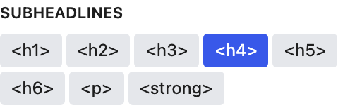
- Headlines and Subheadlines — text style presets from your Customizer (H1–H6, paragraph, bold)
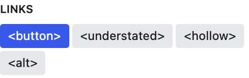
- Links — button, understated, hollow, or alternate styles for the CTA link
Edit the headline and subheadline right on the block or from the Content sidebar panel.
Content
- Choose Image — photo or graphic in the media column (placeholder when empty)
- Headline and Subheadline — main and supporting messages
- Copy — paragraphs or lists below the subheadline
- Link URL — set in the toolbar or sidebar; edit the button text right on the block
Block width
Supports Wide and Full alignment from the block toolbar.
Tips
- By default the content column is the larger side. Swap or resize when the image should dominate.
- Use Circle image style for headshots or logos.
- Keep copy to a sentence or two; let the headline and button carry the action.
Screenshots
Front-end
-
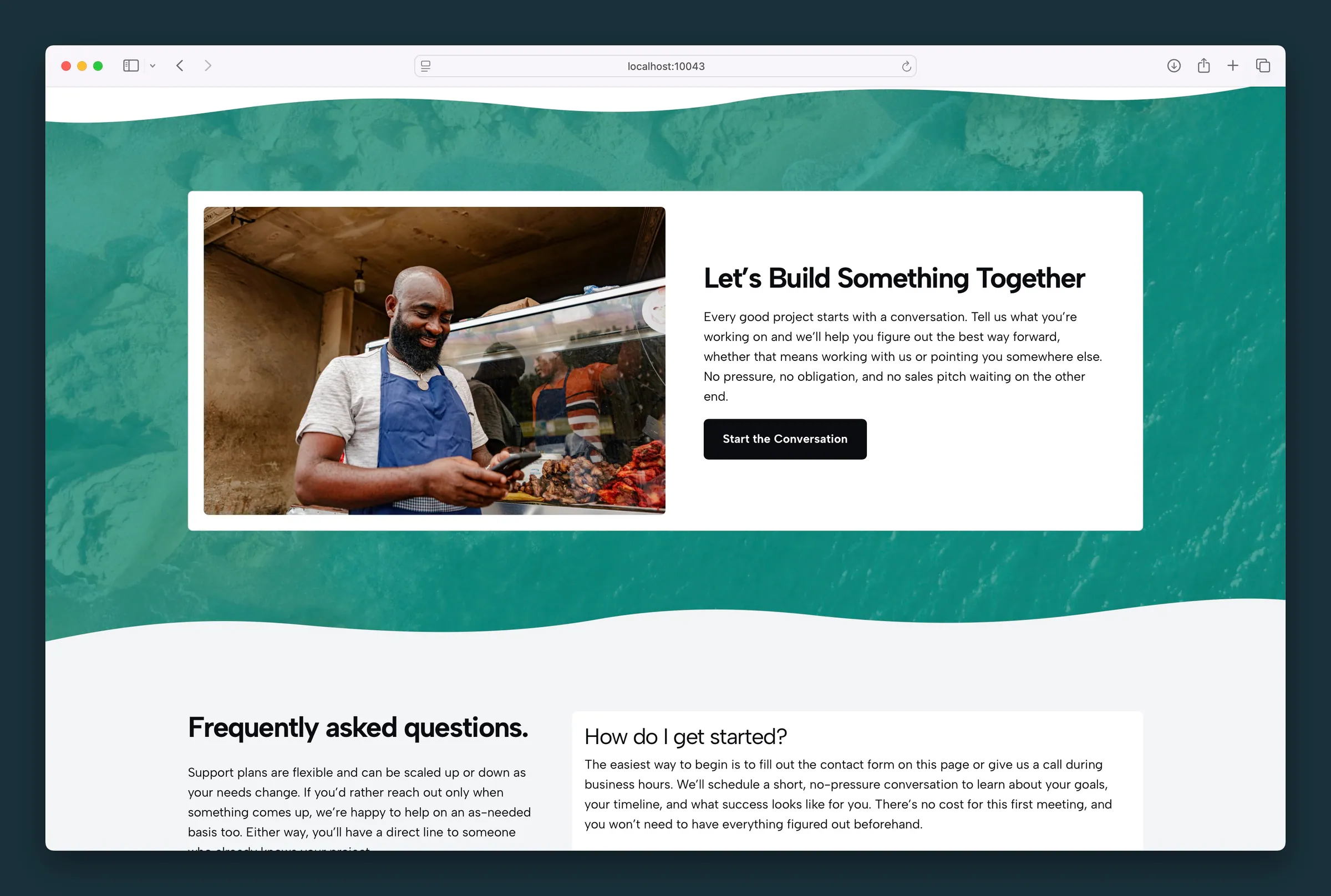
White rounded CTA card on a textured green section — photo left, copy and button right. -
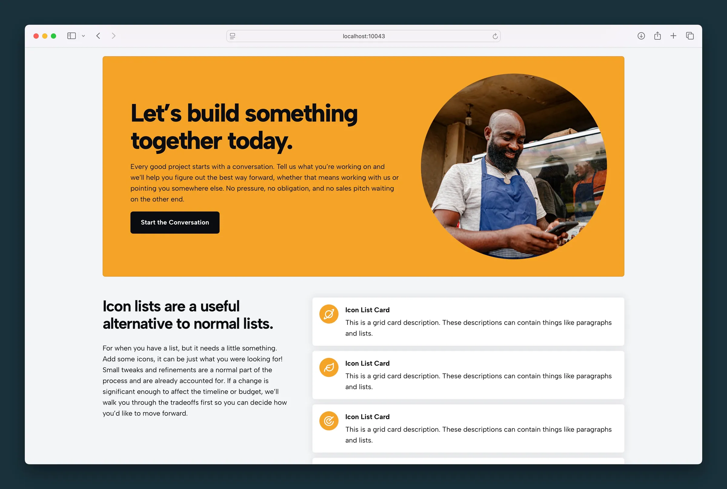
Mustard CTA with circular image style and Start the Conversation button.
Editor
-
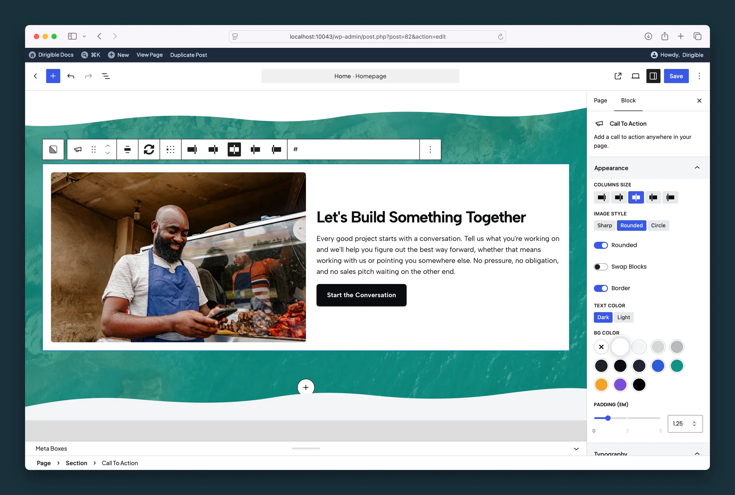
Appearance settings — columns size, rounded image, border, text color, and background. -
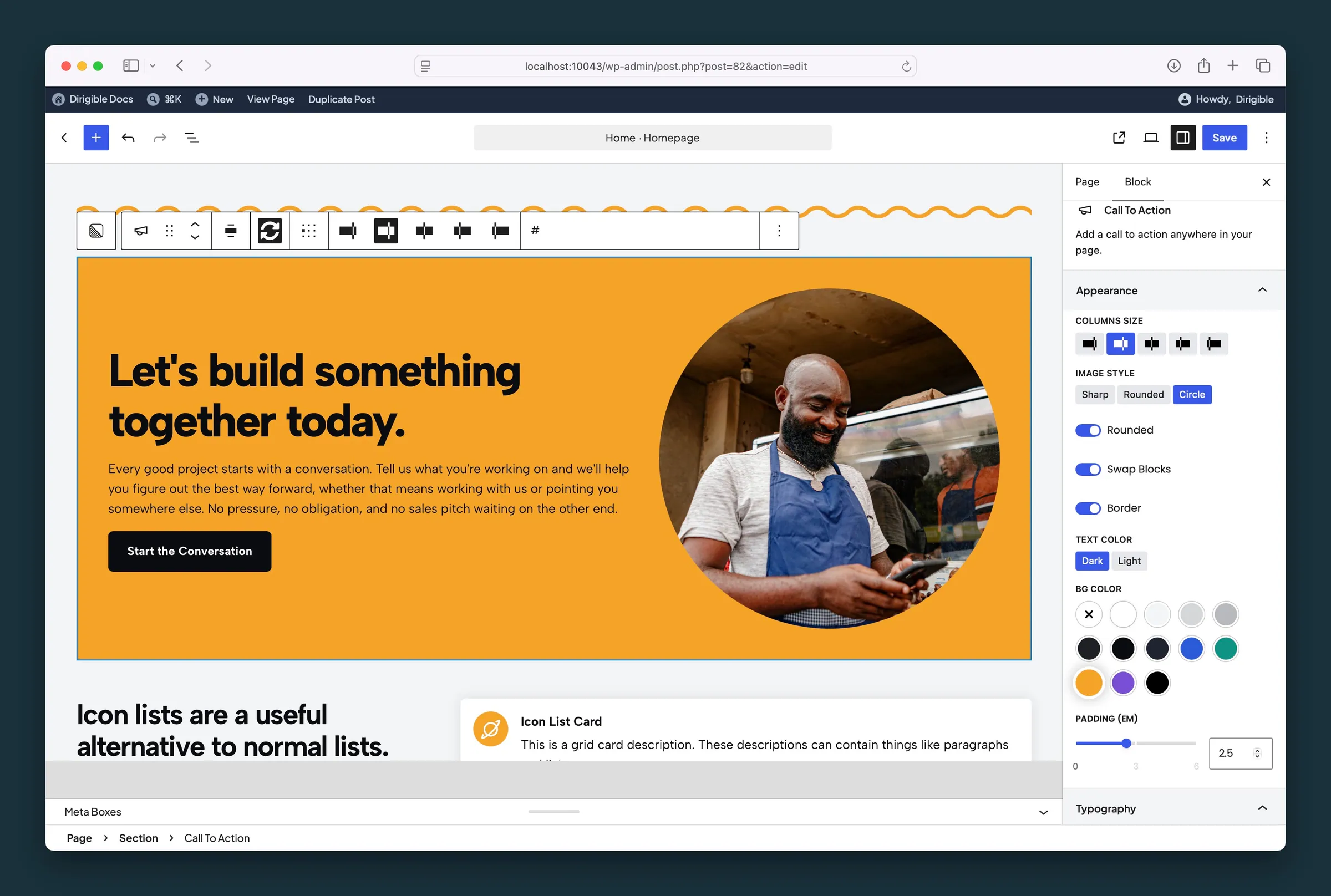
Circle image style with Swap Blocks, mustard background, and larger padding.
Settings
Appearance
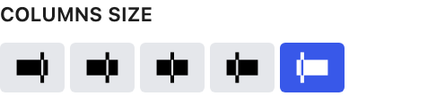
How desktop space is split between the image and content. Even is 50/50; the large and larger presets use the golden ratio (61.8% / 38.2%).
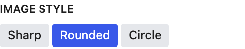
Circle crops the image round, which suits portraits and logos.
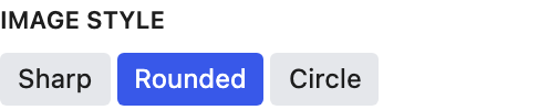
Rounds the corners of the whole band. Image Style handles the image corners separately.

Reverses image and content on desktop only. On mobile, the image stays above the copy.

Adds a border just inside the edge of the band.

Light switches the headline, copy, and button to light colors for dark backgrounds. Choosing a background color picks Dark or Light for you, whichever reads better on that color; change it any time.
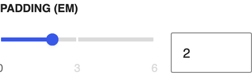
Space inside the band around the content.
Typography
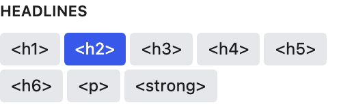
Which text style the headline uses.
Content
You can also edit this right on the block.
You can also edit this right on the block.