

Featured Content Hero
Send visitors to three posts or pages from one large photo hero.
Usage
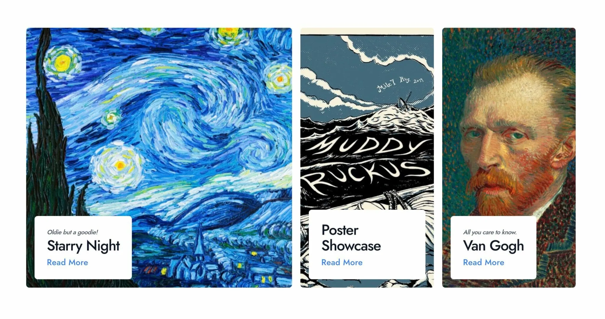
Featured Content Hero features three posts, pages, or other published items as linked photo tiles. On large screens the first tile takes half the row and the other two share the rest. On smaller screens the tiles stack. Each tile shows a background photo with a white card at the bottom, and the whole card links to the item.
Set up each tile in the block sidebar, under Piece 1 (large), Piece 2, and Piece 3:
- Content: search for the post, page, or other item the tile links to.
- Headline: leave it empty to use the item's title.
- Subheadline: an optional line above the headline.
- Background Image: a photo for this tile. Without one, the tile uses the item's featured image, or a solid theme color if it has none.
- Background Origin: which part of your Background Image stays in view as the tile changes shape. It appears once you choose an image. Featured images are always centered.
Nothing shows on the live page until at least one tile has published Content.
When to use it
Use it at the top of a homepage, blog page, or landing page to point visitors at specific articles, services, or pages. The tiles always show the items you picked, so it suits features you choose by hand. For a list that updates as you publish, use Blog Posts.
The block is Wide by default and can be set to Full. With Rounded corners at Full width, the tiles keep a little space from the screen edges.
Tips
- Fill all three tiles. On the live page, a tile without Content is a plain color tile with no card or link. In the editor it shows Choose a piece of content. as a reminder.
- Only published items show. If you unpublish or trash an item, its tile becomes a plain color tile, so pick a replacement.
- Override Headline when a title is too long for the card.
- Add a Background Image when an item's featured image doesn't crop well in a tall tile.
- Titles and featured images come from the items themselves. Update them there and the tiles follow.
Screenshots
Front-end
-
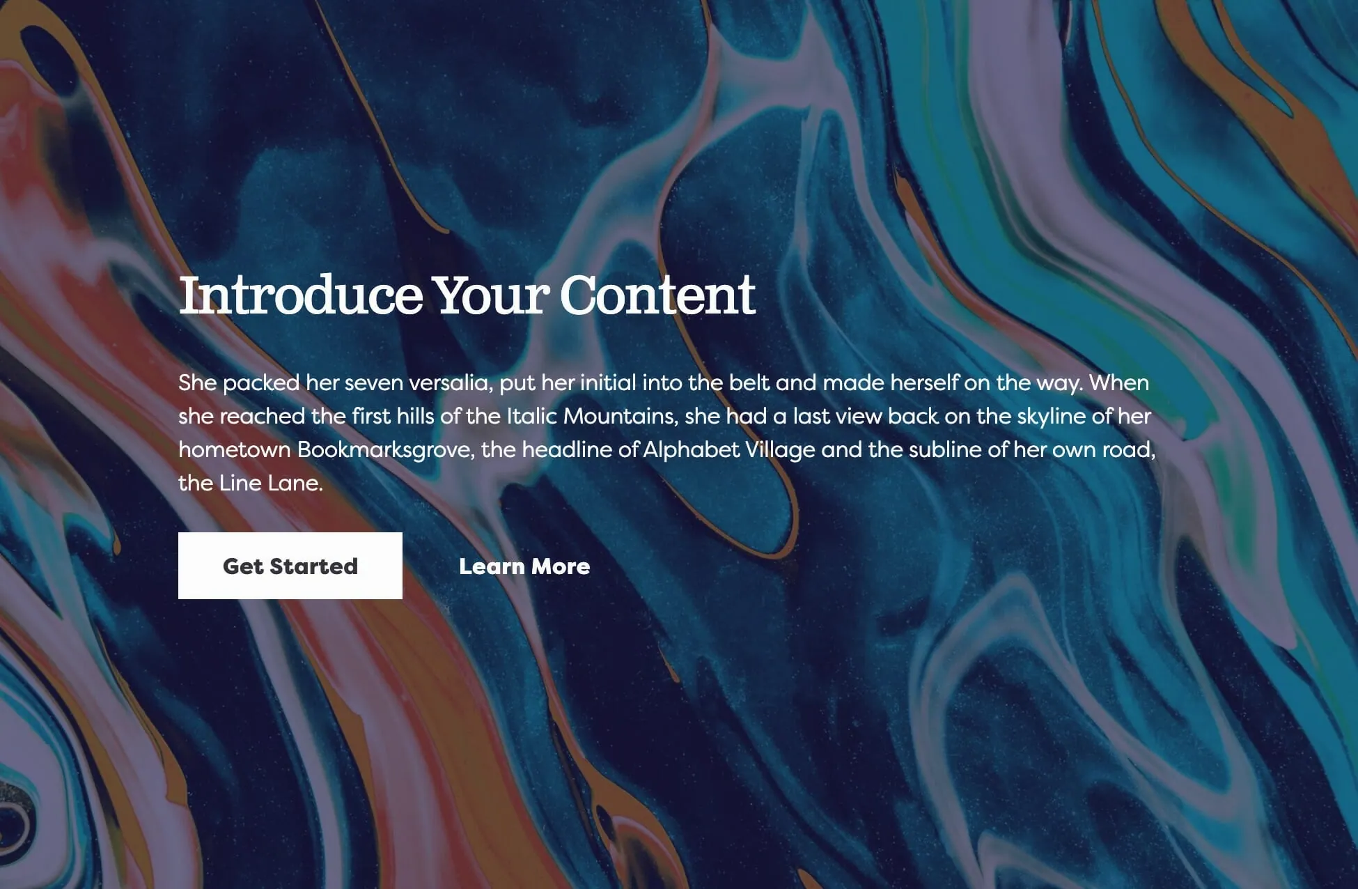
Photo backgrounds with a white headline card at the bottom of each tile.
Settings
Display Options
Tile height on large screens, as a percentage of the browser window's height. On smaller screens tiles are always half the window height.
Rounded rounds the tiles and adds space between them. Sharp puts square tiles edge to edge.
The link label shown on all three tiles. Leave it empty to hide the link.
How the link label looks on every tile. Appears once Link Text has a value.
The heading look for every tile's subheadline. It changes the look only, not the page outline.
The heading look for every tile's headline. It changes the look only, not the page outline.
