

Yearbook
A team directory grid of photos, names, titles, and short bios.
Usage
Yearbook shows people in a grid, each card with a photo, name, job title, short bio, and optional link. Use it for team pages, board listings, speaker lineups, or any staff directory where you type each person in yourself.
The block starts with four sample Card entries. Add or remove people with the block inserter.
For full people management with profile pages and archives, use the Dirigible People plugin instead. Yearbook is the simpler choice when you want a fixed grid you edit by hand.
Parent and child blocks
The outer Yearbook block holds one or more Card blocks.
Select Yearbook for the grid layout and styling shared by every card. Select a single Card to edit that person's photo, name, title, bio, and link.
Grid Settings (parent)
Sidebar controls under Grid Settings:
- Columns: 2, 3, 4 (default), or 5 cards per row. Cards wrap onto more rows on smaller screens.
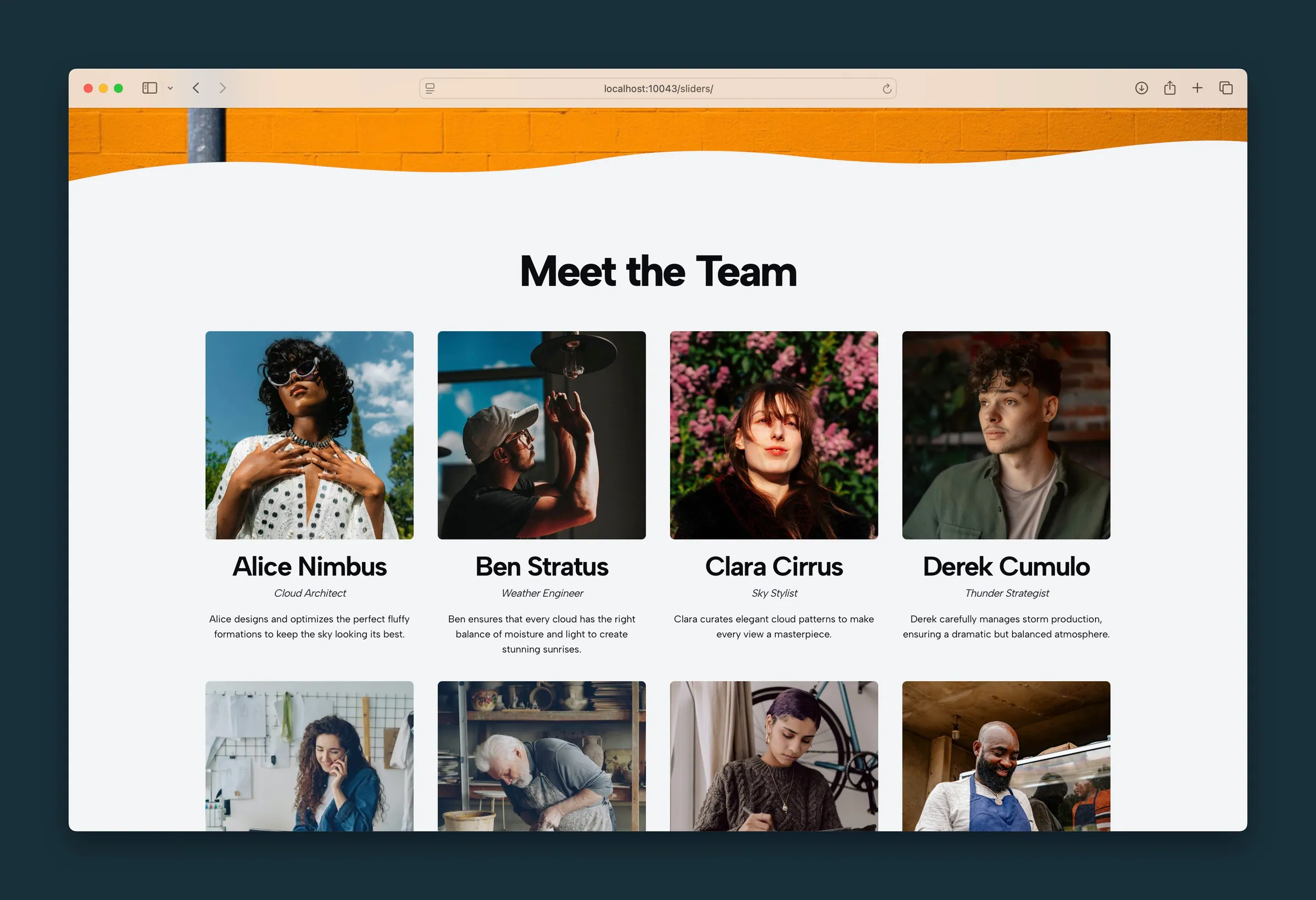
- Image Style: Square (default), Rounded, Headshot (large circle), Thumbnail (small circle), or Hidden.
- Headline Style: how names look, using your site's heading styles (looks like H3 by default). Choose hide to hide names.
- Subheadline Style: how job titles look (looks like H5 by default). Choose hide to hide titles.
- Link Style: one style for every card's link: Link (understated), Button, Alternate, Hollow, Subtle, Ghost, White, or Outline.
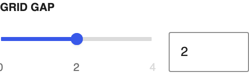
- Grid Gap: space between cards (0–4; default 2).
Toolbar (parent)
Block toolbar controls that aren't in the sidebar:
- Alignment: left, center, or right for the photo, text, and link in each card.
- Toggle Background: adds a subtle rounded background to each card.
- Toggle Text Size: switches every card's bio between regular and small.
- Columns: the same column choices as the sidebar.
Individual cards (child)
Select a Card to edit:
- Photo: click the image placeholder, use the toolbar image button, or Change Image in the sidebar. Then set Image Focal Point to keep the face in frame.
- Name: typed on the canvas or in the sidebar. Its look follows Headline Style.
- Title: job title or role, typed on the canvas or in the sidebar. Its look follows Subheadline Style.
- Body: a short bio.
- Link URL: an optional link on the card.
- Link Text: defaults to Learn More. Edit it on the canvas or in the sidebar once a URL is set.
Cards without a photo show a generic person icon on the live site.
Block width
Yearbook supports Wide and Full alignment from the block toolbar and starts at Wide.
Tips
- Use Headshot for classic team grids and Thumbnail for compact directories with more columns.
- Turn on Toggle Background when cards sit on a busy Section background.
- For dated milestones instead of people, use Timeline.
Screenshots
Front-end
-
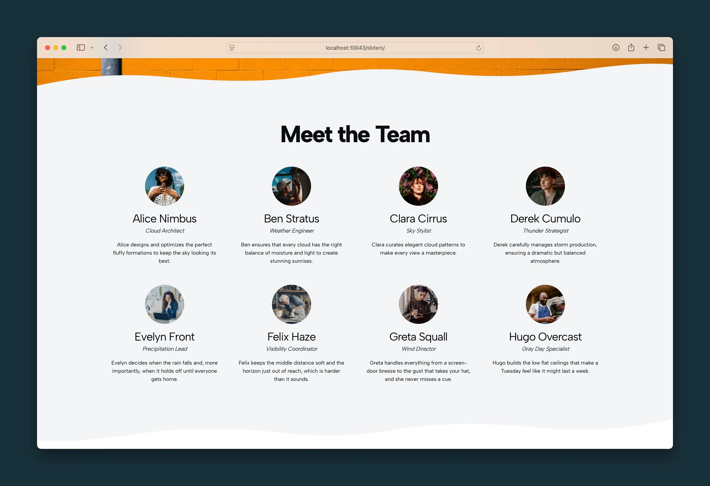
The same team with the Thumbnail image style, small circular photos. -
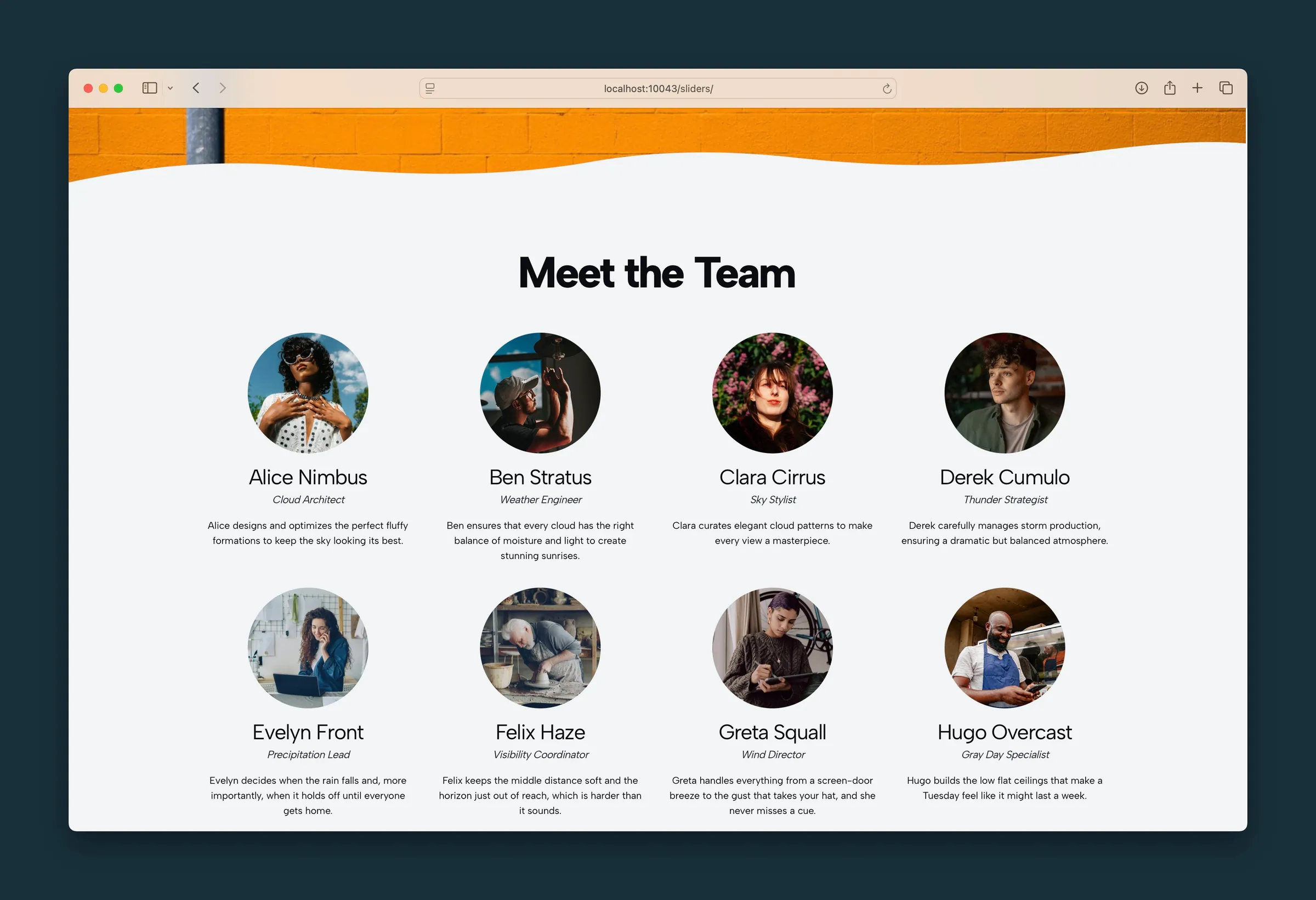
Headshot image style, with larger circular portraits in the same four-column grid.
Editor
-
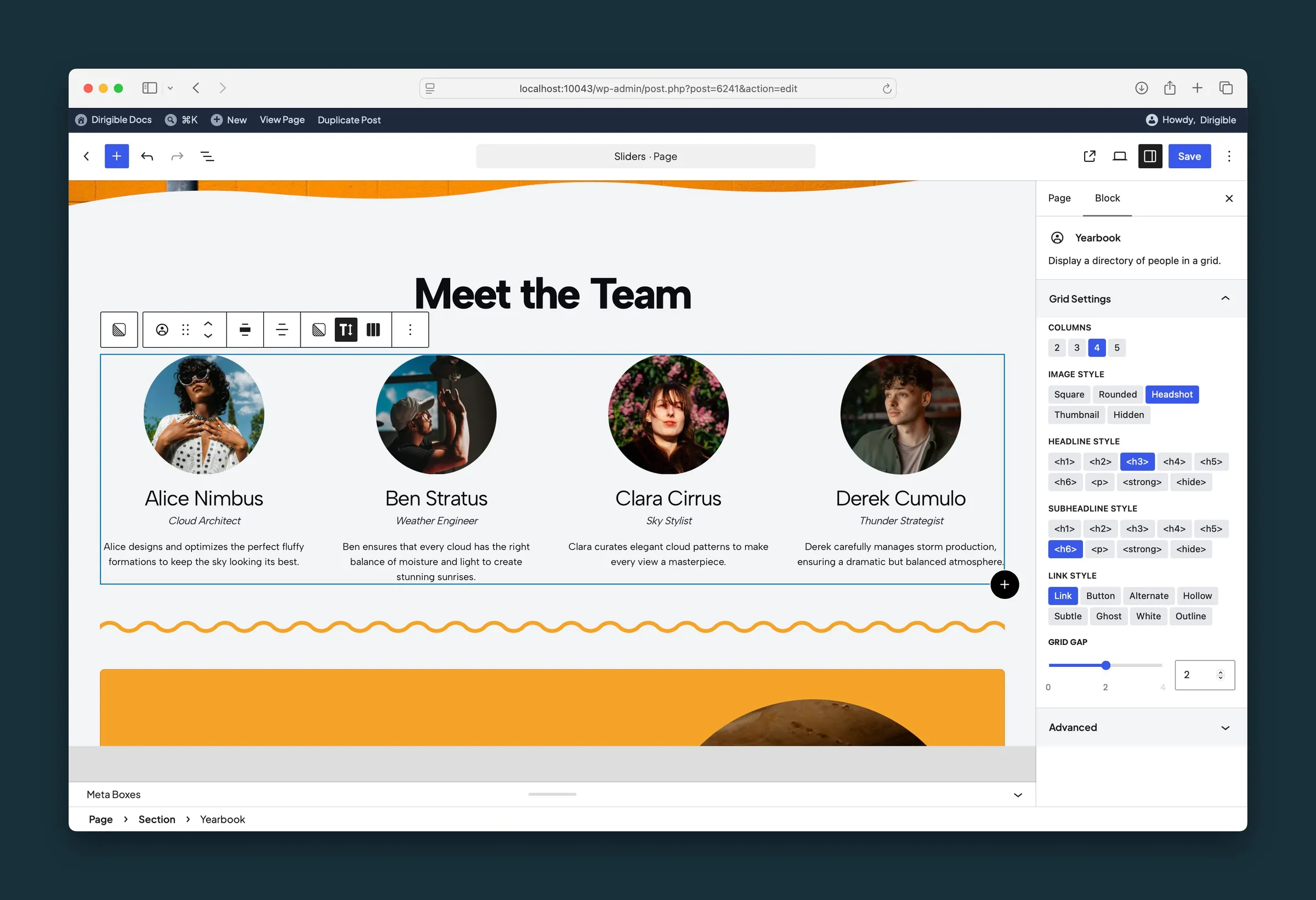
Yearbook settings — four columns, Headshot images, headline and title styles, and grid gap. -
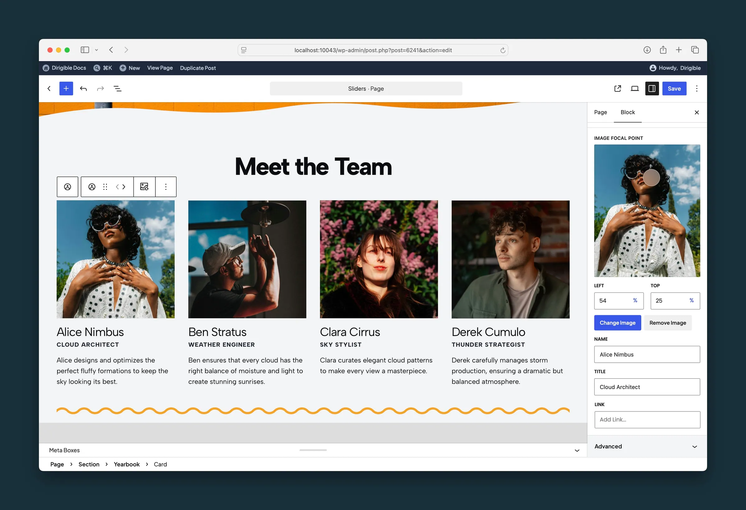
A card selected — image focal point, name, title, and link for Alice Nimbus.
Settings
Grid Settings

Cards per row. Cards wrap onto more rows on smaller screens.
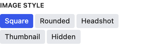
Photo shape for every card. The toolbar Alignment setting also moves Headshot and Thumbnail photos left, center, or right.
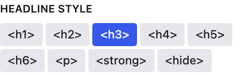
How names look on every card, using your site's heading styles. Choose hide to hide names.
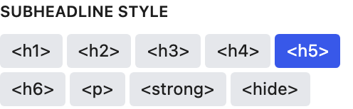
How job titles look on every card. Choose hide to hide titles.
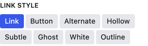
One style for every card's link.
Settings

Drag the dot so the portrait stays framed. Appears after you choose a photo. It follows the image's focal point from the Media Library until you move it here; after that it's this block's own.
The person’s name.
A short role or caption under the name.
Optional destination for this person.
The link label. Use it with Link URL.