

Jump Navigation
Add a table of contents that jumps to sections of a long page.
Usage
Jump Nav is an in-page menu, like a table of contents, that scrolls visitors to sections of the same page. You don't add menu items by hand. Jump Nav builds them automatically, in page order, from:
- Any block with an HTML Anchor set (under Advanced in the block sidebar)
- Older Jump Link blocks placed directly before the section they point to
Insert a Jump Nav block, usually near the top of the page, then add anchors to the sections visitors should reach. The menu updates as you add, rename, or reorder those sections.
For HTML anchors, the default link label is the target block's custom name (set in List View). If it has no custom name, Jump Nav turns the anchor into words — course-details becomes "Course Details". A Jump Link uses its own title.
Use Link labels in the Jump Nav sidebar to change the text for this nav only. Reset goes back to the default label, so renaming a block still updates any label you haven't changed.
If the page has no anchors yet, the block shows "No jump links available" in the editor.
Target warnings
Jump Nav warns you in the sidebar when something will break a link: two sections with the same anchor, a Jump Link sitting right before a block that already has an HTML anchor, a Jump Link at the end with nothing after it, more than one marker for the same block, or Jump Links inside synced patterns or repeated content.
A Jump Link must be followed by a content block at the same level (not tucked inside a different group or column). On the live site, the Jump Link itself disappears and the link points straight at the block after it.
When to use it
Page navigation like this works well for:
- Very long pages with lots of content
- Pages where visitors are likely hunting for one section
- Comparison or reference pages where visitors hop back and forth
Link styling
Jump Nav links use your site's tag styles. Change their look in the Customizer under Styles; tag typography, color, and background changes apply to every Jump Nav on the site.
There is no Reverse Print control on Jump Nav; link colors come from your tag styles.
Appearance
- Sticky — keeps the nav pinned below the site header as visitors scroll (on by default)
- Color — background fill from your site palette
- Style — Tags (default), Pills, Line, Indicator, or Highlight
- Orientation — Horizontal (default) or Vertical
Vertical orientation fits well in a narrow column beside long content — see the demo for an example.
As visitors scroll, Jump Nav highlights the section they're reading. Nothing is highlighted until a section reaches the nav. The links still work as plain page links, so the browser back button and shared links to a section behave as expected.
Block width
Jump Nav supports Wide and Full alignment from the block toolbar (default is full width).
HTML Anchors and Jump Links
Use HTML anchors whenever a block offers the field. Keep Jump Links for older pages and for blocks without anchor support. Either way, every anchor on a page must be unique.
Screenshots
Front-end
-
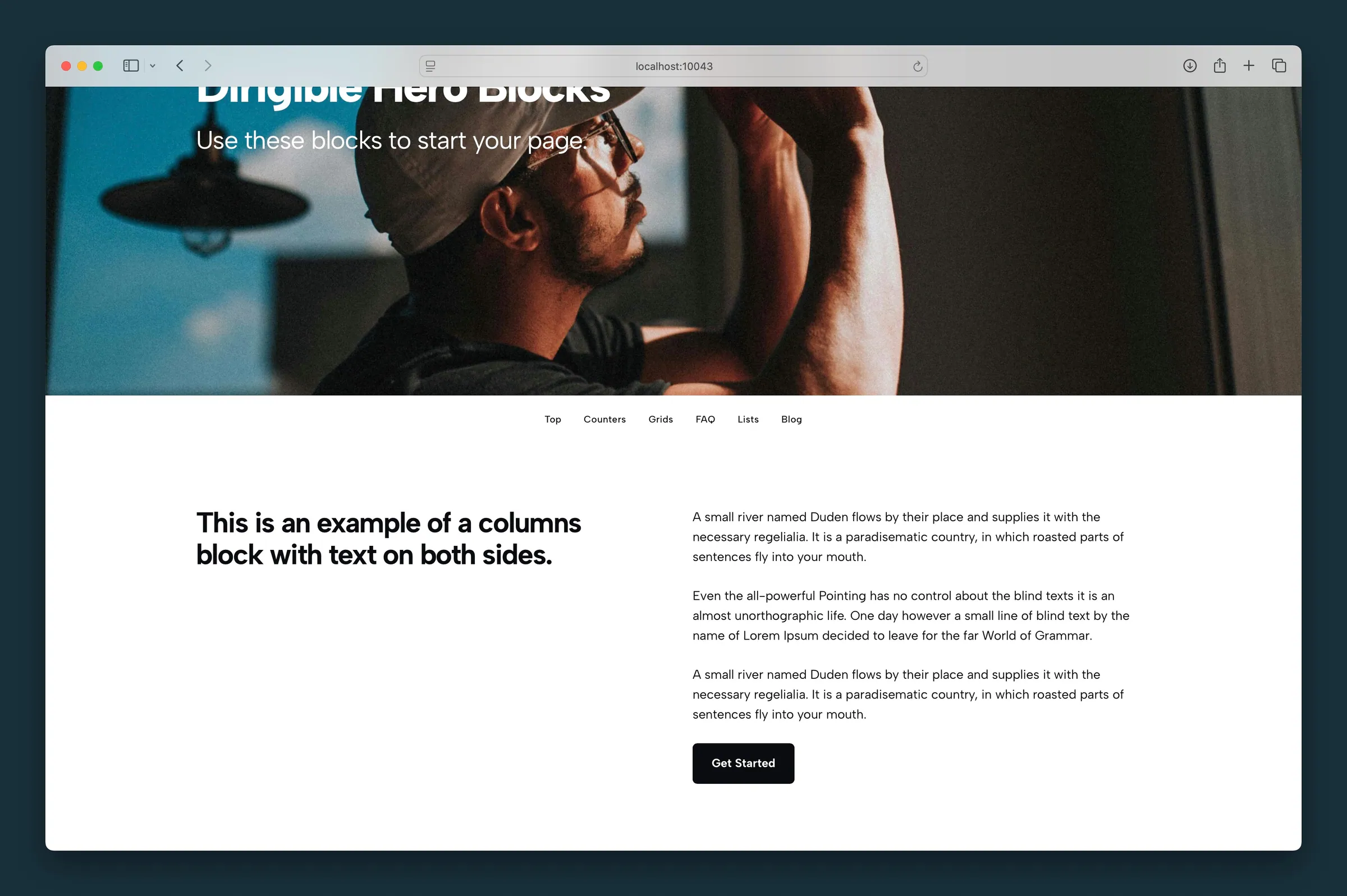
Horizontal Tags nav under the hero — links auto-populate from HTML anchors and Jump Links on the page. -
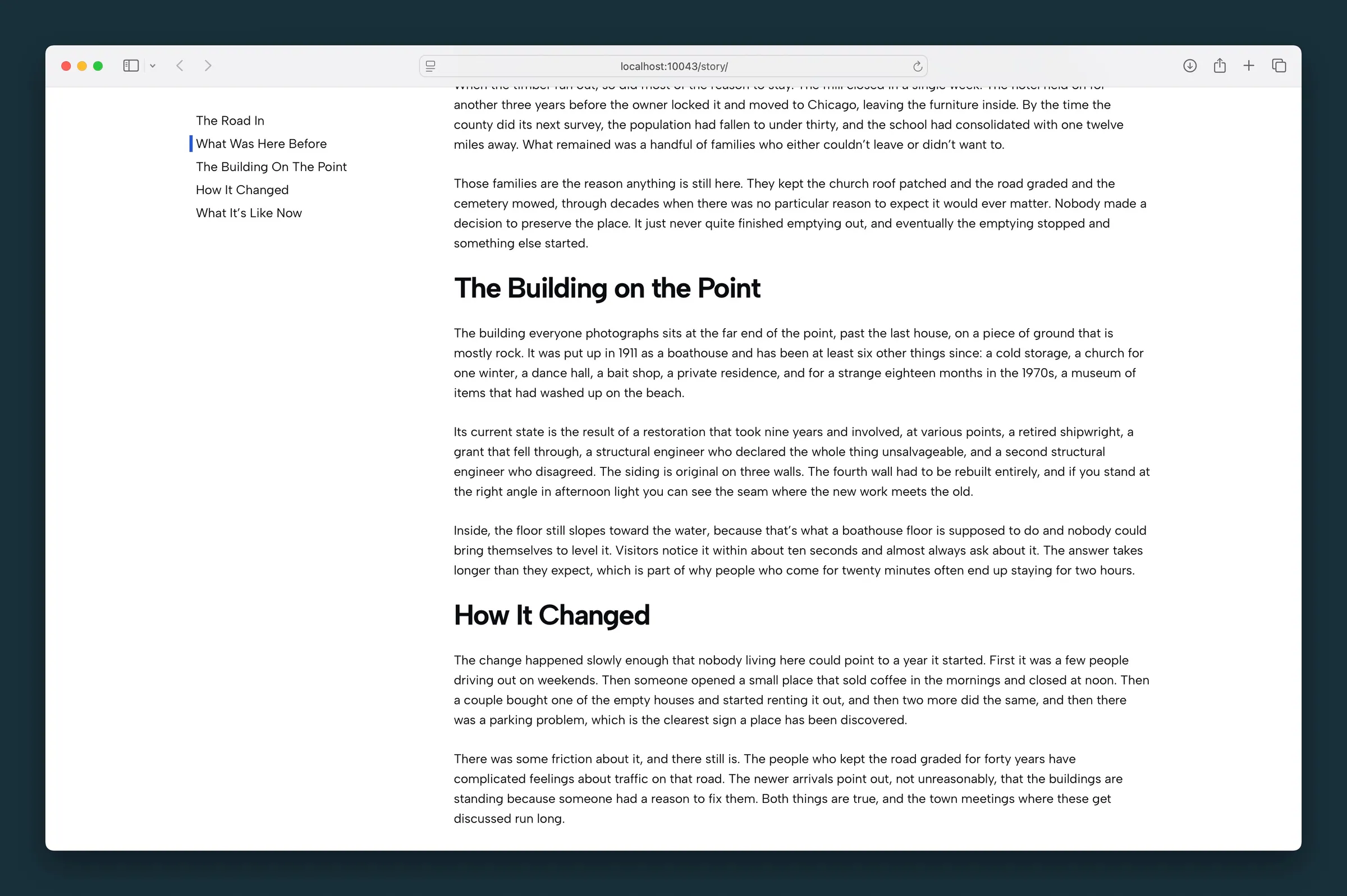
Vertical Line nav beside long-form story copy — current section marked with an active indicator.
Editor
-
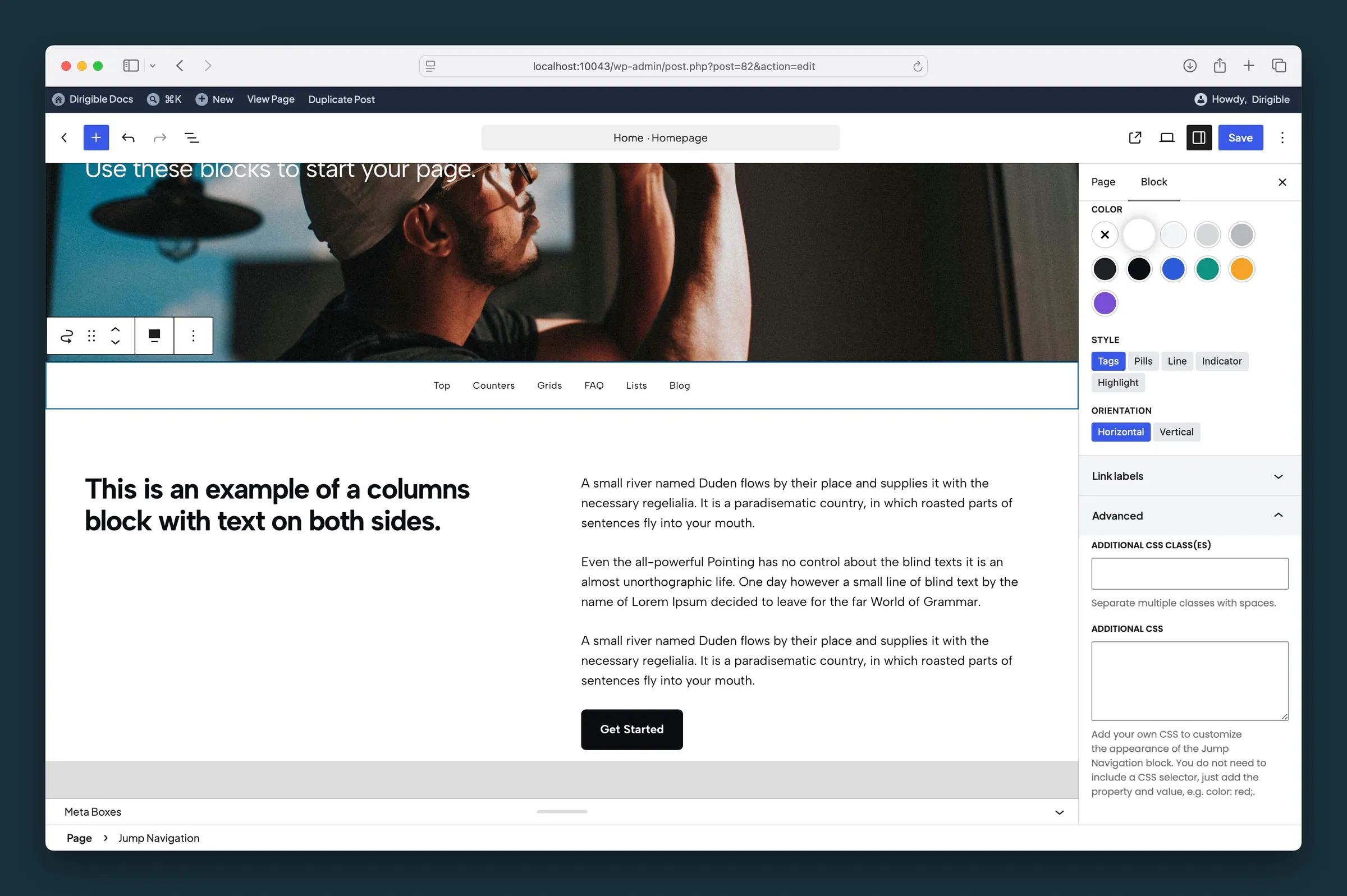
Horizontal Tags layout — Color, Style, and Orientation settings with auto-generated link labels. -
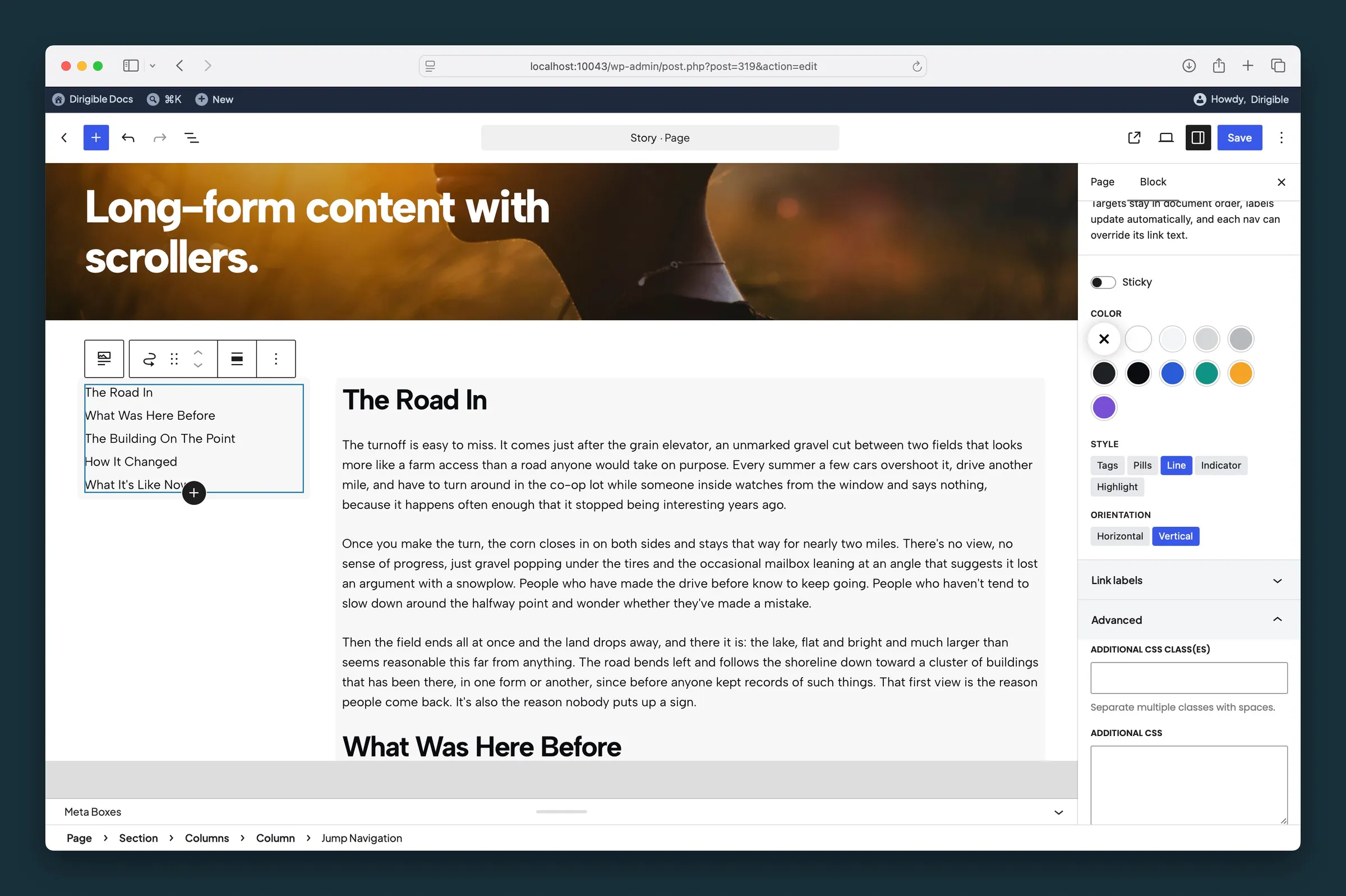
Vertical Line layout in a column — Sticky toggle, Style, Orientation, and Link labels overrides.
Settings
Settings

Keeps the nav pinned below the site header as visitors scroll the page.

Background fill from your site palette. Link colors come from your tag styles in the Customizer, not from this setting.
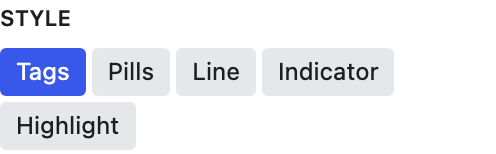
How the links look. Their typography still comes from your tag styles in the Customizer.

Vertical works well in a narrow column beside long content.