

Logos
A row of logos or images with responsive size and spacing options.
Usage
The Logos block shows a group of sponsor, partner, or client logos in a tidy row. It isn't limited to logos: use it for any row of small images that should look the same size.
Logos come in all shapes, so the block evens them out for you. Wide logos are scaled down a little and tall ones up a little, so the row looks balanced instead of every logo sharing the exact same height.
Adding logos
A new Logos block starts empty. Upload logos or pick several from the media library at once. To add, remove, or reorder logos later, use Edit gallery in the block toolbar or the sidebar.
Parent and child blocks
Select Logos for layout, sizing, spacing, opacity, and recolor settings that apply to every logo. Select an individual Logo to swap its image or add a link.
Layout (parent)
- Justify — where the logos sit in the row. Also applies when logos wrap onto more rows on smaller screens.
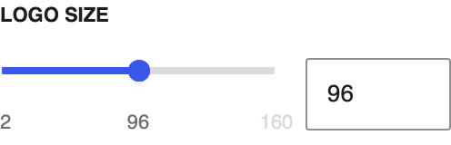
- Logo size — logo height on desktop
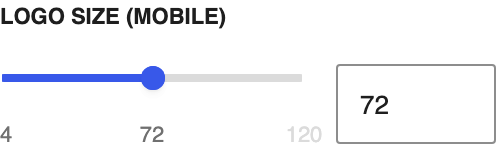
- Logo size (mobile) — logo height on screens 781px wide and narrower
- Gap — space between logos, side to side and between wrapped rows
- Opacity — how see-through the logos are. Linked logos go fully solid on hover for a "light up" effect.
- Remove whitespace — trims transparent or white padding around each logo on the page. This changes how logos display, not the uploaded file. PNG and SVG logos trim transparent edges; JPEG logos trim edge-connected near-white padding.
Recoloring (parent)
- Re-Color Logos — tints every logo one color
- Logo Color — the palette color to use (visible when Re-Color Logos is on)
SVG logos are recommended: they stay crisp at any size, keep file sizes small, and recolor cleanly.
Individual logos (child)
Each Logo child holds one image:
- Link URL — set it in the Logo sidebar or from the toolbar when the Logo is selected (for example, link each sponsor logo to their site)
- Size adjust — fine-tune one logo larger or smaller relative to the others. Starts at 0 and keeps the automatic balance. Use it after Remove whitespace when one mark still needs a little extra presence.
- Keep original spacing — visible when Remove whitespace is on for the row. Turn it on for one logo that should keep its padding while the others trim.
- Change or remove the image from the Logo sidebar
Block width
Logos supports Wide and Full alignment from the block toolbar. Logos wrap onto more rows as needed.
Screenshots
Front-end
-

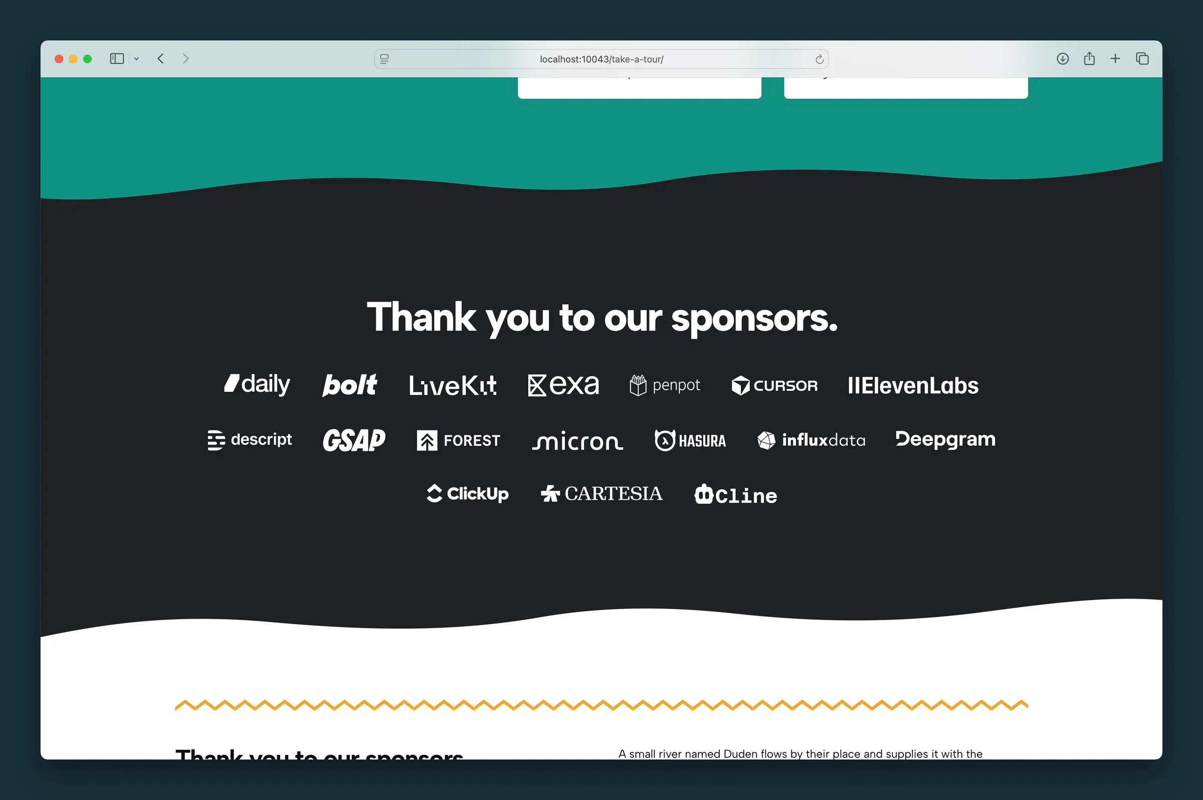
Same partner logos centered on a full-width band with wavy section edges. -
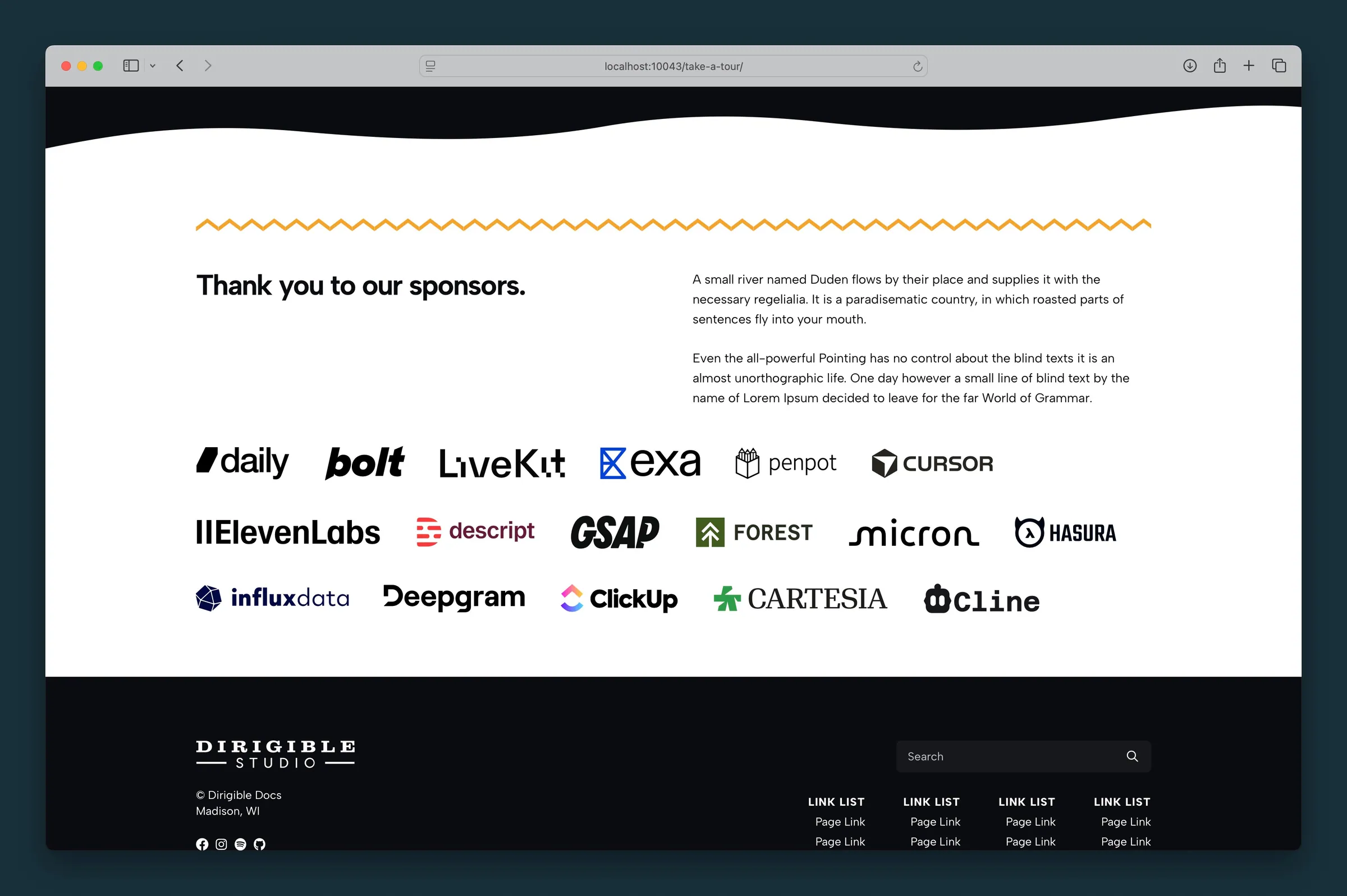
Natural-color logos left-aligned under a heading — wrapping row with gap and max-height controls.
Editor
-
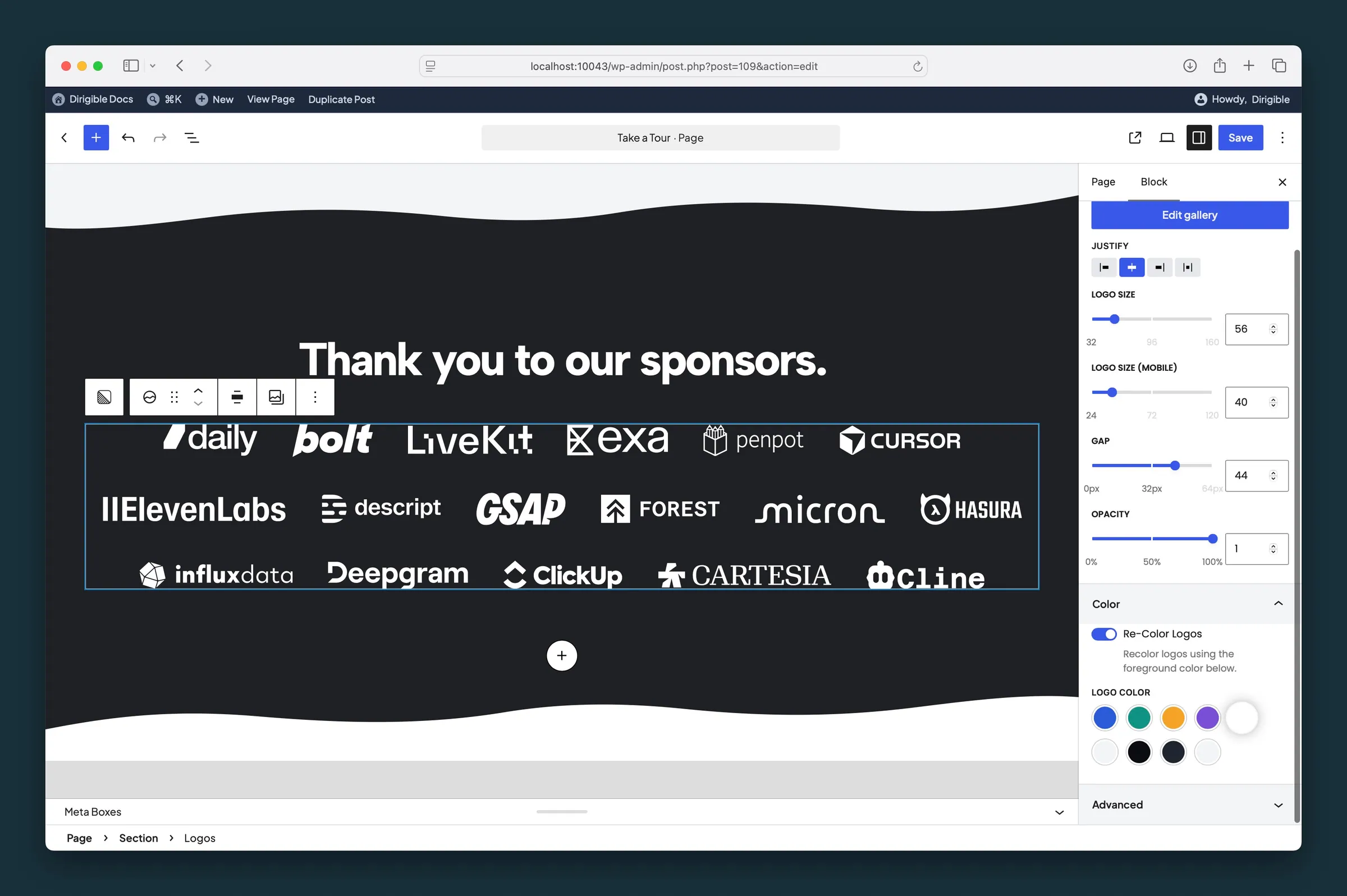
Parent Logos settings on a dark section — Re-Color Logos on with a white Logo Color tint. -
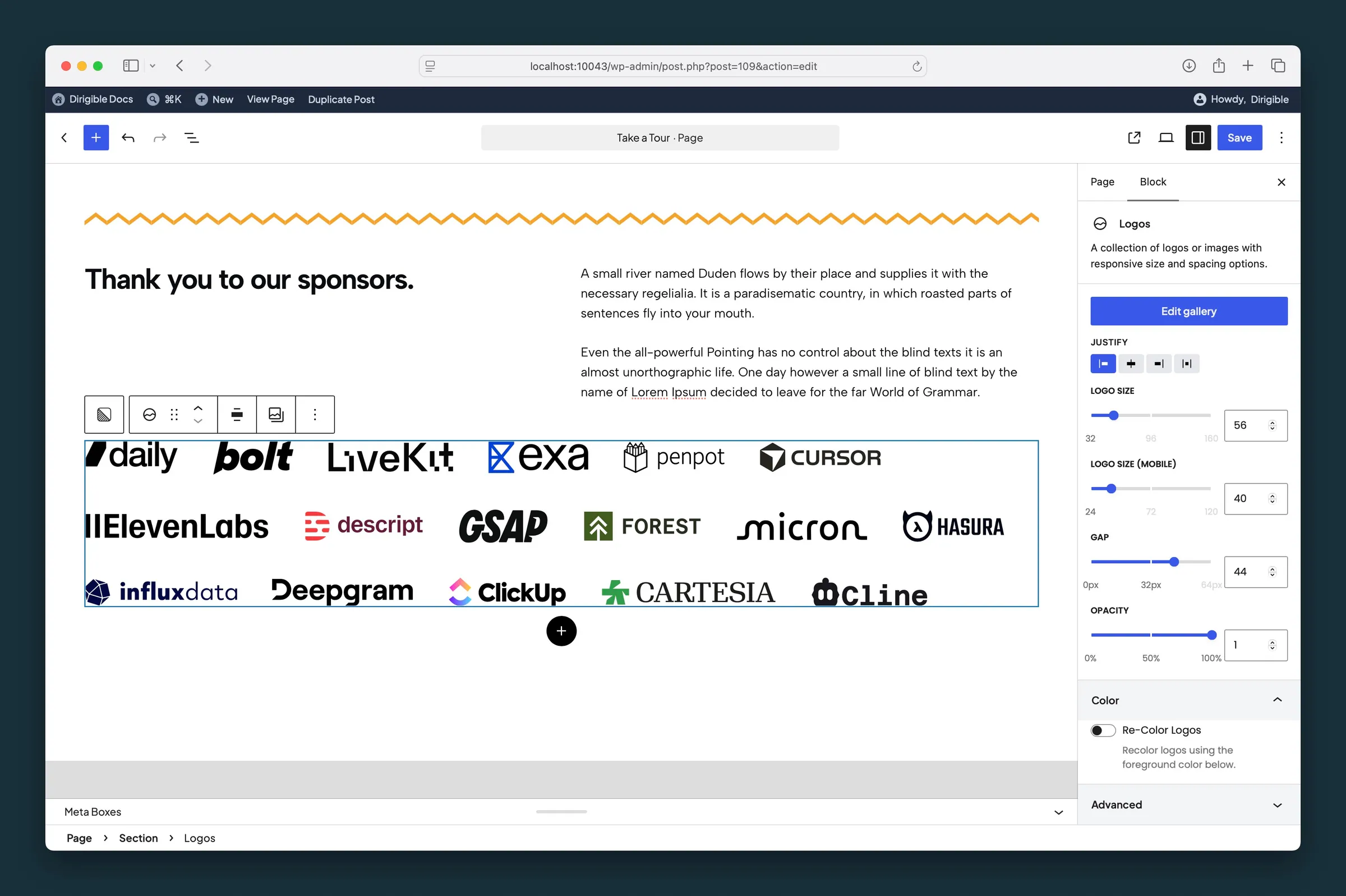
Layout controls — Justify, Logo Size, Gap, and Opacity with brand colors unchanged.
Settings
Settings

Where the logos sit in the row. Also applies when logos wrap onto more rows on smaller screens.
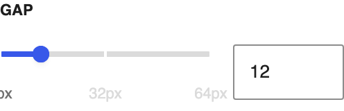
Space between logos, both side to side and between wrapped rows.
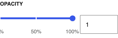
How see-through the logos are. Linked logos go fully solid on hover.
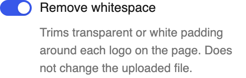
Trims transparent or white padding around each logo on the page. Does not change the uploaded file. Turn on **Keep original spacing** on an individual logo to skip trimming for that mark.
Color
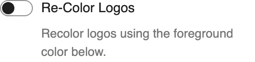
Tints every logo one color from your palette. Works best with SVG logos.
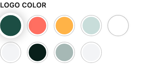
The color used when **Re-Color Logos** is on.
Logo

Optional destination when someone clicks this logo.
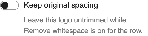
Leave this logo untrimmed while **Remove whitespace** is on for the row.
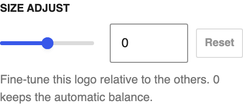
Fine-tune this logo relative to the others. 0 keeps the automatic balance.