

Price List
A list of prices and descriptions for restaurant menus, service menus, or rate sheets.
Usage
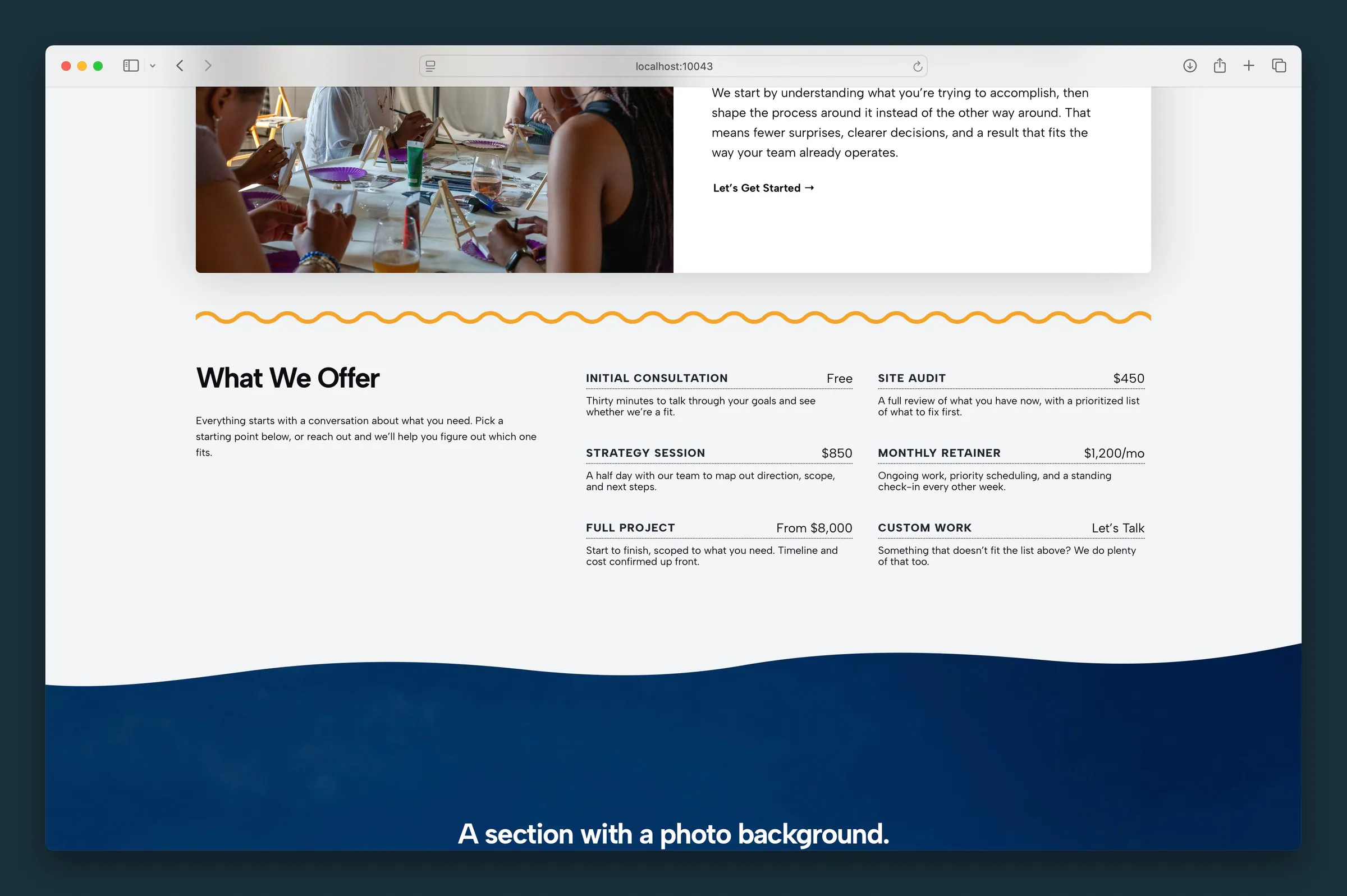
Price List shows items with a title, price, and description: a restaurant or café menu, a salon service menu, or a list of rates. It works like Grid, but each item is laid out as a name and price.
The Price List block holds Offering blocks, plus optional Heading blocks for section labels. Select Price List for columns, layout, and title style. Select an Offering to edit its title, price, and description. Use Add Offering to add more items.
Parent settings
- Columns — 2, 3, or 4 offerings per row on desktop. Items wrap to fewer per row on smaller screens.
- Layout — List (default) or Cards
- List — a dotted line connects each title to its price
- Cards — each offering gets a background fill, with no dotted line
- Headline Style — how every Offering title looks (H1–H6, paragraph, or bold paragraph). Titles stay an H4 in the page outline, and changing this updates every offering at once.
Offering (child)
Each Offering has:
- Title — the item or service name
- Price — any text you like:
$12,€8,Market Price, orLet's Talk - Description — paragraphs or a bulleted list below the title and price
Headings
Add a Heading block between offerings to label menu sections, like "Appetizers" or "Entrees".
Block width
Price List defaults to Wide and also supports Full from the block toolbar.
Tips
- Use List for a classic menu look.
- Switch to Cards when items need more separation, especially on busy backgrounds.
- Use section Headings with 2 columns for long menus.
Screenshots
Front-end
-
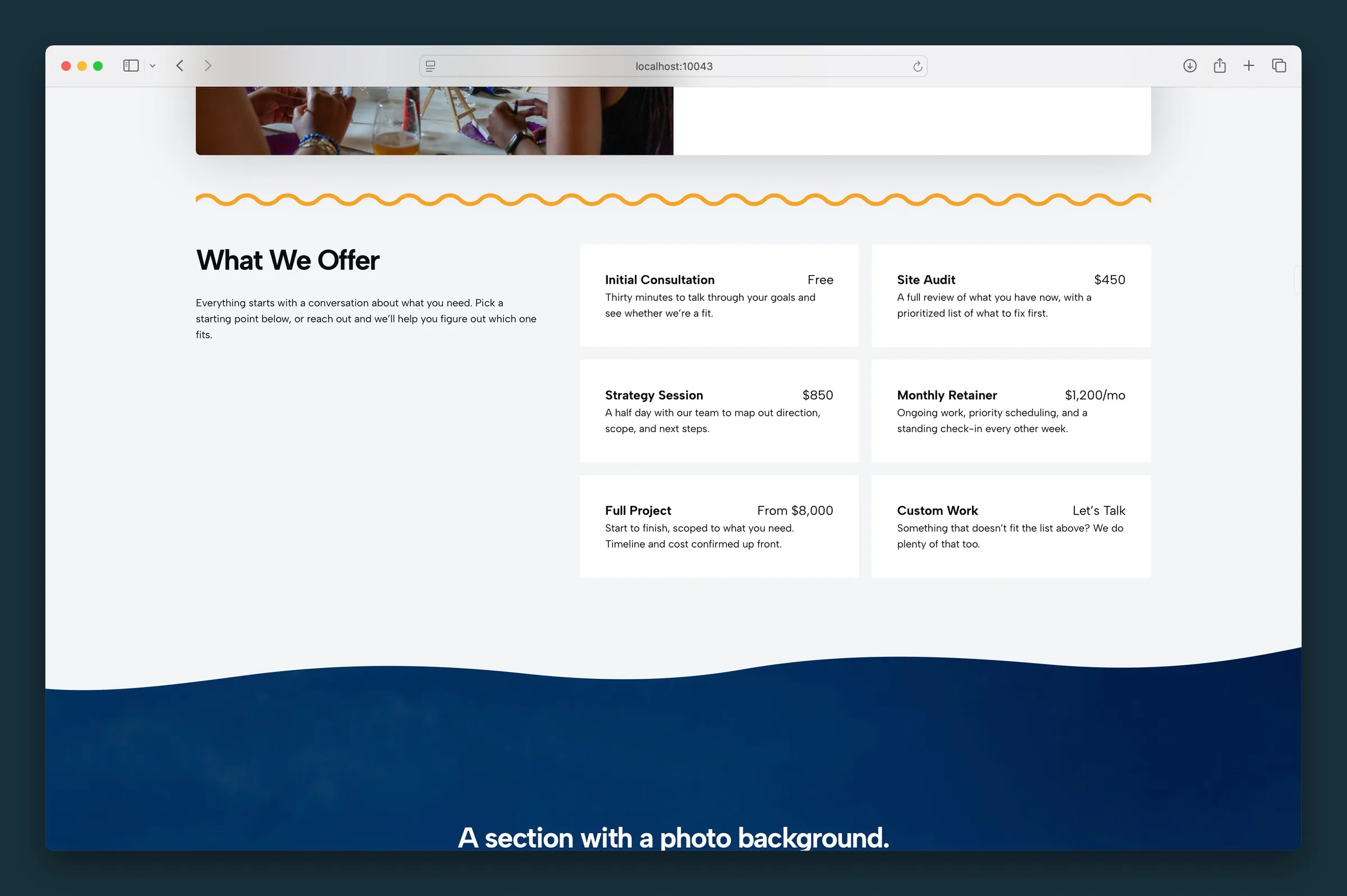
Cards layout with gray fills on each offering — same six services in a two-column grid.
Editor
-
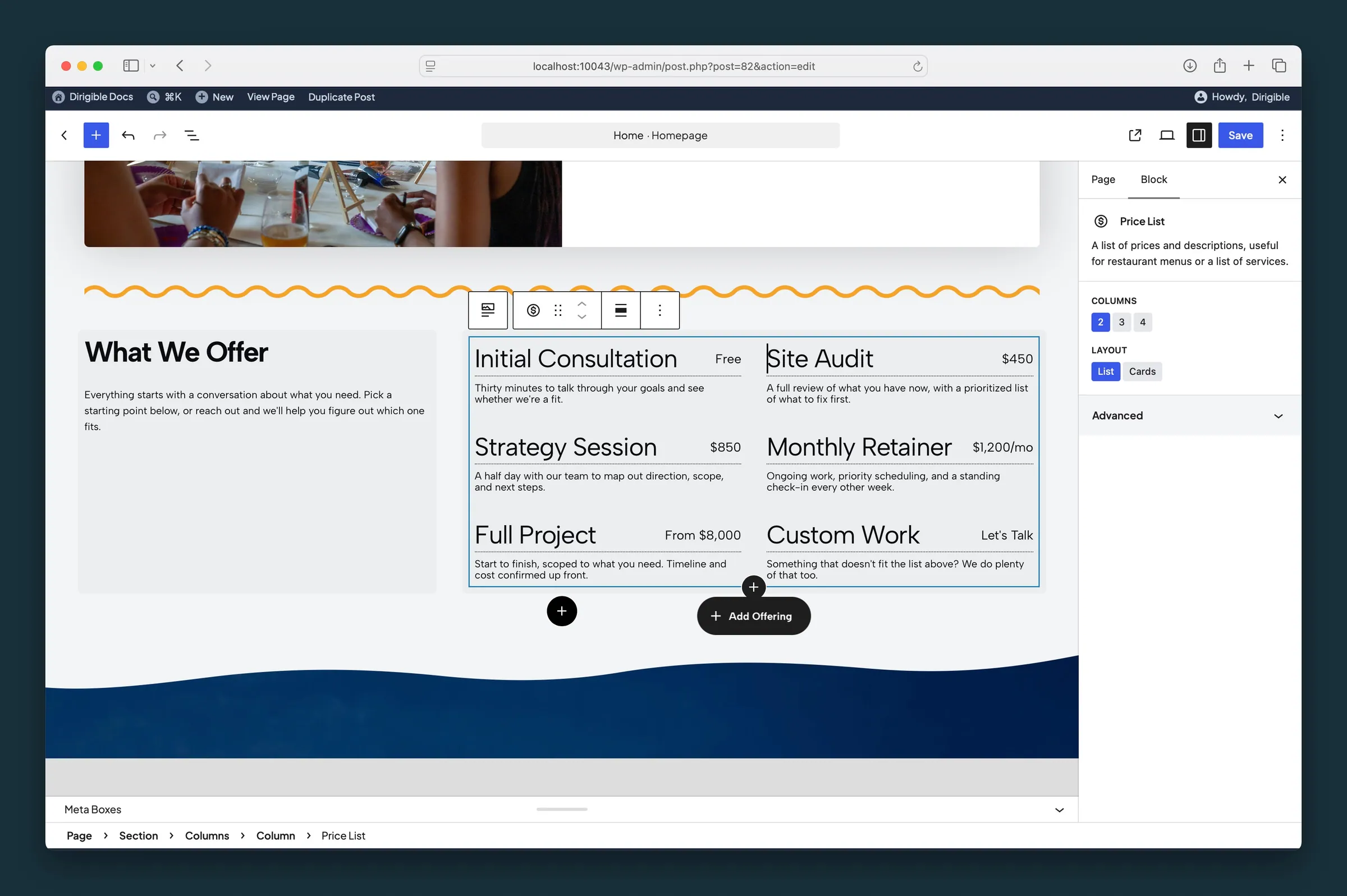
List layout selected — Columns set to 2 with dotted leaders visible in the canvas. -
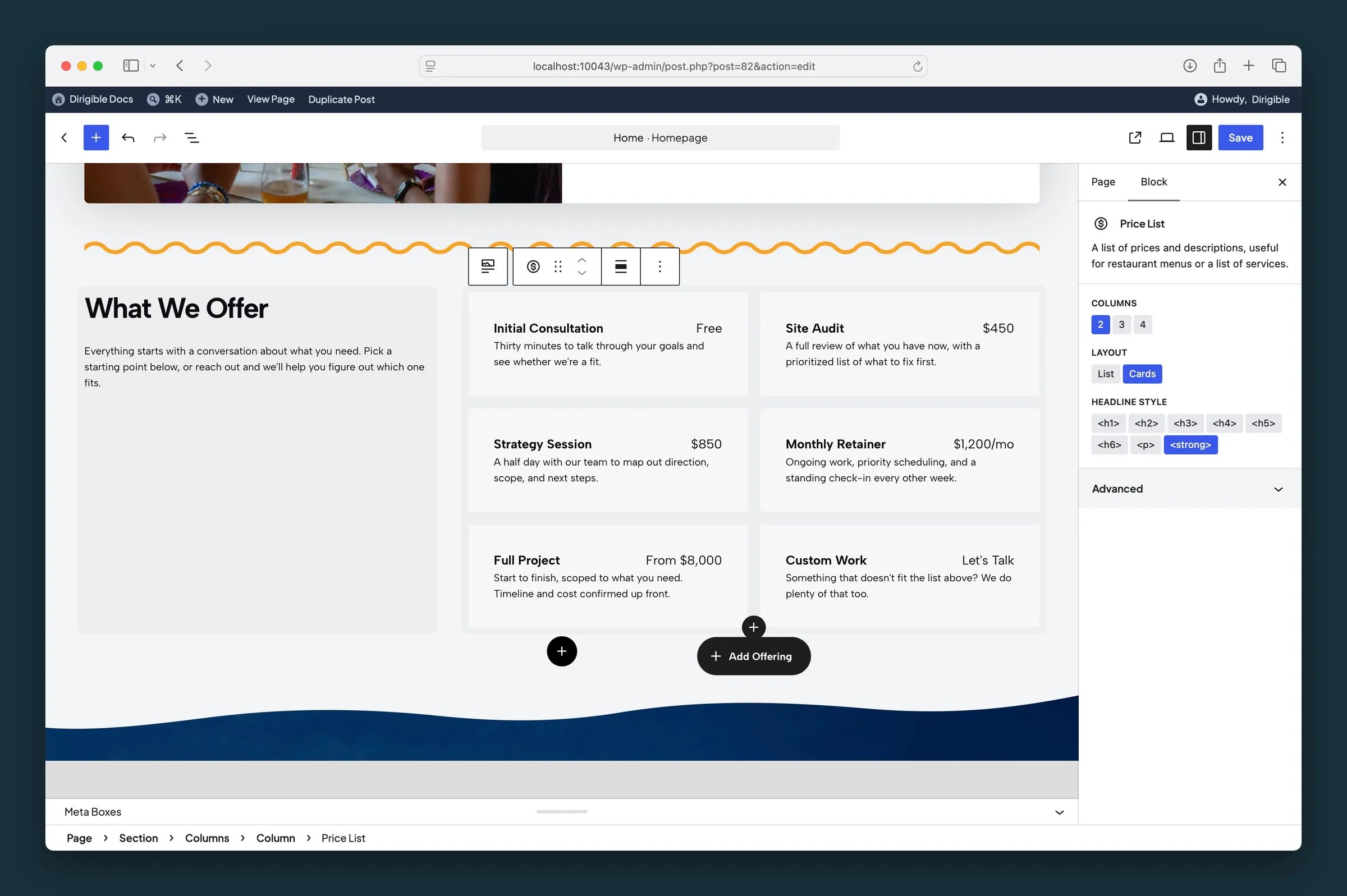
Cards layout with Headline Style set to bold paragraph — parent control applies to every Offering title.
Settings
Settings

Offerings per row on desktop. Smaller screens show fewer per row.
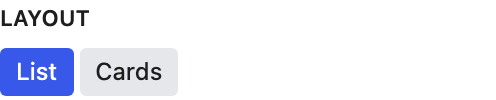
List connects each title to its price with a dotted line. Cards gives each offering a background fill instead.
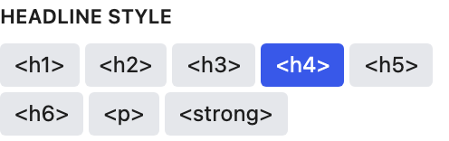
Changes how every Offering title looks. Titles stay an H4 in the page outline.
- <h1>Looks like your site's H1 style.
- <h2>Looks like your site's H2 style.
- <h3>Looks like your site's H3 style.
- <h4> defaultLooks like your site's H4 style.
- <h5>Looks like your site's H5 style.
- <h6>Looks like your site's H6 style.
- <p>Looks like normal paragraph text.
- <strong>Looks like a bold paragraph.