Icon List

Present features, services, or benefits as a scannable icon grid.
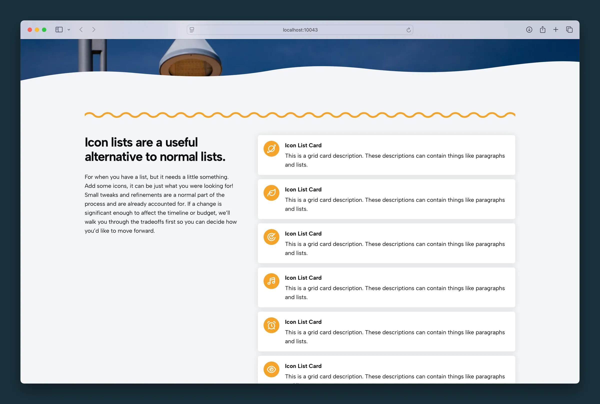
Usage

Icon List displays a row or grid of cards, each with an icon, headline, and body text. Add items in the editor and tune layout, icon size, and typography from the block sidebar.

When to use it

Use Icon List for feature grids, service highlights, or process steps where a small icon helps each point stand out. Pair with a Section for background color or padding when the list needs separation from surrounding copy.

Tips

  • Columns controls how many cards appear per row on larger screens.
  • Turn on Background when each card should read as its own tile.
  • Headline Style and Text Size apply to every card in the list.

Screenshots

Front-end

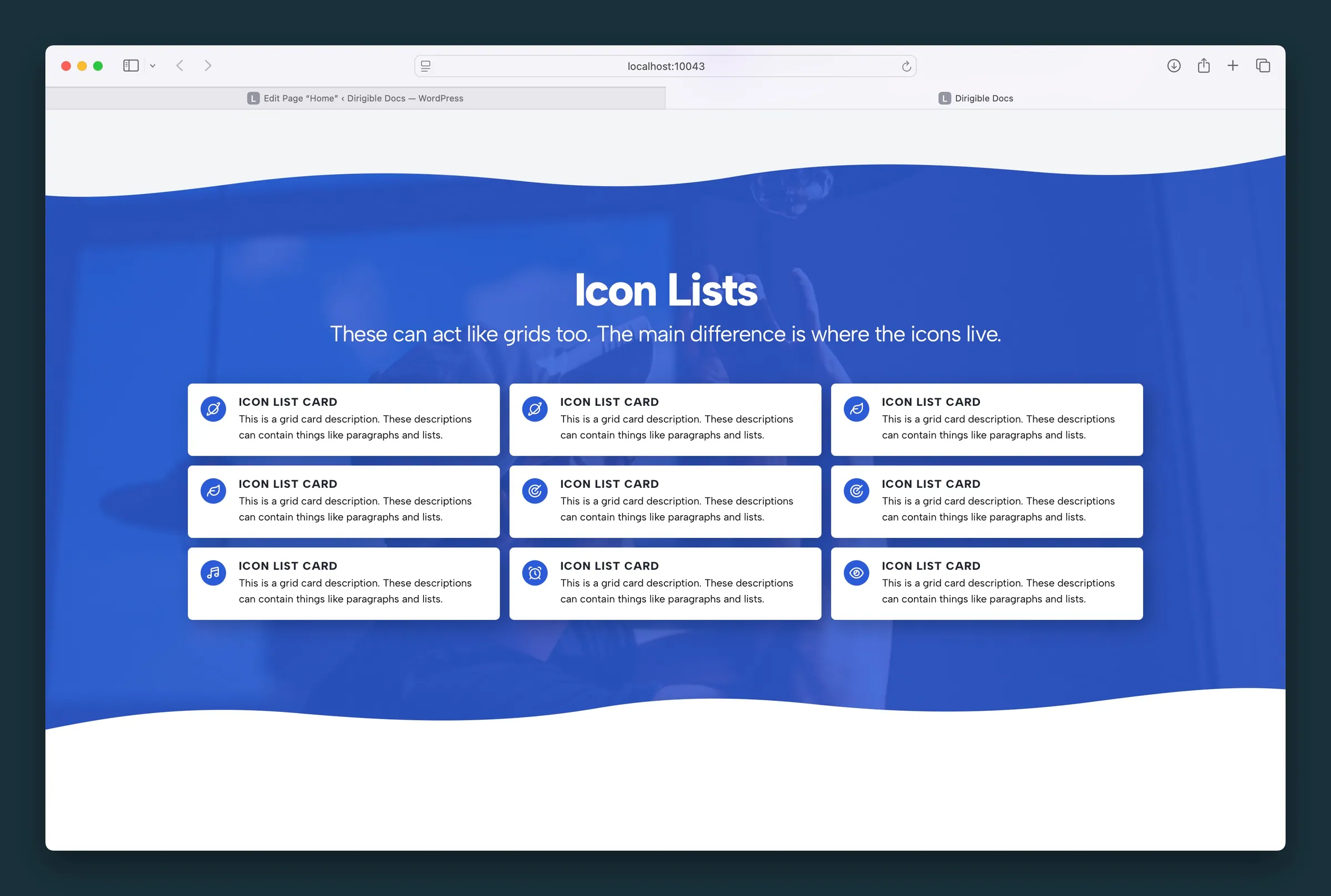
  • Three-column icon list on a photo section β€” cards with blue icon circles.
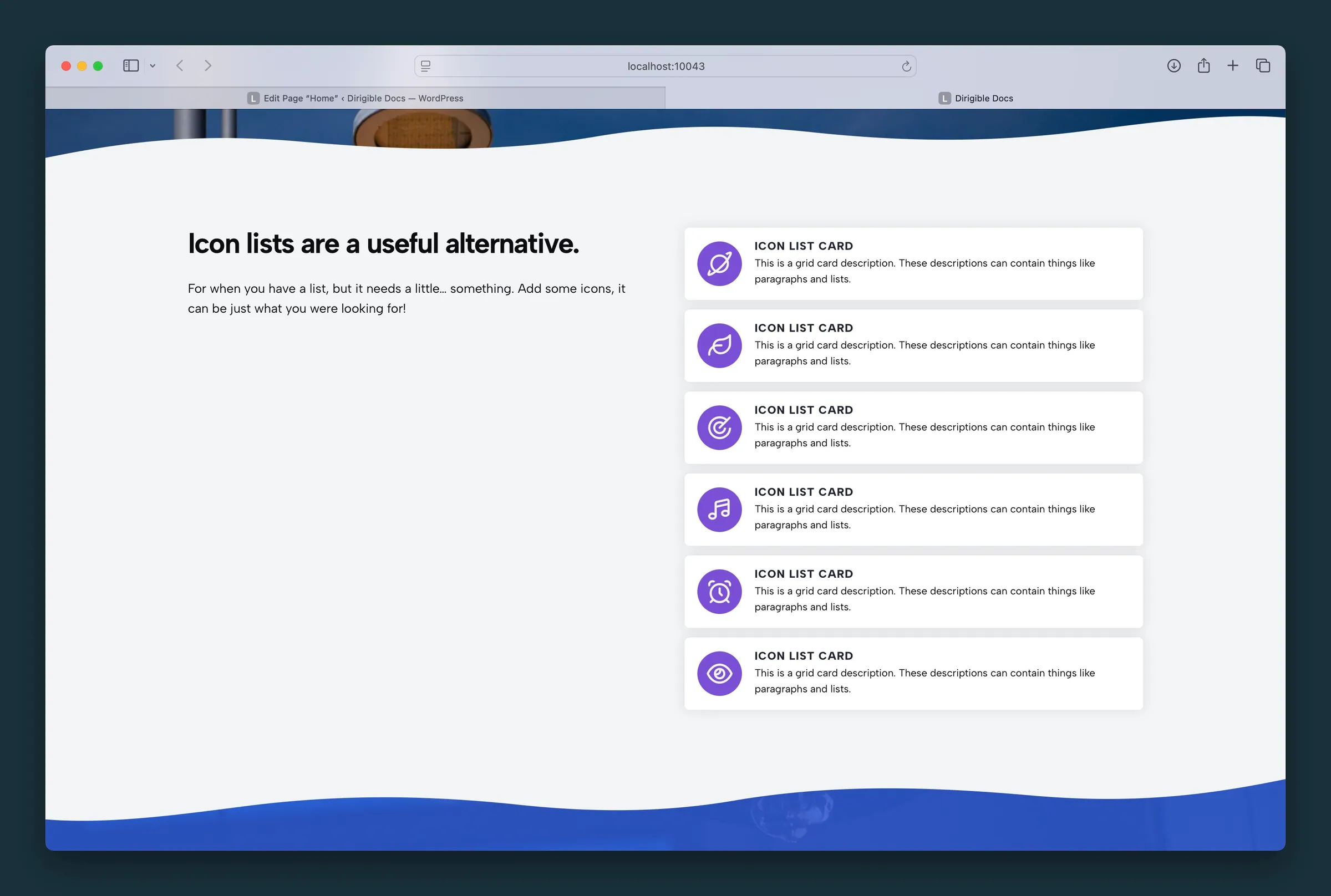
  • Single-column icon list with purple icon circles and card shadows.

Editor

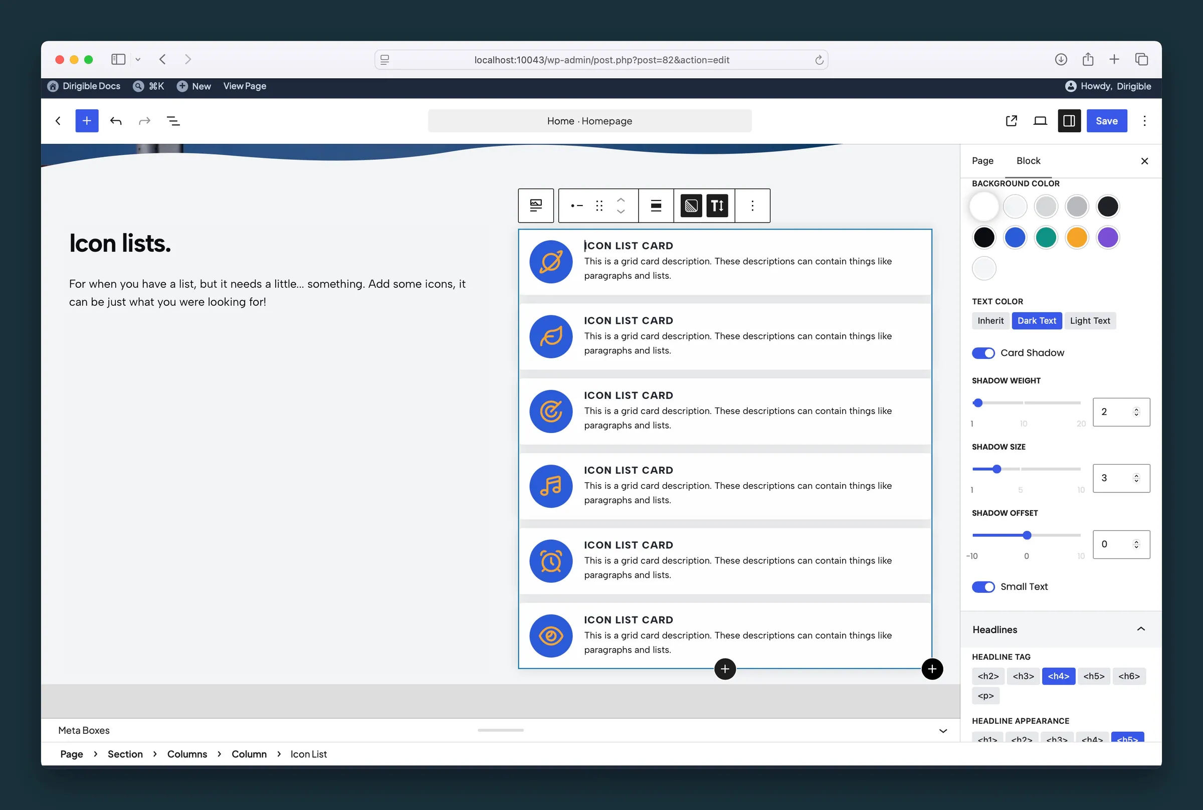
  • Icon List settings β€” card background, text color, shadow, and headline tag.
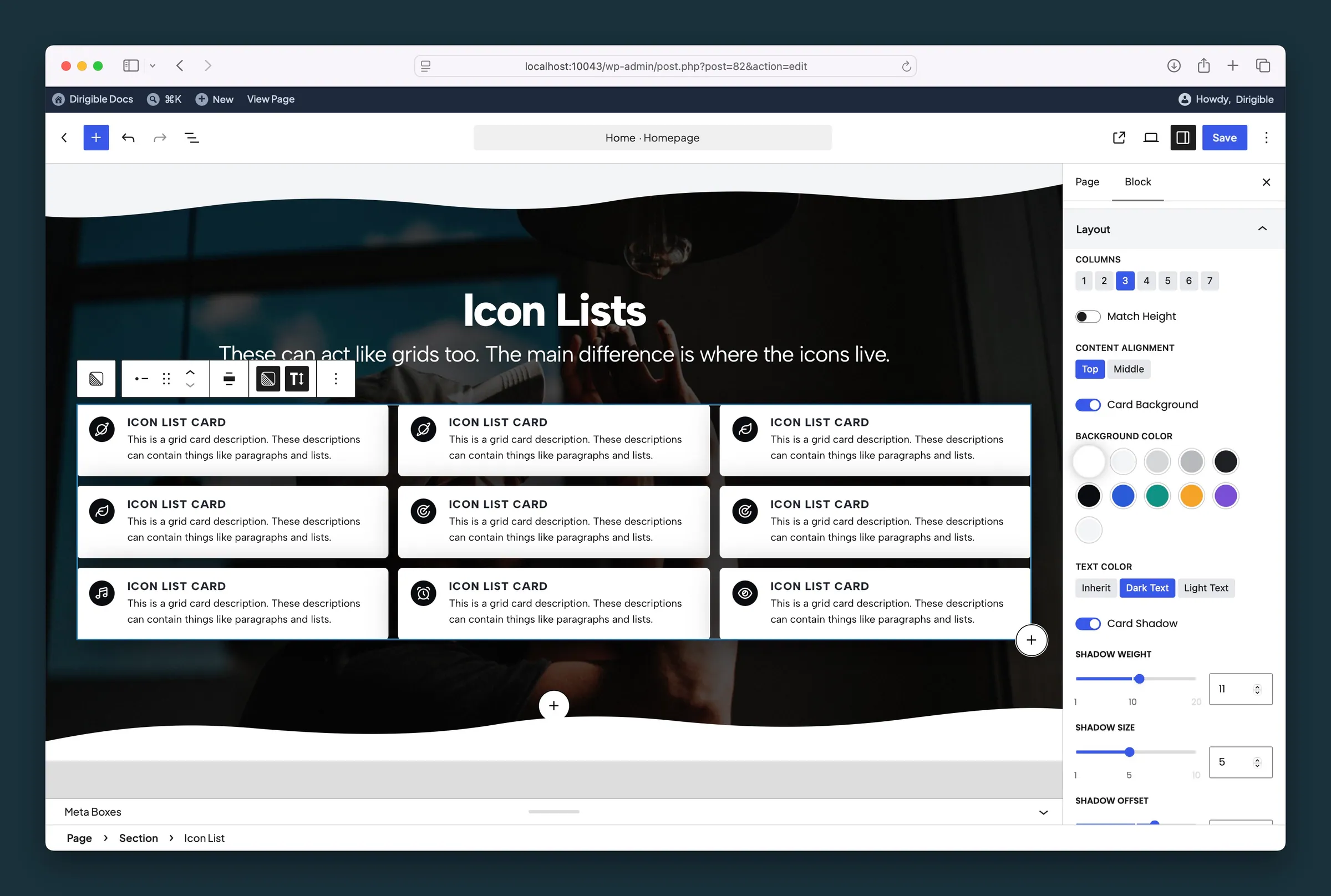
  • Layout settings β€” columns, match height, content alignment, and card shadow.

Settings

Layout

Columns setting in the block editor sidebar
Columns
  • 1
  • 2default
  • 3
  • 4
  • 5
  • 6
  • 7
Match Height setting in the block editor sidebar
Match Height
Content Alignment setting in the block editor sidebar
Content Alignment
  • Top
  • Middledefault
Card Background setting in the block editor sidebar
Card Background
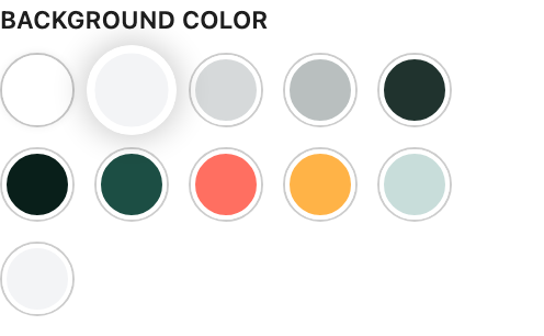
Background Color setting in the block editor sidebar
Background ColorAvailable when Card Background is enabled
Text Color setting in the block editor sidebar
Text ColorAvailable when Card Background is enabled
  • Inheritdefault
  • Dark Text
  • Light Text
Card Shadow setting in the block editor sidebar
Card Shadow
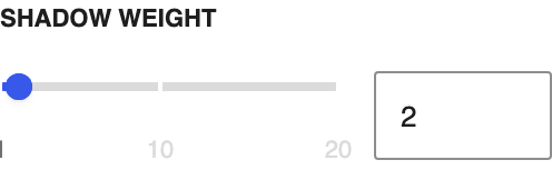
Shadow Weight setting in the block editor sidebar
Shadow WeightAvailable when Card Shadow is enabled
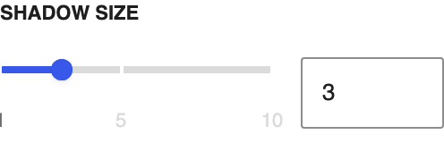
Shadow Size setting in the block editor sidebar
Shadow SizeAvailable when Card Shadow is enabled
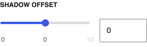
Shadow Offset setting in the block editor sidebar
Shadow OffsetAvailable when Card Shadow is enabled
Small Text setting in the block editor sidebar
Small Text

Headlines

Headline Tag setting in the block editor sidebar
Headline Tag
  • <h2>
  • <h3>
  • <h4>default
  • <h5>
  • <h6>
  • <p>
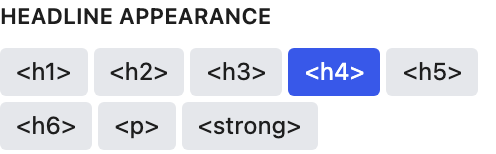
Headline Appearance setting in the block editor sidebar
Headline Appearance
  • <h1>
  • <h2>
  • <h3>
  • <h4>default
  • <h5>
  • <h6>
  • <p>
  • <strong>

Spacing

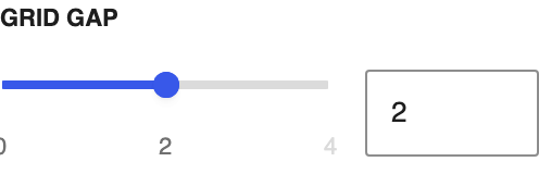
Grid Gap setting in the block editor sidebar
Grid Gap
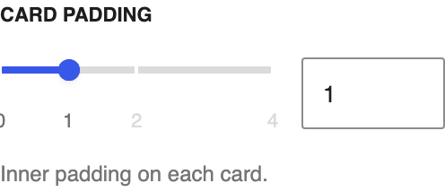
Card Padding setting in the block editor sidebar
Card Padding
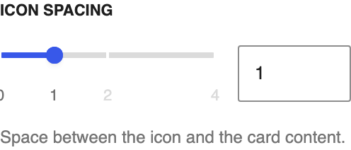
Icon Spacing setting in the block editor sidebar
Icon Spacing

Icons

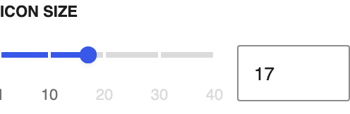
Icon Size setting in the block editor sidebar
Icon Size
Icon Background setting in the block editor sidebar
Icon Background
Background Color setting in the block editor sidebar
Background ColorAvailable when Icon Background is enabled
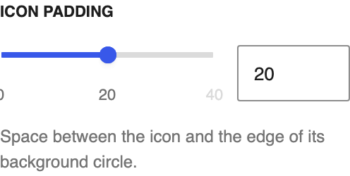
Icon Padding setting in the block editor sidebar
Icon PaddingAvailable when Icon Background is enabled
Color Icons setting in the block editor sidebar
Color Icons
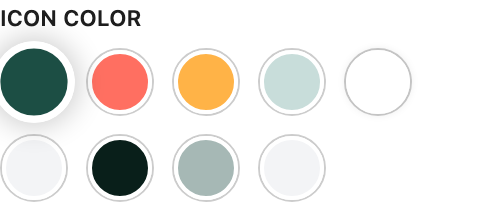
Icon Color setting in the block editor sidebar
Icon ColorAvailable when Color Icons is enabled

Icon Card

Headline