

Formatting Images
- Home ›
- Using WordPress ›
- Page Editing ›
- Formatting Images
Formatting Images
When Formatting Images to display on your site, there are a number of things you’ll want to take into consideration before uploading. Here are some of the requirements to follow to ensure your images look and function the best they can.

A properly Formatted image adhering to the image requirements below.

An improperly Formatted image that has insufficient Image Width and an incorrect Color Mode and Color Profile.
Image Width
Images added to your site should be around 2500px wide. This is an ideal Image Width to ensure high resolution while avoiding unnecessary bulk added to the file size. Images less than 1500px may appear blurry or pixelated.
File Size
An image’s File Size should not exceed 20 MB.
File Name
An image’s File Name should only use letters, numbers, hyphens, and underscores. Any other characters in a File Name, including accented letters, ampersands, etc., may cause unexpected issues.
File Type
Images should be either .jpg, .png, or .gif files.
Logos or Icons are an exception and may be provided in .svg format.
Color Mode (Color Profile, Color Space)
Images for web display should be supplied in the RGB Color Mode. The CMYK Color Mode is inappropriate for web display and should only be used for images used in print.
Color Profile
All images used on your site should have an sRGB Color Profile. Other color profiles may result in images not looking right across different devices.
How can I check if my image is formatted properly?
You can access your image file’s information by doing the following:
On Mac
- Select your image file on your computer.
- Press Command + I.
- In the window that opens, click More Info.
On Windows
- Select your image file on your computer.
- Press Alt + Enter.
- In the window that opens, click Details.
About Responsive Images (read this)
The internet is browsed on all sorts of devices, from teeny tiny phones to great big desktop monitors. Your Dirigible theme and many of it’s blocks do their best to present your images in ways that make the most sense for your user to view them according to their screen size. Dirigible handles it in one of two ways:
Some blocks, including the the stock wordpress image block, media and text, and media callout block will maintain aspect ratio and keep the entire image in view. If you want the entire image to be visible, use this.
Other blocks, including heroes, backgrounds, anything marked background image, photo features, and the background for landing pages and link-in-bio blocks will try to fit the available space of the browser window while ensuring the space is covered by the image, which means its will expand or shrink as necessary. You can use the focal point selector to tell the image what part of it is most important, but people will be viewing your site on anything from tiny 320px phones to 3000px wide desktops.
While you should never be including text on your images in the first place, you ESPECIALLY should never include text on a background image. It will get cut off on small screens as the image tries to expand to fit the larger vertical space and gets cut off by the smaller horizontal space. Below, we’ve illustrated some of these responsive effects.
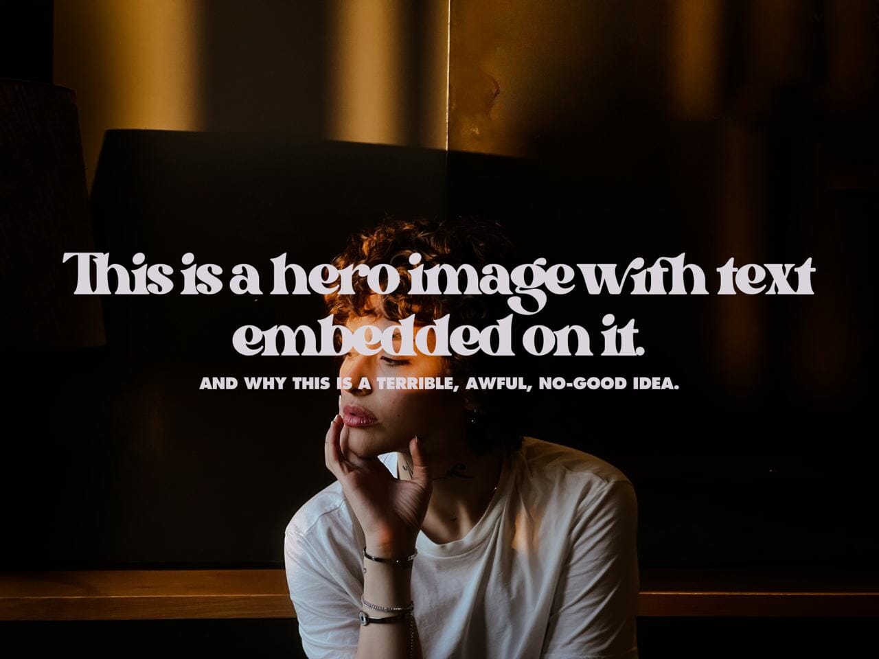
So we’ve prepared our hero image.
Unfortunately we’ve made a terrible mistake, we’ve embedded our text right in our hero image! This means that search engines will never index the most important information on our page. But there are other consequences looming…


