

Lookbook
Usage
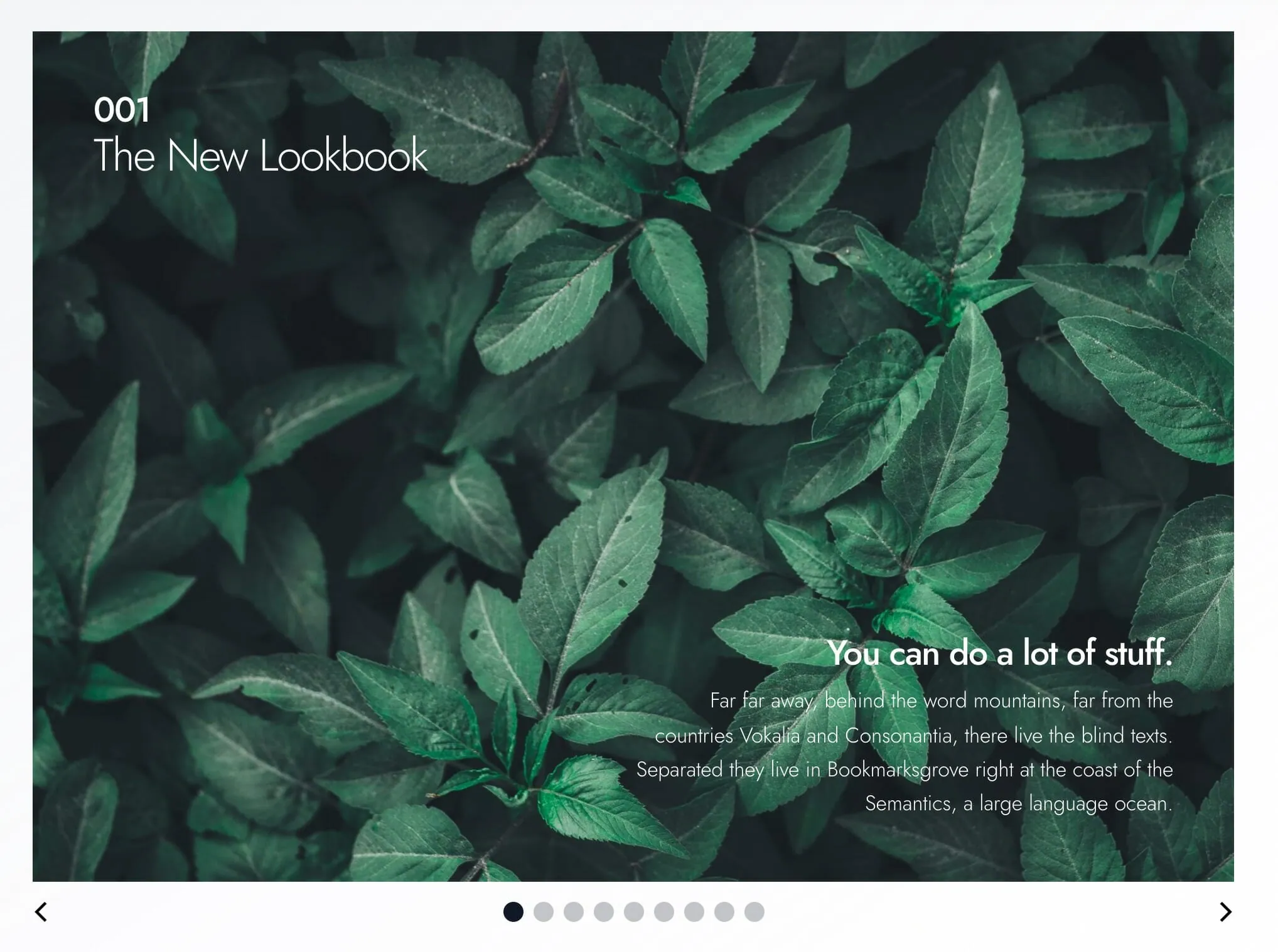
Lookbook is a magazine-style slider. On desktop, visitors move through full-width spreads one slide at a time using the arrows and dots below, or by scrolling sideways on a trackpad. Every slide is as tall as the tallest one, and shorter slides sit centred. On phones, the slides stack so everything stays readable without swiping.
Use it for brand stories, editorial spreads, portfolio chapters, or anything that suits a print-style layout with overlapping photos, columns of copy, and cover pages.
Add slides from the inserter inside the block. In the editor, every slide shows at once so you can edit them easily.
Slider settings
Select the Lookbook block for settings that apply to every slide:
- Wraparound: on by default. The slider loops from the last slide back to the first.
- Autoplay: off by default. Turn it on to advance slides automatically.
- Autoplay Interval: seconds between slides (default 3). Appears when Autoplay is on. Autoplay pauses while the cursor is over the slider, and doesn't run for visitors who've turned on reduced motion in their device settings. Visitors can stop it with a small pause button at the bottom right, which appears when they hover over the slider or reach it with the keyboard (on phones and tablets it's always shown).
Slide types
There are four kinds of slides. Select a slide to edit its settings.
Cover Slide
A full-width photo with a headline and body copy on top.
- BG Image: the background photo.
- Reverse Print: light text for dark photos.
- Text BG: adds a solid panel behind the body copy.
- Lead: a short label above the headline.
- Headline and Subheadline: the main title and a supporting line.
- Body: the slide's paragraph text.
Copy Slide
A text-led spread with up to three columns of copy and an optional logo.
- BG: background color from your theme palette (default Gray).
- Reverse Print: light text for dark backgrounds.
- Alternative Layout: switches to a different arrangement.
- Lead and Headline: a short label and the main title.
- Copy Area A, Copy Area 2, Copy Area 3: separate blocks of text. The layout adjusts to how many you fill in.
- Logo: an optional small logo.
Image Collage
Overlapping photos with a headline and body copy set among them.
- Gallery: up to five images. The collage layout changes with the number of images.
- BG: background color (default Gray).
- Text BG: adds a solid panel behind the body copy.
- Reverse Print: light text for dark backgrounds.
- Lead, Headline, Body: the slide's copy.
Image Blocks
Photos arranged in a clean grid beside a column of copy.
- Gallery: up to four images. The layout changes with the number of images and Alternative Layout.
- BG: background color (default Gray).
- Reverse Print: light text for dark backgrounds.
- Alternative Layout: switches to a different photo and copy arrangement.
- Lead, Headline, Body: the slide's copy.
Image Collage overlaps photos for a scrapbook feel. Image Blocks keeps them in a tidier grid.
Notes on slide settings
- Use Reverse Print rather than recoloring each heading by hand. It changes all the text on the slide at once, which makes swapping backgrounds later easier.
- Lead works well for a section label, issue number, or chapter marker.
Block width
Lookbook supports Wide, Full, and Center alignment and defaults to Wide.
Tips
- Mix slide types: open with a Cover Slide, then follow with Copy Slide or Image Collage pages.
- Leave Autoplay off for text-heavy spreads so visitors can read at their own pace.
- For a slider with a background photo on every slide, see Storyboard Slider. For free-form slides you build from any blocks, see Slideshow.
Screenshots
Front-end
-
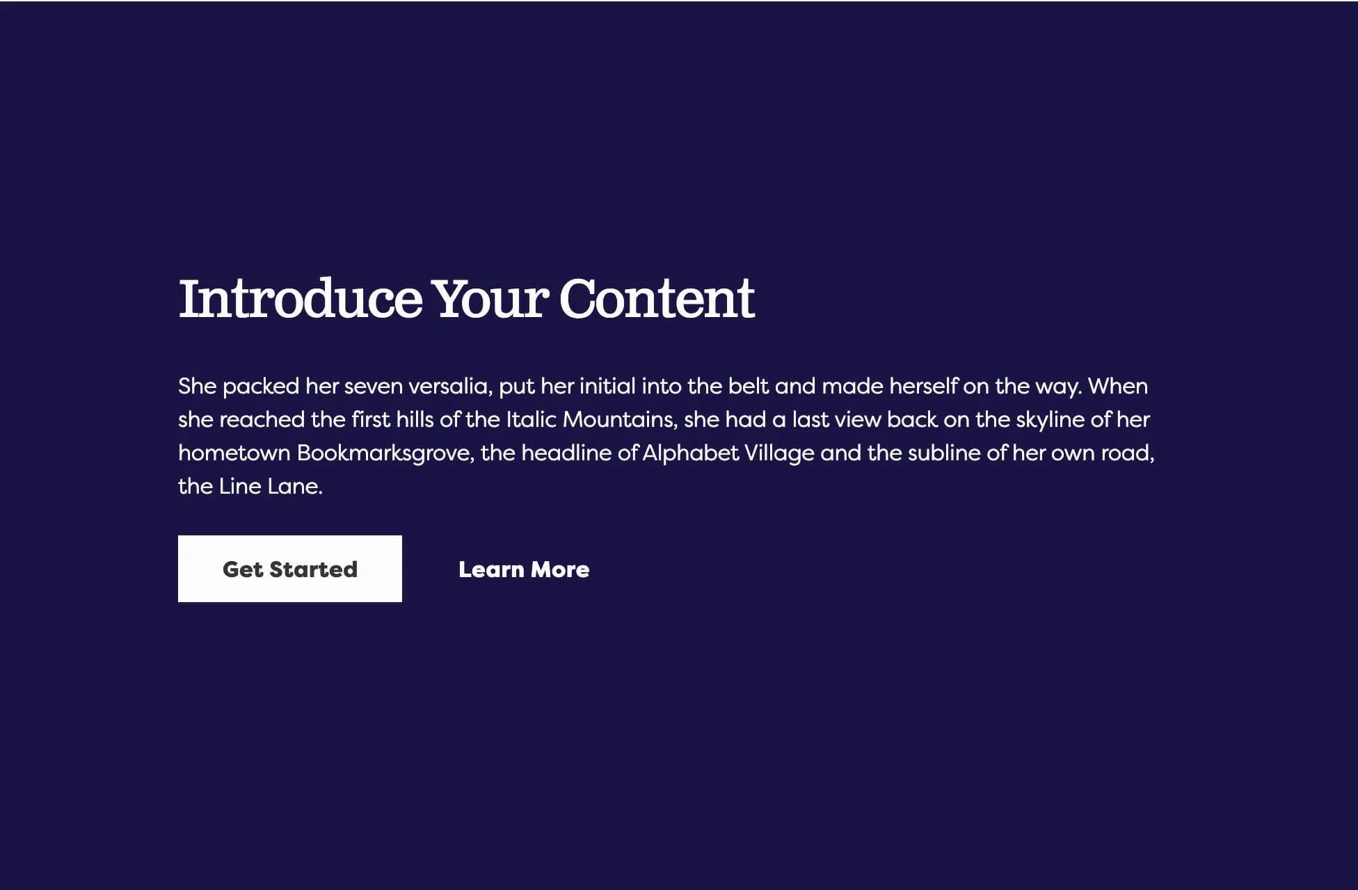
A photo slide with a gallery of images on a colored background.
Editor
-
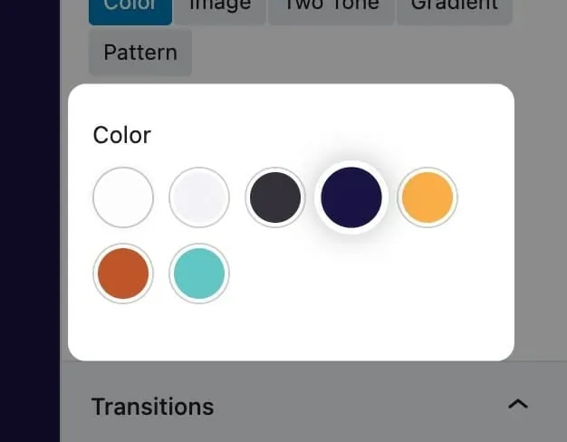
The BG setting offers your theme's palette colors. -
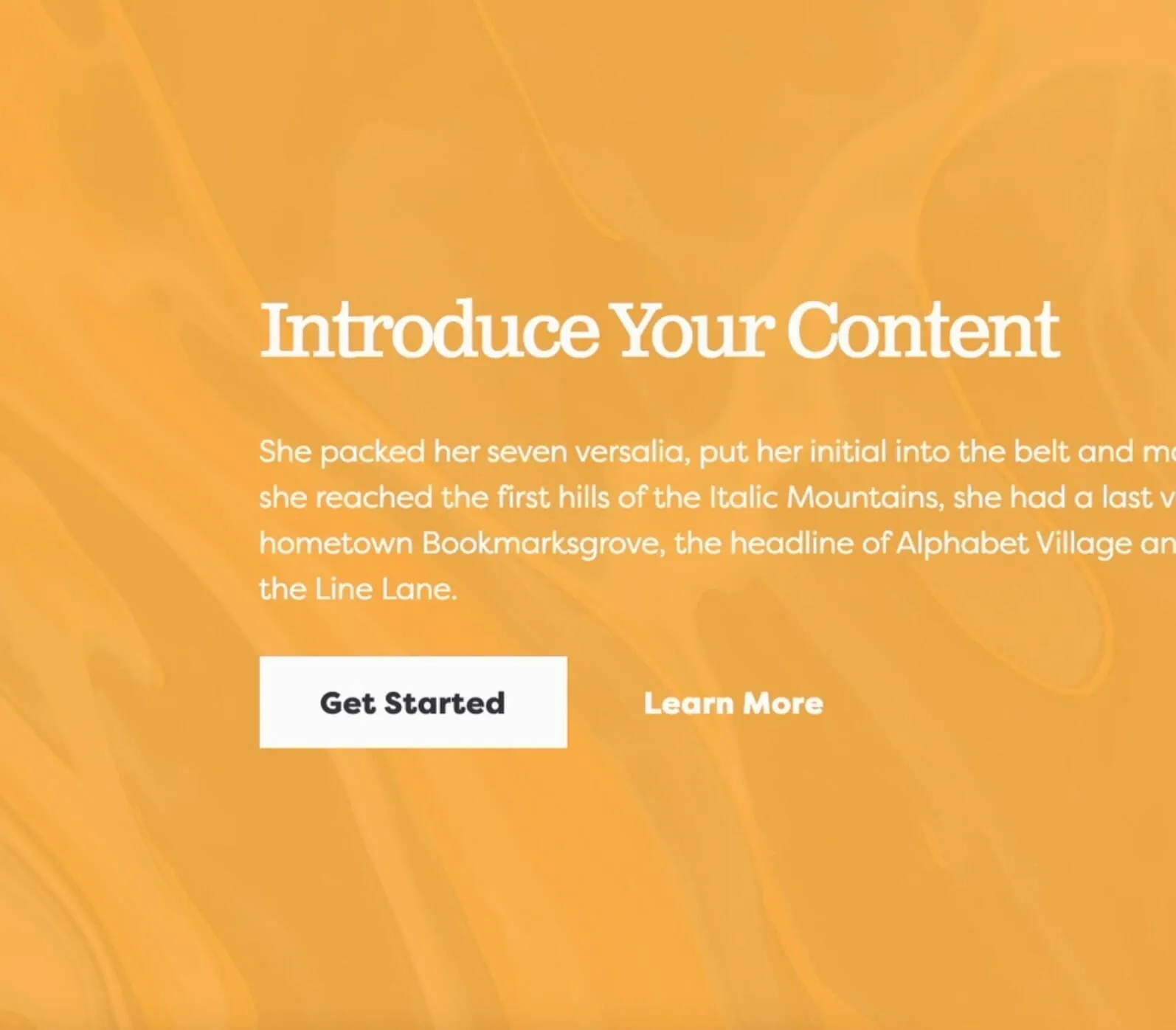
Reverse Print switches to light text for dark backgrounds. -
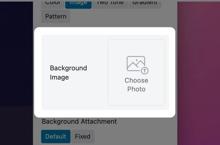
BG Image sets the full-width background photo on a Cover Slide.
Settings
Lookbook

Loops from the last slide back to the first. Turn it off to stop at the ends.
Advances slides automatically on desktop. When off, visitors use the dots below the slider.
Seconds between slides. Appears when Autoplay is on.