

Photo Block Slider
Usage
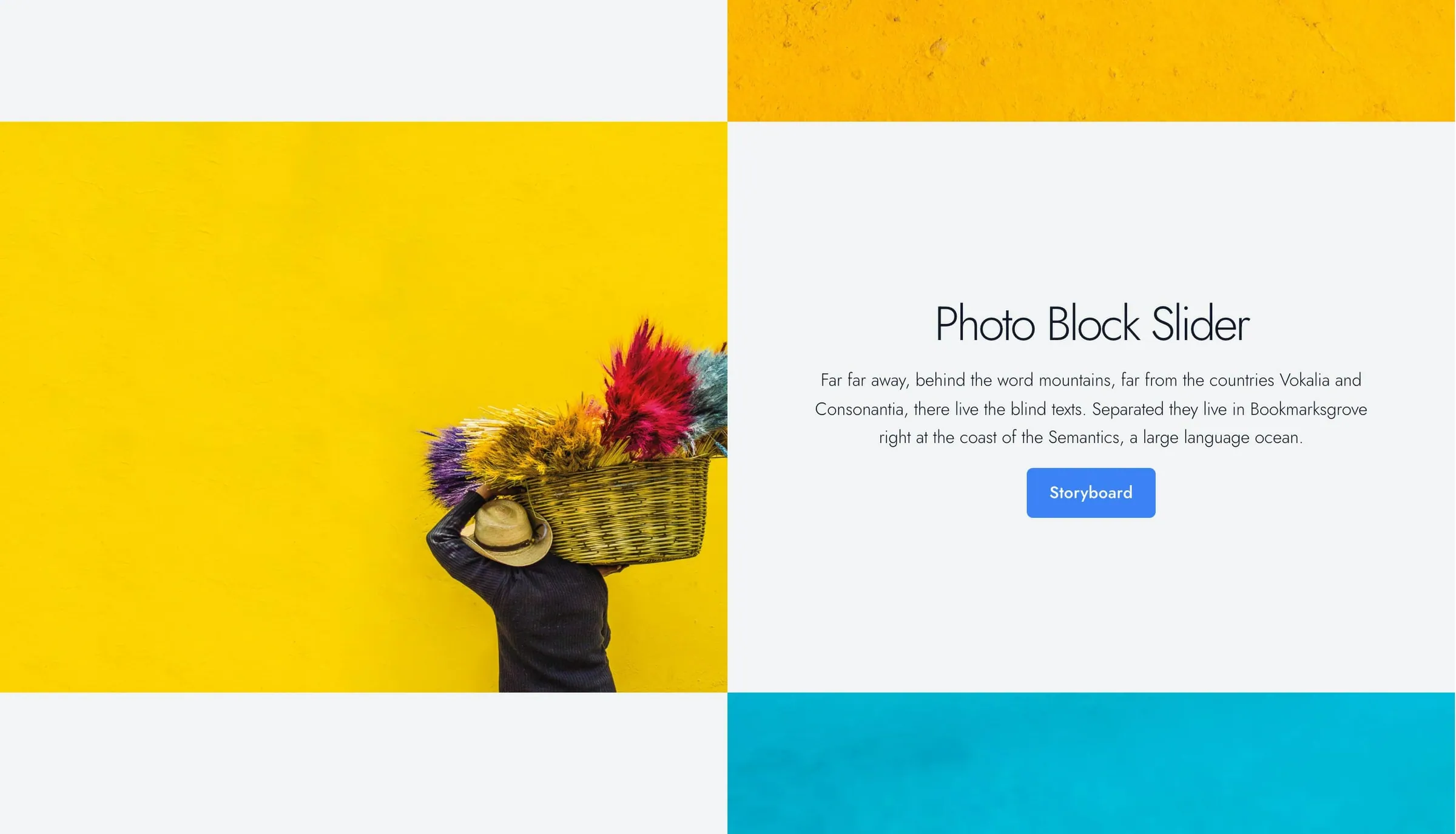
Photo Block Slider pairs one panel of text with an image slider that rotates on its own. The photos in Gallery cycle on one half while your headline, body, and link stay put on the other. Use it to tell one story across several photos.
The block is split down the middle, photos on one side and text on the other. Turn on Swap Blocks to switch sides on desktop.
Content fields
The text is the same for every photo:
- Headline: the main title.
- Subheadline: an optional supporting line.
- Body: the panel's paragraph text.
- Link: an optional link below the body.
These style settings appear once the matching field has content:
- Headline Style (default h2) and Subheadline Style (default h4): the heading look. They change the look only, not the page outline.
- Link Style: Understated (default), Button, Alternate, or Hollow.
Layout and appearance
- Text Placement: where the text sits in its panel (default center). This also sets the alignment, so bottom right gives right-aligned text.
- Reverse Print: light text for dark backgrounds.
- Swap Blocks: switches which side the photos and text are on, on desktop.
- Background: the text panel's color from your theme palette (default Gray).
Gallery and timing
- Gallery: the photos that rotate. Add at least one for the block to appear.
- Slide Interval: time between photos in milliseconds, where 1000 is one second (default 2000). The photos always rotate on their own; there's no setting to turn that off. They pause while the cursor is over them, and stay still for visitors who've turned on reduced motion in their device settings. Visitors can stop it with a small pause button at the bottom right, which appears when they hover over the photos or reach it with the keyboard (on phones and tablets it's always shown).
Block width
Photo Block Slider supports Wide and Full alignment and defaults to Full.
Tips
- Write text that fits every photo, since the panel doesn't change as photos rotate.
- For different text on each slide, use Storyboard Slider. For slides built from any blocks, use Slideshow.
Screenshots
Front-end
-
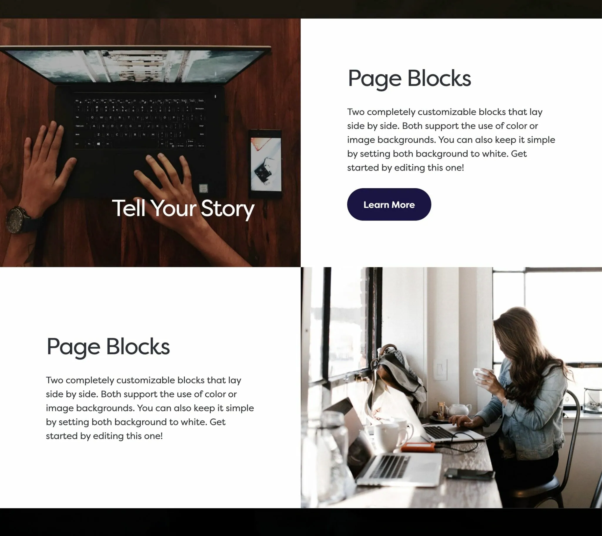
Swap Blocks puts the photos and text on opposite sides.
Editor
-
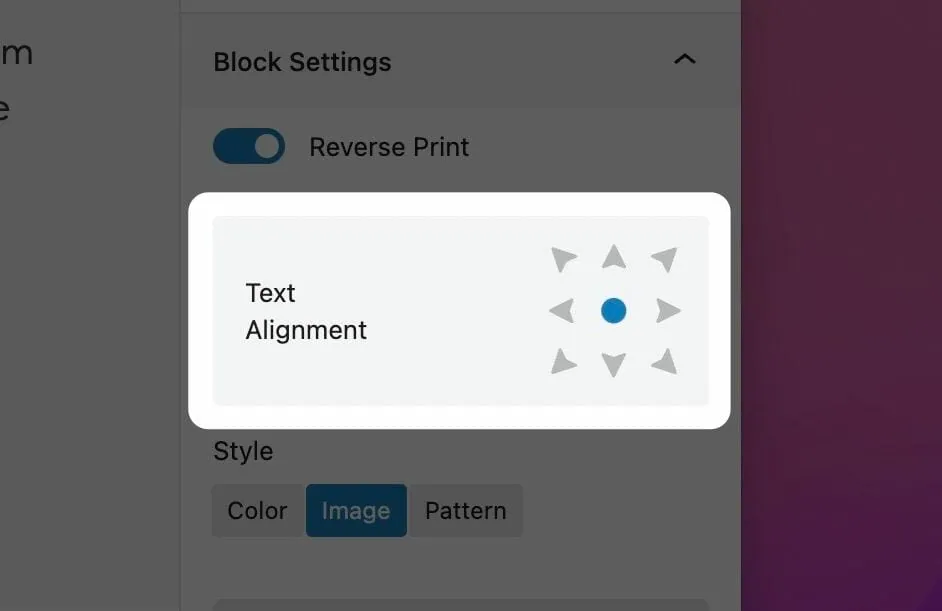
Text Placement sets where the text sits in its panel. -
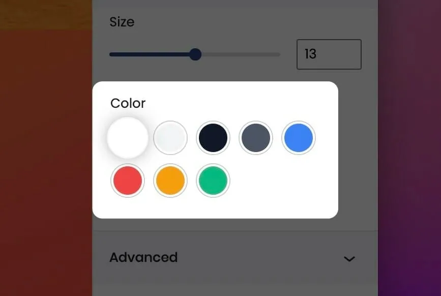
Background sets the text panel's color. -
Swap Blocks switches which side the photos and text are on.
Settings
Photo Block Slider

The panel's main title. Stays the same as the photos rotate.

An optional line below the headline.
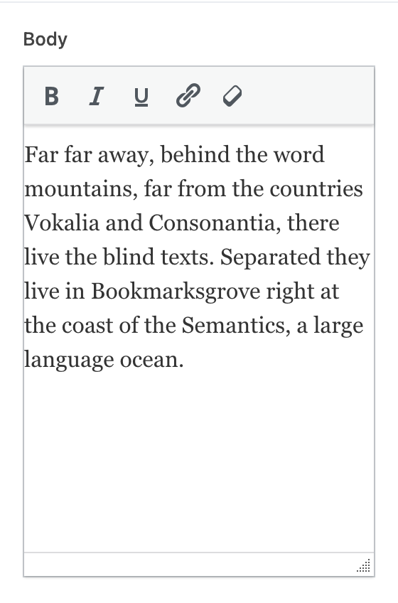
The panel's paragraph text. Stays the same as the photos rotate.

An optional link below the body.
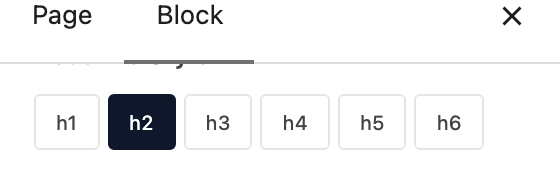
The heading look for the headline. Changes the look only, not the page outline.

The heading look for the subheadline. Changes the look only, not the page outline.

How the link looks. Appears once Link is set.

Where the text sits in its panel. Also sets the alignment, so bottom right gives right-aligned text.

Light text for dark background colors.

Switches which side the photos and text are on, on desktop.
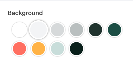
The text panel's background color.
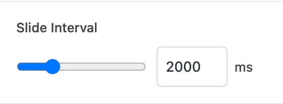
Time between photos in milliseconds; 1000 is one second. The photos always rotate on their own.
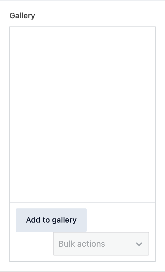
The photos that rotate beside the text. Each photo is one slide.