

Storyboard Slider
Usage
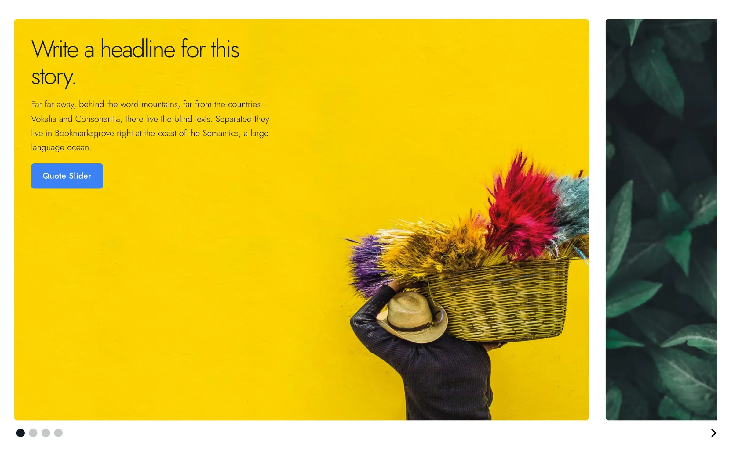
Storyboard Slider is a slider of large photo slides that visitors click or swipe through. Use it to walk visitors through a story, case study, portfolio project, or step-by-step message.
Each slide has a background photo, an optional color overlay, and its own headline, subheadline, body, and link. Slides can look different from each other while sharing a few settings on the main block.
Visitors move between slides with the arrows and dots below, by swiping, or by scrolling sideways on a trackpad; the slider never advances on its own. Dragging with a mouse doesn't move the slides. In the editor, all slides are stacked so you can edit them in one view.
Every slide is as tall as the tallest one, so the page below never jumps. On phones, where the text sits below each photo, a slide with less text sits centred in that height.
Slider settings
Select the Storyboard Slider block for settings that apply to every slide:
- Slide Position: Center (default) or Left. Sets where the current slide sits in the slider.
- Wraparound: on by default. The slider loops from the last slide back to the first.
- Corners: Rounded (default) or Sharp.
Slides
Use Add Slide to build your story. Each slide has these settings.
Content
- Headline: the slide's main title.
- Subheadline: an optional supporting line.
- Body: the slide's paragraph text.
- Link: an optional call to action below the body.
These style settings appear once the matching field has content:
- Headline Style (default h2) and Subheadline Style (default h4): the heading look. They change the look only, not the page outline.
- Link Style: Understated (default), Button, Alternate, or Hollow.
Layout
- Text Placement: where the text sits on the slide on desktop (default bottom right). This also sets the alignment, so bottom right gives right-aligned text. On phones, the photo sits above the text instead of behind it.
- Reverse Print: light text for dark photos, on by default. Slides without a photo get a dark background when it's on and a white one when it's off.
Background
- BG Image: the slide's background photo.
- Background Origin: which part of the photo stays in view as the slide resizes (default center).
- BG Overlay: a color over the photo (default Primary).
- Overlay Opacity: how strong the overlay color is (default 40).
Accessibility
Only the current slide can be reached with the keyboard. To reach another slide, use the arrows below the slider, or the arrow keys once the slider has keyboard focus.
Block width
Storyboard Slider supports Wide and Full alignment and defaults to Full.
Tips
- Give every slide a strong BG Image. The block is built around photography.
- On phones, keep each slide's Body about the same length, so short slides don't sit in a lot of empty space.
- If text is hard to read over a busy photo, raise Overlay Opacity or move the text with Text Placement.
- For slides built from any blocks, try Slideshow. For a row of logos, use Logo Carousel.
Screenshots
Front-end
-
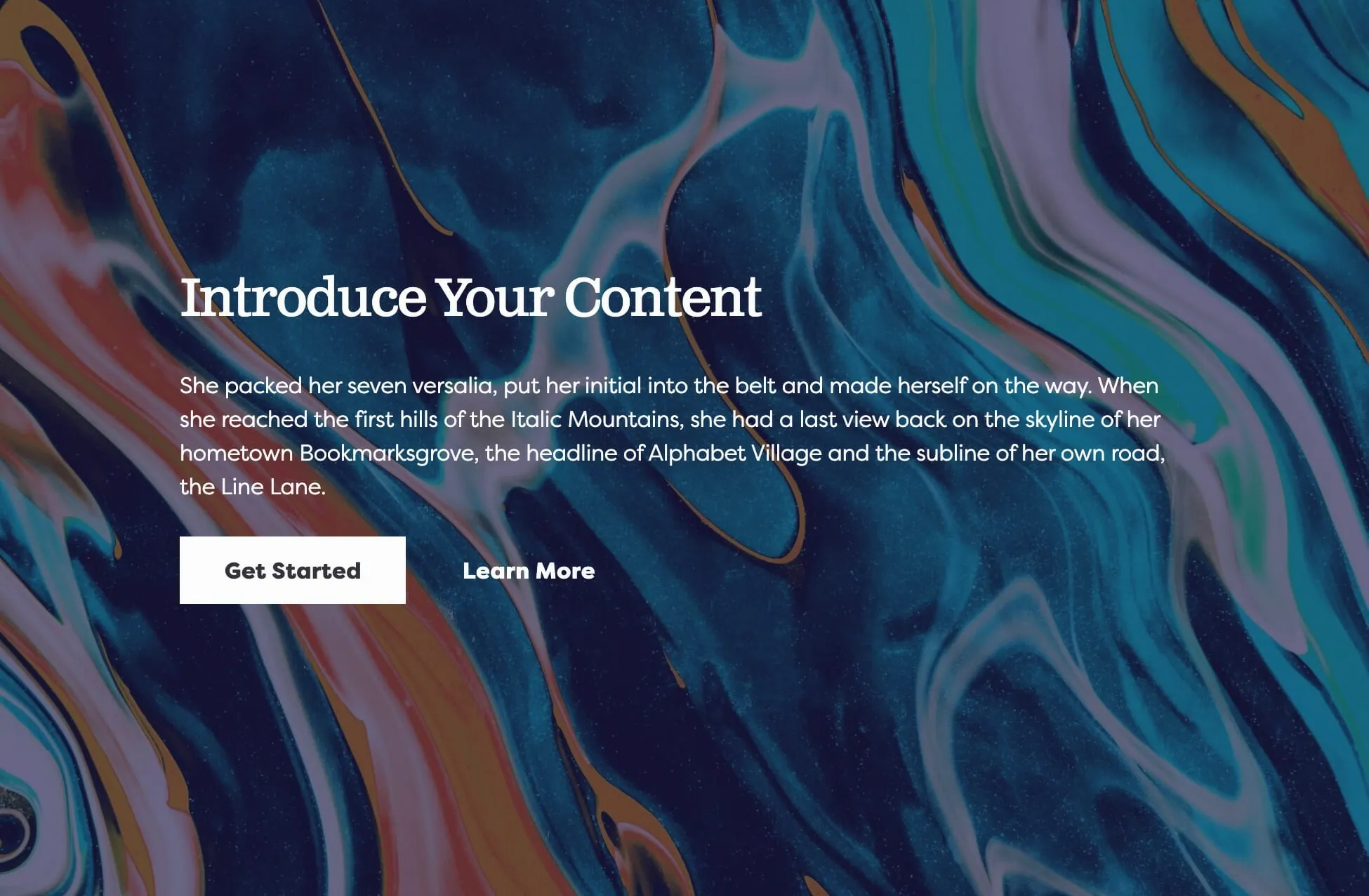
A slide with a background photo, color overlay, and text in the corner.
Editor
-
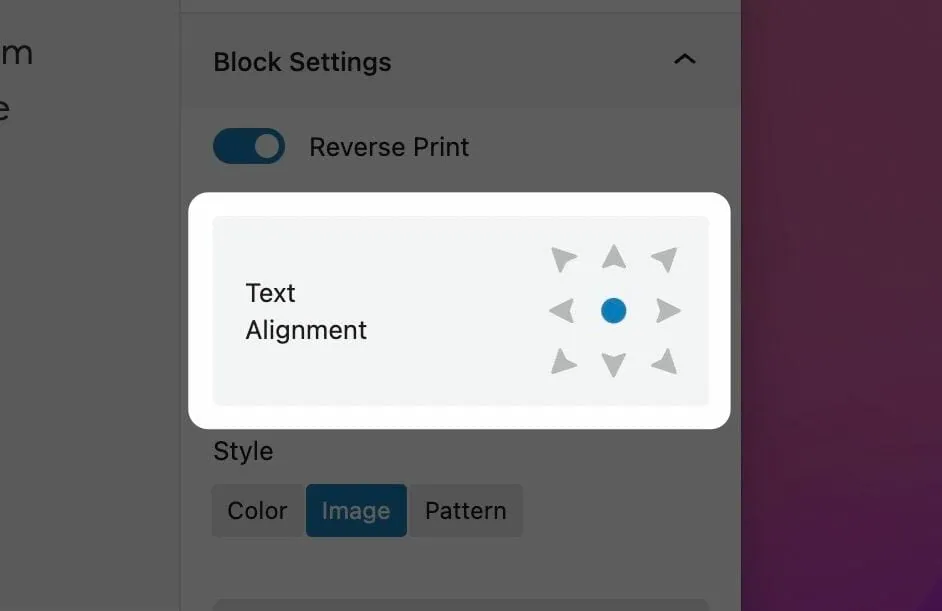
Text Placement sets where the text sits on each slide. -
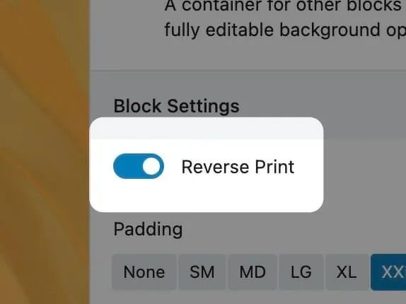
Reverse Print switches to light text for dark photos. -
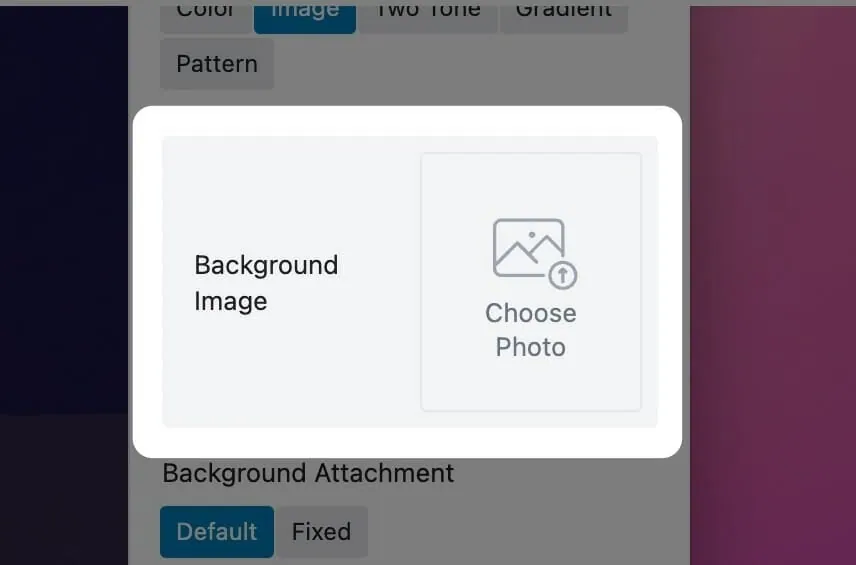
BG Image and overlay settings for one slide.
Settings
Storyboard
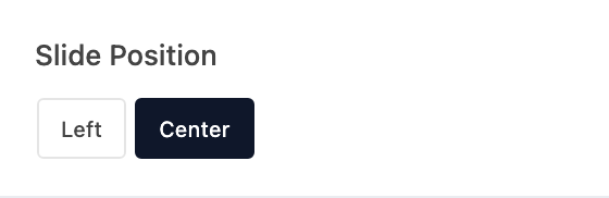
Where the current slide sits in the slider: centered, or lined up on the left.

Loops from the last slide back to the first.

Applies to every slide.
Add a row for each slide, with its text, photo, overlay, and text placement.