

Quote Slider
Usage
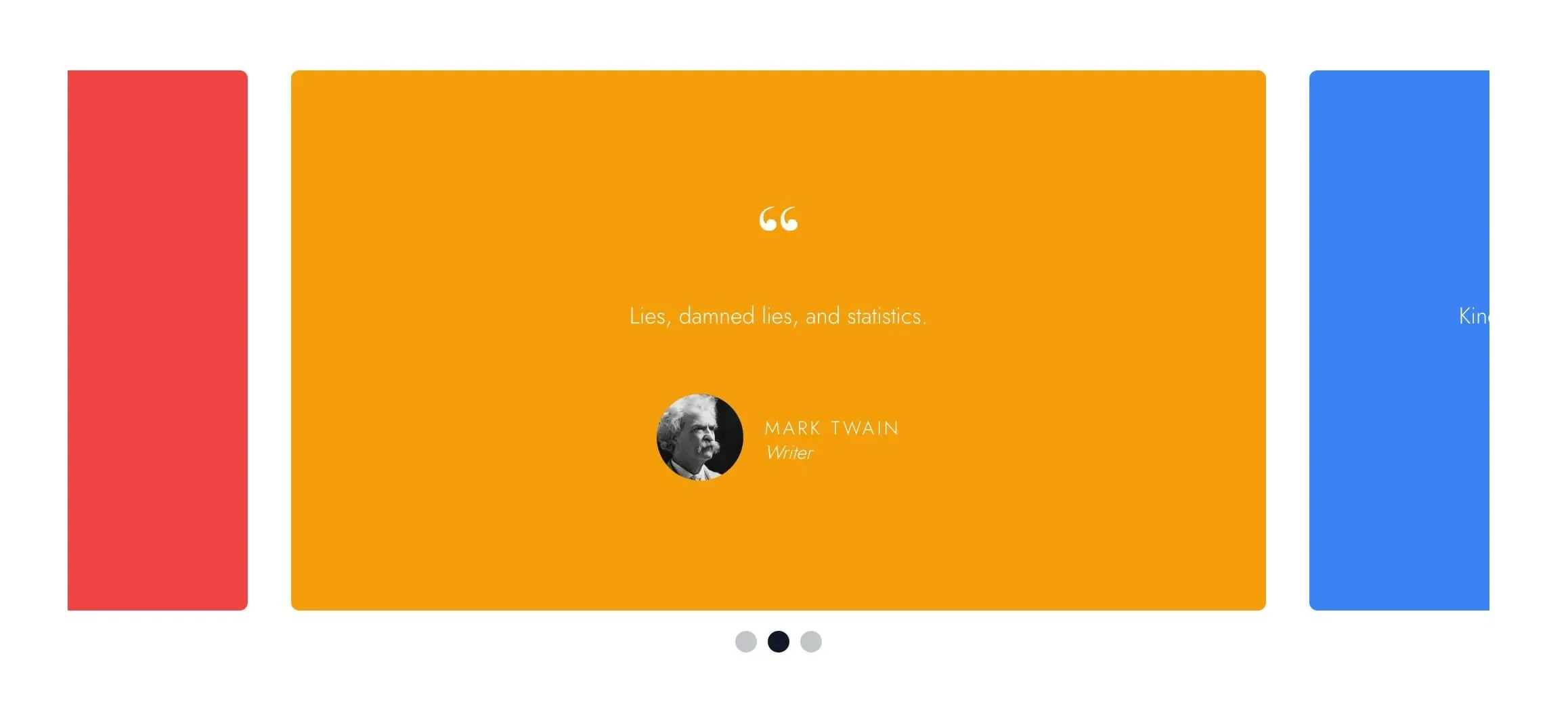
Quote Slider is a testimonial carousel. Each slide is a card with a large quotation mark, the quote, and an optional citation with a name, title, and headshot.
The neighboring slides peek in at the edges so visitors can tell there's more to see. Visitors can swipe, scroll sideways on a trackpad, click the dots below, or use the arrow keys once the slider has keyboard focus. Dragging with a mouse doesn't move the quotes.
Every card is as tall as the longest quote, and shorter cards sit centred in that space, so the page below never jumps as quotes change.
In the editor, all slides show at once in a grid. On the live page they sit in a single row that slides.
Slider settings
Select the Quote Slider block for settings that apply to every slide:
- Wraparound: on by default. The slider loops from the last quote back to the first.
- Autoplay: off by default. Turn it on to advance quotes automatically.
- Autoplay Interval: seconds between quotes (default 3). Appears when Autoplay is on. Autoplay pauses while the cursor is over the slider, and doesn't run for visitors who've turned on reduced motion in their device settings. Visitors can stop it with a small pause button at the bottom right, which appears when they hover over the slider or reach it with the keyboard (on phones and tablets it's always shown).
On phones, each slide is almost the full screen width. On larger screens, slides match your theme's content width.
Slides
Use Add Slide to add a quote card. Each one has:
- Quote: the quotation text.
- Citation Name: who said it.
- Citation Title: their role or organization, shown below the name.
- Citation Headshot: an optional round photo beside the citation.
- Background: the card color (default Primary).
- Reverse Print: light text for dark backgrounds, on by default. Use this rather than recoloring the text by hand.
Block width
Quote Slider supports Wide and Full alignment and defaults to Full.
Tips
- Keep quotes short, since each card is no wider than your content width on desktop.
- Keep quotes about the same length. One long quote makes every card that tall, with empty space around the short ones.
- Citations without a headshot are centered.
- When you mix light and dark cards, set Reverse Print on each slide to match its Background.
- For slides built from any blocks, use Slideshow. For a row of logos, use Logo Carousel.
Screenshots
Front-end
-

A quote card with light text on a dark background.
Editor
-
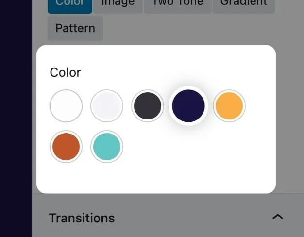
Background sets the color of each quote card. -
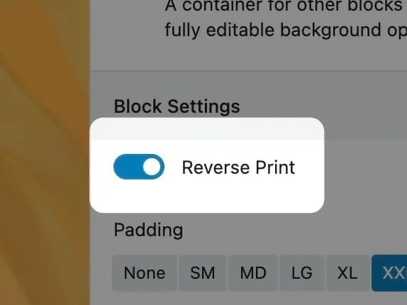
Reverse Print switches to light text on dark cards.
Settings
Quote Slider

Loops from the last quote back to the first.
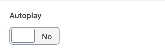
Advances quotes automatically. When off, visitors swipe or use the dots.
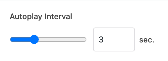
Seconds between quotes. Appears when Autoplay is on.
Add a row for each quote card, with the quote, citation, and card color.