

Overlay Grid

Usage
Overlay Grid is a grid of photo cards with a hover effect. Depending on your settings, hovering reveals a headline, a color overlay, or a second photo. Use it for portfolios, service categories, team highlights, or any collection where the photo leads.
Style settings on the block apply to every card. Each card's photo, text, and link go in the Cards list.
Grid settings
Select the Overlay Grid block for settings that apply to every card.
Layout
- Columns: 2 (default), 3, or 4 cards per row. Cards wrap onto new rows and rearrange on smaller screens.
- Spacing: the gap between cards (default 4).
- Corners: Sharp (default) or Rounded.
Text Position
Choose Inside (default) or Outside. Each shows a different set of settings.
Inside puts the headline, subheadline, and link on top of the photo:
- Overlay Style: Solid (default), Gradient, or Photo. Photo swaps in each card's Overlay Image on hover.
- Text Behavior: Show on Hover (default) or Always Show.
- Text Origin: where the text sits on the card (default center). A Gradient overlay fades from this side.
- Link Style: Understated (default), Button, or Hidden.
- BG Overlay: the overlay color (default White). Hidden when Overlay Style is Photo.
- Overlay Opacity: how strong the overlay color is (default 90). Hidden when Overlay Style is Photo.
Outside puts the headline and subheadline below the photo, and shows the card's link text over the photo on hover:
- Overlay Style: Solid (default), Badge (a round call-to-action), or Photo.
- Text Align: left, center (default), or right for the text below the photo.
- Overlay Text: the heading look for the hover label, or hidden to turn it off. Not shown for Badge.
Type and color
- Headline Style: the heading look for card headlines (default h4).
- Subheadline Style: the text look for subheadlines (default p).
- Reverse Print: light text, on by default. Pair it with dark overlays so text stays readable.
Cards
Use Add Card for each item:
- Image: the card photo.
- Overlay Image: the photo shown on hover when Overlay Style is Photo.
- Headline and Subheadline: the card's text.
- Link: makes the whole card clickable. Its link text is also used for the hover label when text is Outside.
Block width
Overlay Grid supports Wide and Full alignment and defaults to Wide.
Tips
- Pick Text Position first: Inside for text over photos, Outside for cards with text below and a hover call-to-action.
- Use Always Show when visitors need to see the text without hovering, such as on phones and tablets.
- For numbered cards under one main idea, see Breakout Grid.
Screenshots
Front-end
-
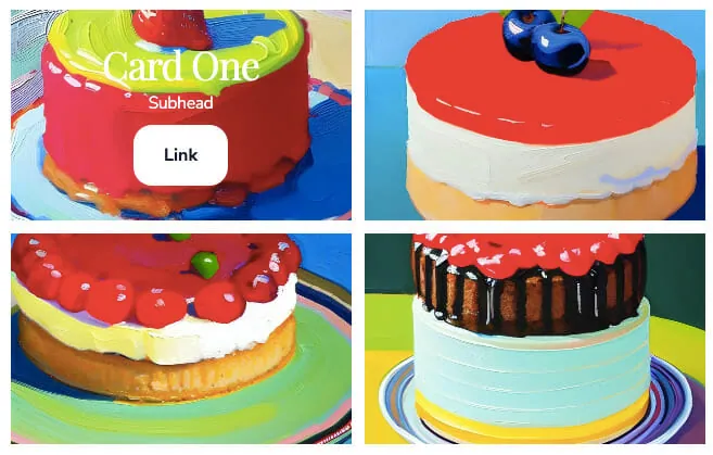
Cards with text inside the photo and text below it.
Editor
-
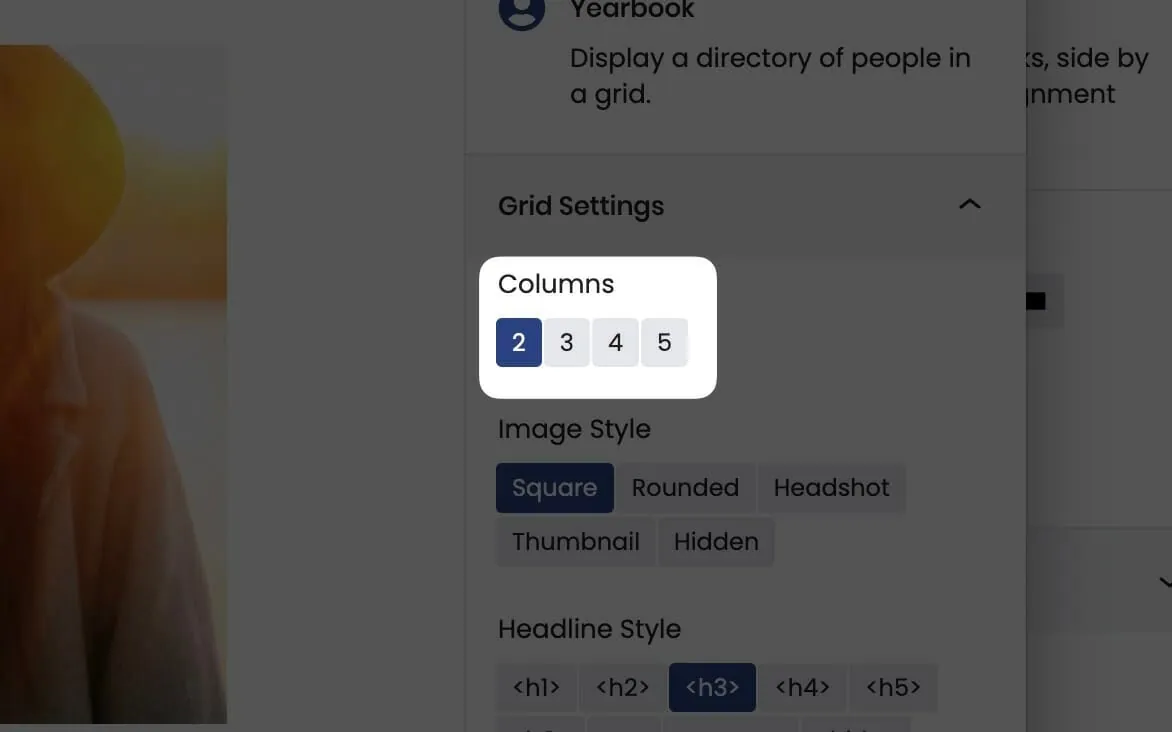
Columns sets how many cards sit in each row. -
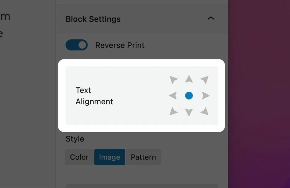
Text Origin sets where the text sits on each card. -
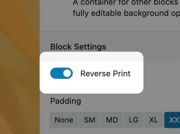
Reverse Print switches to light text over dark overlays.
Settings
Overlay Grid

Cards per row on large screens. Cards rearrange on smaller screens.

Inside puts text over the photo. Outside puts it below, with the link text shown over the photo on hover.
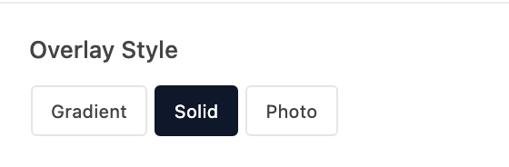
What covers the photo when text is Inside. Photo swaps in each card's Overlay Image on hover.

What appears over the photo on hover when text is Outside. Badge shows a round call-to-action.

Show the text and overlay only on hover, or all the time. Appears when Text Position is Inside.

Alignment for the text below each photo. Appears when Text Position is Outside.

Light text for dark overlays. Use this rather than recoloring each card's text by hand.
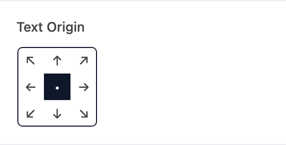
Where the text sits on each card. A Gradient overlay fades from this side.
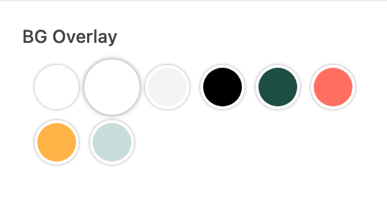
The overlay color for Solid and Gradient styles. Hidden when Overlay Style is Photo.

How strong the overlay color is. Hidden when Overlay Style is Photo.
The gap between cards.

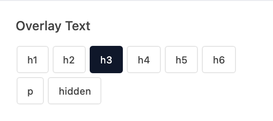
The heading look for the hover label when text is Outside, or hidden to turn it off. Not shown for Badge.
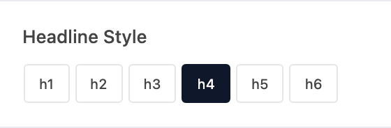
The heading look for card headlines. Changes the look only, not the page outline.

The text look for card subheadlines. Changes the look only, not the page outline.
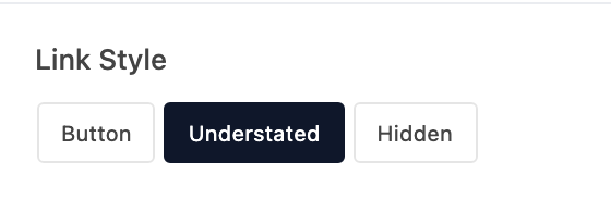
How the link shows on each card. Appears when Text Position is Inside.
Add a row for each card, with its image, text, and link.