

Collection
Usage
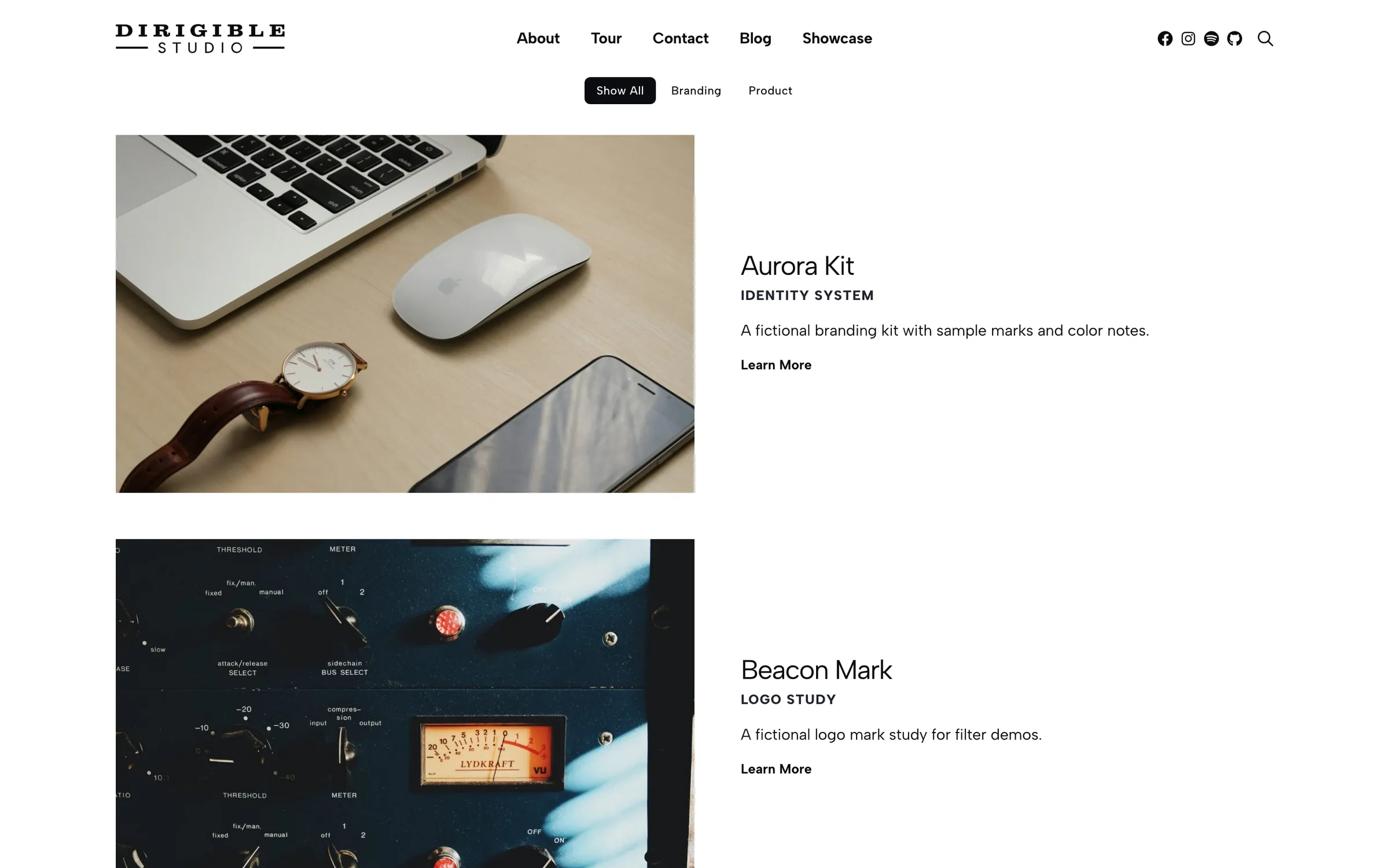
The Collection block shows your work as a portfolio gallery: Cards (default), a List, a Grid, or Overlay tiles. Leave Collections blank to include all work, or pick one or more to narrow it down.
Turn on Allow Filtering and choose Filters to add filter buttons: Show All plus one per filter.
Content
- Collections — which Collections to include. Leave blank for every published work.
- Allow Filtering / Filters — filter buttons for visitors. Assign those Filters on your works first.
When to use it
Use Collection as the main listing on your portfolio or case studies page. For a masonry image wall, use Packery Collection. To feature a few pieces in a slider, use Portfolio Slider.
Cards and Grid show image, title, and optional subtitle, excerpt, and link. Overlay puts that text over the image on hover. List splits image and copy side by side.
Appearance
- Layout — Cards (default), List, Overlay, or Grid
- Order By / Order — Default menu order, or sort by date, title, or last modified
- Image Fit — Uniform crops to fill the frame; Preserved keeps the original proportions
- Image Shape / Image Style — rectangle or square crop, square or rounded corners
- Text Align — left, center, or right for the copy under each item
- Show Title — hide the work name on List and Overlay only. Cards and Grid always show the title.
- Show Subtitle / Show Excerpt / Show Link — toggle those fields on every layout
- Title Style / Subtitle Style — how the title and subtitle look. They stay an H3 and H4 in the page outline.
- Link Text / Link Style — label and Button vs Standard link when Show Link is on
Tips
- Show Excerpt uses each work's excerpt, so keep it to a sentence.
- Assign Filters on each work before turning on Allow Filtering, or the filter buttons won't match anything.
- Set Layout to Overlay first if you need Padding between tiles.
- Set Layout to List first if you want images to alternate left and right (Image Alternate).
Settings
Collection
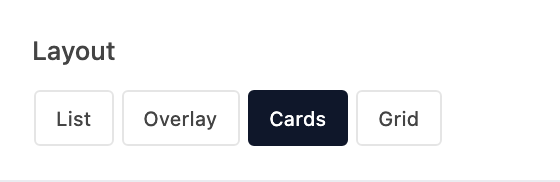
How the works are arranged on the page.
- ListImage and copy sit side by side in stacked rows.
- OverlayImage tiles with title and copy on a hover overlay.
- Cards defaultImage above copy in a responsive card grid — the usual portfolio listing.
- GridA tighter four-across card grid.
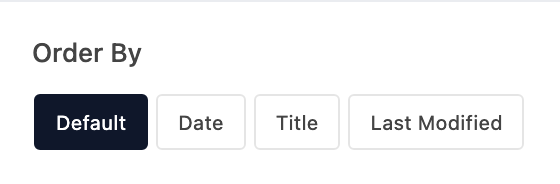
How works are sorted. Default follows the order in Portfolio.
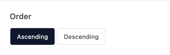
Ascending or descending after you pick an Order By other than Default.

How each featured image fills its frame.
- Uniform defaultCrops the image to fill the frame.
- PreservedKeeps the original proportions.
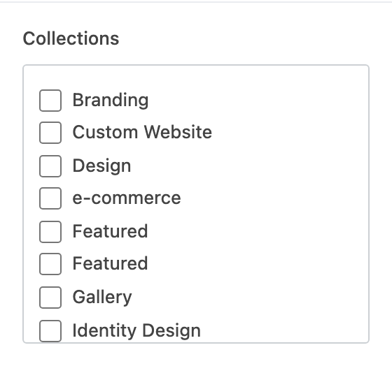
Which Collections to include. Leave blank to show all work.

Adds filter buttons above the listing. Choose which Filters next.
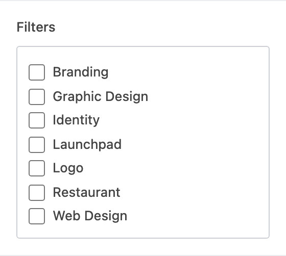
Which Filters get a button. Appears when Allow Filtering is on. A button only matches works that have that Filter assigned.

On List layout, switches the image and text sides on every other row.
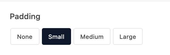
Space between Overlay tiles. Set Layout to Overlay first.

Crop shape for uniform images.
- RectangleA wide rectangle crop.
- SquareA 1:1 crop.

Corner treatment on each image.
- SquareSquare corners.
- RoundedRounded corners.
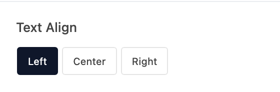
Alignment for the title, subtitle, excerpt, and link on each item.
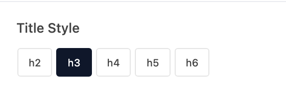
Visual style for the work name. The name stays an H3. Appears when Show Title is on.
- h2Looks like your site's H2 style.
- h3 defaultLooks like your site's H3 style.
- h4Looks like your site's H4 style.
- h5Looks like your site's H5 style.
- h6Looks like your site's H6 style.
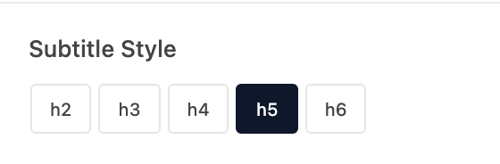
Visual style for the subtitle. The subtitle stays an H4. Appears when Show Subtitle is on.
- h2Looks like your site's H2 style.
- h3Looks like your site's H3 style.
- h4Looks like your site's H4 style.
- h5 defaultLooks like your site's H5 style.
- h6Looks like your site's H6 style.

Show or hide the work name on List and Overlay layouts. Cards and Grid always show the title.



Show a separate link under each item. Images and titles still link to the work page.
Label for the link on each item (placeholder Learn More). Appears when Show Link is on.
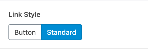
How the link on each item looks. Appears when Show Link is on.
- ButtonA solid button.
- Standard defaultA text link.