

Portfolio Slider
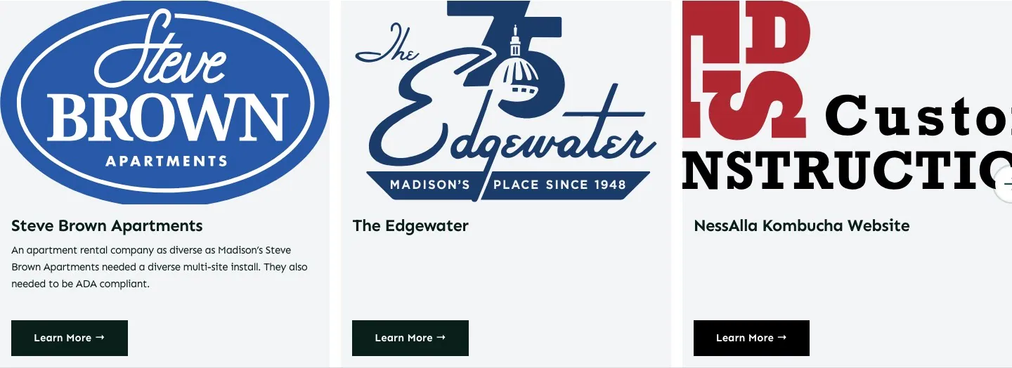
Usage
Portfolio Slider shows your work as cards in a horizontal slider. Each card includes the featured image, title, excerpt, and a link. Use the arrow, chevron, or caret buttons to move through the set.
Leave Collections blank for all work, or pick collections to narrow the slides.
When to use it
Use this to feature a handful of case studies on a home or services page without listing the full portfolio. Use Collection when visitors should scan or filter the whole set.
Appearance
- Link Text / Link Style — the link label, shown as a button or text link
- Headline Style — how the work name looks (it stays an H3 in the page outline)
- Text Size — regular or small excerpt
- Pager — arrow, chevron, or caret on the prev/next buttons
- Maximum Cards Visible — how many cards show at once (1–4, default 3)
Tips
- Keep excerpts short so the cards stay the same height.
- Set Order By to date to show your newest work first.
Settings
Portfolio Slider
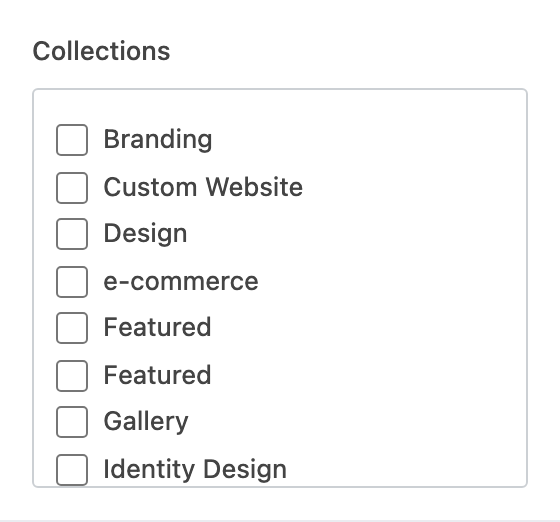
Which Collections to include. Leave blank to show all work.
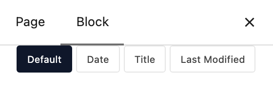
How works are sorted. Default follows the order in Portfolio.

Ascending or descending after you pick an Order By other than Default.

Label on each card’s link (default Learn More →).
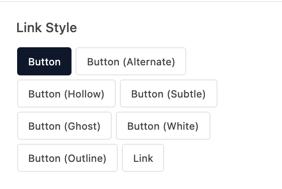
Shows the card link as a button or a text link.
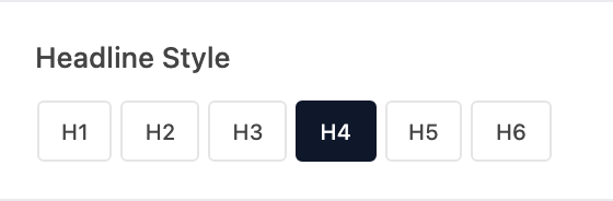
Visual style for the work name. The name stays an H3.
- H1Looks like your site's H1 style.
- H2Looks like your site's H2 style.
- H3Looks like your site's H3 style.
- H4 defaultLooks like your site's H4 style.
- H5Looks like your site's H5 style.
- H6Looks like your site's H6 style.

Excerpt size on each card.
- RegularRegular paragraph size.
- SmallSmaller excerpt text.

Icon on the previous and next buttons.
- Arrow defaultA long arrow.
- ChevronA chevron.
- CaretA small caret.
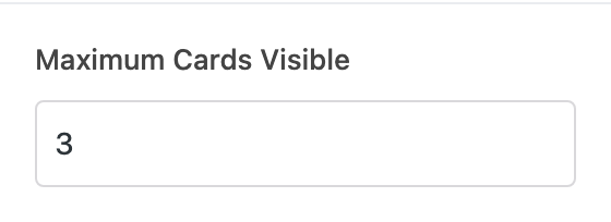
How many cards show at once (1–4, default 3).