

Logo Grid Collection

Usage
Logo Grid Collection puts each work's featured image in an even logo grid. Set Max Columns, logo size, and a single Gap. Each logo links to that work’s page.
Leave Collections blank for all work, or pick collections to narrow it down.
When to use it
Use this when logos should line up in columns, like a partner page or a "who we work with" section. Use Logo Collection for a wrapping strip that can left-, center-, or right-align.
Works without a featured image are skipped.
Content
- Collections — which Collections to include. Leave blank for all work with a featured image.
Appearance
- Order By / Order — Default menu order, or sort by date, title, or last modified
- Logo Height / Logo Width — the box each logo sits in
- Gap — space between cells
- Max Columns — the most logos per row on wide screens. Smaller screens show fewer.
Tips
- Use logos with transparent backgrounds and similar padding so the grid looks even.
Settings
Collection
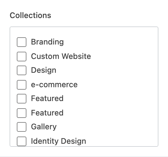
Which Collections to include. Leave blank to show all work with a featured image.
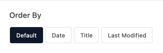
How works are sorted. Default follows the order in Portfolio.

Ascending or descending after you pick an Order By other than Default.
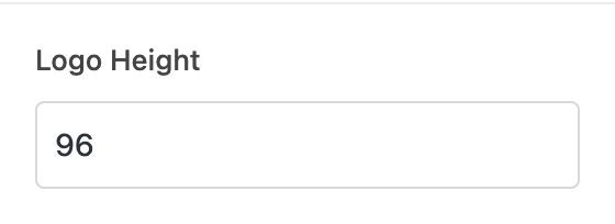
Maximum logo height in pixels (32–256, default 96).
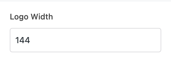
Maximum logo width in pixels (32–512, default 144). Also sets how narrow each grid cell can get.
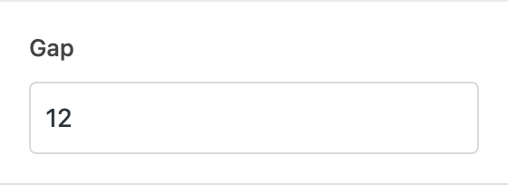
Space between logos in pixels (0–128, default 12).
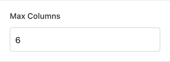
Most logos per row (0–10, default 6). Smaller screens show fewer.